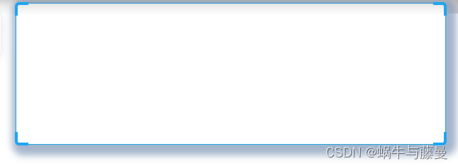
边框样式 – 四角边框
效果:
代码:
<div class="card_div">
  <div class="border_corner border_corner_left_top"></div>
  <div class="border_corner border_corner_right_top"></div>
  <div class="border_corner border_corner_left_bottom"></div>
  <div class="border_corner border_corner_right_bottom"></div>
  ...
</div>

// 卡片样式
  .card_div{


    min-height: 200px;
    border: 1px solid #21a7e1;
    box-shadow: 5px 5px 10px 10px  rgba(24,68,124,0.4);
    padding-top:20px;
    border-radius: 6px;
    position: relative;
    /*四个角框*/
    .border_corner{


      z-index: 2500;
      position: absolute;
      width: 19px;
      height: 19px;
      background: rgba(0,0,0,0);
      border: 4px solid #1fa5f1;
    }
    .border_corner_left_top{


      top: -2px;
      left: -2px;
      border-right: none;
      border-bottom: none;
      border-top-left-radius: 6px;
    }
    .border_corner_right_top{


      top: -2px;
      right: -2px;
      border-left: none;
      border-bottom: none;
      border-top-right-radius: 6px;
    }
    .border_corner_left_bottom{


      bottom: -2px;
      left: -2px;
      border-right: none;
      border-top: none;
      border-bottom-left-radius: 6px;
    }
    .border_corner_right_bottom{


      bottom: -2px;
      right: -2px;
      border-left: none;
      border-top: none;
      border-bottom-right-radius: 6px;
    }
  }
各种分割线
<div class="对应类名"></div>
// 实线
.splitLine_Virtualization {


  width: 100%;
 border: 0;
 border-top: 1px solid #d0d0d5;
}

// 渐变线
// 渐变线-两边虚化
.splitLine_Virtualization_sides {


  width: 100%;
  border: 0;
  padding-top: 1px;
  background: linear-gradient(to right, transparent, #d0d0d5, transparent);
}
// 渐变线-右边虚化
.splitLine_Virtualization_right {


  width: 100%;
  border: 0;
  padding-top: 1px;
  background: linear-gradient(to right, #d0d0d5, transparent);
}

// 点线
.splitLine_Virtualization {


	width: 100%;
	border: 0;
	border-top: 1px dotted #a2a9b6;
}
//虚线
.splitLine_Virtualization {


	width: 100%;
	border: 0;
	border-top: 1px dashed #a2a9b6;
}
// 疏密可控的虚线
.splitLine_Virtualization {


	width: 100%;
	border: 0;
	padding-top: 1px;
	background: repeating-linear-gradient(to right, #a2a9b6 0px, #a2a9b6 4px, transparent 0px, transparent 12px);
	}
//双实线
.splitLine_Virtualization {


	width: 100%;
	border: 0;
	border-top: 1px double #a2a9b6;
}
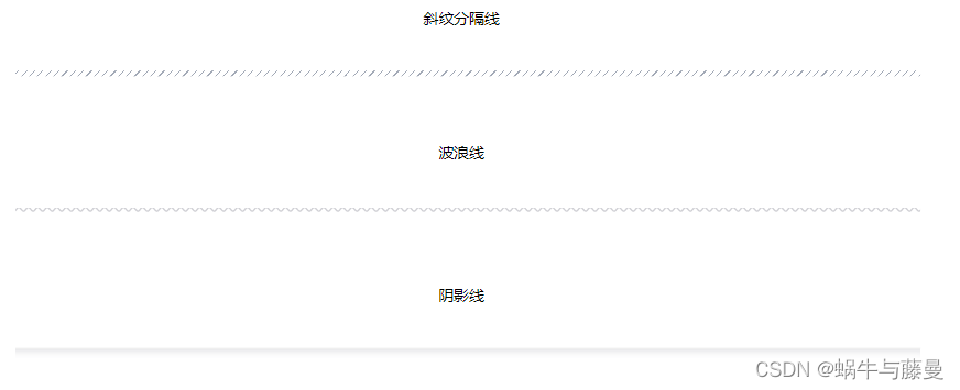
//斜纹分隔线
.splitLine_Virtualization {


	width: 100%;
	border: 0;
	padding: 3px;
	background: repeating-linear-gradient(135deg, #a2a9b6 0px, #a2a9b6 1px, transparent 1px, transparent 6px);
}
//波浪线
.splitLine_Virtualization {


	width: 100%;
	border: 0;
	color: #d0d0d5;
	height: .5em;
	white-space: nowrap;
	letter-spacing: 100vw;
	padding-top: .5em;
}
.splitLine_Virtualization::before {


		content: "\2000\2000";
		/* IE浏览器实线代替 */
		text-decoration: overline;
		/* 现代浏览器 */
		text-decoration: overline wavy;
	}
**//阴影线**

```javascript
.splitLine_Virtualization {


	width: 100%;
	border: 0;
	padding-top: 10px;
	color: #d0d0d5;
	border-top: 1px solid rgba(0, 0, 0, .1);
	box-shadow: inset 0 10px 10px -10px;
}
字体
-机械字体
(可网上找)字体文件链接:https://pan.baidu.com/s/1j9TGAh4qUZZkG1ZbqOzDjw
提取码:mr9l
.ttf格式字体库文件引用方式
@font-face
{


  font-family: DigifaceFont; // 自定义名字
  src: url('font/Digiface Regular.ttf') // 文件位置
}
// 使用
font-family: 'DigifaceFont';
.eot和.woff格式字体库文件引用方式
@font-face
{


  font-family: 'UnidreamLED'; // 自定义名字
  src:url(font/UnidreamLED.eot); // 兼容ie9
  src:url(font/UnidreamLED.eot?#iefix)format('embedded-opentype'), // 兼容ie6-ie8
  url('font/UnidreamLED.woff') format('woff'),
  local('UnidreamLED'), url("font/UnidreamLED.woff");
}
// 使用
font-family: 'UnidreamLED';