一.filter: drop-shadow(). 设置图片的阴影
<div class="img_box"><img /></div>
//css样式
.img_box {
width: 53px;
height: 53px;
overflow: hidden;
position: relative;
}
. img {
position: absolute;
width: 53px;
height: 53px;
filter: drop-shadow(70px 0 0 #EA5E30) //关键
}
二.background-blend-mode 背景的混合模式
.pic1 {
background-image: url($img), linear-gradient(#f00, #f00);
background-blend-mode: lighten;
background-size: cover;
}
效果如下:
也可以实现渐变的效果
.pic1 {
background-image: url($img), linear-gradient(#f00, #00f);
background-blend-mode: lighten;
background-size: cover;
}
效果如下:
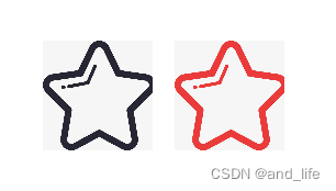

二.svg方法
<svg t="1653466467217" class="icon1" viewBox="0 0 1024 1024" version="1.1" xmlns="http://www.w3.org/2000/svg" p-id="3355" width="200" height="200"><path d="xxx"></path></svg>
<svg t="1653466467217" class="icon2" viewBox="0 0 1024 1024" version="1.1" xmlns="http://www.w3.org/2000/svg" p-id="3355" width="200" height="200"><path d="xxx"></path></svg>
//css样式
<style>
.icon2{
fill: #f61f41;
}
</style>