Android Layout 布局属性全解
android开发者谷歌文档http://android.xsoftlab.net/reference/android/view/ViewGroup.html
- <FrameLayout
- android:layout_width=“” //取值范围”match_parent”、”wrap_content”、”XXdp” 布局整体宽度
- android:layout_height=“”//取值范围”match_parent”、”wrap_content”、”XXdp” 布局整体高度
- android:layout_weight=“”//取值示例”1.0” 布局所占比重
- android:layout_gravity=“” //取值范围”center”、”top”、”bottom”、”left”、”right”、”right|bottom” 布局位置
- android:layout_margin=“” //取值示例”0dp” 距离父控件四个方向距离
- android:layout_marginLeft=“” //取值示例”0dp” 距离父控件左间距
- android:layout_marginTop=“” //取值示例”0dp” 距离父控件上间距
- android:layout_marginRight=“” //取值示例”0dp” 距离父控件右间距
- android:layout_marginBottom=“” //取值示例”0dp” 距离父控件下间距
- android:layout_marginStart=“” //取值示例”-50dp” “50dp” 控件离父控件开始的位置的距离(前者不显示前50dp)
- android:layout_marginEnd=“” //取值示例”-50dp” “50dp” 控件离父控件结束的位置的距离(前者不显示后50dp)
- android:addStatesFromChildren=“” //取值范围”true” 、”false” viewgroup的drawable属性是否把它的子类的drawable的state包含进来。测试中linearlayout如果不包含该属性(false),当子widget被点击时不会出现被选中的状态。也就是子类的state不会被传递给父类了
- android:descendantFocusability=“” //见下
- android:splitMotionEvents=“” //取值范围”true” “false” 定义布局是否传递touch事件到子布局
- android:layoutMode=“” //取值范围 “clipBounds” “opticalBounds” 见下
- android:id=“”
- android:tag=“” //listView中区别Item非常有用的Tag标签(key-value)
- android:scrollX=“” //The initial horizontal scroll offset, in pixels. [dimension]最初的水平滚动的偏移,以像素为单位。
- android:scrollY=“” //The initial virtual scroll offset, in pixels. [dimension]最初的竖直滚动的偏移,以像素为单位。
- android:background=“”
- android:padding=“” //取值示例”0dp” 控件内容(文本图片子控件等)距离控件四个方向边界的距离
- android:paddingLeft=“”
- android:paddingTop=“”
- android:paddingRight=“”
- android:paddingBottom=“”
- android:paddingStart=“” //见下 文字对齐方式详解
- android:paddingEnd=“” //见下 文字对齐方式详解
- android:foreground=“” //设置布局的前景图,前景图不会被子元素覆盖
- android:foregroundGravity=“” //设置布局前景图的位置
- android:foregroundInsidePadding=“” //
- android:focusable=“” //取值”true” “false” 能否获得焦点(按键)
- android:focusableInTouchMode=“” //取值”true” “false” 是否可以通过touch获取到焦点(android:focusable 为先决条件)
- android:fitsSystemWindows=“” //取值”true” “false” 设置布局调整时是否考虑系统窗口(如状态栏)
- android:fadeScrollbars=“” //取值”true” “false” 滚动条自动隐藏
- android:fadingEdge=“” //设置拉滚动条时 ,边框渐变的方向。none(边框颜色不变),horizontal(水平方向颜色变淡),vertical(垂直方向颜色变淡)。
- android:fadingEdgeLength=“” //滚动条渐变长度
- android:filterTouchesWhenObscured=“” //取值范围 “true” “false”所在窗口被其它可见窗口遮住时,是否过滤触摸事件
- android:visibility=“” //取值范围 “gone” “visible” “invisible”(虽不可见,但占据布局位置)
- android:scrollbars=“”//取值范围 “none” “horizontal” “vertical” 设置滚动条
- android:scrollbarStyle=“” //outsideInset : 该ScrollBar显示在视图(view)的边缘,增加了view的padding. 如果可能的话,该ScrollBar仅仅覆盖这个view的背景. insideInset :该ScrollBar显示在padding区域里面,增加了控件的padding区域,该ScrollBar不会和视图的内容重叠. outsideOverlay : 该ScrollBar显示在视图(view)的边缘,不增加view的padding,该ScrollBar将被半透明覆盖 insideOverlay : 该ScrollBar显示在内容区域里面,不会增加了控件的padding区域,该ScrollBar以半透明的样式覆盖在视图(view)的内容
- android:isScrollContainer=“” //取值范围 “true”“false” 设置当前View是否为滚动容器(是否可以为输入法腾出空间而隐藏)
- android:scrollbarFadeDuration=“” //褪色时间
- android:scrollbarDefaultDelayBeforeFade=“” //设置滚动条N毫秒后开始淡化,以毫秒为单位。
- android:scrollbarSize=“” //设置滚动条大小
- android:scrollbarThumbHorizontal=“@drawable” //设置水平滚动条的drawable
- android:scrollbarThumbVertical=“@drawable” //设置垂直滚动条的drawable.
- android:scrollbarTrackHorizontal=“@drawable”//设置水平滚动条背景(轨迹)的色drawable
- android:scrollbarTrackVertical=“@deawable” //设置垂直滚动条背景(轨迹)的drawable注意直接
- android:scrollbarAlwaysDrawHorizontalTrack=“true/false” //设置水平滚动条是否含有轨道
- android:scrollbarAlwaysDrawVerticalTrack=“true/false” // 设置垂直滚动条是否含有轨道
- android:requiresFadingEdge=“none/horizontal/vertical” //定义褪色时滚动边缘
- android:nextFocusLeft=“@+id/” //Up键按下之后,哪一个控件获得焦点(被选中)
- android:nextFocusRight=“@+id/”
- android:nextFocusUp=“@+id/”
- android:nextFocusDown=“@+id/”
- android:nextFocusForward=“@+id/”
- android:clickable=“true/false”
- android:longClickable=“true/false”
- android:saveEnabled=“true/false” //设置是否在窗口冻结时(如旋转屏幕)保存View的数据
- android:drawingCacheQuality=“auto|low|hight” //设置绘图缓存质量
- android:keepScreenOn=“true/false” //View在可见的情况下是否保持唤醒状态
- android:duplicateParentState=“true/false” 如果设置此属性,将直接从父容器中获取绘图状态(光标,按下等)。 注意根据目前测试情况仅仅是获取绘图状态,而没有获取事件,也就是你点一下LinearLayout时Button有被点击的效果,但是不执行点击事件。
- android:minHeight=“”
- android:minWidth=“”
- android:soundEffectsEnabled=“true/false” // 设置点击或触摸时是否有声音效果
- android:hapticFeedbackEnabled=“true/false” // 实现单击某个视图,系统提供一个触力反馈(震动一下)
- android:contentDescription=“@string/” //图片不可见时的文字描述(盲人)
- android:onClick=“”
- android:overScrollMode=“ifContentScrolls/always/never” //滚动到边界时的效果
- android:alpha=“0.1” //透明度
- android:translationX=“” //X轴的偏移距离
- android:translationY=“”
- android:transformPivotX=“” //从某点的X轴偏移距离
- android:transformPivotY=“”
- android:rotation=“” //旋转
- android:rotationX=“”
- android:rotationY=“”
- android:scaleX=“” //设置X轴缩放比例
- android:scaleY=“”
- android:verticalScrollbarPosition=“defaultPosition/left/right” //设置垂直滚动条的位置
- android:layerType=“none/hardware/software” //绘图是否开启硬件加速
- android:layoutDirection=“” //定义布局图纸的方向
- android:textDirection=“” //
- android:textAlignment=“inherit/…..” //文字对齐方式
- android:importantForAccessibility=“noHideDescendants/….” //设置可达性的重要行
- android:accessibilityLiveRegion=“”
- android:labelFor=“” //添加标签
- android:measureAllChildren=“” //见下
- android:animateLayoutChanges=“true” //添加默认布局动画
- android:clipChildren=“” //见下
- android:clipToPadding=“” //见下转载
- android:layoutAnimation=“” //设置layout动画
- android:animationCache=“”
- android:persistentDrawingCache=“” android:alwaysDrawnWithCache=“” />
<FrameLayout
android:layout_width="" //取值范围"match_parent"、"wrap_content"、"XXdp"  布局整体宽度
android:layout_height=""//取值范围"match_parent"、"wrap_content"、"XXdp"  布局整体高度
android:layout_weight=""//取值示例"1.0"  布局所占比重
android:layout_gravity="" //取值范围"center"、"top"、"bottom"、"left"、"right"、"right|bottom" 布局位置
android:layout_margin="" //取值示例"0dp" 距离父控件四个方向距离
android:layout_marginLeft="" //取值示例"0dp" 距离父控件左间距
android:layout_marginTop="" //取值示例"0dp" 距离父控件上间距
android:layout_marginRight="" //取值示例"0dp" 距离父控件右间距
android:layout_marginBottom="" //取值示例"0dp" 距离父控件下间距
android:layout_marginStart="" //取值示例"-50dp" "50dp"  控件离父控件开始的位置的距离(前者不显示前50dp)
android:layout_marginEnd=""   //取值示例"-50dp" "50dp"  控件离父控件结束的位置的距离(前者不显示后50dp)
android:addStatesFromChildren="" //取值范围"true" 、"false" viewgroup的drawable属性是否把它的子类的drawable的state包含进来。测试中linearlayout如果不包含该属性(false),当子widget被点击时不会出现被选中的状态。也就是子类的state不会被传递给父类了
android:descendantFocusability="" //见下
android:splitMotionEvents=""  //取值范围"true" "false" 定义布局是否传递touch事件到子布局
android:layoutMode="" //取值范围 "clipBounds" "opticalBounds"  见下
android:id=""
android:tag="" //listView中区别Item非常有用的Tag标签(key-value)
android:scrollX="" //The initial horizontal scroll offset, in pixels. [dimension]最初的水平滚动的偏移,以像素为单位。
android:scrollY="" //The initial virtual scroll offset, in pixels. [dimension]最初的竖直滚动的偏移,以像素为单位。
android:background=""
android:padding="" //取值示例"0dp" 控件内容(文本图片子控件等)距离控件四个方向边界的距离
android:paddingLeft=""
android:paddingTop=""
android:paddingRight=""
android:paddingBottom=""
android:paddingStart="" //见下  文字对齐方式详解
android:paddingEnd="" //见下  文字对齐方式详解
android:foreground="" //设置布局的前景图,前景图不会被子元素覆盖
android:foregroundGravity="" //设置布局前景图的位置
android:foregroundInsidePadding="" //
android:focusable="" //取值"true" "false"  能否获得焦点(按键)
android:focusableInTouchMode="" //取值"true" "false"  是否可以通过touch获取到焦点(android:focusable 为先决条件)
android:fitsSystemWindows="" //取值"true" "false"  设置布局调整时是否考虑系统窗口(如状态栏)
android:fadeScrollbars="" //取值"true" "false" 滚动条自动隐藏
android:fadingEdge=""  //设置拉滚动条时 ,边框渐变的方向。none(边框颜色不变),horizontal(水平方向颜色变淡),vertical(垂直方向颜色变淡)。
android:fadingEdgeLength="" //滚动条渐变长度
android:filterTouchesWhenObscured="" //取值范围  "true" "false"所在窗口被其它可见窗口遮住时,是否过滤触摸事件
android:visibility="" //取值范围 "gone" "visible" "invisible"(虽不可见,但占据布局位置)
android:scrollbars=""//取值范围 "none" "horizontal" "vertical" 设置滚动条
android:scrollbarStyle="" //outsideInset :  该ScrollBar显示在视图(view)的边缘,增加了view的padding. 如果可能的话,该ScrollBar仅仅覆盖这个view的背景.                                  insideInset :该ScrollBar显示在padding区域里面,增加了控件的padding区域,该ScrollBar不会和视图的内容重叠.                                                    outsideOverlay :  该ScrollBar显示在视图(view)的边缘,不增加view的padding,该ScrollBar将被半透明覆盖                                                         insideOverlay : 该ScrollBar显示在内容区域里面,不会增加了控件的padding区域,该ScrollBar以半透明的样式覆盖在视图(view)的内容
android:isScrollContainer=""  //取值范围 "true""false" 设置当前View是否为滚动容器(是否可以为输入法腾出空间而隐藏)
android:scrollbarFadeDuration="" //褪色时间
android:scrollbarDefaultDelayBeforeFade="" //设置滚动条N毫秒后开始淡化,以毫秒为单位。
android:scrollbarSize="" //设置滚动条大小
android:scrollbarThumbHorizontal="@drawable" //设置水平滚动条的drawable
android:scrollbarThumbVertical="@drawable" //设置垂直滚动条的drawable.
android:scrollbarTrackHorizontal="@drawable"//设置水平滚动条背景(轨迹)的色drawable
android:scrollbarTrackVertical="@deawable" //设置垂直滚动条背景(轨迹)的drawable注意直接
android:scrollbarAlwaysDrawHorizontalTrack="true/false" //设置水平滚动条是否含有轨道
android:scrollbarAlwaysDrawVerticalTrack="true/false"  // 设置垂直滚动条是否含有轨道
android:requiresFadingEdge="none/horizontal/vertical" //定义褪色时滚动边缘
android:nextFocusLeft="@+id/" //Up键按下之后,哪一个控件获得焦点(被选中)
android:nextFocusRight="@+id/"
android:nextFocusUp="@+id/"
android:nextFocusDown="@+id/"
android:nextFocusForward="@+id/"
android:clickable="true/false"
android:longClickable="true/false"
android:saveEnabled="true/false" //设置是否在窗口冻结时(如旋转屏幕)保存View的数据
android:drawingCacheQuality="auto|low|hight" //设置绘图缓存质量
android:keepScreenOn="true/false" //View在可见的情况下是否保持唤醒状态
android:duplicateParentState="true/false"  如果设置此属性,将直接从父容器中获取绘图状态(光标,按下等)。 注意根据目前测试情况仅仅是获取绘图状态,而没有获取事件,也就是你点一下LinearLayout时Button有被点击的效果,但是不执行点击事件。
android:minHeight=""
android:minWidth=""
android:soundEffectsEnabled="true/false" // 设置点击或触摸时是否有声音效果
android:hapticFeedbackEnabled="true/false" // 实现单击某个视图,系统提供一个触力反馈(震动一下)
android:contentDescription="@string/"        //图片不可见时的文字描述(盲人)
android:onClick=""
android:overScrollMode="ifContentScrolls/always/never" //滚动到边界时的效果
android:alpha="0.1" //透明度
android:translationX="" //X轴的偏移距离
android:translationY=""
android:transformPivotX="" //从某点的X轴偏移距离
android:transformPivotY=""
android:rotation=""  //旋转
android:rotationX=""
android:rotationY=""
android:scaleX="" //设置X轴缩放比例
android:scaleY=""
android:verticalScrollbarPosition="defaultPosition/left/right"  //设置垂直滚动条的位置
android:layerType="none/hardware/software" //绘图是否开启硬件加速
android:layoutDirection="" //定义布局图纸的方向
android:textDirection=""  //
android:textAlignment="inherit/....."   //文字对齐方式
android:importantForAccessibility="noHideDescendants/...."    //设置可达性的重要行
android:accessibilityLiveRegion=""
android:labelFor=""   //添加标签
android:measureAllChildren=""  //见下
android:animateLayoutChanges="true"   //添加默认布局动画
android:clipChildren="" //见下
android:clipToPadding="" //见下转载
android:layoutAnimation="" //设置layout动画
android:animationCache=""
android:persistentDrawingCache="" android:alwaysDrawnWithCache="" />
android:descendantFocusability
开发中很常见的一个问题,项目中的listview不仅仅是简单的文字,常常需要自己定义listview,自己的Adapter去继承BaseAdapter,在adapter中按照需求进行编写,问题就出现了,可能会发生点击每一个item的时候没有反应,无法获取的焦点。原因多半是由于在你自己定义的Item中存在诸如ImageButton,Button,CheckBox等子控件(也可以说是Button或者Checkable的子类控件),此时这些子控件会将焦点获取到,所以常常当点击item时变化的是子控件,item本身的点击没有响应。
这时候就可以使用descendantFocusability来解决啦,API描述如下:
android:descendantFocusability
Defines the relationship between the ViewGroup and its descendants when looking for a View to take focus.
Must be one of the following constant values.

该属性是当一个为view获取焦点时,定义viewGroup和其子控件两者之间的关系。
属性的值有三种:
beforeDescendants:viewgroup会优先其子类控件而获取到焦点
afterDescendants:viewgroup只有当其子类控件不需要获取焦点时才获取焦点
blocksDescendants:viewgroup会覆盖子类控件而直接获得焦点
通常我们用到的是第三种,即在Item布局的根布局加上android:descendantFocusability=”blocksDescendants”的属性就好了
android:layoutMode
Defines the layout mode of this ViewGroup.
Must be one of the following constant values.
| Constant | Value | Description |
|---|---|---|
clipBounds |
0 | Use the children’s clip bounds when laying out this container.铺设这种容器时,使用子控件剪辑边界。 |
opticalBounds |
1 | Use the children’s optical bounds when laying out this container.铺设这种容器时,使用子控件光纤边界界。 |
This corresponds to the global attribute resource symbol layoutMode.
Related Methods
android:paddingstart
Android 4.1(Jelly Bean) 在 TextView 和 EditText 元素里对“双向文字顺序”提供了有限的功能支持,允许应用程序在编辑和显示字符的时候,能够同时支持从左到右(LTR)以及从右到左(RTL)的排列格式。Android 4.2目前已经对“从右到左”的文字排列顺序给予了原生级别的全面支持,包括提供了一个布局镜面工具,使得开发者把能够将优质的用户体验带给每一位用户,不管该用户的书写顺序是从左到右,还是从右到左。
Android 4.2保证了该新特性不会影响到目前已经存在程序,如果之前的程序代码不修改,其应用的外观将维持现状。如果你想要修改程序,那么仅仅需要很小的改动,应用就可以自动地被“镜面反射”,这样就能轻易地将系统语言设置为从右到左的书写格式(阿拉伯语,希伯来语和波斯语都采用这种格式)。例如,下面的截图就展示了上述的设置效果:
 从左到右的布局方式
 从右到左的布局方式
要实现RTL(从右到左)的布局镜面反射,仅仅需要遵循下列步骤就可以做到:
1. 在你的应用程序声明文件(manifest)里声明开启RTL mirroring的支持。具体做法是:在manifest.xml声明文件的<application>元素中,添加 android:supportsRtl=”true”
2. 修改应用程序中所有的“left/right”布局属性,改为对应的”start/end”布局
1)如果你的应用程序是针对Android 4.2目标平台(应用的targetSdkVersion或者minSdkVersion是17或者更高), 那么你就应当用“start”和“end”替换原来的“left”和“right”。例如,android:paddingLeft应当被替换为android:paddingStart。
2) 如果你想让你的应用程序与Android 4.2之前的版本保持兼容(也就是与targetSdkVersion或者minSdkVersion为16或者更早的版本),那么你应当既加上“start”和“end”,又加上“left”和“right”。例如,你应当同时写上:adnroid:paddingLeft和android:paddingStart。
为了更精确地控制应用程序在UI上的文字书写顺序(从左到右,或者从右到左),Android 4.2 引入了如下的API:
android:layoutDirection —该属性设置组件的布局排列方向
android:textDirection — 该属性设置组件的文字排列方向
android:textAlignment — 该属性设置文字的对齐方式
getLayoutDirectionFromLocale() —该方法用于获取指定地区的惯用布局方式
在使用从右到左的排列方式时,你甚至创建自定义的布局方式,可绘制对象,以及其他资源。仅仅是简单地使用资源匹配器“ldrtl”对你的资源进行一下标识,你就可以把资源定义为“从右到左方向的资源”。在调试和优化从右到左的布局方面,HierarchyViewer目前支持对start/end属性,布局方向,文字方向,文字对齐方式等所有信息的层次化显示。
那么现在是时候为所有的用户开发优美的Android应用程序了,无论用户的文字语言习惯是从左到右,还是从右到左。我们非常期待看到这些优美应用的产生!
android:foreground
- android:foreground 设置布局的前景图,前景图不会被子元素覆盖
- android:foregroundGravity 设置布局前景图的位置
对于FrameLayout.LayoutParams,这里仅有android:layout_gravity属性,可以查看前面文章
http://isux.tencent.com/learn-android-from-zero-session3.html
我们可以实践一下:
新建一个Android项目,然后在layout文件夹找到布局xml文件并写入以下布局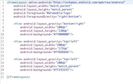
运行效果如下: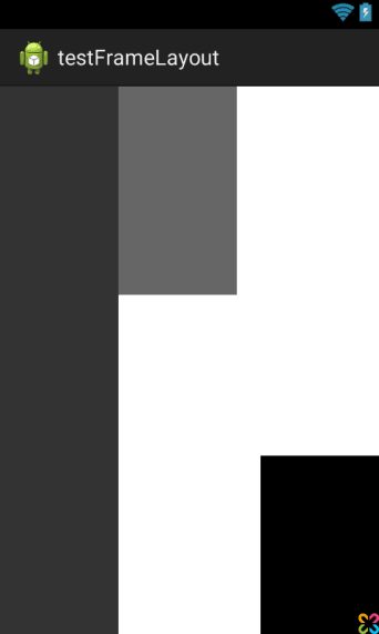
android:measureAllChildren
viewFlipper中的item如何动态设置高度?
例如:
<ViewFlipper
android:layout_width="match_parent"
android:layout_height="wrap_content"
android:layout_gravity="bottom">

<include layout="@layout/layoutone"/>

<include layout="@layout/layouttwo"/>

<include layout="@layout/layoutthree"/>

</ViewFlipper>
假如想做成一个layoutone是50dp,layouttwo是50dp,layoutthree是80dp高度的话,你会发现在子布局中设置高度后,ViewFlipper切换时总是以子view中高度最大的值为其高度值,也就是80dp。但是又不想让layoutone和layouttwo太高,开始的时候想通过LayoutParams动态设置吧,可惜不行(把viewflipper单独出来才行),然后找到需要设置android:measureAllChildren=”false”,或者代码调用setMeasureAllChildren(false);即可,因为默认情况下measureAllChildren=true。设置后各个view的高度就不同了。该属性也适合FrameLayout等。
原因:参见FrameLayout#onMeasure(int, int)的源码,android:measureAllChildren=”true”时,将所有children加入到mMeasureAllChildren的链表中,然后再重新measure下。
效果图

看到这个图时你可以先想想如果是你,你怎么实现这个效果。马上想到用RelativeLayout?NO,NO,NO,,,
二、实现代码

< LinearLayout xmlns:android =”http://schemas.android.com/apk/res/android”
android:layout_width =”match_parent”
android:layout_height =”match_parent”
android:clipChildren =”false”
android:orientation =”vertical” >
< android.support.v4.view.ViewPager
android:id =”@+id/view_pager”
android:layout_width =”match_parent”
android:layout_height =”0dip”
android:layout_weight =”1.0” />
< LinearLayout
android:layout_width =”match_parent”
android:layout_height =”48dip”
android:background =”#B0C4DE”
android:orientation =”horizontal” >
< ImageView
android:layout_width =”0dip”
android:layout_height =”fill_parent”
android:layout_weight =”1.0”
android:scaleType =”fitCenter”
android:src =”@drawable/ic_launcher” />
< ImageView
android:layout_width =”0dip”
android:layout_height =”fill_parent”
android:layout_weight =”1.0”
android:scaleType =”fitCenter”
android:src =”@drawable/ic_launcher” />
< ImageView
android:layout_width =”0dip”
android:layout_height =”64dip”
android:layout_gravity =”bottom”
android:layout_weight =”1.0”
android:scaleType =”fitCenter”
android:src =”@drawable/ic_launcher” />
< ImageView
android:layout_width =”0dip”
android:layout_height =”fill_parent”
android:layout_weight =”1.0”
android:scaleType =”fitCenter”
android:src =”@drawable/ic_launcher” />
< ImageView
android:layout_width =”0dip”
android:layout_height =”fill_parent”
android:layout_weight =”1.0”
android:scaleType =”fitCenter”
android:src =”@drawable/ic_launcher” />
</ LinearLayout >
</ LinearLayout >
代码说明:
1、只需在根节点设置android:clipChildren为false即可,默认为true
2、可以通过android:layout_gravity控制超出的部分如何显示。
3、android:clipChildren的意思:是否限制子View在其范围内
翻文档找到下面介绍
android:clipChildren setClipChildren(boolean) Defines whether a child is limited to draw inside of its bounds or not.
android:clipToPadding setClipToPadding(boolean)Defines whether the ViewGroup will clip its drawing surface so as to exclude the padding area.
2. clipToPadding用来定义ViewGroup是否允许在padding中绘制。默认情况下,cliptopadding被设置为ture, 也就是把padding中的值都进行裁切了。1.clipChild用来定义他的子控件是否要在他应有的边界内进行绘制。 默认情况下,clipChild被设置为true。 也就是不允许进行扩展绘制。
还有该功能是android第一个版本就已经提供的方法。 所有可以跨任意android版本使用。
这两个属性联合起来能干什么呢? 哈, 用来做一些类似于心形放大等点击特效非常合适啊。 不用去更改布局, 只需加入这两个属相,并引入动画效果就完成了。
按照上面的思路,做个demo吧。
先看看最后的效果吧, 点击第三个机器人就会播放一个变大的效果(类似于心变大的效果)

废话不多说,上关键代码:
1. 布局代码(核心)
主要看设的两个关键属性android:clipChildren和android:clipToPadding均为false。 这就让点击第三个小人时,可以跨边界进行绘制,并且允许其在padding区域内绘制。
<LinearLayout xmlns:android="http://schemas.android.com/apk/res/android"
    xmlns:tools="http://schemas.android.com/tools"
    android:layout_width="match_parent"
    android:layout_height="match_parent"
    android:paddingBottom="@dimen/activity_vertical_margin"
    android:paddingLeft="@dimen/activity_horizontal_margin"
    android:paddingRight="@dimen/activity_horizontal_margin"
    android:paddingTop="@dimen/activity_vertical_margin"
    tools:context=".MainActivity"
    android:clipChildren="false"
    android:clipToPadding="false">

    <ImageView
        android:id="@+id/img1"
        android:layout_width="wrap_content"
        android:layout_height="wrap_content"
        android:layout_weight="1"
        android:src="@drawable/ic_launcher" />

    <ImageView
        android:id="@+id/img2"
        android:layout_width="wrap_content"
        android:layout_height="wrap_content"
        android:layout_weight="1"
        android:src="@drawable/ic_launcher" />

    <ImageView
        android:id="@+id/img3"
        android:onClick="AA"
        android:layout_width="wrap_content"
        android:layout_height="wrap_content"
        android:layout_weight="1"
        android:background="@android:color/black"
        android:src="@drawable/ic_launcher" />

    <ImageView
        android:id="@+id/img4"
        android:layout_width="wrap_content"
        android:layout_height="wrap_content"
        android:layout_weight="1"
        android:src="@drawable/ic_launcher" />

    <ImageView
        android:id="@+id/img5"
        android:layout_width="wrap_content"
        android:layout_height="wrap_content"
        android:layout_weight="1"
        android:src="@drawable/ic_launcher" />

    <ImageView
        android:id="@+id/img6"
        android:layout_width="wrap_content"
        android:layout_height="wrap_content"
        android:layout_weight="1"
        android:src="@drawable/ic_launcher" />

</LinearLayout>
2. 其他辅助代码,如动画和act等内容

<?xml version="1.0" encoding="utf-8"?>
<scale
    xmlns:android="http://schemas.android.com/apk/res/android"
    android:fromXScale="1.0"
    android:fromYScale="1.0"
    android:toXScale="3.0"
    android:toYScale="3.0"
    android:duration="2000"
       android:pivotX="50%"
       android:pivotY="50%"
    >
</scale>
package com.example.clipchildren;

import android.os.Bundle;
import android.app.Activity;
import android.view.Menu;
import android.view.View;
import android.view.animation.Animation;
import android.view.animation.AnimationUtils;
import android.widget.ImageView;
import android.widget.Toast;

public class MainActivity extends Activity {

    //只对第三个小人做放大动作
    ImageView image3 =null;
    @Override
    protected void onCreate(Bundle savedInstanceState) {
        super.onCreate(savedInstanceState);
        setContentView(R.layout.activity_main);
        image3 = (ImageView) findViewById(R.id.img3);
    }


    @Override
    public boolean onCreateOptionsMenu(Menu menu) {
        // Inflate the menu; this adds items to the action bar if it is present.
        getMenuInflater().inflate(R.menu.main, menu);
        return true;
    }

    public void AA(View view) {
        Toast.makeText(this, "aa", Toast.LENGTH_SHORT).show();
        Animation an = AnimationUtils.loadAnimation(getApplicationContext(), R.anim.anims);
        image3.startAnimation(an);
    }

}
3. 除了这种应用,网上还有其他人对这两个属性的妙用:
用viewPaper来实现一个Gallery效果:http://www.iteye.com/topic/1129898