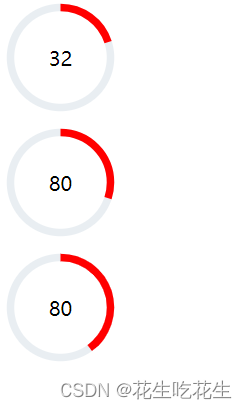
效果图
使用组件把这个给封装,代码:需要传入参数为类名,中间的数值,以及圆环百分比。里面的数字是根据位置调整上去的哦。
那么这个svg中的circle中的cx和cy就是坐标位置,stroke-width就是边界宽度,stroke就是颜色。
function circle(className, value, percent) {
  let content = `
  <div class="cirbox" style="position:relative;width:100px;height:100px">
  <svg width="100" height="100" style="transform: rotate(-90deg);">
    <circle
      cx="50"
      cy="50"
      r="40"
      stroke-width="6"
      stroke="#e9eef2"
      fill="none"
    ></circle>
    <circle
      class="${className+"path"}"
      cx="50"
      cy="50"
      r="40"
      stroke-width="6"
      stroke="red"
      fill="none"
    ></circle>
  </svg><div class="useNum" style="position:absolute;top:40px;width:100px;text-align:center;">${value}</div>
  </div>
  `;

/* .useNum {
        position: absolute;
        top: 0;
        left: -50px;
        width: 100%;
        text-align: center;
        font-size: 20px;
        font-weight: 900;
        height: 400px;
        line-height: 400px;
      } */

  $(`.${className}`).append(content);
  let circle = document.querySelector(`.${className}path`),
    len = 2 * Math.PI * circle.getAttribute("r");
  //   console.log(circle, range, len);
  let perimeter = circle.getTotalLength(); //圆环的周长
  //   console.log(perimeter);
  // 在圆环上设置属性
  circle.style.strokeDasharray = len;
  circle.style.strokeDashoffset = len - len * percent;
  console.log(circle.style.strokeDashoffset)
  circle.style.transition = "stroke-dashoffset .3s ease-in-out";
}
使用:
<!-- 参考连接:https://moxo.io/blog/2017/07/22/svg-circular-animation/#%E7%AC%AC%E4%B8%80%E6%AD%A5-%E5%9C%86%E5%BD%A2%E7%9A%84-svg-shape-lt-circle-gt -->
<!-- 参考连接:https://blog.csdn.net/weixin_44137800/article/details/113697403 -->
<!DOCTYPE html>
<html lang="en">
  <head>
    <meta charset="UTF-8" />
    <title>Title</title>
    <style>
      * {
        margin: 0;
        padding: 0;
      }

      html,
      body {
        height: 100%;
        width: 100%;
        overflow: hidden;
      }

      .circlebox {
        position: relative;

      }
      .circle1{
          position: relative;
      }
      .circle2{
          position: relative;
      }

      /* .useNum {
        position: absolute;
        top: 0;
        left: -50px;
        width: 100%;
        text-align: center;
        font-size: 20px;
        font-weight: 900;
        height: 400px;
        line-height: 400px;
      } */
      #range {
        height: 20px;
        width: 100%;
      }
    </style>
    <script src="https://cdn.bootcdn.net/ajax/libs/jquery/3.6.1/jquery.js"></script>
    <script src="./circle.js"></script>
  </head>

  <body>
    <div class="circlebox">
      <!-- <svg width="400" height="400">
        <circle
          cx="200"
          cy="200"
          r="100"
          stroke-width="10"
          stroke="#e9eef2"
          fill="none"
        ></circle>
        <circle
          class="path"
          cx="200"
          cy="200"
          r="100"
          stroke-width="10"
          stroke="red"
          fill="none"
        ></circle>
      </svg>
      <div class="useNum">使用率32</div> -->
      <!-- 控制器 -->
      <!-- <input id="range" type="range" min="0" max="100" step="1" value="0" /> -->
    </div>
    <div class="circle1"></div>
    <div class="circle2"></div>

    <script>
    //   let circle = document.querySelector(".path"),
    //     range = document.querySelector("#range"),
    //     len = 2 * Math.PI * circle.getAttribute("r");
    //   //   console.log(circle, range, len);
    //   let perimeter = circle.getTotalLength(); //圆环的周长
    //   //   console.log(perimeter);
    //   // 在圆环上设置属性
    //   circle.style.strokeDasharray = len;
    //   circle.style.strokeDashoffset =len - len * 0.7;
    //   circle.style.transition = "stroke-dashoffset .3s ease-in-out";

    //   range.oninput = () => {
    //     let range_value = Number(range.value),
    //     value = len - (range_value / 100) * len;
    //     circle.style.strokeDashoffset = value;
    //   };
       $(function(){
           circle('circlebox',32,.2)
           circle('circle1',80,.3)
           circle('circle2',80,.4)
       })

    </script>
  </body>
</html>
参考: