CSS 样式书写规范(推荐)
编码设置
采用 UTF-8 编码,在 CSS 代码头部使用:
@charset "utf-8";
注意,必须要定义在 CSS 文件所有字符的前面(包括编码注释),@charset 才会生效。
例如,下面的例子都会使得 @charset 失效:
/* 字符编码 */
@charset "utf-8";
html,
body {
  height: 100%;
}
@charset "utf-8";
命名空间规范
•布局:以 g 为命名空间,例如:.g-wrap 、.g-header、.g-content。
•状态:以 s 为命名空间,表示动态的、具有交互性质的状态,例如:.s-current、s-selected。
•工具:以 u 为命名空间,表示不耦合业务逻辑的、可复用的的工具,例如:u-clearfix、u-ellipsis。
•组件:以 m 为命名空间,表示可复用、移植的组件模块,例如:m-slider、m-dropMenu。
•钩子:以 j 为命名空间,表示特定给 JavaScript 调用的类名,例如:j-request、j-open。
命名空间思想
没有选择 BEM 这种命名过于严苛及样式名过长过丑的规则,采取了一种比较折中的方案。
不建议使用下划线 _ 进行连接
•节省操作,输入的时候少按一个 shift 键
•能良好区分 JavaScript 变量命名
字符小写
定义的选择器名,属性及属性值的书写皆为小写。
选择器
当一个规则包含多个选择器时,每个选择器独占一行。
、+、~、> 选择器的两边各保留一个空格。
.g-header > .g-header-des,
.g-content ~ .g-footer {
}
命名短且语义化良好
对于选择器的命名,尽量简洁且具有语义化,不应该出现 g-abc 这种语义模糊的命名。
规则声明块
•当规则声明块中有多个样式声明时,每条样式独占一行。
•在规则声明块的左大括号 { 前加一个空格。
•在样式属性的冒号 : 后面加上一个空格,前面不加空格。
•在每条样式后面都以分号 ; 结尾。
•规则声明块的右大括号 } 独占一行。
•每个规则声明间用空行分隔。
•所有最外层引号使用单引号 ‘ 。
•当一个属性有多个属性值时,以逗号 , 分隔属性值,每个逗号后添加一个空格,当单个属性值过长时,每个属性值独占一行。
完整示例如下:
.g-footer,
.g-header {
  position: relative;
}
.g-content {
  background:
    linear-gradient(135deg, deeppink 25%, transparent 25%) -50px 0,
    linear-gradient(225deg, deeppink 25%, transparent 25%) -50px 0,
    linear-gradient(315deg, deeppink 25%, transparent 25%),
    linear-gradient(45deg, deeppink 25%, transparent 25%);
  }
.g-content::before {
  content: '';
}
数值与单位
•当属性值或颜色参数为 0 – 1 之间的数时,省略小数点前的 0 。color: rgba(255, 255, 255, 0.5)color: rgba(255, 255, 255, .5);
•当长度值为 0 时省略单位。margin: 0px automargin: 0 auto
•十六进制的颜色属性值使用小写和尽量简写。color: #ffcc00color: #fc0
样式属性顺序
单个样式规则下的属性在书写时,应按功能进行分组,并以 Positioning Model > Box Model > Typographic > Visual 的顺序书写,提高代码的可读性。
•如果包含 content 属性,应放在最前面;
•Positioning Model 布局方式、位置,相关属性包括:position / top / right / bottom / left / z-index / display / float / …
•Box Model 盒模型,相关属性包括:width / height / padding / margin / border / overflow / …
•Typographic 文本排版,相关属性包括:font / line-height / text-align / word-wrap / …
•Visual 视觉外观,相关属性包括:color / background / list-style / transform / animation / transition / …
Positioning 处在第一位,因为他可以使一个元素脱离正常文本流,并且覆盖盒模型相关的样式。盒模型紧跟其后,因为他决定了一个组件的大小和位置。其他属性只在组件内部起作用或者不会对前面两种情况的结果产生影响,所以他们排在后面。
合理使用使用引号
在某些样式中,会出现一些含有空格的关键字或者中文关键字。
font-family 内使用引号
当字体名字中间有空格,中文名字体及 Unicode 字符编码表示的中文字体,为了保证兼容性,都建议在字体两端添加单引号或者双引号:
body {
  font-family: 'Microsoft YaHei', '黑体-简', '\5b8b\4f53';
}
background-image 的 url 内使用引号
如果路径里面有空格,旧版 IE 是无法识别的,会导致路径失效,建议不管是否存在空格,都添加上单引号或者双引号:
div {
  background-image: url('...');
}
避免使用 !important
除去某些极特殊的情况,尽量不要不要使用 !important。
!important 的存在会给后期维护以及多人协作带来噩梦般的影响。
当存在样式覆盖层叠时,如果你发现新定义的一个样式无法覆盖一个旧的样式,只有加上 !important 才能生效时,是因为你新定义的选择器的优先级不够旧样式选择器的优先级高。所以,合理的书写新样式选择器,是完全可以规避一些看似需要使用 !important 的情况的。
代码注释
单行注释
星号与内容之间必须保留一个空格。
/* 表格隔行变色 */
多行注释
星号要一列对齐,星号与内容之间必须保留一个空格。
/** * Sometimes you need to include optional context for the entire component. Do that up here if it's important enough. */
规则声明块内注释
使用 // 注释,// 后面加上一个空格,注释独立一行。
.g-footer { border: 0; // .... }
CSS布局实例(详解)
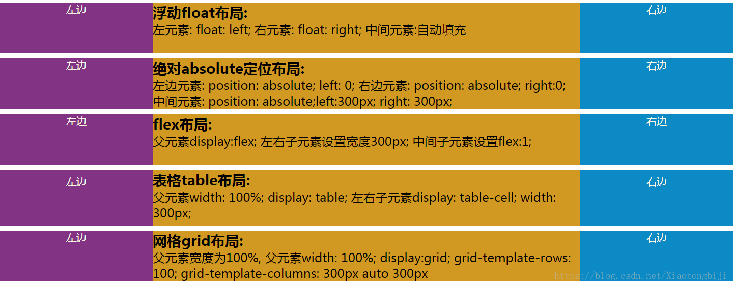
一、css布局实现左中右布局的5种方式
本文介绍了详解css布局实现左中右布局的5种方式,分享给大家,具体如下:
<!doctype html>
<html lang="en">
<head>
    <meta charset="UTF-8">
    <meta name="viewport"
          content="width=device-width, user-scalable=no, initial-scale=1.0, maximum-scale=1.0, minimum-scale=1.0">
    <meta http-equiv="X-UA-Compatible" content="ie=edge">
    <title>Document</title>
    <style>
        html *{
            margin: 0;
            padding: 0;
        }

        article{
            height: 100px;
        }
        section{
            margin-top: 10px;
        }

        .left{
            width: 300px;
            height: 100px;
            background-color: #823384;
            text-align: center;
            font-size: 20px;
            color: #fdf6e3;
        }
        .center{
            height: 100px;
            background-color: #d29922;
        }
        .right{
            width: 300px;
            height: 100px;
            background-color: #0c8ac5;
            text-align: center;
            font-size: 20px;
            color: #fdf6e3;
        }

    </style>
</head>
<body>
<!--浮动布局-->
<!--左浮动, 右浮动, 中间自动填充-->
<section class="layout float">
    <style>
        .float article div{

        }
        .float article .left{
            float: left;
        }
        .float article .right{
            float: right;
        }
        .float article .center{
        }

    </style>


    <article class="left-right-center">

        <div class="left">左边</div>
        <div class="right">右边</div>
        <div class="center"><h1>
            浮动float布局:
        </h1> 左元素: float: left; 右元素: float: right; 中间元素:自动填充</div>

    </article>
</section>

<!--绝对定位-->
<section class="layout absolute">
    <style>
        article{
            position: relative;
        }

        .absolute .left-center-right div{
            position: absolute;
        }

        .absolute .left-center-right .left{
            left: 0;
        }

        .absolute .left-center-right .center{

            left: 300px;
            right: 300px;
        }

        .absolute .left-center-right .right{
            right: 0;

        }

    </style>
    <article class="left-center-right">

        <div class="left">左边</div>
        <div class="center"><h1>
            绝对absolute定位布局:
        </h1> 左边元素: position: absolute; left: 0;

            右边元素: position: absolute; right:0; 中间元素: position: absolute;left:300px; right: 300px;
        </div>
        <div class="right">右边</div>
    </article>
</section>

<!--flex布局-->
<section class="layout flexbox">

    <style>

        .flexbox .left-center-right{

            display: flex;

        }
        .flexbox .left-center-right .left{

        }
        .flexbox .left-center-right .center{

            flex:1;
        }

        .flexbox .left-center-right .right{

        }

    </style>

    <article class="left-center-right">
        <div class="left">左边</div>
        <div class="center"><h1>
            flex布局:
        </h1> 父元素display:flex; 左右子元素设置宽度300px; 中间子元素设置flex:1;</div>
        <div class="right">右边</div>
    </article>
</section>

<!--表格布局-->
<section class="table-box layout">
    <style>
        .table-box .left-center-right{
            width: 100%;
            display: table;
        }

        .table-box .left-center-right>div{

            display: table-cell;

        }

        .table-box .left-center-right .left{
        }

        .table-box .left-center-right .center{
        }

        .table-box .left-center-right .right {
        }

    </style>
    <article class="left-center-right">
        <div class="left">左边</div>
        <div class="center"><h1>
            表格table布局:
        </h1> 父元素width: 100%; display: table;
            左右子元素display: table-cell; width: 300px; </div>
        <div class="right">右边</div>
    </article>
</section>

<!--网格布局-->
<section class="grid layout">
    <style>

        .grid article{
            display: grid;
            width: 100%;
            grid-template-rows: 100px;
            grid-template-columns: 300px auto 300px;
        }

    </style>
    <article class="left-center-right">
        <div class="left">左边</div>
        <div class="center"><h1>
            网格grid布局:
        </h1> 父元素宽度为100%,
            父元素width: 100%; display:grid; grid-template-rows: 100; grid-template-columns: 300px auto 300px</div>
        <div class="right">右边</div>
    </article>
</section>
</body>
</html>
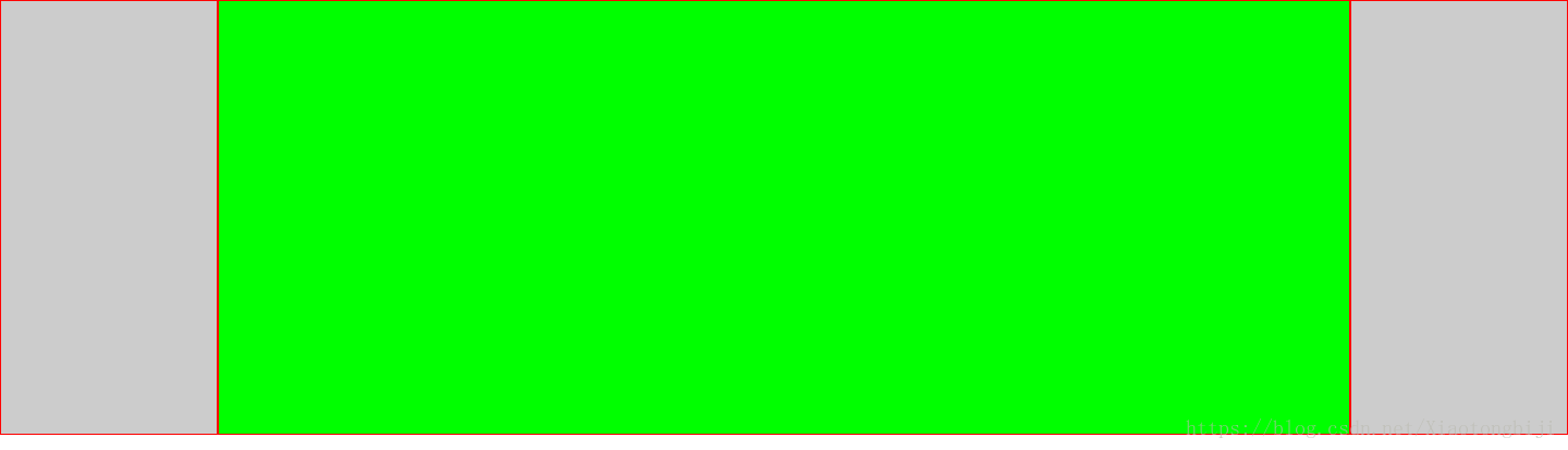
二、CSS双飞翼布局的两种方式实现示例
双飞翼布局,就是两端固定宽高,中间自适应的三栏布局:
方式一:通过flex弹性布局来实现
<body>
    <div class="wrap">
        <div class="div1"></div>
        <div class="div2"></div>
        <div class="div3"></div>
    </div>
</body>
*{  //先简单粗暴的解决一下浏览器的默认样式
    margin: 0;
    padding: 0;
    border: 0;
    box-sizing:border-box;   //使用border-box,盒模型好计算,妈妈再也不用担心我算不清块宽高了
}
.wrap{
    width: 100%;
    height: 100%;
    display: flex;     //使用弹性布局
    flex-flow:row nowrap;  //以沿主轴方向行显示,不换行,从而来显示3个块
    justify-content:space-around;  //这一个加和不叫其实也没事,加上去的意思就是两端对齐
}

[class^='div']{  // 给所有的div都加上高和边框样式,方便观看,不然都缩成一条线了
    height: 400px;
    border: 1px solid #f00;
}

.div1,.div3{  //给两端的div固定的宽
    width: 200px;
    background-color: #ccc;
    flex-shrink: 1; //默认是1,所以不用写也没事,写出来是表达这个意思
}
.div2{
    background-color: #0f0;
    flex-grow:1;  //这个比较重要,作用是让第二个块的宽度撑满剩余的空间
}
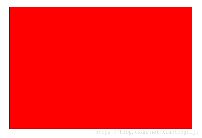
三、三种绝对定位元素的水平垂直居中的方法
1.css实现居中
缺点:需要提前知道元素的宽度和高度。
<!doctype html>
<html lang="en">
<head>
    <meta charset="UTF-8">
    <title>Document</title>
    <style>
        .box{
            width: 600px;
            height: 400px;
            position: absolute;
            left: 50%; top: 50%;
            border:1px solid #000;
            background:red;
            margin-top: -200px;    /* 高度的一半 */
            margin-left: -300px;    /* 宽度的一半 */
        }
    </style>
</head>
<body>
    <div class="box">
    </div>
</body>
</html>
2、css3实现水平垂直居中
注意:无论元素的尺寸是多少,都可以居中。不过IE8以上才兼容这种写法,移动端可忽略。
<!doctype html>
<html lang="en">
<head>
    <meta charset="UTF-8">
    <title>Document</title>
    <style>
        .box{
            width: 600px;
            height: 400px;
            position: absolute;
            left: 50%;
            top: 50%;
            border:1px solid #000;
            background:red;
            transform: translate(-50%, -50%);    /* 50%为自身尺寸的一半 */
        }
    </style>
</head>
<body>
    <div class="box">
    </div>
</body>
</html>
3、margin:auto实现居中
<!doctype html>
<html lang="en">
<head>
    <meta charset="UTF-8">
    <title>Document</title>
    <style>
        .box{
            width: 600px;
            height: 400px;
            position: absolute;
            left: 0;
            top: 0;
            right: 0;
            bottom: 0;
            border:1px solid #000;
            background:red;
            margin: auto;    /* 有了这个就自动居中了 */
        }
    </style>
</head>
<body>
    <div class="box">
    </div>
</body>
</html>
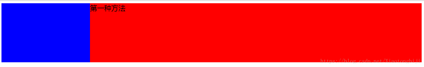
四、两种左侧固定,右侧自适应的方法
第一种方法:
<!DOCTYPE>
<html lang="en">
<head>
<meta charset="UTF-8">
<title>Document</title>
<style>
.one {
position: absolute;
height: 200px;
width: 300px;
background-color: blue;
}
.two {
height: 200px;
margin-left: 300px;
background-color: red;
}
</style>
</head>
<body>
<div class="one"></div>
<div class="two">第一种方法</div>
</body>
</html>
第二种方法:
<!DOCTYPE>
<html lang="en">
<head>
<meta charset="UTF-8">
<title>Document</title>
<style>
.one {
float:left;
height: 200px;
width: 300px;
background-color: blue;
}
.two {
overflow: auto;
height: 200px;
background-color: red;
}
</style>
</head>
<body>
<div class="one"></div>
<div class="two">第二种方法</div>
</body>
</html>
五、响应式布局
响应式布局在面对不同分辨率设备灵活性强,在平时的网页设计中基本上都要用到响应式布局设计,它给我们提供了良好的用户浏览页面,能带给我们更好的客户体验,下面给大家分享下我做的一个简单的响应式的布局:
不同的页面会适用不同大小浏览器页面,它会随着分辨率的变化而变化。代码展示如下:
<!DOCTYPE html>
2.<html>
3.<head>
4.<meta charset="utf-8" />
5.<title></title>
6.<style>
7.  p{
8.    font-size: 12px;
9.  }
10.  header{
11.    width: 100%;
12.  }
13.  header img{
14.    width: 100%;
15.  }
16.  @media (min-width: 1300px) and (max-width:1400px) {
17.    #left{
18.      float: left;
19.      width: 30%;
20.      margin: 0px 50px;
21.    }
22.    #left #logo-bg{
23.      margin: 10% 10%;
24.      width: 80%;
25.      position: relative;
26.    }
27.    #left #logo{
28.      float: left;
29.      width: 12%;
30.      position: absolute;
31.      left: 13%;
32.      top: 230px;
33.    }
34.    #left p{
35.      margin-bottom: -20px;
36.    }
37.    #left p,h4{
38.      text-align: center;
39.      color: red;
40.    }
41.    #right{
42.      float: left;
43.      width: 60%;
44.      margin: 15% 0px;
45.    }
46.    #right h2{
47.      text-align: center;
48.    }
49.    #right fieldset{
50.      text-align: center;
51.      border-left: none;
52.      border-right: none;
53.      border-bottom: none;
54.    }
55.    #right fieldset legend{
56.      padding: 0px 20px;
57.    }
58.    #fen{
59.      width: 100%;
60.      -webkit-column-count: 6;
61.      -moz-column-count: 6;
62.      -o-column-count: 6;
63.      -ms-column-count: 6;
64.      column-count: 6;
65.      -webkit-column-gap: 1em;
66.      -moz-column-gap: 1em;
67.      -o-column-gap: 1em;
68.      -ms-column-gap: 1em;
69.      column-gap: 1em;
70.    }
71.    #fen img{
72.      width: 100%;
73.      border-radius: 10px 10px 10px 10px;
74.    }
75.    #fen p,h4{
76.      text-align: center;
77.      color: red;
78.    }
79.    #fen p{
80.      margin-bottom: -20px;
81.    }
82.    #di p{
83.      text-align: center;
84.    }
85.    #di p span{
86.       color: red;
87.    }
88.  }
89.  @media (min-width: 1000px) and (max-width:1300px){
90.    #left{
91.      float: left;
92.      width: 30%;
93.      margin: 0px 50px;
94.    }
95.    #left #logo-bg{
96.      margin: 10% 10%;
97.      width: 80%;
98.      position: relative;
99.    }
100.    #left #logo{
101.      width: 12%;
102.      position: absolute;
103.      left: 14%;
104.      top: 190px;
105.    }
106.    #left p{
107.      margin-bottom: -20px;
108.    }
109.    #left p,h4{
110.      text-align: center;
111.      color: red;
112.    }
113.    #right{
114.      float: left;
115.      width: 60%;
116.      margin: 15% 0px;
117.    }
118.    #right h2{
119.      text-align: center;
120.    }
121.    #right fieldset{
122.      text-align: center;
123.      border-left: none;
124.      border-right: none;
125.      border-bottom: none;
126.    }
127.    #right fieldset legend{
128.      padding: 0px 20px;
129.    }
130.    #fen{
131.      width: 100%;
132.      -webkit-column-count: 3;
133.      -moz-column-count: 3;
134.      -o-column-count: 3;
135.      -ms-column-count: 3;
136.      column-count: 3;
137.      -webkit-column-gap: 1em;
138.      -moz-column-gap: 1em;
139.      -o-column-gap: 1em;
140.      -ms-column-gap: 1em;
141.      column-gap: 1em;
142.    }
143.    #fen img{
144.        width: 100%;
145.        border-radius: 10px 10px 10px 10px;
146.    }
147.    #fen p,h4{
148.        text-align: center;
149.        color: red;
150.      }
151.    #fen p{
152.        margin-bottom: -20px;
153.    }
154.    #di p{
155.      text-align: center;
156.    }
157.    #di p span{
158.      color: red;
159.    }
160.  }
161.</style>
162.</head>
163.<body>
164.  <header>
165.    <img src="img/rag.png" />
166.  </header>
167.  <aside id="left">
168.    <img src="img/logo-bg.png" id="logo-bg"/>
169.    <img src="img/logo.png" id="logo" />
170.    <hr />
171.    <p>THE</p>
172.    <h4>WEBLOCUE</h4>
173.    <hr />
174.    <p>THE</p>
175.    <h4>WEBLOCUE</h4>
176.    <hr />
177.    <p>THE</p>
178.    <h4>WEBLOCUE</h4>
179.    <hr />
180.  </aside>
181.  <article id="right">
182.    <h2>“Give me problems, give me work.”</h2>
183.    <p>In the year 1878 I took dogree of Doctor of Medicline of the Unibertive of the London and problems to Netbody to go through the course,In the year 1878 I took dogree of Doctor of Medicline of the Unibertive of the London and problems to Netbody to go through the course,In the year 1878 I took dogree of Doctor of Medicline of the Unibertive of the London and problems to Netbody to go through the course.</p>
184.    <p>In the year 1878 I took dogree of Doctor of Medicline of the Unibertive of the London and problems to Netbody to go through the course,In the year 1878 I took dogree of Doctor of Medicline of the Unibertive of the London and problems to Netbody to go through the course,In the year 1878 I took dogree of Doctor of Medicline of the Unibertive of the London and problems to Netbody to go through the course.</p>
185.    <fieldset><legend>victors</legend></fieldset>
186.    <div id="fen">
187.      <img src="img/1.jpg" />
188.      <p>SETCOME</p>
189.      <h4>HOLEMES</h4>
190.      <img src="img/2.jpg" />
191.      <p>SETCOME</p>
192.      <h4>HOLEMES</h4>
193.      <img src="img/3.jpg" />
194.      <p>SETCOME</p>
195.      <h4>HOLEMES</h4>
196.      <img src="img/4.jpg" />
197.      <p>SETCOME</p>
198.      <h4>HOLEMES</h4>
199.      <img src="img/5.jpg" />
200.      <p>SETCOME</p>
201.      <h4>HOLEMES</h4>
202.      <img src="img/6.jpg" />
203.      <p>SETCOME</p>
204.      <h4>HOLEMES</h4>
205.    </div>
206.    <fieldset><legend>*</legend></fieldset>
207.    <div id="di">
208.      <p>In the year 1878 I took <span>Suing table</span> dogree of Doctor</p>
209.      <p>What the year 2016 I took dogree <span>Ruing roid</span> of Doctor</p>
210.    </div>
211.  </article>
212.</body>
213.</html>
六、CSS固定宽度的三列布局运用实例解析
这很基础,我们直接看代码便能明白:
 	<div id="wrapper">
 	 <div id="header">header</div>
 	 <div id="body" class="cls">
 	  <div id="aside">
 	   <div class="inner">
 	    aside
 	    <br><br><br><br><br><br><br><br><br><br><br><br><br><br><br><br><br><br>
 	   </div>
 	  </div>
 	  <div id="content" class="cls">
 	   <div id="main">
 	    <div class="inner">
 	     main
 	     <br><br><br><br><br><br><br><br><br><br><br><br><br><br><br><br><br><br>
 	    </div>
 	   </div>
 	   <div id="content-aside">
 	    <div class="inner">
 	     content-aside
 	     <br><br><br><br><br><br><br><br><br><br><br><br><br><br><br><br><br><br>
 	    </div>
 	   </div>
 	  </div>
 	 </div>
 	 <div id="footer">footer</div>
 	</div>
#header{ width: 980px; height: 90px; margin: 0 auto; background: #f60;}
 #body{ width: 980px; margin: 0 auto;}
 #aside{ float: left; width: 240px; background: #ccc;}
 #content{ margin-left: 240px;}
 #main{ float: left; width: 540px; background: pink;}
 #content-aside{  float: left; width: 200px; background: orange; }
 #footer{ width: 980px; height: 90px; margin: 0 auto; background: #08f;}

实例:实现三列图片等宽等间距布局
每个图片块左浮动,宽25%,左外边距2.5%:
<!DOCTYPE html>
 <html>
 <head>
 <meta charset="utf-8">
 <meta name="viewport" content="width=device-width,initial-scale= ,maximum-scale= ,user-scalable=0">
 <title>三列图片等宽布局</title>
 <style>
 * {
     margin: 0;
      padding: 0;
  }
  img {
      display: block;
      width: 25%;
      margin:  5% 0 0  5%;
      float: left;
  }
  </style>
  </head>
  <body>
  <div>
  <img src=" images/photo1.jpg" /><img src=" images/photo1.jpg" /><img src=" images/photo1.jpg" />
  <img src=" images/photo1.jpg" /><img src=" images/photo1.jpg" /><img src=" images/photo1.jpg" />
  <img src=" images/photo1.jpg" /><img src=" images/photo1.jpg" /><img src=" images/photo1.jpg" />

  </div>
  </body>
  </html>
width: 25%; 表示父级元素宽度的30%.
height: 30%; 如果没有设置父级元素的具体高度,那么这个height是没有效果的.
百分比布局也可以看做是一种响应式布局.
简单实用的 百分比布局 还是很适合手机WAP页面布局的:
min-width:320px;
 max-width:980px;
 width:100%;
 overflow-x: hidden;
 margin: 0 auto;
最小宽度320px,最大宽度980px,在320px和980px之间自动适应宽度,看起来还行.
在<img>标签里只用设置width属性百分比值,比如width="40%",不用设置height属性,这样图片能够自行按原比例缩放.
容器里面的块,同样可以用百分比布局,比如左边的60%,右边的40%.