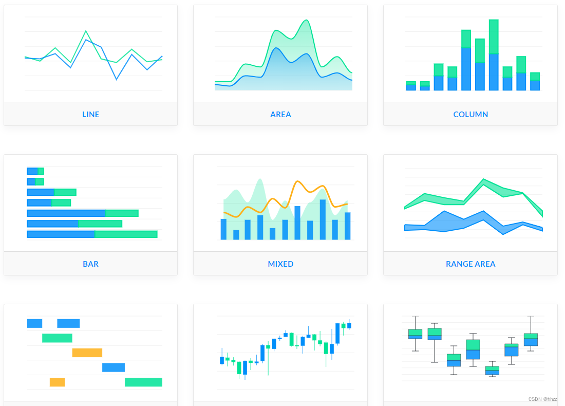
在开发可视化项目的过程中往往涉及到可视化图表, 多酷炫的报表, 大屏, 都用了非常多的图表,
接下来我和大家分享一些比较流行的开源免费的图表库.
分享10种比较流行的开源免费的图表库
1,Frappe Charts
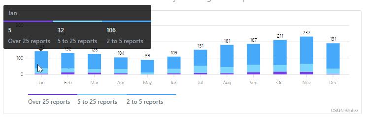
Frappe Charts - 免费开源、轻量无依赖的 web 图表库,简单不臃肿,支持搭配 Vue / React 等框架使用,一个小巧简单的 JavaScript 图表库,通过简单几个参数,可以快速生成类似于 Github 那样美观大气的图表。
官网github地址:https://github.com/frappe/charts
<!--HTML-->
  <div id="chart"></div>
  // Javascript
  let chart = new frappe.Chart( "#chart", {

     // or DOM element
    data: {


      labels: ["12am-3am", "3am-6am", "6am-9am", "9am-12pm",
      "12pm-3pm", "3pm-6pm", "6pm-9pm", "9pm-12am"],

      datasets: [
        {


          name: "Some Data", chartType: 'bar',
          values: [25, 40, 30, 35, 8, 52, 17, -4]
        },
        {


          name: "Another Set", chartType: 'bar',
          values: [25, 50, -10, 15, 18, 32, 27, 14]
        },
        {


          name: "Yet Another", chartType: 'line',
          values: [15, 20, -3, -15, 58, 12, -17, 37]
        }
      ],

      yMarkers: [{

     label: "Marker", value: 70,
        options: {

     labelPos: 'left' }}],
      yRegions: [{

     label: "Region", start: -10, end: 50,
        options: {

     labelPos: 'right' }}]
    },

    title: "My Awesome Chart",
    type: 'axis-mixed', // or 'bar', 'line', 'pie', 'percentage', 'donut'
    height: 300,
    colors: ['purple', '#ffa3ef', 'light-blue'],

    tooltipOptions: {


      formatTooltipX: d => (d + '').toUpperCase(),
      formatTooltipY: d => d + ' pts',
    }
  });

  chart.export();

代码:
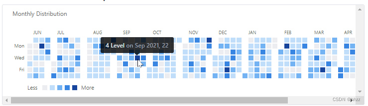
  let heatmap = new frappe.Chart("#heatmap", {


    type: 'heatmap',
    title: "Monthly Distribution",
    data: {


      dataPoints: {

    '1524064033': 8, /* ... */},
                        // object with timestamp-value pairs
      start: startDate
      end: endDate      // Date objects
    },
    countLabel: 'Level',
    discreteDomains: 0  // default: 1
    colors: ['#ebedf0', '#c0ddf9', '#73b3f3', '#3886e1', '#17459e'],
                // Set of five incremental colors,
                // preferably with a low-saturation color for zero data;
                // def: ['#ebedf0', '#c6e48b', '#7bc96f', '#239a3b', '#196127']
  });
2,Recharts
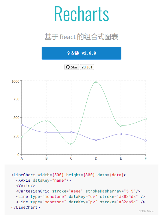
官网链接 :https://recharts.org/zh-CN/guide
-
组合
用解耦的、可重用的 React 组件快速构建你的图表。 -
可靠
依赖于轻量级的 D3 子模块构建 SVG 元素。扫描二维码关注公众号,回复: 15335820 查看本文章
-
强大
调整组件的属性与传递组件自定义你的图表。
代码:
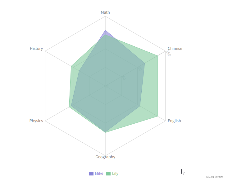
import React, {

     PureComponent } from 'react';
import {

     Radar, RadarChart, PolarGrid, Legend, PolarAngleAxis, PolarRadiusAxis, ResponsiveContainer } from 'recharts';

const data = [
  {


    subject: 'Math',
    A: 120,
    B: 110,
    fullMark: 150,
  },
  {


    subject: 'Chinese',
    A: 98,
    B: 130,
    fullMark: 150,
  },
  {


    subject: 'English',
    A: 86,
    B: 130,
    fullMark: 150,
  },
  {


    subject: 'Geography',
    A: 99,
    B: 100,
    fullMark: 150,
  },
  {


    subject: 'Physics',
    A: 85,
    B: 90,
    fullMark: 150,
  },
  {


    subject: 'History',
    A: 65,
    B: 85,
    fullMark: 150,
  },
];

export default class Example extends PureComponent {


  static demoUrl = 'https://codesandbox.io/s/radar-chart-specified-domain-mfl04';

  render() {


    return (
      <ResponsiveContainer width="100%" height="100%">
        <RadarChart cx="50%" cy="50%" outerRadius="80%" data={

    data}>
          <PolarGrid />
          <PolarAngleAxis dataKey="subject" />
          <PolarRadiusAxis angle={

    30} domain={

    [0, 150]} />
          <Radar name="Mike" dataKey="A" stroke="#8884d8" fill="#8884d8" fillOpacity={

    0.6} />
          <Radar name="Lily" dataKey="B" stroke="#82ca9d" fill="#82ca9d" fillOpacity={

    0.6} />
          <Legend />
        </RadarChart>
      </ResponsiveContainer>
    );
  }
}
import React, {
PureComponent } from 'react';
import {
RadialBarChart, RadialBar, Legend, ResponsiveContainer } from 'recharts';
const data = [
{
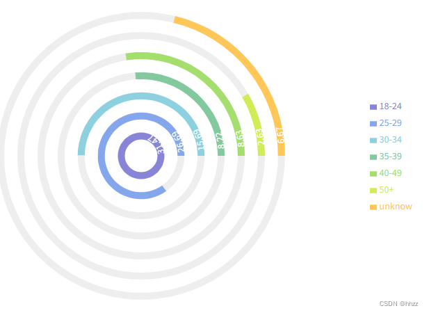
name: '18-24',
uv: 31.47,
pv: 2400,
fill: '#8884d8',
},
{
name: '25-29',
uv: 26.69,
pv: 4567,
fill: '#83a6ed',
},
{
name: '30-34',
uv: 15.69,
pv: 1398,
fill: '#8dd1e1',
},
{
name: '35-39',
uv: 8.22,
pv: 9800,
fill: '#82ca9d',
},
{
name: '40-49',
uv: 8.63,
pv: 3908,
fill: '#a4de6c',
},
{
name: '50+',
uv: 2.63,
pv: 4800,
fill: '#d0ed57',
},
{
name: 'unknow',
uv: 6.67,
pv: 4800,
fill: '#ffc658',
},
];
const style = {
top: '50%',
right: 0,
transform: 'translate(0, -50%)',
lineHeight: '24px',
};
export default class Example extends PureComponent {
static demoUrl = 'https://codesandbox.io/s/simple-radial-bar-chart-qf8fz';
render() {
return (
<ResponsiveContainer width="100%" height="100%">
<RadialBarChart cx="50%" cy="50%" innerRadius="10%" outerRadius="80%" barSize={
10} data={
data}>
<RadialBar
minAngle={
15}
label={
{
position: 'insideStart', fill: '#fff' }}
background
clockWise
dataKey="uv"
/>
<Legend iconSize={
10} layout="vertical" verticalAlign="middle" wrapperStyle={
style} />
</RadialBarChart>
</ResponsiveContainer>
);
}
}
import React, {
PureComponent } from 'react';
import {
ComposedChart,
Line,
Area,
Bar,
XAxis,
YAxis,
CartesianGrid,
Tooltip,
Legend,
Scatter,
ResponsiveContainer,
} from 'recharts';
const data = [
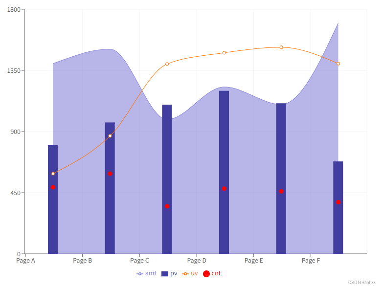
{
name: 'Page A',
uv: 590,
pv: 800,
amt: 1400,
cnt: 490,
},
{
name: 'Page B',
uv: 868,
pv: 967,
amt: 1506,
cnt: 590,
},
{
name: 'Page C',
uv: 1397,
pv: 1098,
amt: 989,
cnt: 350,
},
{
name: 'Page D',
uv: 1480,
pv: 1200,
amt: 1228,
cnt: 480,
},
{
name: 'Page E',
uv: 1520,
pv: 1108,
amt: 1100,
cnt: 460,
},
{
name: 'Page F',
uv: 1400,
pv: 680,
amt: 1700,
cnt: 380,
},
];
export default class Example extends PureComponent {
static demoUrl = 'https://codesandbox.io/s/simple-composed-chart-h9zif';
render() {
return (
<ResponsiveContainer width="100%" height="100%">
<ComposedChart
width={
500}
height={
400}
data={
data}
margin={
{
top: 20,
right: 20,
bottom: 20,
left: 20,
}}
>
<CartesianGrid stroke="#f5f5f5" />
<XAxis dataKey="name" scale="band" />
<YAxis />
<Tooltip />
<Legend />
<Area type="monotone" dataKey="amt" fill="#8884d8" stroke="#8884d8" />
<Bar dataKey="pv" barSize={
20} fill="#413ea0" />
<Line type="monotone" dataKey="uv" stroke="#ff7300" />
<Scatter dataKey="cnt" fill="red" />
</ComposedChart>
</ResponsiveContainer>
);
}
}
3,Protovis
Protovis 是一个可视化 javaScript 图表生成工具。
官网链接:https://mbostock.github.io/protovis/ex/
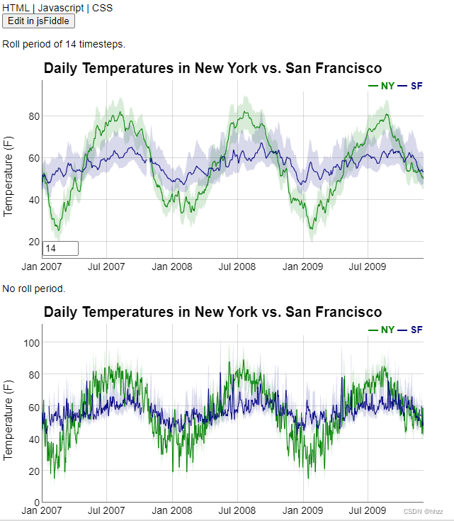
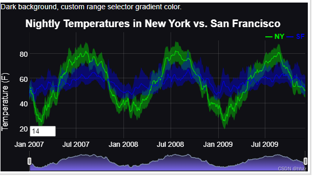
4,dygraphs
Dygraphs 是一个开源的 JS 库;用于生成可与用户交互的、可缩放的时间图表。主要用于显示密集的数据集合,用户能够很好的浏览和查看数据。
官网链接: https://dygraphs.com/gallery/#g/linear-regression
接下来分享几个图表案例:
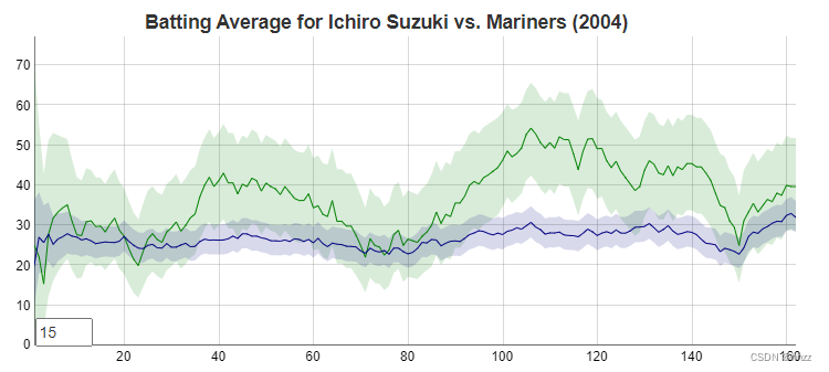
代码:
new Dygraph(
  document.getElementById("baseballdiv"),
  "suzuki-mariners.txt",
  {


    fractions: true,
    errorBars: true,
    showRoller: true,
    rollPeriod: 15
  }
);
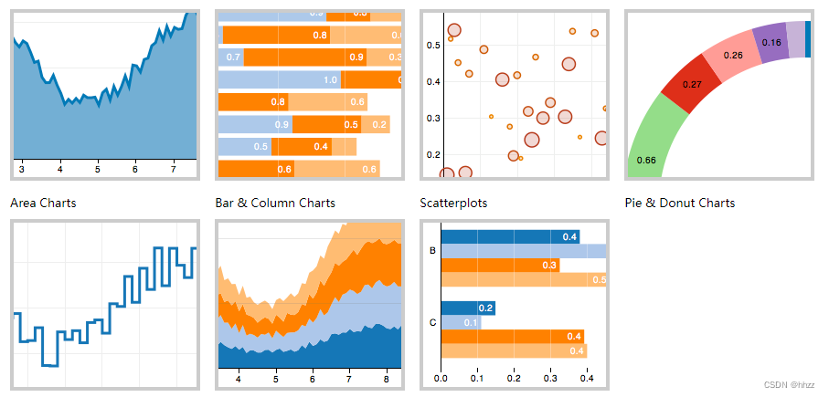
5,Nivo
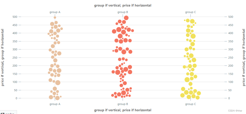
官网链接 :https://nivo.rocks/swarmplot/
Nivo 是一个基于 D3 和 React 的精美的可视化图表框架,提供十四种不同类型的组件来呈现图表数据。
Nivo 提供了许多自定义选项和三个渲染选项:Canvas,SVG,甚至基于 API 的HTML。它的文档非常出色,Demo 可配置且非常有意思。这是一个高级库,使用非常便捷。 接下来分享几个图表案例:
代码:
/ install (please try to align the version of installed @nivo packages)
// yarn add @nivo/sunburst
import {

     ResponsiveSunburst } from '@nivo/sunburst'

// make sure parent container have a defined height when using
// responsive component, otherwise height will be 0 and
// no chart will be rendered.
// website examples showcase many properties,
// you'll often use just a few of them.
const MyResponsiveSunburst = ({

     data /* see data tab */ }) => (
    <ResponsiveSunburst
        data={

    data}
        margin={

    {

     top: 10, right: 10, bottom: 10, left: 10 }}
        id="name"
        value="loc"
        cornerRadius={

    2}
        borderColor={

    {

     theme: 'background' }}
        colors={

    {

     scheme: 'nivo' }}
        childColor={

    {


            from: 'color',
            modifiers: [
                [
                    'brighter',
                    0.1
                ]
            ]
        }}
        enableArcLabels={

    true}
        arcLabelsSkipAngle={

    10}
        arcLabelsTextColor={

    {


            from: 'color',
            modifiers: [
                [
                    'darker',
                    1.4
                ]
            ]
        }}
    />
)
// install (please try to align the version of installed @nivo packages)
// yarn add @nivo/swarmplot
import {

     ResponsiveSwarmPlot } from '@nivo/swarmplot'

// make sure parent container have a defined height when using
// responsive component, otherwise height will be 0 and
// no chart will be rendered.
// website examples showcase many properties,
// you'll often use just a few of them.
const MyResponsiveSwarmPlot = ({

     data /* see data tab */ }) => (
    <ResponsiveSwarmPlot
        data={

    data}
        groups={

    [ 'group A', 'group B', 'group C' ]}
        identity="id"
        value="price"
        valueFormat="$.2f"
        valueScale={

    {

     type: 'linear', min: 0, max: 500, reverse: false }}
        size={

    {


            key: 'volume',
            values: [
                4,
                20
            ],
            sizes: [
                6,
                20
            ]
        }}
        forceStrength={

    4}
        simulationIterations={

    100}
        borderColor={

    {


            from: 'color',
            modifiers: [
                [
                    'darker',
                    0.6
                ],
                [
                    'opacity',
                    0.5
                ]
            ]
        }}
        margin={

    {

     top: 80, right: 100, bottom: 80, left: 100 }}
        axisTop={

    {


            orient: 'top',
            tickSize: 10,
            tickPadding: 5,
            tickRotation: 0,
            legend: 'group if vertical, price if horizontal',
            legendPosition: 'middle',
            legendOffset: -46
        }}
        axisRight={

    {


            orient: 'right',
            tickSize: 10,
            tickPadding: 5,
            tickRotation: 0,
            legend: 'price if vertical, group if horizontal',
            legendPosition: 'middle',
            legendOffset: 76
        }}
        axisBottom={

    {


            orient: 'bottom',
            tickSize: 10,
            tickPadding: 5,
            tickRotation: 0,
            legend: 'group if vertical, price if horizontal',
            legendPosition: 'middle',
            legendOffset: 46
        }}
        axisLeft={

    {


            orient: 'left',
            tickSize: 10,
            tickPadding: 5,
            tickRotation: 0,
            legend: 'price if vertical, group if horizontal',
            legendPosition: 'middle',
            legendOffset: -76
        }}
    />
)
6,Echarts
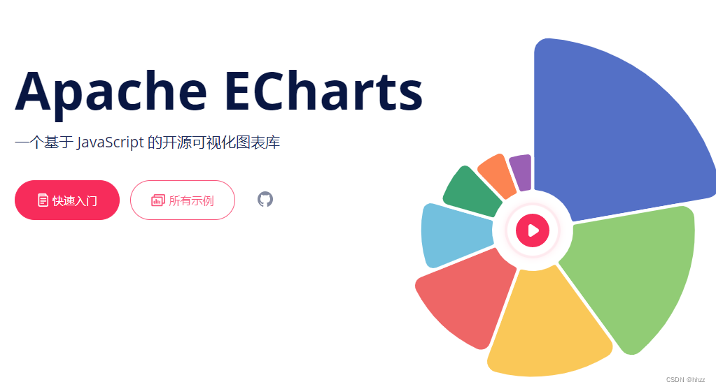
官网链接:https://echarts.apache.org/zh/index.html
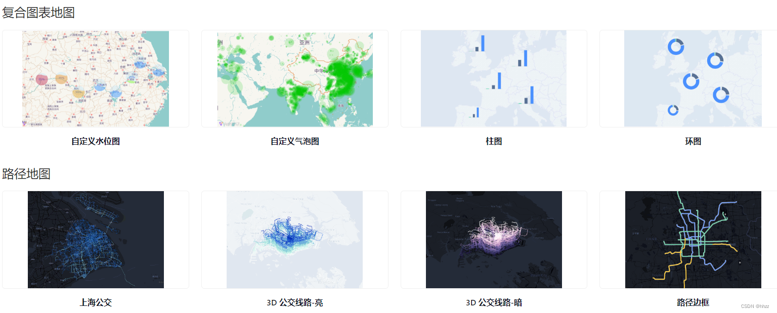
7,AntV
官网链接:https://antv.vision/
数据可视化 AntV 的设计原则是基于 Ant Design 设计体系衍生的,具有数据可视化特性的指导原则。它在遵循 Ant Design
设计价值观的同时,对数据可视化领域的进一步解读,如色板、字体的指引。
AntV 经过大量的项目实战经验,总结了四条核心原则:准确、清晰、有效、美,这四条原则按重要等级先后排序,相辅相成且呈递进关系。
它提供了丰富的地理数据统计案例:
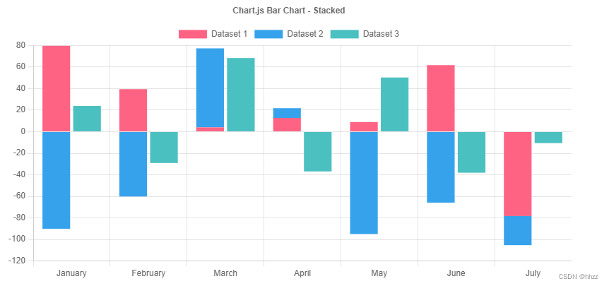
8,Chart.js
https://www.chartjs.org/docs/latest/samples/bar/stacked-groups.html
Chart.js 是一个非常受欢迎的开源库,在 GitHub 上超过 6 万+ star。灵活 且轻量,允许我们使用 HTML5 Canvas 元素构建响应式图表。可以轻松地对折线图和条形图进行混合和匹配以组合不同的数据集,实现非常有意思的功能, 支持 vue 和react。
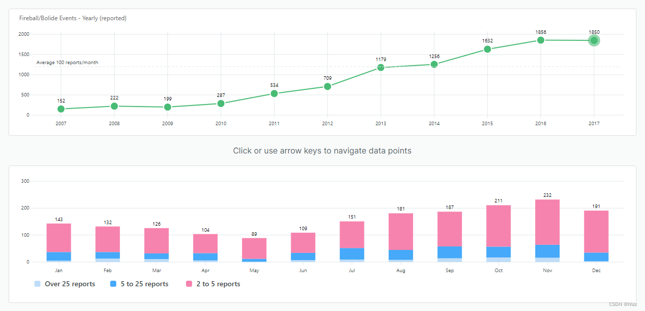
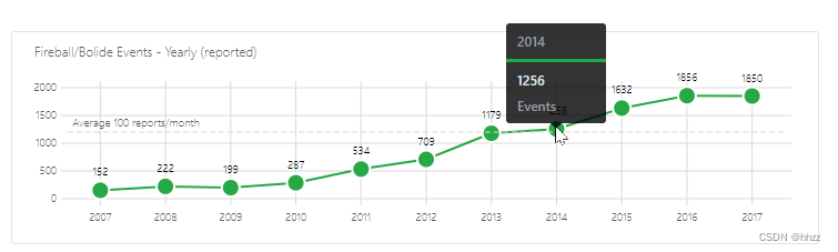
9,ApexCharts
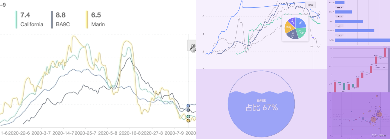
官网地址:https://apexcharts.com/vue-chart-demos/
ApexCharts 是一个简洁的 SVG 图表库,附带 Vue 和 React
包装器。它在不同设备上的效果非常丝滑,并提供了详细的文档。ApexCharts 是一个麻省理工学院许可的开源项目,可用于商业和非商业项目。
接下来分享一下它提供的一些图表展示:
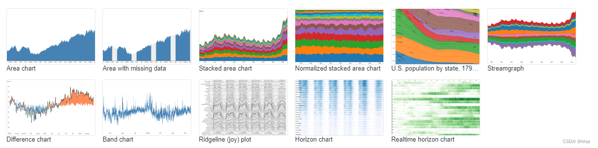
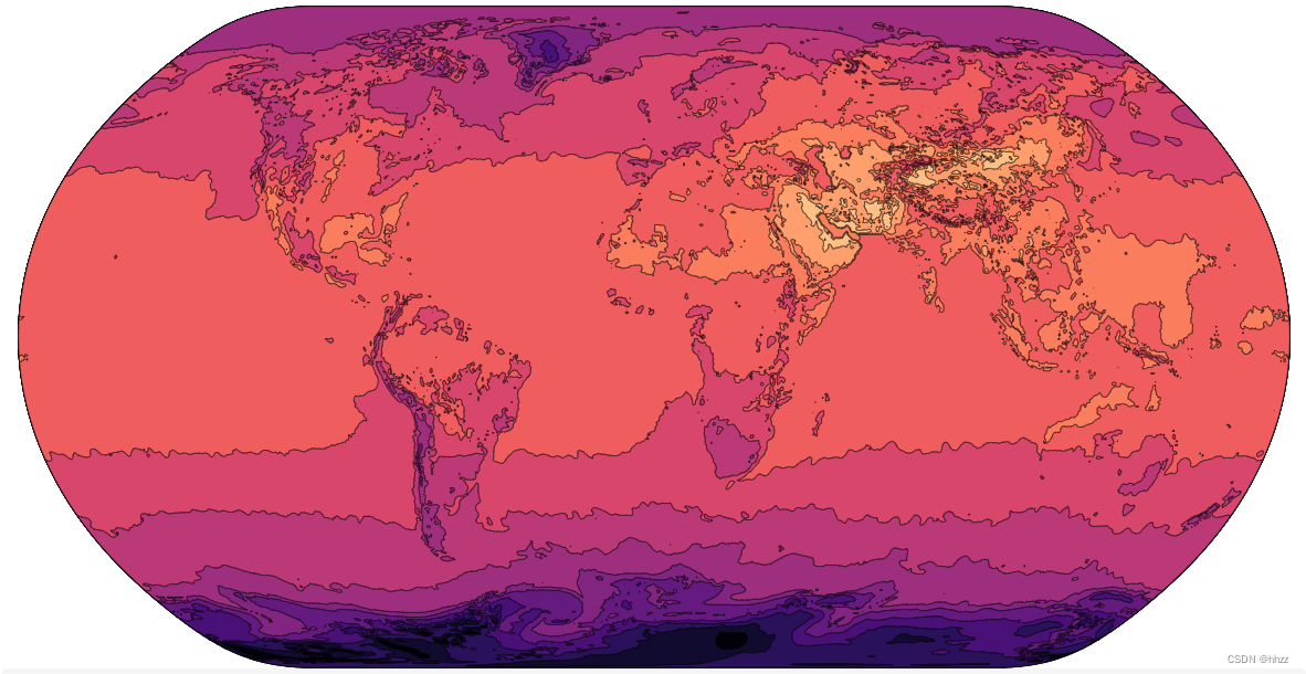
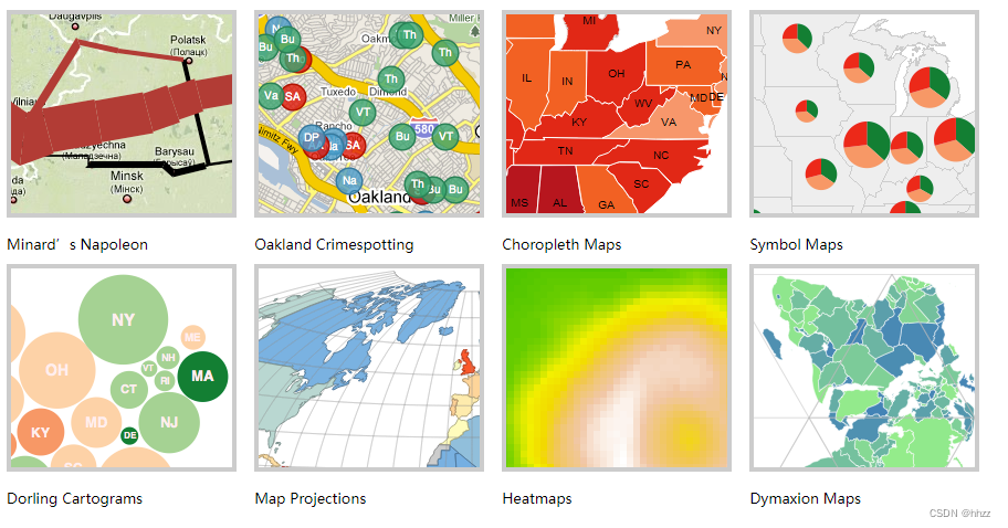
10、D3.js
官网链接 :https://github.com/xswei/d3js_doc
https://observablehq.com/@d3/gallery
D3 (或者叫 D3.js )是一个基于 web 标准的 JavaScript 可视化库。 D3 可以借助 SVG, Canvas 以及HTML 将你的数据生动的展现出来。 D3 结合了强大的可视化交互技术以及数据驱动 DOM 的技术,让你可以借助于现代浏览器的强大功能自由的对数据进行可视化。