前言
此笔记及后续所有笔记均基于如下环境
- Qt Quick 2.12
- Qt 5.12
参考文献: qmlbook
以下所有笔记均从上述qmlbook中选取精华得来,如果嫌英文太多或者原文太长,推荐看下面的内容速通
QtQuick 预备知识
二维坐标系
新建一个 quick 工程文件
main.qml 代码清单
import QtQuick 2.12
import QtQuick.Window 2.12

// 主window
Window {


    width: 640
    height: 480
    visible: true
    title: qsTr("Hello World")

    // 构建一个长方形
    // 左上角绘制点为[0,0]
    // 绘制长宽为176 96
    // Gradient给予长方形一个渐变底色
    Rectangle {


        id: rect1
        x: 12; y: 12
        width: 176; height: 96
        gradient: Gradient {


            GradientStop {

     position: 0.0; color: "lightsteelblue" }
            GradientStop {

     position: 1.0; color: "slategray" }
        }
        border.color: "slategray"
    }
}
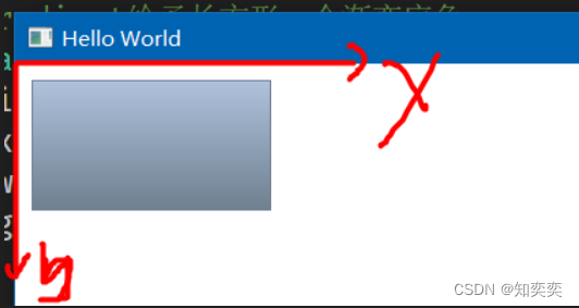
quick 中的坐标系如下图所示
- y 轴向下为正
- x 轴向右为正
所有的组件绘制起点都是左上角点,所以代码中我们设置 Rectangle 的坐标为 [12,12] 即为绘制起点坐标
text
很简单,学过类似的声明式页面开发都知道这些英文代表什么,就不多废话了
仅就不易辨别或者 QT 自带特有的属性进行分析讲解
Text {


    width: 40; height: 120
    text: 'A very long text'

    // elide 表示文本省略的位置,省略位置会以三个英文原点代替
    // 这里表示中间省略,故文本最终展示为:"A...t"
    elide: Text.ElideMiddle

    style: Text.Sunken
    styleColor: '#FF4444'

    verticalAlignment: Text.AlignTop
}
image
Image {


    x: 12+64+12; y: 12
    // width: 72
    height: 72/2
    source: "assets/triangle_red.png"
    fillMode: Image.PreserveAspectCrop
    clip: true
}
mousearea
鼠标可点击位置
下方代码实现:点击左侧方形,改变右侧方形的显示与隐藏
Rectangle {


    id: rect1
    x: 12; y: 12
    width: 76; height: 96
    color: "lightsteelblue"

    // 设置一个点击区域
    // onClicked 点击后触发的方法
    MouseArea {


        id: area
        width: parent.width
        height: parent.height
        onClicked: rect2.visible = !rect2.visible
    }
}

Rectangle{


    id: rect2
    x: rect1.width+24; y:12
    width: 76; height: 96
    color: "deepskyblue"
}
组件
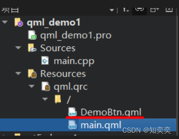
在 main.qml 同级目录下新建一个自定义组件文件 DemoBtn.qml
下方展示最终文件结构
以下简单案例实现:自定义一个按钮 DemoBtn,并给予其两个插槽,可更改按钮显示文本以及按钮点击事件;在主界面 main.qml 调用自定义按钮,实现组件复用
下方为 DemoBtn.qml 代码清单
import QtQuick 2.12

// 定义根元素
// 需要在根元素内定义接收的参数,让根元素下所有子元素调度
Rectangle {


    id: root

    // 既然这是一个自定义组件,就必须给予可传递的参数位置来改变组件内容
    // 导出属性使用 property alias
    property alias text: label.text
    // 导出信号或者其他触发方法使用 signal
    signal clicked

    width: 116; height: 26
    color: "lightsteelblue"
    border.color: "slategrey"

    Text {


        id: label
        anchors.centerIn: parent
        text: "Start"
    }
    MouseArea {


        anchors.fill: parent
        onClicked: {


            // 点击事件直接采用根元素接收来的参数clicked
            root.clicked()
        }
    }
}
回到咱们的 main.qml
由于处于同级目录,不需要 import 导入,直接使用自定义组件即可!
自定义组件名==文件名
// 由于我们编写的自定义组件文件名为DemoBtn.qml,所以使用该组件时依旧使用此名称
DemoBtn {


    id: button
    x: 12; y: 12

    // 传递text参数
    text: "innerText"
    // 传递点击事件参数
    onClicked: {


        status.text="Button click!!!"
    }
}

// 被控制的text组件
Text {


    id: status
    x: 12; y: 76
    width: 116; height: 26
    text: "waiting ..."
    horizontalAlignment: Text.AlignHCenter
}
组件复用还可以使用另外一种方法 Item
在开发大型项目时,几乎都采用此方法
修改自定义组件 DemoBtn.qml 代码为
import QtQuick 2.12

Item {


    id: root
    width: 116; height: 26

    property alias text: label.text
    signal clicked

    Rectangle {


        anchors.fill: parent
        color: "lightsteelblue"
        border.color: "slategrey"

        Text {


            id: label
            anchors.centerIn: parent
            text: "Start"
        }
        MouseArea {


            anchors.fill: parent
            onClicked: {


                root.clicked()
            }
        }
    }
}
定位元件
Column 列定位
在其中添加的组件都会按照列的方向竖直排列
Column{


    id: row
    x: 12; y:12

    // 每个组件之间垂直方向间隔
    spacing: 8

    // 所有组件(这里使用了我自己写的可复用组件,实际上就是一个带背景颜色的正方形)
    SimpleRect{

    }
    SimpleRect{

    color: "deepskyblue"}
    SimpleRect{

    color: "lightgreen"}
}
Row 行定位
水平方向,不做过多解释
Row{


    id: row
    x: 12; y:12
    spacing: 8
    SimpleRect{

    }
    SimpleRect{

    color: "deepskyblue"}
    SimpleRect{

    color: "lightgreen"}
}
Grid 栅格排列
Grid{


    id: row
    x: 12; y:12
    rows: 2
    columns: 2
    spacing: 8
    anchors.centerIn: parent
    SimpleRect{

    }
    SimpleRect{

    color: "deepskyblue"}
    SimpleRect{

    color: "lightgreen"}
    SimpleRect{

    color: "orange"}
}
Grid 搭配 Repeater 可以实现循环渲染元素的效果
Grid{


    id: row
    x: 12; y:12
    rows: 4
    columns: 4
    spacing: 8
    anchors.centerIn: parent

    // 将会渲染16个,4x4排列的,由正方形组成的矩阵
    Repeater{


        model: 16
        SimpleRect{

    }
    }
}
布局项
子组件通过对其父组件的各个锚点,实现精确定位
(这类似于 android 的约束布局,欠约束的子组件将会可以被改变位置)
使用 anchors 锚点作为定位手段

水平居中与垂直居中,并附带水平和垂直方向上的偏移
Rectangle{


    id: rect1
    anchors.fill: parent

    Rectangle{


        id: rect2
        width: 100; height: 100
        color: "deepskyblue"
        anchors.horizontalCenter: parent.horizontalCenter
        anchors.verticalCenter: parent.verticalCenter
        anchors.verticalCenterOffset: 10
        anchors.horizontalCenterOffset: -10
    }
}
指定方向锚点约束,并附加 margin
Rectangle{


    id: rect1
    anchors.fill: parent

    Rectangle{


        id: rect2
        width: 100; height: 100
        color: "deepskyblue"
        anchors.top: parent.top
        anchors.topMargin: 10
        anchors.left: parent.left
        anchors.leftMargin: 50
    }
}
输入元素
输入元素即文本输入框 TextInput
首先看一下焦点定位与键盘切换焦点示例
import QtQuick 2.5

Rectangle {


    width: 200
    height: 80
    color: "linen"

    TextInput {


        id: input1
        x: 8; y: 8
        width: 96; height: 20

        // 是否获取焦点
        focus: true
        text: "Text Input 1"

        // 点击键盘上的tab键后,焦点移动到哪一个组件上去
        KeyNavigation.tab: input2
    }

    TextInput {


        id: input2
        x: 8; y: 36
        width: 96; height: 20
        text: "Text Input 2"
        KeyNavigation.tab: input1
    }
}
使用 keys 进行按键检测,是不是想到实现一个角色控制游戏了?
import QtQuick 2.5

DarkSquare {


    width: 400; height: 200

    GreenSquare {


        id: square
        x: 8; y: 8
    }
    focus: true
    Keys.onLeftPressed: square.x -= 8
    Keys.onRightPressed: square.x += 8
    Keys.onUpPressed: square.y -= 8
    Keys.onDownPressed: square.y += 8
    Keys.onPressed: {


        switch(event.key) {


            case Qt.Key_Plus:
                square.scale += 0.2
                break;
            case Qt.Key_Minus:
                square.scale -= 0.2
                break;
        }

    }
}
下一期将讲述流元素的使用