目录
相信大家在面试的时候也会经常碰到两栏、三栏布局,一下列出来几种方式以供大家参考,废话不多说,直接上干货,如有不足之处,请大家补充。
一、两栏布局
左列定宽,右列自适应
1.利用浮动,margin实现
<style>
    .container {
      width: 500px;
      height: 200px;
      line-height: 200px;
    }
    .left {
      width: 200px;
      height: 100%;
      background: rebeccapurple;
      text-align: center;
      float: left;
    }
    .right {
      height: 100%;
      margin-left: 200px;
      background: pink;
      text-align: center;
    }
  </style>
  <div class="container">
    <div class="left">left固定</div>
    <div class="right">right自适应</div>
  </div>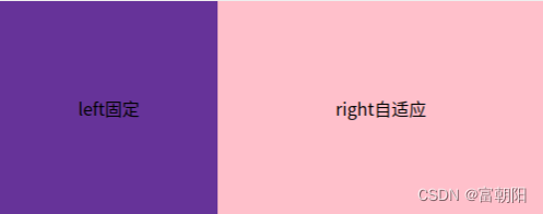
2.浮动+BFC
.container {
      width: 500px;
      height: 200px;
      line-height: 200px;
    }
    .left {
      width: 200px;
      height: 100%;
      background: rgb(177, 141, 214);
      text-align: center;
      float: left;
    }
    .right {
      height: 100%;
      /* 触发BFC */
      overflow: hidden;
      background: rgb(205, 29, 58);
      text-align: center;
    }
  </style>
  <div class="container">
    <div class="left">left固定</div>
    <div class="right">right自适应</div>
</div> 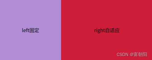
3. 定位
<style>
    .container {
      width: 500px;
      height: 200px;
      line-height: 200px;
      position: relative;
    }
    .left {
      width: 200px;
      height: 100%;
      background: orange;
      text-align: center;
      position: absolute;
      left: 0;
    }
    .right {
      height: 100%;
      background: blue;
      text-align: center;
      position: absolute;
      left: 200px;
      right: 0;
    }
  </style>
  <div class="container">
    <div class="left">left固定</div>
    <div class="right">right自适应</div>
</div> 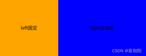
4.flex
<style>
    .container {
      width: 500px;
      height: 200px;
      line-height: 200px;
      display: flex;
    }
    .left {
      width: 200px;
      height: 100%;
      background: orange;
      text-align: center;
    }
    .right {
      height: 100%;
      background: blue;
      text-align: center;
      flex: 1;
    }
  </style>
  <div class="container">
    <div class="left">left固定</div>
    <div class="right">right自适应</div>
  </div>
5.table布局
<style>
    .container {
      width: 500px;
      height: 200px;
      line-height: 200px;
      display: table;
    }
    .left {
      width: 200px;
      height: 100%;
      background: orange;
      text-align: center;
      display: table-cell;
    }
    .right {
      height: 100%;
      background: blue;
      text-align: center;
      display: table-cell;
    }
  </style>
  <div class="container">
    <div class="left">left固定</div>
    <div class="right">right自适应</div>
  </div>
二、三栏布局
左右两列定宽,中间自适应
1.浮动+margin
<style>
    .container {
      width: 500px;
      height: 200px;
      line-height: 200px;
    }
    .left {
      width: 100px;
      height: 100%;
      float: left;
      background: orange;
      text-align: center;
    }
    .right {
      width: 100px;
      height: 100%;
      float: right;
      background: blue;
      text-align: center;
    }

    .center {
      height: 100%;
      margin-left: 100px;
      margin-right: 100px;
      background: oldlace;
    }
  </style>
  <div class="container">
    <div class="left">left固定</div>
    <div class="right">right固定</div>
    <div class="center">中间自适应</div>
  </div>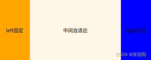
2.浮动+BFC
<style>
    .container {
      width: 500px;
      height: 200px;
      line-height: 200px;
    }
    .left {
      width: 100px;
      height: 100%;
      float: left;
      background: orange;
      text-align: center;
    }
    .right {
      width: 100px;
      height: 100%;
      float: right;
      background: blue;
      text-align: center;
    }

    .center {
      height: 100%;
      /* 触发BFC */
      overflow: hidden;
      background: oldlace;
      text-align: center;
    }
  </style>
  <div class="container">
    <div class="left">left固定</div>
    <div class="right">right固定</div>
    <div class="center">中间自适应</div>
  </div>
3.flex
<style>
    .container {
      width: 500px;
      height: 200px;
      line-height: 200px;
      display: flex;
    }
    .left {
      width: 100px;
      height: 100%;
      float: left;
      background: orange;
      text-align: center;
    }
    .right {
      width: 100px;
      height: 100%;
      float: right;
      background: blue;
      text-align: center;
    }

    .center {
      height: 100%;
      flex: 1;
      background: oldlace;
      text-align: center;
    }
  </style>
  <div class="container">
    <div class="left">left固定</div>
    <div class="center">中间自适应</div>
    <div class="right">right固定</div>
  </div>
4.table布局
注意容器的顺序
<style>
    .container {
      width: 500px;
      height: 200px;
      line-height: 200px;
      display: table;
    }
    .left {
      width: 100px;
      height: 100%;
      display: table-cell;
      background: orange;
      text-align: center;
    }
    .right {
      width: 100px;
      height: 100%;
      display: table-cell;
      background: blue;
      text-align: center;
    }

    .center {
      height: 100%;
      display: table-cell;
      background: oldlace;
      text-align: center;
    }
  </style>
  <div class="container">
    <div class="left">left固定</div>
    <div class="center">中间自适应</div>
    <div class="right">right固定</div>
  </div>
5.定位
注意容器的顺序
<style>
    .container {
      width: 500px;
      height: 200px;
      line-height: 200px;
      position: relative;
    }
    .left {
      width: 100px;
      height: 100%;
      background: orange;
      text-align: center;
      position: absolute;
      left: 0;
    }
    .right {
      width: 100px;
      height: 100%;
      background: blue;
      text-align: center;
      position: absolute;
      right: 0;
    }

    .center {
      height: 100%;
      background: oldlace;
      text-align: center;
      margin: 0 100px;
    }
  </style>
  <div class="container">
    <div class="left">left固定</div>
    <div class="right">right固定</div>
    <div class="center">中间自适应</div>
  </div>
欢迎在评论区交流。如果文章对你有所帮助,不要忘了点上宝贵的一赞!
我的博客原文:CSS多栏布局-两栏布局和三栏布局