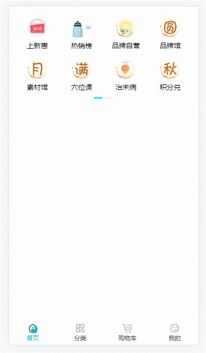
预览
组件代码
<template>
  <div class="scroll-list">
    <div
      class="scroll-list-content"
      :style="{ background, color, fontSize: size }"
      ref="scrollListContent"
    >
      <div class="scroll-list-group" v-for="(item, index) in list" :key="index">
        <div class="scroll-list-item" v-for="menuItem in item">
          <img class="scroll-list-item-img" :src="menuItem[icon]" alt="" />
          <span class="scroll-list-item-text">{

    {

     menuItem[name] }}</span>
        </div>
      </div>
    </div>
    <div v-if="isScrollBar && indicator" class="scroll-list-indicator">
      <div
        class="scroll-list-indicator-bar"
        :style="{ width: width }"
        ref="scrollListIndicatorBar"
      >
        <span
          :style="{ height: height }"
          class="scroll-list-indicator-slider"
        ></span>
      </div>
    </div>
  </div>
</template>

<script>
import {


  defineComponent,
  onMounted,
  onBeforeUnmount,
  reactive,
  ref,
  toRefs,
  nextTick,
  watch,
} from "vue";

export default defineComponent({


  props: {


    list: {


      type: Array,
      default: () => [], // 数据
    },
    indicator: {


      type: Boolean,
      default: true, // 是否显示面板指示器
    },
    indicatorColor: {


      type: String,
      default: "#f2f2f2", // 指示器非激活颜色  (暂不支持)
    },
    indicatorActiveColor: {


      type: String,
      default: "#3c9cff", // 指示器滑块颜色  (暂不支持)
    },
    indicatorWidth: {


      type: String,
      default: "", // 指示器 宽度
    },
    indicatorBottom: {


      type: String,
      default: "", // 指示器 距离内容底部的距离 (设置 0 会隐藏指示器)
    },
    background: {


      type: String,
      default: "", // 内容区域背景色
    },
    color: {


      type: String,
      default: "", // 内容区域文本颜色
    },
    size: {


      type: String,
      default: "", // 内容区域文本字体大小
    },
    indicatorStyle: {


      type: String,
      default: "", // 指示器 样式 (暂不支持)
    },
    icon: {


      type: String,
      default: "icon", // 图标字段
    },
    name: {


      type: String,
      default: "name", // 文本字段
    },
  },
  setup(props) {


    const width = ref("");
    const height = ref("");
    const {

     indicatorWidth, indicatorBottom, indicator } = props;
    watch(
      () => [indicatorWidth, indicatorBottom],
      (newVal) => {


        console.log(newVal);
        const _width = newVal[0].includes("px") ? newVal[0] : newVal[0] + "px";
        const _height = newVal[1].includes("px") ? newVal[1] : newVal[1] + "px";
        width.value = _width;
        height.value = _height;
      },
      {

     immediate: true }
    );

    const state = reactive({


      scrollListContent: null, // 内容区域 dom
      scrollListIndicatorBar: null, // 底部指示器 dom
      isScrollBar: false,
    });

    onMounted(() => {


      nextTick(() => {


        state.isScrollBar = hasScrollbar();
        if (!indicator || !state.isScrollBar) return;
        state.scrollListContent.addEventListener("scroll", handleScroll);
      });
    });

    onBeforeUnmount(() => {


      if (!indicator || !state.isScrollBar) return;
      // 页面卸载,移除监听事件
      state.scrollListContent.removeEventListener("scroll", handleScroll);
    });

    function handleScroll() {


      /**
       * 使用滚动比例来实现同步滚动
       * tips: 这里时一道数学题, 不同的可以把下面的几个参数都打印处理看看
       * 解析一下 这里的实现
       * state.scrollListContent.scrollWidth  内容区域的宽度
       * state.scrollListContent.clientWidth  当前内容所占的可视区宽度
       * state.scrollListIndicatorBar.scrollWidth  指示器的宽度
       * state.scrollListIndicatorBar.clientWidth  当前指示器所占的可视区宽度
       *
       * 内容区域的宽度 - 当前内容所占的可视区宽度 = 内容区域可滚动的最大距离
       * 指示器的宽度 - 当前指示器所占的可视区宽度 = 指示器可滚动的最大距离
       *
       * 内容区域可滚动的最大距离 / 指示器可滚动的最大距离 = 滚动比例 (scale)
       *
       * 最后通过滚动比例 来算出 指示器滚动的 距离 (state.scrollListIndicatorBar.scrollLeft)
       *
       * 指示器滚动的距离 = 容器滚动的距离 / 滚动比例 (对应下面的公式)
       *
       * state.scrollListIndicatorBar.scrollLeft = state.scrollListContent.scrollLeft / scale
       */

      const scale =
        (state.scrollListContent.scrollWidth -
          state.scrollListContent.clientWidth) /
        (state.scrollListIndicatorBar.scrollWidth -
          state.scrollListIndicatorBar.clientWidth);

      state.scrollListIndicatorBar.scrollLeft =
        state.scrollListContent.scrollLeft / scale;
    }

    function hasScrollbar() {


      return (
        state.scrollListContent.scrollWidth >
          state.scrollListContent.clientWidth ||
        state.scrollListContent.offsetWidth >
          state.scrollListContent.clientWidth
      );
    }

    return {

     ...toRefs(state), width, height, handleScroll, hasScrollbar };
  },
});
</script>

<style lang="less" scoped>
.scroll-list {


  &-content {


    width: 100%;
    overflow-y: hidden;
    overflow-x: scroll;
    // white-space: nowrap;
    display: flex;
    flex-wrap: nowrap;
    /*滚动条整体样式*/
    &::-webkit-scrollbar {


      width: 0;
      height: 0;
    }
  }
  &-group {


    display: flex;
    flex-wrap: wrap;
    // margin-bottom: 16px;
    min-width: 100%;
    &:nth-child(2n) {


      margin-bottom: 0;
    }
  }
  &-item {


    // display: inline-block;
    margin-bottom: 16px;
    text-align: center;
    width: calc(100% / 4);
    &-img {


      width: 44px;
      height: 44px;
      object-fit: cover;
    }
    &-text {


      display: block;
    }
    &:nth-child(n + 5) {


      margin-bottom: 0;
    }
  }
  &-indicator {


    width: 100%;
    display: flex;
    align-items: center;
    justify-content: center;
    pointer-events: none; // 禁用滑动指示灯时 滑块滚动
    &-bar {


      width: 40px; // 指示器的默认宽度
      overflow-y: hidden;
      overflow-x: auto;
      white-space: nowrap;
      /*滚动条整体样式*/
      &::-webkit-scrollbar {


        width: 0;
        height: 4px;
      }
      /* 滚动条里面小滑块 样式设置 */
      &::-webkit-scrollbar-thumb {


        border-radius: 50px; /* 滚动条里面小滑块 - radius */
        background: rgb(60, 237, 237); /* 滚动条里面小滑块 - 背景色 */
      }
      /* 滚动条里面轨道 样式设置 */
      &::-webkit-scrollbar-track {


        border-radius: 50px; /* 滚动条里面轨道 - radius */
        background: rgb(242, 242, 242); /* 滚动条里面轨道 - 背景色 */
      }
    }
    &-slider {


      height: 10px;
      min-width: 120px;
      display: block;
    }
  }
}
</style>
页面使用
- 引入
import ScrollList from "@/components/localComponents/ScrollList/index.vue";
- 注册
components: {

     ScrollList }
- 使用
<ScrollList v-if="menuList.length > 0" :list="menuList" icon="menuImageUrl" name="menuName" />
简要说明:
- v-if 的作用是防止接口数据没返回而导致 底部滚动条不显示问题
- list 菜单数据,一般就是接口返回的数据
- icon 图片字段,可以自定义(解决接口返回的图片字段不一定是icon) 默认是 icon
- name 文本字段,可以自定义(解决接口返回的文本字段不一定是name) 默认是 name
- 其他的一些具体参数请自行查看组件代码