加载动画组件
效果如下:

分解一下组件的内容,该组件分为两个部分,一部分是灰色圆形框,另一部分是蓝色跳动的线条。实现的完整代码如下。
<template>
  <div class="home">
    <svg
      class="pl"
      viewBox="0 0 168 168"
      width="168px"
      height="168px"
      xmlns="http://www.w3.org/2000/svg"
    >
      <defs>
        <linearGradient id="pl-grad" x1="0" y1="0" x2="0" y2="1">
          <stop offset="0%" stop-color="hsl(193,90%,55%)" />
          <stop offset="100%" stop-color="hsl(223,90%,55%)" />
        </linearGradient>
      </defs>
      <circle
        class="pl__ring"
        r="56"
        cx="64"
        cy="64"
        fill="none"
        stroke="hsla(0,10%,10%,0.1)"
        stroke-width="16"
        stroke-linecap="round"
      />
      <path
        class="pl__worm"
        d="M92,15.492S78.194,4.967,66.743,16.887c-17.231,17.938-28.26,96.974-28.26,96.974L119.85,59.892l-99-31.588,57.528,89.832L97.8,19.349,13.636,88.51l89.012,16.015S81.908,38.332,66.1,22.337C50.114,6.156,36,15.492,36,15.492a56,56,0,1,0,56,0Z"
        fill="none"
        stroke="url(#pl-grad)"
        stroke-width="16"
        stroke-linecap="round"
        stroke-linejoin="round"
        stroke-dasharray="44 1111"
        stroke-dashoffset="10"
      />
    </svg>
  </div>
</template>

<style>
* {


  border: 0;
  box-sizing: border-box;
  margin: 0;
  padding: 0;
}
:root {


  --hue: 223;
  --bg: hsl(var(--hue), 10%, 90%);
  --fg: hsl(var(--hue), 10%, 10%);
  font-size: calc(16px + (24 - 16) * (100vw - 320px) / (1280 - 320));
}
/* .body {
  background-color: #ffffff;
  color: var(--fg);
  font: 1em/1.5 sans-serif;
  height: 30%;

  transition: background-color 0.3s;
} */
main {


  padding: 1.5em 0;
}
.home {


  display: grid;
  place-items: center;
}
.pl,
.pl__worm {


  animation-duration: 3s;
  animation-iteration-count: infinite;
}
.pl {


  animation-name: bump;
  animation-timing-function: linear;
  width: 8em;
  height: 8em;
}
.pl__ring {


  stroke: hsla(var(--hue), 10%, 10%, 0.1);
  transition: stroke 0.3s;
}
.pl__worm {


  animation-name: worm;
  animation-timing-function: cubic-bezier(0.42, 0.17, 0.75, 0.83);
}

/* Dark theme */
@media (prefers-color-scheme: dark) {


  :root {


    --bg: hsl(var(--hue), 10%, 10%);
    --fg: hsl(var(--hue), 10%, 90%);
  }
  .pl__ring {


    stroke: hsla(var(--hue), 10%, 90%, 0.1);
  }
}

/* Animations */
@keyframes bump {


  from,
  42%,
  46%,
  51%,
  55%,
  59%,
  63%,
  67%,
  71%,
  74%,
  78%,
  81%,
  85%,
  88%,
  92%,
  to {


    transform: translate(0, 0);
  }
  44% {


    transform: translate(1.33%, 6.75%);
  }
  53% {


    transform: translate(-16.67%, -0.54%);
  }
  61% {


    transform: translate(3.66%, -2.46%);
  }
  69% {


    transform: translate(-0.59%, 15.27%);
  }
  76% {


    transform: translate(-1.92%, -4.68%);
  }
  83% {


    transform: translate(9.38%, 0.96%);
  }
  90% {


    transform: translate(-4.55%, 1.98%);
  }
}
@keyframes worm {


  from {


    stroke-dashoffset: 10;
  }
  25% {


    stroke-dashoffset: 295;
  }
  to {


    stroke-dashoffset: 1165;
  }
}
</style>
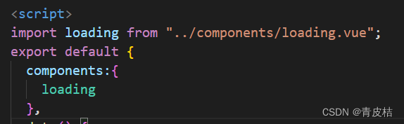
在其他页面使用前先引入一下(文件名和路径记得改):
引入后使用:
