目录
前言
Flutter中Sliver是跟Widget滚动相关的一些Widget。在app的开发过程中,滚动的使用随处可见,商品信息的列表展示,股票下拉刷新最新的行情等等。总结下来就是:要展示的内容的长度超过了当前屏幕的显示范围的时候,我们就会用到滚动组件。最常见的就是ListView和GridView。大部分的情况下,常见的ListView和GridView基本上能满足用户的需求,当我们要实现一些复杂的动画的时候,Sliver组件就派上了用场。比如说下面的动画效果,我们就可以使用Slivers轻松的实现。


今天的这篇文章主要是讲解分析下Sliver的用法。
一、关于Sliver
在开发的过程中,大部分的可滚动视图,比如说ListView和GridView,实际上都是使用Slivers实现的。研究下源码,比如说ListView的定义,下面截图自ListView的定义。
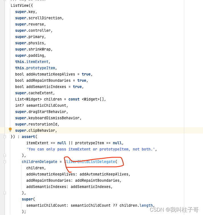
图3.ListView的定义
GridView也是:
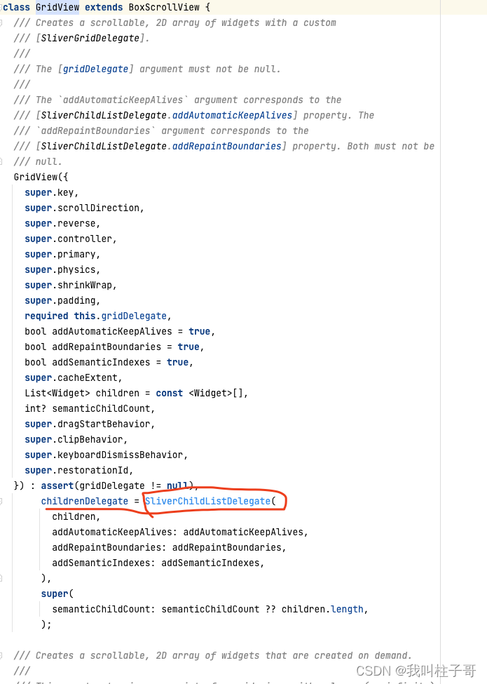
图4.GridView的定义
Sliver的官方解释是:我们可以把Slivers看成是较低级别的接口,使用Slivers我们可以更加精细的控制滚动区域,从而实现各种效果。因为Slivers中的视图是在需要的时候才去构建渲染,所以当可滚动区域的视图非常多的时候,Slivers特别高效。
Flutter中所有的Sliver组件都是和CustomScrollView搭配使用,sliver组件作为CustomScrollView的子控件。常用的Slivers有SliverList,SliverGridView,SliverAppBar。下面将会详细介绍下他们的用法。
二、SliverList
SliverList有一个delegate的必选参数,delegate分两种:SliverChildListDelegate和SliverChildBuilderDelegate.区别是是否一次性的构建子控件。
我们可以通过简单的例子来看下两种delegate的区别:
1.SliverChildListDelegate
比如说我们要使用SliverList展示三个(或者其他个数)不同颜色的Container,类似下面的效果图:
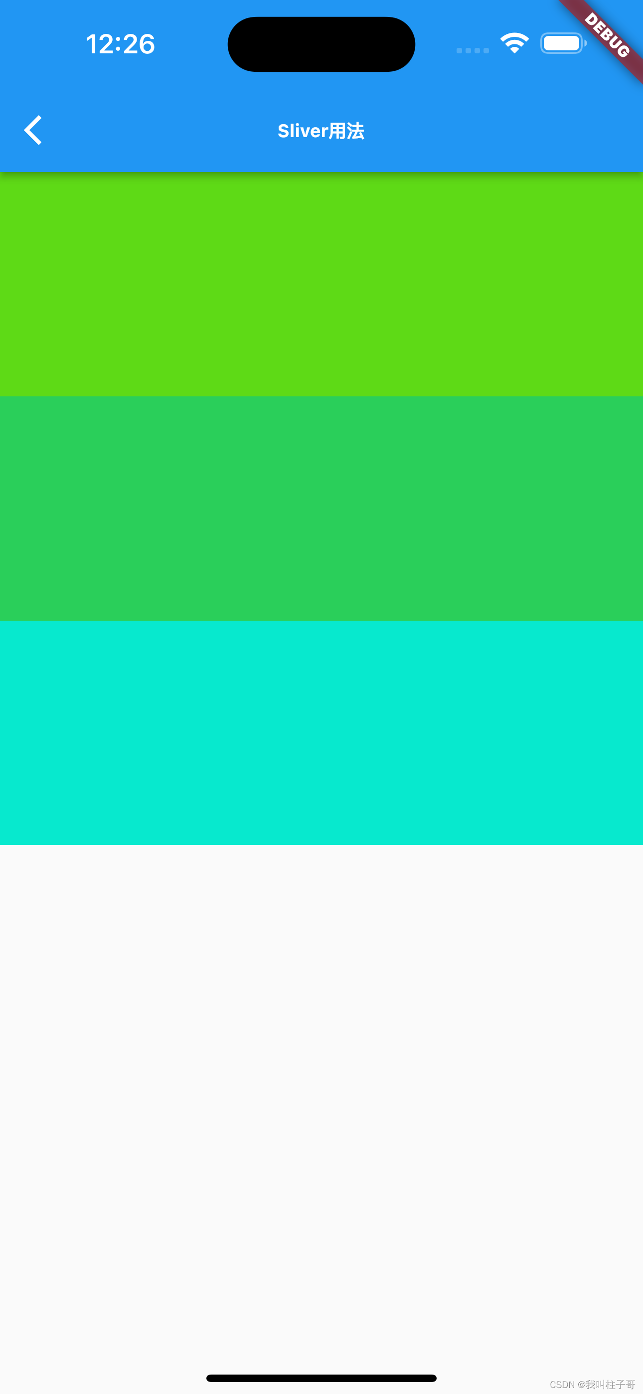
图5.简单的SliverList
我们可以通过下面的代码来实现:
class SliverForListPage extends StatefulWidget {
  const SliverForListPage({Key? key}) : super(key: key);

  @override
  State<SliverForListPage> createState() => _SliverForListPageState();
}

class _SliverForListPageState extends State<SliverForListPage> {
  Color getRandomColor({int r = 255, int g = 255, int b = 255, a = 255}) {
    if (r == 0 || g == 0 || b == 0) return Colors.black;
    if (a == 0) return Colors.white;
    return Color.fromARGB(
      a,
      r != 255 ? r : math.Random.secure().nextInt(r),
      g != 255 ? g : math.Random.secure().nextInt(g),
      b != 255 ? b : math.Random.secure().nextInt(b),
    );
  }

  @override
  Widget build(BuildContext context) {
    return Scaffold(
      appBar: AppBar(
        title: const Text('Sliver用法',style: TextStyle(fontWeight: FontWeight.bold,fontSize: 12),),
      ),
      body: CustomScrollView(
        slivers: [

          SliverList(delegate: SliverChildListDelegate([
            Container(color: getRandomColor(),height: 150,),
            Container(color: getRandomColor(),height: 150,),
            Container(color: getRandomColor(),height: 150,),
          ])),
        ],

      ),
    );
  }
}
在上面的代码中,外层使用CustomScrollView来包裹一个SliverList.。用过Row和Column的话,会发现两者用法差不多,区别就是Column和Row中要展示的子控件的数组名称叫做children,而Slivers系列组件使用slivers表示要展示的控件数组。这里的SliverList创建控件的效率是不高的,因为SliverChildListDelegate是一次性的创建Container。
2.SliverChildBuilderDelegate
当要展示的控件非常多的时候,我们可以使用SliverChildBuilderDelegate高效的创建控件列表。我们可以使用下面的代码来创建一个无限的列表:只有当控件可见的时候,才会被创建,因此效率非常高。
class SliverForListPage extends StatefulWidget {
  const SliverForListPage({Key? key}) : super(key: key);

  @override
  State<SliverForListPage> createState() => _SliverForListPageState();
}

class _SliverForListPageState extends State<SliverForListPage> {
  Color getRandomColor({int r = 255, int g = 255, int b = 255, a = 255}) {
    if (r == 0 || g == 0 || b == 0) return Colors.black;
    if (a == 0) return Colors.white;
    return Color.fromARGB(
      a,
      r != 255 ? r : math.Random.secure().nextInt(r),
      g != 255 ? g : math.Random.secure().nextInt(g),
      b != 255 ? b : math.Random.secure().nextInt(b),
    );
  }

  @override
  Widget build(BuildContext context) {
    return Scaffold(
      appBar: AppBar(
        title: const Text('Sliver用法',style: TextStyle(fontWeight: FontWeight.bold,fontSize: 12),),
      ),
      body: CustomScrollView(
        slivers: [
          SliverList(delegate: SliverChildBuilderDelegate((context, index) => Container(color: getRandomColor(),height: 150,))),
        ],

      ),
    );
  }
}
图6.懒加载的方式创建SliverList
三、SliverGrid
SliverGridView和SliverList一样,可以显示或者使用delegate指定列表。配置SliverGridView有三种方式:
1.count构造函数设置SliverGrid
我们可以使用下面的代码创建100个不同颜色的Container列表。
class SliverForGridViewPage extends StatefulWidget {
  const SliverForGridViewPage({Key? key}) : super(key: key);

  @override
  State<SliverForGridViewPage> createState() => _SliverForGridViewPageState();
}

class _SliverForGridViewPageState extends State<SliverForGridViewPage> {
  Color getRandomColor({int r = 255, int g = 255, int b = 255, a = 255}) {
    if (r == 0 || g == 0 || b == 0) return Colors.black;
    if (a == 0) return Colors.white;
    return Color.fromARGB(
      a,
      r != 255 ? r : math.Random.secure().nextInt(r),
      g != 255 ? g : math.Random.secure().nextInt(g),
      b != 255 ? b : math.Random.secure().nextInt(b),
    );
  }

  List<Widget> generateWidgetList(){
    List<Widget> list = [];
    for(var i = 0;i<100;i++){
      Container container =  Container(
        color: getRandomColor(),
        height: 150,
      );
      list.add(container);
    }
    return list;
  }
  @override
  Widget build(BuildContext context) {
    return Scaffold(
      appBar: AppBar(
        title: const Text('SliverGrid.extent',style: TextStyle(fontWeight: FontWeight.bold,fontSize: 12),),
      ),
      body: CustomScrollView(
        slivers: [
          SliverGrid.extent(maxCrossAxisExtent: 100,children: generateWidgetList(),),
        ],

      ),
    );
  }
}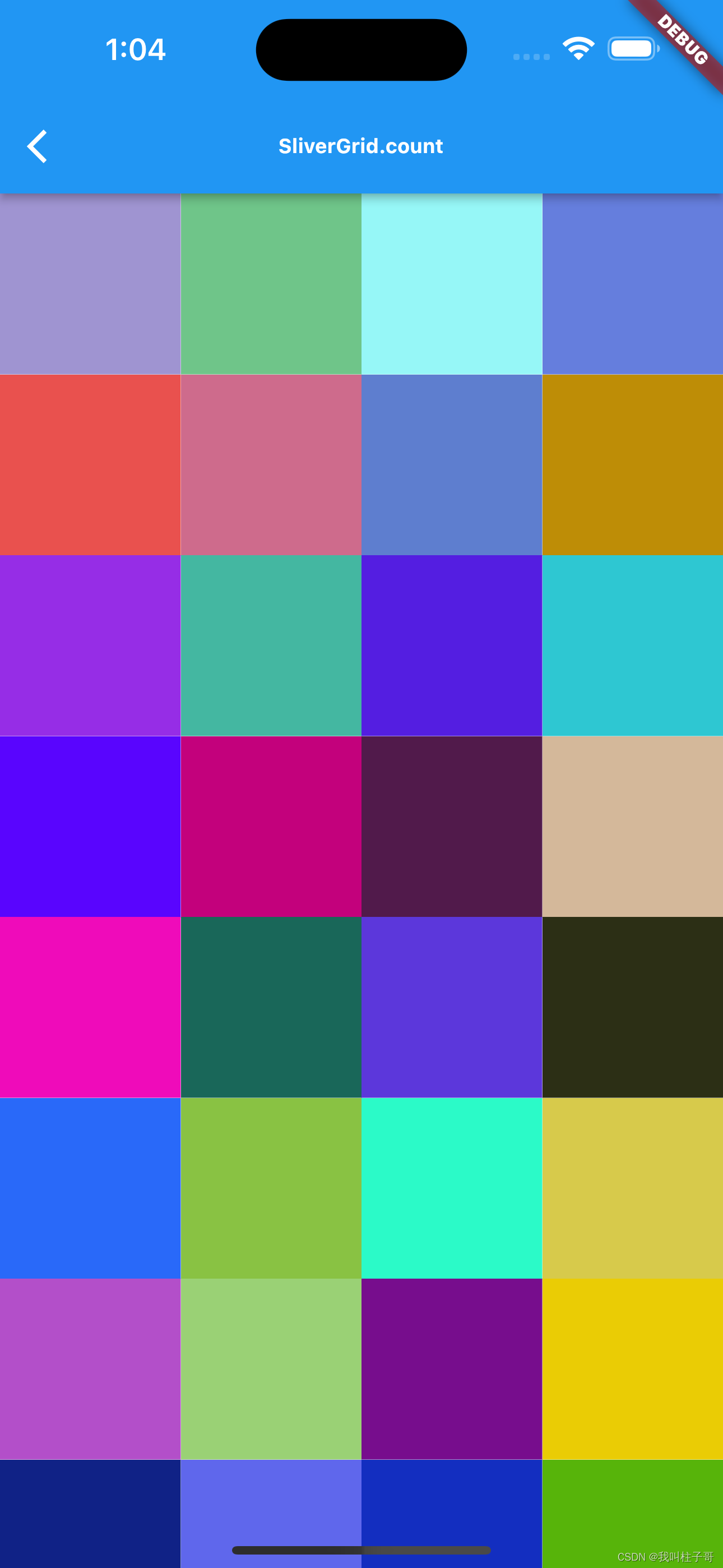
图7.count构造函数实现SliverGrid
2.Extent构造函数设置SliverGrid
我们可以使用下面的代码创建100个不同颜色的Container,效果如图8所示:
class SliverForGridViewPage extends StatefulWidget {
  const SliverForGridViewPage({Key? key}) : super(key: key);

  @override
  State<SliverForGridViewPage> createState() => _SliverForGridViewPageState();
}

class _SliverForGridViewPageState extends State<SliverForGridViewPage> {
  Color getRandomColor({int r = 255, int g = 255, int b = 255, a = 255}) {
    if (r == 0 || g == 0 || b == 0) return Colors.black;
    if (a == 0) return Colors.white;
    return Color.fromARGB(
      a,
      r != 255 ? r : math.Random.secure().nextInt(r),
      g != 255 ? g : math.Random.secure().nextInt(g),
      b != 255 ? b : math.Random.secure().nextInt(b),
    );
  }

  List<Widget> generateWidgetList(){
    List<Widget> list = [];
    for(var i = 0;i<100;i++){
      Container container =  Container(
        color: getRandomColor(),
        height: 150,
      );
      list.add(container);
    }
    return list;
  }
  @override
  Widget build(BuildContext context) {
    return Scaffold(
      appBar: AppBar(
        title: const Text('SliverGrid.extent',style: TextStyle(fontWeight: FontWeight.bold,fontSize: 12),),
      ),
      body: CustomScrollView(
        slivers: [
          //这里构建了无限滚动的不同容器
          SliverGrid.extent(maxCrossAxisExtent: 100,children: generateWidgetList(),),
        ],

      ),
    );
  }
}
图8.count构造函数实现SliverGrid
3.默认构造函数设置SliverGrid
我们可以使用下面的代码创建图9所示的无效滚动的SliverGrid网格视图。
class SliverForGridViewPage extends StatefulWidget {
  const SliverForGridViewPage({Key? key}) : super(key: key);

  @override
  State<SliverForGridViewPage> createState() => _SliverForGridViewPageState();
}

class _SliverForGridViewPageState extends State<SliverForGridViewPage> {
  Color getRandomColor({int r = 255, int g = 255, int b = 255, a = 255}) {
    if (r == 0 || g == 0 || b == 0) return Colors.black;
    if (a == 0) return Colors.white;
    return Color.fromARGB(
      a,
      r != 255 ? r : math.Random.secure().nextInt(r),
      g != 255 ? g : math.Random.secure().nextInt(g),
      b != 255 ? b : math.Random.secure().nextInt(b),
    );
  }

  @override
  Widget build(BuildContext context) {
    return Scaffold(
      appBar: AppBar(
        title: const Text('SliverGrid.extent',style: TextStyle(fontWeight: FontWeight.bold,fontSize: 12),),
      ),
      body: CustomScrollView(
        slivers: [
          //这里构建了无限滚动的不同容器
          SliverGrid(gridDelegate: const SliverGridDelegateWithFixedCrossAxisCount(crossAxisCount: 4), delegate: SliverChildBuilderDelegate((context, index) => Container(
            color: getRandomColor(),
            height: 150,
          ))),
        ],

      ),
    );
  }
}
图9.count构造函数指定SliverGrid
四、SliverAppBar
这里我们看一下如何来实现文章开始的时候实现的AppBar的动画效果。
以上面的无限滚动的Container列表为例,我们使用SliverAppBar代替AppBar,同时设置下flexibleSpace参数和expandedHeight参数就可以实现文章开始的时候的效果,代码如下:
class SliverForListPage extends StatefulWidget {
  const SliverForListPage({Key? key}) : super(key: key);

  @override
  State<SliverForListPage> createState() => _SliverForListPageState();
}

class _SliverForListPageState extends State<SliverForListPage> {
  Color getRandomColor({int r = 255, int g = 255, int b = 255, a = 255}) {
    if (r == 0 || g == 0 || b == 0) return Colors.black;
    if (a == 0) return Colors.white;
    return Color.fromARGB(
      a,
      r != 255 ? r : math.Random.secure().nextInt(r),
      g != 255 ? g : math.Random.secure().nextInt(g),
      b != 255 ? b : math.Random.secure().nextInt(b),
    );
  }

  @override
  Widget build(BuildContext context) {
    return Scaffold(
      body: CustomScrollView(
        slivers: [
          SliverAppBar(
            title: const Text('SliverList',style: TextStyle(fontWeight: FontWeight.bold,fontSize: 12),),
            backgroundColor: Colors.blue,
            flexibleSpace: FlexibleSpaceBar(
              background: Image.asset('images/header.jpeg',fit: BoxFit.cover,),
            ),
          ),
          SliverList(delegate: SliverChildBuilderDelegate((context, index) => Container(color: getRandomColor(),height: 150,))),
        ],

      ),
    );
  }
}
实现的效果如下图:
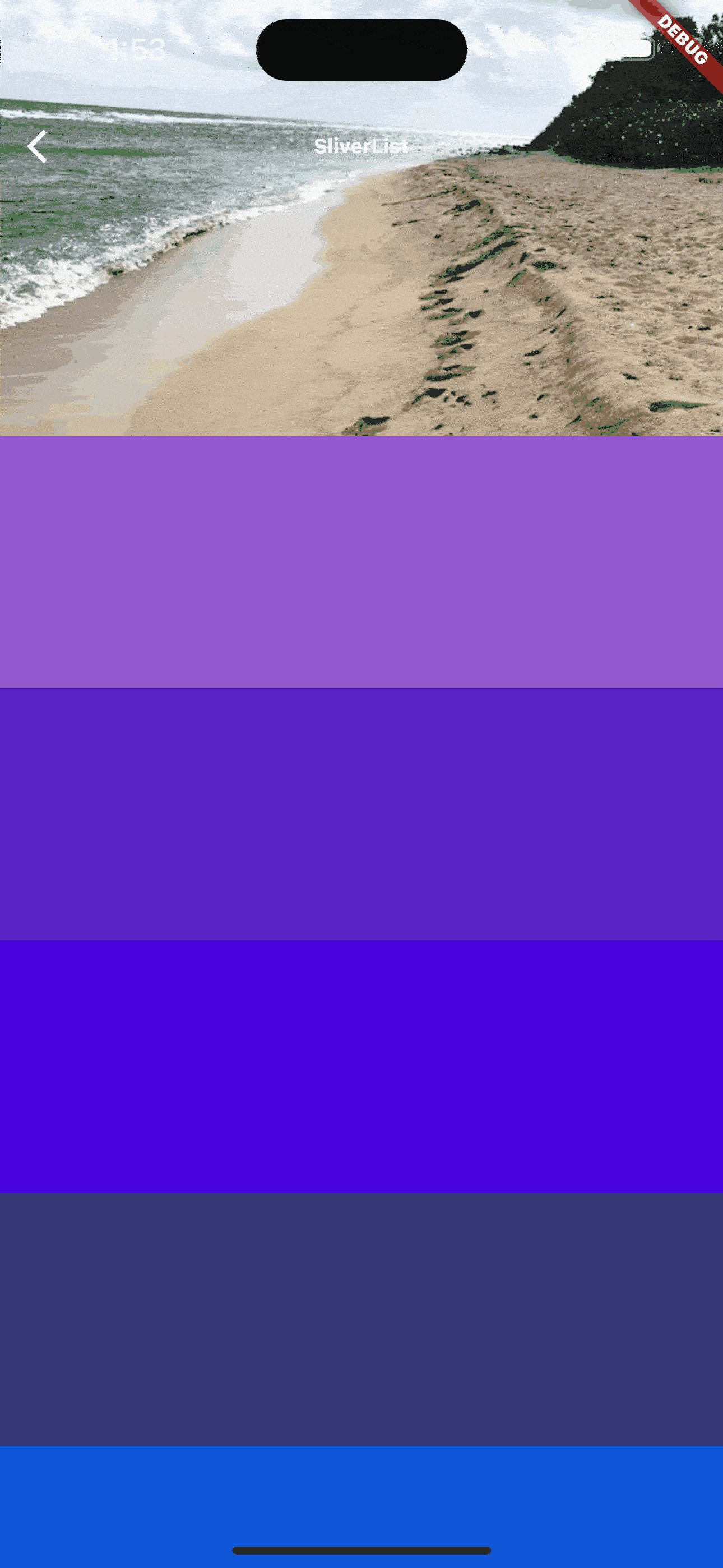
图10.SliverApp效果
这个时候我们可以看到,SliverAppBar跟随下面的列表一起滚动。下拉的时候,超过expandedHeight参数的时候,显示SliverAppBar,往上滑动的时候,SliverAppBar会跟着列表一起滑动,直至消失。
我们也可以通过设置一些参数来自定义AppBar动画效果。
当我们把floating参数设置成true的时候,看下变化(图11)。我们发现及时往下滚动的时候,没有在列表顶部,SliverAppBar也会出现。
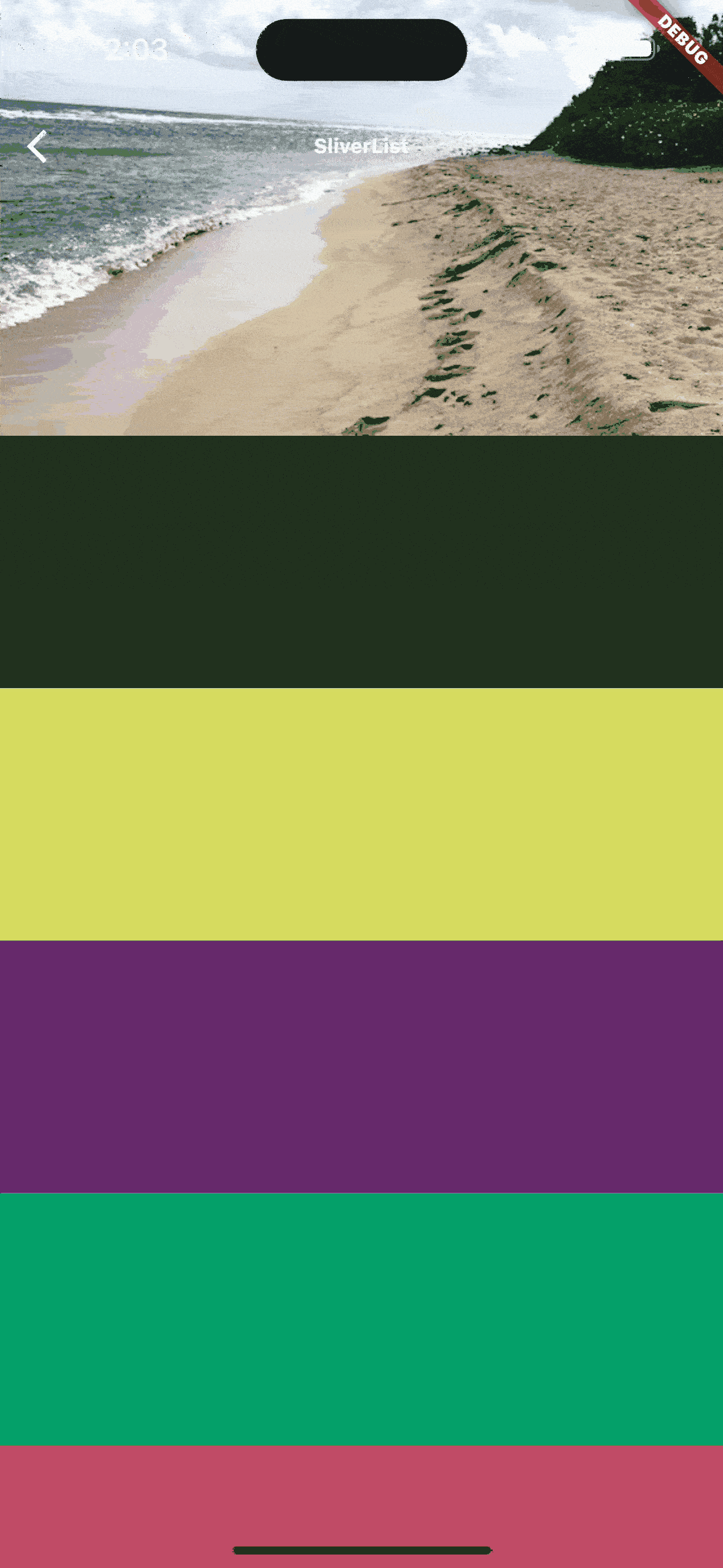
图11.SliverAppBar
当我们同时把snap和float参数设置成true的时候,向下滚动的时候,SliverAppBar自动弹回到视图中(图12)。

图13.SliverAppBar
当然你可以根据自己的需要来设置不同的参数,实现自己的AppBar动画效果。
看完这篇文章之后,你也可以结合SliverList,SliverGrid,SliverAppBar思考下文章开头的分组效果如何实现。Good luck!