作为程序员一天不写代码,不会咋样,第二天会比较生疏,所以小编也不能闲着,
3天的时间吧,搞了个羽毛球场地预约系统,看着场地预约页面比较简单,

小编下班回家,搞了2个晚上,才完善了点,解决了一些bug。
当然可能业务逻辑也有问题,毕竟是二开,简直就是搞得,爆了,无语言表啊。
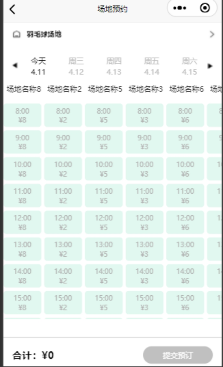
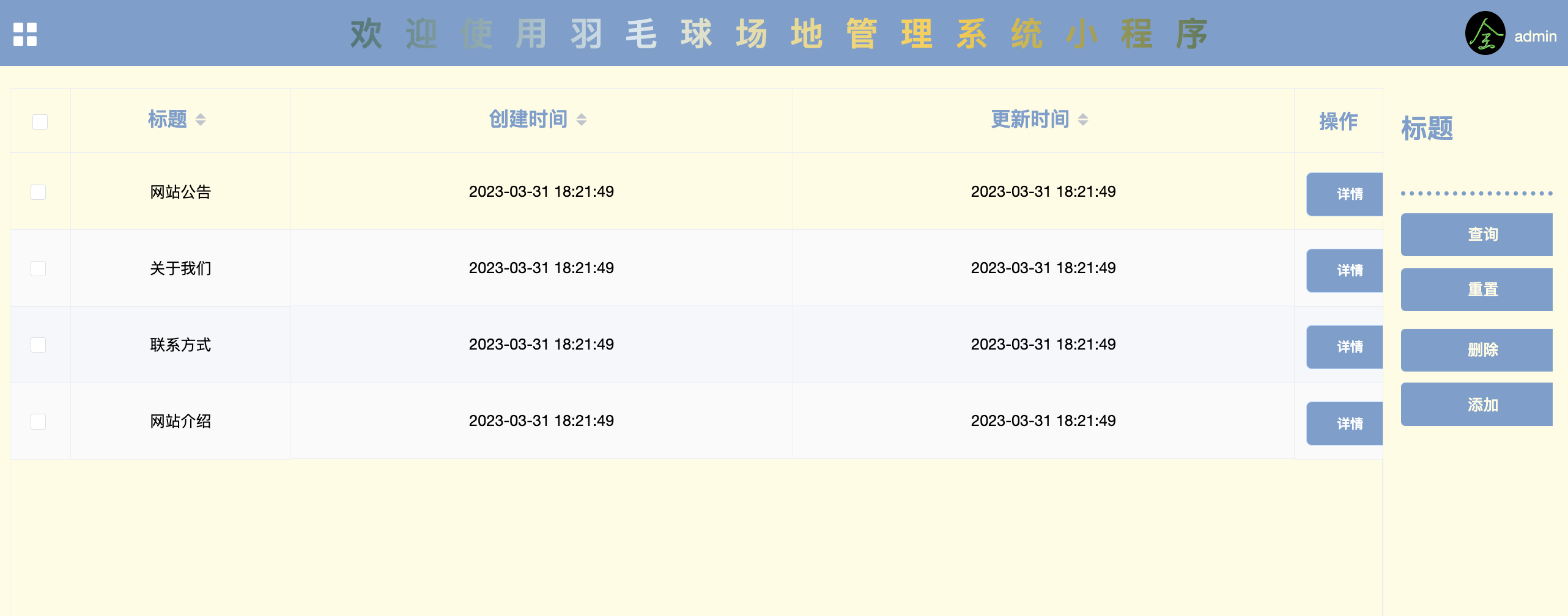
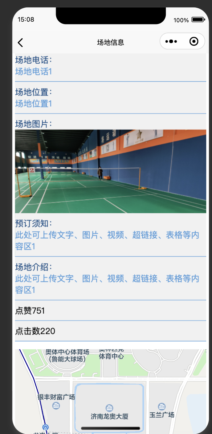
如图:场地预约
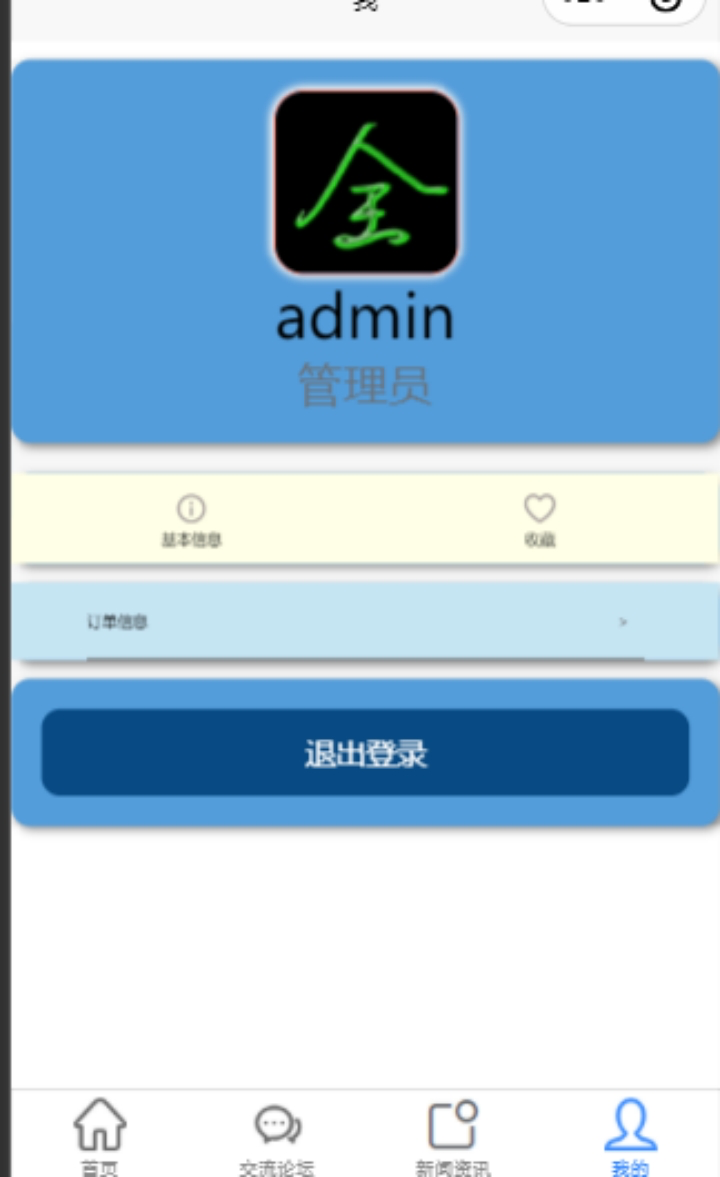
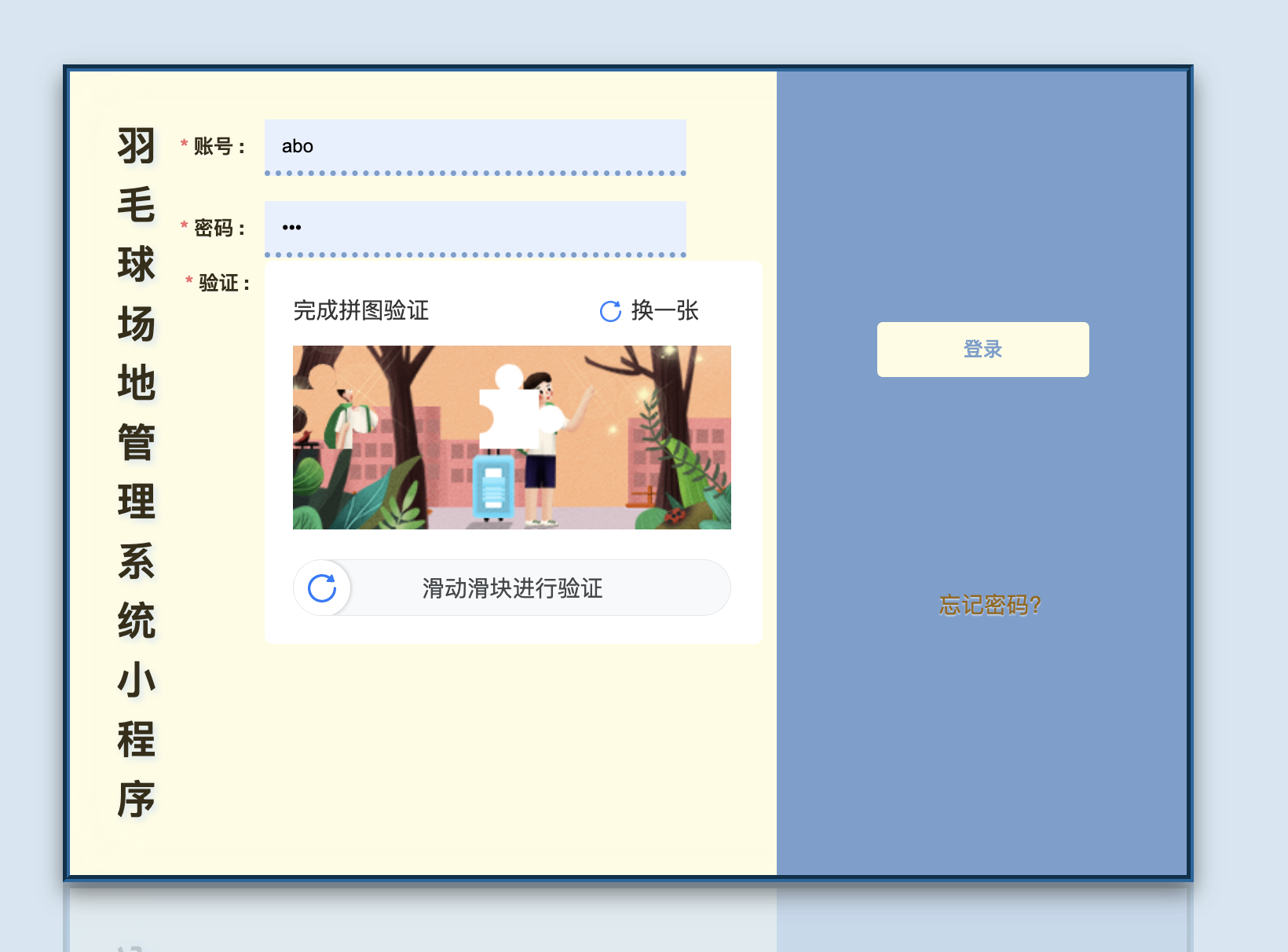
用户登录:
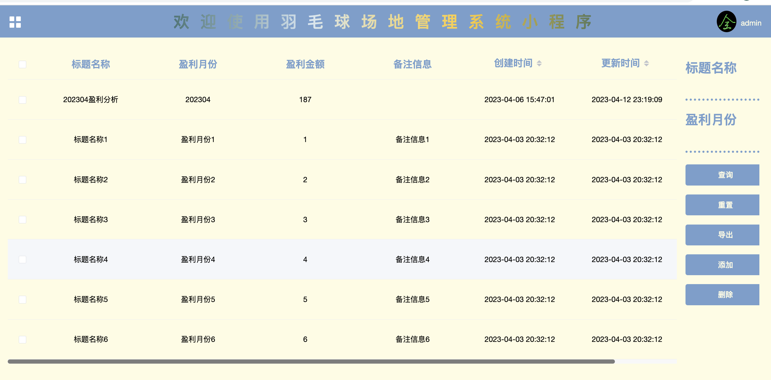
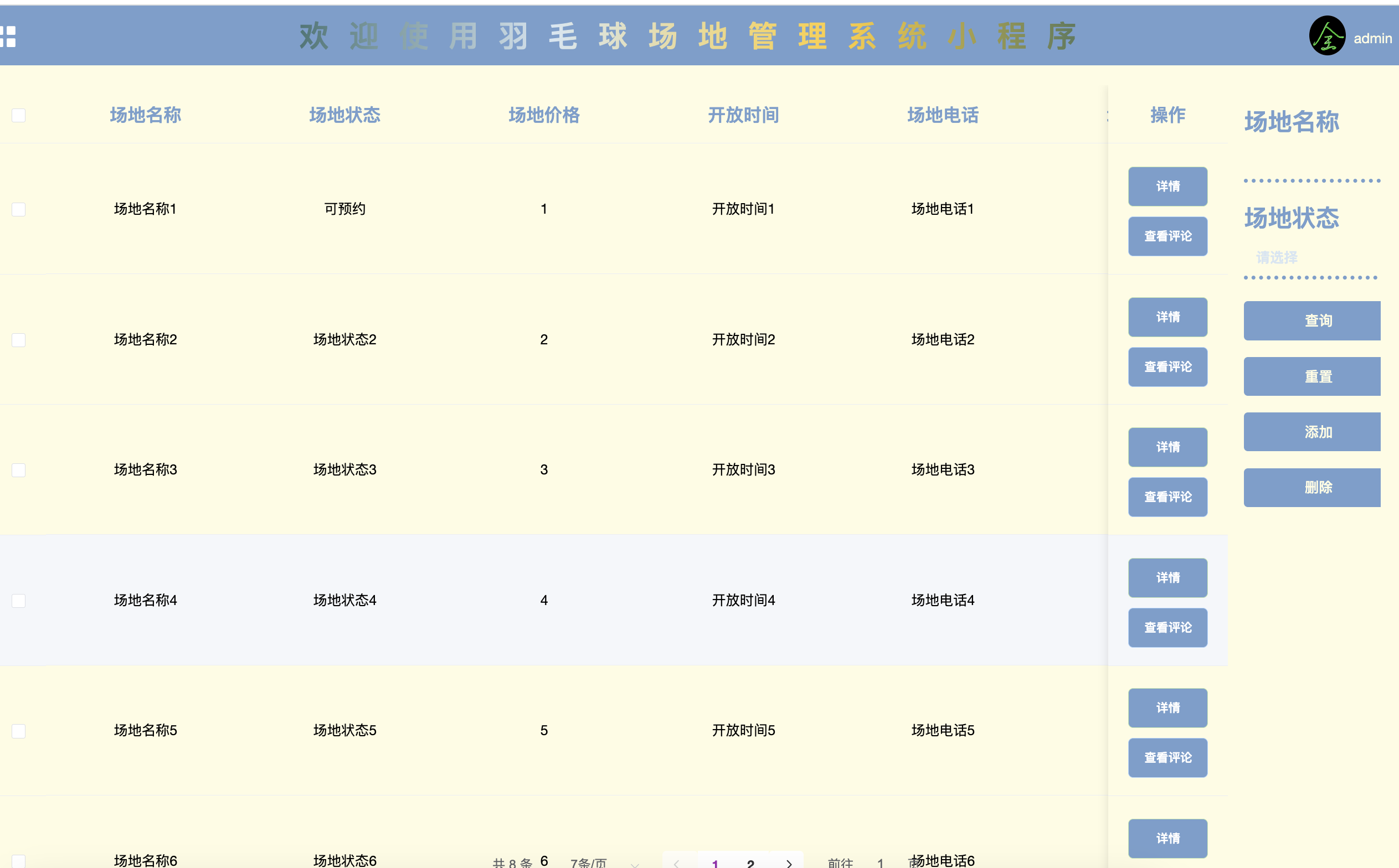
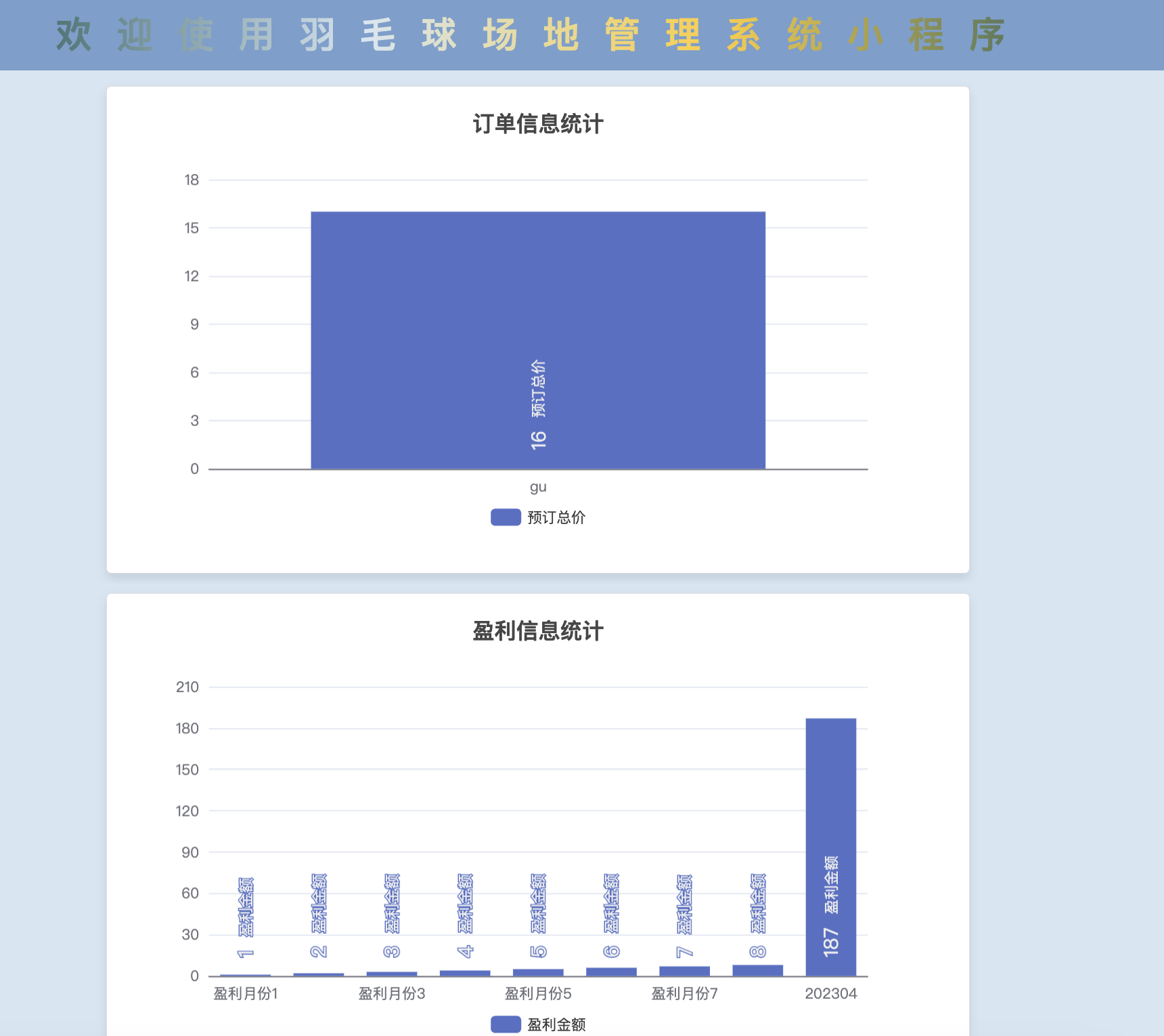
后台管理系统: 图表渲染订单数据和收益信息,
但是小编觉得还可以更美,搜罗了一下度娘,做了一下美化,对这个系统感兴趣的小伙伴,私信联系我呦!!!
还支持定制开发,需要更高级的功能,也可以单独开发。然后我们学习一下echart。

①legend:图例
legend: {


    icon: 'roundRect',// 图例的形状,带圆角的矩形(roundRect)
    itemWidth: 15,// 单个icon的width(单位px)
    itemHeight: 10,// 单个icon的height(单位px)
    itemGap: 25,// 每个icon之间的距离(单位px)
    barBorderRadius: 5,// icon的圆角(单位px)
    top: 33,// 整个图例的top
    right: 10,// 整个图例的right
    data: ['早餐(份)', '中餐(份)','晚餐(份)','就餐人数(人)'],
    textStyle: {

    // 图例的文字颜色,color为一个值时所有的文字颜色相同
        color: ["#FFC365",'#7FC5FF','#D12053','#3AC47E']
    }
}
②,③yAxis:Y轴,在yAxis数组中写多个集合则有多个Y轴
一个Y轴时,在左侧(不需要特别标注)
两个Y轴时,左右侧各一个(不需要特别标注)
2个Y轴时,通过配置 offset 属性防止同个位置多个 Y 轴的重叠
yAxis: [
    {


        type: 'value',// 坐标轴类型,数值轴(value),适用于连续数据
        nameTextStyle: {

    // 坐标轴名称的文字样式
            color: '#64A7DF'
            // 关于该坐标轴的color,fontSize,fontWeight等都在这里设置
        },
        axisLine: {

    // 坐标轴轴线相关设置
            lineStyle: {

     //轴线样式写在这个下面
                color: '#64A7DF'
            }
        },
        splitLine: {

    // 分隔线
            show: true,
            lineStyle: {


                color: '#22376d'
            },
        },
    },// 第一个Y轴(左侧)
    {


        type: 'value',
        axisLabel: {

    // 刻度标签
            formatter: '{value}'
        },
        nameTextStyle: {


            color: '#64A7DF'
        },
        axisLine: {


            lineStyle: {


                color: '#64A7DF'
            }
        },
        splitLine: {


            show: true,
            lineStyle: {


                color: '#22376d'
            },
        },
    }// 第二个Y轴(右侧)
],
④splitLine:分隔线,可以写在yAxis(Y轴)、xAxis(X轴)的数组中
写在yAxis(Y轴)里是横向的,形如 ‘三’
写在xAxis(X轴)里是纵向的,形如 ‘川’
yAxis: [
    {


        splitLine: {

     // ‘三’形分隔线
            show: true,
            lineStyle: {


                color: '#22376d'
            },
        }
    }
]
⑤xAxis:X轴
xAxis: [
    {


        type: 'category',// 类目轴,适用于离散的类目数据。为该类型时类目数据可自动从 series.data 或 dataset.source 中取,或者可通过 xAxis.data 设置类目数据。
        data: [...this.leftMiddleResult.nDate],// this.leftMiddleResult.nDate为日期的数组
        axisTick: {

    // 坐标轴刻度相关设置
            show: false //X轴默认是显示的
        },
        nameTextStyle: {

    // 坐标轴名称的文字样式
            color: '#64A7DF'
        },
        axisLine: {

    // 坐标轴轴线相关设置
            lineStyle: {


                color: '#64A7DF'
            }
        }
    }
],
⑥series.type = ‘bar’:柱状图(条形图)
series: [
    {


        name: '早餐(份)',//这个name要跟legend里的data统一
        type: 'bar',
        data: [
            this.leftMiddleResult.list[0].nBreakfast,
            this.leftMiddleResult.list[1].nBreakfast,
            this.leftMiddleResult.list[2].nBreakfast,
            this.leftMiddleResult.list[3].nBreakfast
        ],
        itemStyle: {

        // 小柱子的样式
            color: '#FFC365',
            borderRadius : [18, 18, 0 ,0]
        }
    },
    {


        name: '中餐(份)',
        type: 'bar',
        data: [
            this.leftMiddleResult.list[0].nLunch,
            this.leftMiddleResult.list[1].nLunch,
            this.leftMiddleResult.list[2].nLunch,
            this.leftMiddleResult.list[3].nLunch
        ],
        itemStyle: {

        // 小柱子的样式
            color: '#7FC5FF',
            borderRadius : [18, 18, 0 ,0]
        },
    },
    {


        name: '晚餐(份)',
        type: 'bar',
        data: [
            this.leftMiddleResult.list[0].nDinner,
            this.leftMiddleResult.list[1].nDinner,
            this.leftMiddleResult.list[2].nDinner,
            this.leftMiddleResult.list[3].nDinner
        ],
        itemStyle: {

        // 小柱子的样式
            color: '#D12053',
            borderRadius : [18, 18, 0 ,0]
        },
    },
    {


        name: '就餐人数(人)',
        type: 'bar',
        data: [
            this.leftMiddleResult.list[0].nEatPeople,
            this.leftMiddleResult.list[1].nEatPeople,
            this.leftMiddleResult.list[2].nEatPeople,
            this.leftMiddleResult.list[3].nEatPeople
        ],
        yAxisIndex: 1,// 使用的 y 轴的 index,也就是说这个bar对应的是第二条Y轴(右侧Y轴)上的高度
        itemStyle: {

        // 小柱子的样式
            color: '#3AC47E',
            borderRadius : [18, 18, 0 ,0]
        },
        barCategoryGap: '40%',  // 每一组小柱子的间距(默认为类目间距的20%),设置在最后一个这里起到了全局效果
    }
]