【微信小程序—动画工坊】动画入门
前情
需要了解的前置知识:
- 子代选择器
- 基本布局
分析
可以将任务进行一下拆分。
-
如何让小球跑动起来?
通过@keyframe创造动画函数,然后再通过animation绑定创造动画函数
@keyframe的百分比代表动画的进度,0%代表动画的起点,100%代表动画的终点,如果有多个相同的位置,可以多个时间点合并设置。
-
怎么控制动画的走向?
使用transform:translate函数
transform:translate(a,b),代表元素等会要移到距离起点位置右方a个距离和下方b个距离的位置。 -
如何控制动画的快慢?
在animation里面我们可以设置动画的周期,如果我们给的周期越短,意味着动画要完成得越快,反之同理。
animation: 6s; -
如何使动画无穷无尽地进行下去?
animation: infinite; -
如何使小球平滑地跑动起来?
在animation中添加ease属性
-
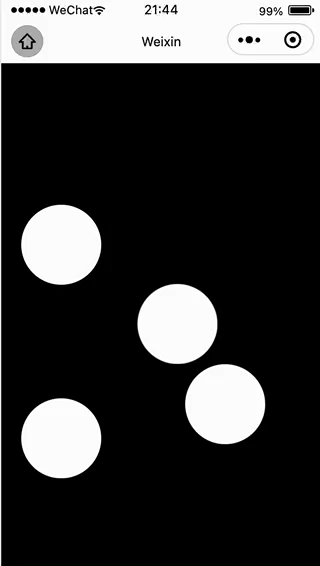
如何使得画出小球?
先画出一个正方形,然后这样子设置
border-radius: 100%;
代码文件
- wxml
<view class="container">
  <view></view>
  <view></view>
  <view></view>
  <view></view>
</view>
- css
page{
  display:flex;
  justify-content: center;
  align-items: center;
  height: 100vh;
  background-color: black;
}

.container{
  position: relative;
  width: 200px;
  height: 200px;
}

.container view{
  position: absolute;
  width: 40%;
  height: 40%;
  border-radius: 100%;
  background-color:#ffffff;
  animation: loading 6s infinite ease;
}

.container :first-child{
  animation-delay: 1.5s;
}

.container :nth-child(1){
  animation-delay: 2.0s;
}

.container :nth-child(2){
  animation-delay: 3s;
}

.container :nth-child(3){
  animation-delay: 5s;
}

@keyframes loading{
  0%,100%{
    transform: translate(0,0);
  }
  20%{
    transform: translate(100px,100px)
  }
  40%{
    transform: translate(-100px,-100px);
  }
  60%{
    transform: translate(-100px,100px);
  }
  80%{
    transform: translate(100px,-100px);
  }
}