目录
1.CSS常见布局技巧
巧妙利用一个技术更快更好的布局:
- margin 负值的运用
- 文字围绕浮动元素
- 行内块的巧妙运用
- CSS三角强化
1.margin 负值运用

边框过粗,边框都为1px 相当于1px+1px = 2px,所以中间的边框较粗。使用margin-left: -1px; 让右边的盒子向左走1px,将左边的边框遮住。
代码实现
<!DOCTYPE html>
<html lang="en">
<head>
<meta charset="UTF-8">
<meta http-equiv="X-UA-Compatible" content="IE=edge">
<meta name="viewport" content="width=device-width, initial-scale=1.0">
<title>margin负值的巧妙运用</title>
<style>
ul li {
float: left;
width: 150px;
height: 200px;
border: 1px solid red;
list-style: none;
margin-left: -1px;
}
</style>
</head>
<body>
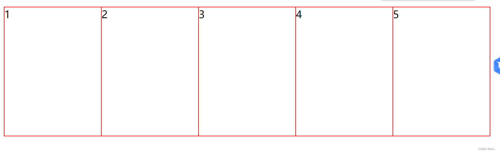
<ul>
<li>1</li>
<li>2</li>
<li>3</li>
<li>4</li>
<li>5</li>
</ul>
</body>
</html>当鼠标经过时,让其显示出不同的边框
ul li:hover {
border: 1px solid blue;
}
可是右边边框缺少。

- 让每个盒子margin 往右移动 -1px 正好压住相邻盒子边框
- 鼠标经过某个盒子的时候,提高当前盒子的层级即可(如果没有固定定位,则加相对定位(保留位置),如果有定位,则加z-index)
2.文字围绕浮动元素

巧妙运用浮动元素不会压住文字的特性。

代码实现:
<!DOCTYPE html>
<html lang="en">

<head>
    <meta charset="UTF-8">
    <meta http-equiv="X-UA-Compatible" content="IE=edge">
    <meta name="viewport" content="width=device-width, initial-scale=1.0">
    <title>文字围绕浮动元素的巧妙运用</title>
    <style>
        * {
            margin: 0;
            padding: 0;
        }

        .box {
            width: 300px;
            height: 70px;
            background-color: pink;
            margin: 0 auto;
            padding: 5px;
        }

        .pic {
            float: left;
            width: 120px;
            height: 60px;
            margin-right: 5px;
        }

        .pic img {
            width: 100%;
        }
    </style>

</head>

<body>
    <div class="box">
        <div class="pic">
            <img src="images/img.png" alt="">
        </div>
        <p>克里斯蒂亚诺罗纳尔多</p>
    </div>
</body>

</html>
3.行内块巧妙应用

代码实现:
<!DOCTYPE html>
<html lang="en">
<head>
<meta charset="UTF-8">
<meta http-equiv="X-UA-Compatible" content="IE=edge">
<meta name="viewport" content="width=device-width, initial-scale=1.0">
<title>行内块的巧妙使用</title>
<style>
* {
margin: 0;
padding: 0;
}
.box {
text-align: center;
}
.box a {
display: inline-block;
width: 36px;
height: 36px;
background-color: #f7f7f7;
border: 1px solid #ccc;
text-align: center;
line-height: 36px;
text-decoration: none;
color: #333;
}
.box .prev,
.box .next {
width: 85px;
font-size: 14px;
}
.box .current,
.box .elp {
border: none;
background-color: #fff;
}
.box input {
height: 36px;
width: 45px;
border: 1px solid #ccc;
outline: none;
}
.box button {
width: 60px;
height: 36px;
background-color: #f7f7f7;
border: 1px solid #ccc;
}
</style>
</head>
<body>
<div class="box">
<a href="#" class="prev"><<上一页</a>
<a href="#" class="current">2</a>
<a href="#">3</a>
<a href="#">4</a>
<a href="#">5</a>
<a href="#">6</a>
<a href="#" class="elp">...</a>
<a href="#" class="next">>>下一页</a> 到第
<input type="text"> 页
<button>确定</button>
</div>
</body>
</html>2.CSS三角巧妙应用
代码实现:
<!DOCTYPE html>
<html lang="en">
<head>
<meta charset="UTF-8">
<meta http-equiv="X-UA-Compatible" content="IE=edge">
<meta name="viewport" content="width=device-width, initial-scale=1.0">
<title>CSS三角强换的巧妙运用</title>
<style>
.class {
/* width: 0;
height: 0;
把上边框的宽度调大
border-top: 100px solid transparent;
border-right: 50px solid skyblue;
左边和下边的边框宽度设置为0
border-bottom: 0 solid blue;
border-left: 0 solid green; */
/* 代码简写 */
/* 1.只保留右边的边框有颜色 */
border-color: transparent red transparent transparent;
/* 2.样式都是solid */
border-style: solid;
/* 3.上边框宽度要大,有边框宽度稍小,其余的边框为0; */
border-width: 100px 50px 0 0;
}
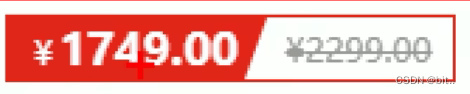
.price {
width: 160px;
height: 24px;
border: 1px solid red;
margin: 0 auto;
line-height: 24px;
}
.miaosha {
position: relative;
float: left;
width: 90px;
height: 100%;
text-align: center;
background-color: red;
color: #fff;
font-weight: 700;
margin-right: 8px;
}
.miaosha i {
position: absolute;
right: 0;
top: 0;
height: 0;
width: 0;
border-color: transparent #fff transparent transparent;
border-style: solid;
border-width: 24px 10px 0 0;
}
.origin {
font-size: 12px;
color: gray;
text-decoration: line-through;
}
</style>
</head>
<body>
<div class="class"></div>
<div class="price">
<span class="miaosha">
¥1650
<i></i>
</span>
<span class="origin">¥5650</span>
</div>
</body>
</html>3.CSS 初始化
不同浏览器对有些标签的默认值是不同的,为了消除不同的浏览器对HTML文本呈现的差异,照顾浏览器的兼容,我们需要CSS初始化
简单理解:CSS初始化是指重设浏览器的样式。(也称为CSS reset)
每个网页都必须首先进行CSS初始化。
这里我们以 京东CSS初始化代码为例。
Unicode编码字体:
把中文字体的名称用相应的Unicode编码来代替,这样就可以有效的避免浏览器解释CSS代码时候出现乱码的问题。
比如:
黑体 \9ED1\4F53
宋体 \5B8B\4F53
微软雅黑 \5FAE\8F6F\96C5\9ED1