【2022前端面试】CSS手写面试题汇总(加紧收藏)
更新时间:2022年3月3日
把答案一起写上,但是希望大家在看之前思考一下,如果有好的建议,跪求改正!
本文致力于建设前端面试题库,欢迎兄弟们投稿哈!
大纲
没标重点全是重点!
布局
1、两栏布局的实现
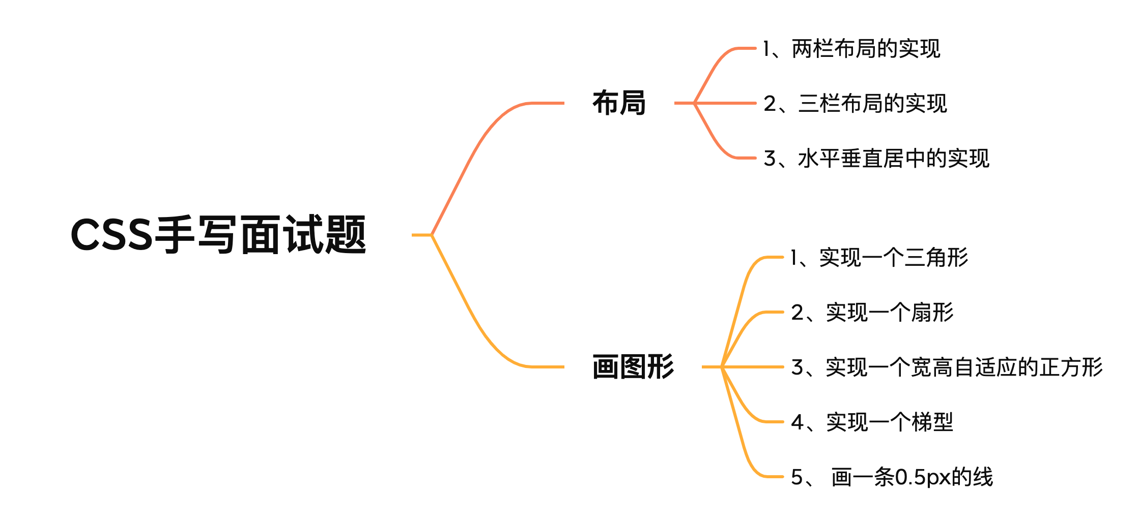
题目分析:一般两栏布局指的是左边一栏宽度固定,右边一栏宽度自适应。
float布局
方法一:
假定左边固定宽度为100px,将左边的宽度设置为100px,添加左浮动;将右边的宽度设置auto,利用margin-left空出100px,即margin-left设置为100px。
代码
.left {


  float: left;
  width: 100px;
	height: 100px;
  background: red;
}
.right {


  margin-left: 100px;
	height: 100px;
  width: auto;
  background: blue;
}
效果
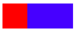

方法二:
上面的方法利用了,margin-left,让浮动的元素错位,导致视觉上是正常的。
这次可以用用BFC来解决浮动的问题。
假定左边固定宽度为100px,将左边的宽度设置为100px,添加左浮动;将右边的元素设置overflow: hidden; 这样右边就触发了BFC,BFC的区域不会与浮动元素发生重叠,所以两侧就不会发生重叠。
代码
.left {


  float: left;
  width: 100px;
	height: 100px;
  background: red;
}
.right {


	height: 100px;
  overflow: hidden;
  background: blue;
}
效果
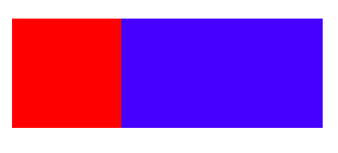
Flex布局
现在最流行的还是利用flex布局。
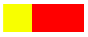
需要给两个子元素加一个父元素,在父元素上设置display: flex,将左边元素设置为固定宽度如100px,将右边的元素设置为flex:1。
为了做区分改一下颜色
代码
.father {


  display: flex;
  height: 100px;
}
.left {


  width: 100px;
  background: blue;
}
.right {


  flex: 1;
  background: yellow;
}
效果
定位
方法一:
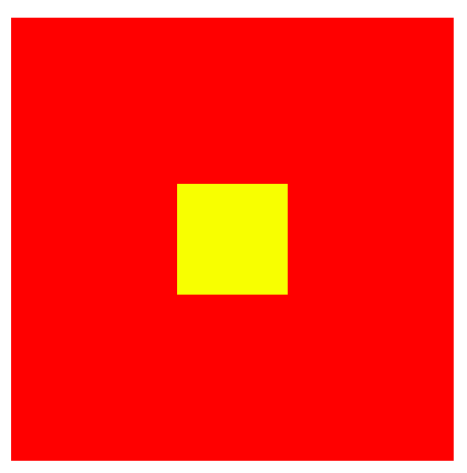
利用绝对定位,将父级元素设置为相对定位。左边元素设置为absolute定位,并且宽度设置为100px,这时左边元素会固定在左边。将右边元素的margin-left的值设置为100px。
代码
.father {


  position: relative;
  height: 100px;
}
.left {


  position: absolute;
  width: 100px;
  height: 100px;
  background: tomato;
}
.right {


  margin-left: 100px;
	height: 100px;
  background: black;
}
效果

方法二:
利用绝对定位,将父级元素设置为相对定位。左边元素宽度设置为100px,这次将右边元素设置为绝对定位,将左边被占的地方空出来。
.father {


  position: relative;
  height: 100px;
}
.left {


  width: 100px;
	height:100px;
  background: yellow;
}
.right {


  position: absolute;
	height:100px;
  top: 0;
  right: 0;
  bottom: 0;
  left: 100px;
  background: red;
}
效果
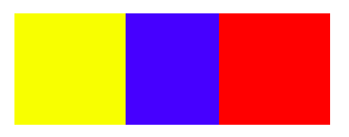
2、三栏布局的实现
题目分析:三栏布局一般指的是页面中一共有三栏,左右两栏宽度固定,中间自适应的布局
定位
利用绝对定位,左右两栏设置为绝对定位,中间设置对应方向大小的margin的值。
代码
.father {


  position: relative;
  height: 100px;
}

.left {


  position: absolute;
  width: 100px;
  height: 100px;
  background: red;
}

.right {


  position: absolute;
  right: 0;
	top: 0;
  width: 100px;
  height: 100px;
  background: blue;
}

.center {


  margin-left: 100px;
  margin-right: 100px;
  height: 100px;
  background: lightgreen;
}
效果
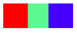
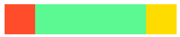
Flex布局
利用flex布局,左右两栏设置固定大小,中间一栏设置为flex:1。
代码
.father {


  display: flex;
  height: 100px;
}

.left {


  width: 100px;
  background: blue;
}

.right {


  width: 100px;
  background: red;
}

.center {


  flex: 1;
  background: lightgreen;
}
效果
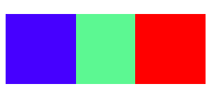
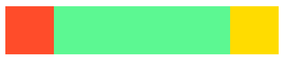
float布局
利用浮动,左右两栏设置固定大小,并设置对应方向的浮动。中间一栏设置左右两个方向的margin值。
注意这种方式,中间一栏的dom必须放到最后。优先设置浮动!
代码
.father {


  height: 100px;
}

.left {


  float: left;
  width: 100px;
  height: 100px;
  background: yellow;
}

.right {


  float: right;
  width: 100px;
  height: 100px;
  background: gold;
}

.center {


  height: 100px;
  margin-left: 100px;
  margin-right: 100px;
  background: blue;
}
效果
圣杯布局
利用浮动和负边距来实现。
说实话,整的有点绕
父级元素设置左右的 padding,三列均设置向左浮动,中间一列放在最前面,宽度设置为父级元素的宽度,因此后面两列都被挤到了下一行,通过设置 margin 负值将其移动到上一行,再利用相对定位,定位到两边。
代码
.father {


  height: 100px;
	padding-left: 100px;
	padding-right: 100px;
}

.left {


  float: left;
	margin-left: -100%;
	position: relative;
	left: -100px;
  width: 100px;
  height: 100px;
  background: tomato;
}

.right {


	position: relative;
	right: -100px;
  float: left;
	margin-left: -100px;
  width: 100px;
  height: 100px;
  background: gold;
}

.center {


  float: left;

  width: 100%;
  height: 100px;
  background: lightgreen;
}
效果
双飞翼布局
双飞翼布局,双飞翼布局相对于圣杯布局来说,左右位置的保留是通过中间列的 margin 值来实现的,而不是通过父元素的 padding 来实现的。
注意要在center元素外包一层,以便使用margin留出占位。
代码
.father {


  height: 100px;
}

.left {


  float: left;
  margin-left: -100%;
  width: 100px;
  height: 100px;
  background: tomato;
}

.right {


  float: left;
  margin-left: -100px;
  width: 100px;
  height: 100px;
  background: gold;
}

.wrapper {


  float: left;
  width: 100%;
  height: 100px;
  background: lightgreen;
}

.center {


  margin-left: 100px;
  margin-right: 100px;
  height: 100px;
}
效果
3、水平垂直居中的实现
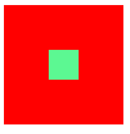
绝对定位
方法一
利用绝对定位,先将元素的左上角通过top:50%和left:50%定位到页面的中心,然后再通过translate来调整元素的中心点到页面的中心。
代码
.parent {


	position: relative;
	width: 400px;
	height: 400px;
	background: red;
}

.child {


	position: absolute;
	background: lightgreen;
	width: 100px;
	height: 100px;
	left: 50%;
	top: 50%;
	transform: translate(-50%,-50%);
}
效果
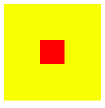
方法二
利用绝对定位,设置四个方向的值都为0,并将margin设置为auto,由于宽高固定,因此对应方向实现平分,可以实现水平和垂直方向上的居中。
该方法适用于盒子有宽高的情况
代码
.parent {


  position: relative;
	width: 400px;
	height: 400px;
	background: yellow;
}

.child {


  position: absolute;
	width: 100px;
	height: 100px;
	background: red;
    top: 0;
    bottom: 0;
    left: 0;
    right: 0;
    margin: auto;
}
效果
方法三
利用绝对定位,先将元素的左上角通过top:50%和left:50%定位到页面的中心,然后再通过margin负值来调整元素的中心点到页面的中心。
该方法适用于盒子宽高已知的情况
代码
.parent {


  position: relative;
	width: 400px;
	height: 400px;
	background: red;
}

.child {


  position: absolute;
	width: 100px;
	height: 100px;
	background: yellow;
    top: 50%;
    left: 50%;
    margin-top: -50px;
    margin-left: -50px;
}
效果
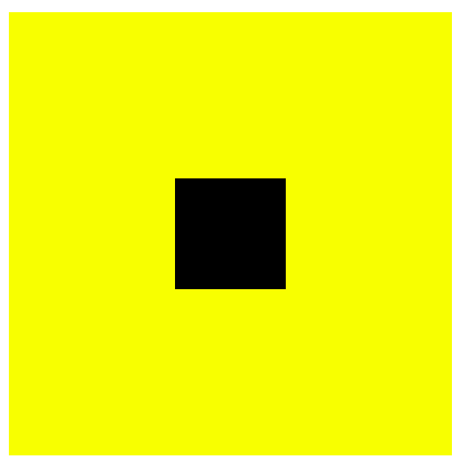
Flex布局
使用flex布局,通过align-items:center和justify-content:center设置容器的垂直和水平方向上为居中对齐,其子元素可以实现垂直和水平的居中。
代码
.parent {


  display: flex;
  justify-content:center;
  align-items:center;
	width: 400px;
	height: 400px;
	background: yellow;
}

.child {


	width: 100px;
	height: 100px;
	background: black;
}
效果
画图形
画图形绝对是CSS手写题中最常见的了
1、实现一个三角形
一个有趣的现象,将width和height设置为0。再设置border。
代码
div {


    width: 0;
    height: 0;
    border: 100px solid;
    border-color: orange blue red green;
}
效果
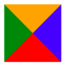
发现出现了很多三角形,其实这些三角形就是border
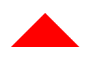
利用border画一个红色的三角形
div {


	width: 0;
	height: 0;
	border-bottom: 50px solid red;
	border-right: 50px solid transparent;
	border-left: 50px solid transparent;
}
效果
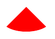
2、实现一个扇形
在画一个三角形的基础上,加上圆角样式,border-radius: 100%;
代码
div {


	width: 0;
	height: 0;
	border-bottom: 50px solid red;
	border-right: 50px solid transparent;
	border-left: 50px solid transparent;
	border-radius: 100%;
}
3、实现一个宽高自适应的正方形
1、利用vw来实现
代码
div {


  width: 10%;
  height: 10vw;
  background: black;
}
效果

2、利用元素的margin/padding百分比是相对父元素width的性质来实现
代码
div {


  width: 20%;
  height: 0;
  padding-top: 20%;
  background: red;
}
效果
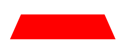
4、实现一个梯型
用伪元素来生成一个矩形
代码
.tab {


    width: 300px;
    height: 80px;
    position: relative;
    margin: 100px auto;
    font-size: 60px;
    text-align: center;
}

.tab::before {


    content: '';
    position: absolute;
    top: 0; right: 0; bottom: 0; left: 0;
    z-index: -1;
    background: red;
    transform: perspective(.5em) rotateX(5deg);
}
效果
5、 画一条0.5px的线
- 采用transform: scale()的方式,该方法用来定义元素的2D 缩放转换:
transform: scale(0.5,0.5);
- 采用meta viewport的方式
<meta name="viewport" content="width=device-width, initial-scale=0.5, minimum-scale=0.5, maximum-scale=0.5"/>
这样就能缩放到原来的0.5倍,如果是1px那么就会变成0.5px。viewport只针对于移动端,只在移动端上才能看到效果
系列文章
博客说明与致谢
文章所涉及的部分资料来自互联网整理,其中包含自己个人的总结和看法,分享的目的在于共建社区和巩固自己。
引用的资料如有侵权,请联系本人删除!
如果你感觉对你有帮助的话,不妨给我点赞鼓励一下,好文记得收藏哟!关注我一起成长!
所属专栏:前端面试
幸好我在,感谢你来!