背景:近期H5项目有个UI需求,单行文本超长时,超出的部分...省略且有一个查看的图标;否则正常展示。
在此背景下了总结下文本溢出的几种实现方式。
1、单行文本溢出【纯css】
效果:
<!--html-->
<div class="text-ellipsis">一些随机文字,一二三四五六七八九十。超长测试文本1234567890。</div>

<!--css-->
.text-ellipsis {
  width: 200px;
  white-space: nowrap;
  overflow: hidden;
  text-overflow: ellipsis;
}
2、多行文本溢出【纯css】
效果:

<!--html-->
<div class="text-ellipsis-two">一些随机文字,一二三四五六七八九十。超长测试文本1234567890。</div>

<!--css-->
.text-ellipsis-two {
  width: 200px;
  overflow: hidden;
  text-overflow: ellipsis;
  display: -webkit-box;
  -webkit-line-clamp: 2;
  -webkit-box-orient: vertical;
}看效果已实现,但略一思索-webkit-前缀,怕不是有兼容性问题。如你所想,它有。需要兼容IE的童鞋,请彻底放弃这种写法,具体参见caniuse。
单纯的依靠CSS想要定制多行文本溢出展示有难度,有没有封装好的组件直接用,于是就有了第三种实现方式。
3、HeyUI组件库:TextEllipsis 超出文本省略
效果:

<!--html-->
<!--例一-->
<TextEllipsis :text="txt1" :height="50" v-width="200">
  <template slot="more">...</template>
</TextEllipsis>

<!--例二-->
<TextEllipsis :text="txt1" :height="50" v-width="200" :isLimitHeight="isLimitH" >
  <template slot="more"><span>...</span><span @click="isLimitH=false">查看更多</span></template>
  <span slot="after" v-if="!isLimitH" @click="isLimitH=true">收起</span>
</TextEllipsis>

<!--data-->
txt1: '一些随机文字,一二三四五六七八九十。超长测试文本1234567890。',
isLimitH: true
例一即可实现方式二中的效果。
例二中自定义更多,文本超长时,溢出部分...省略,且展示查看更多按钮;点击查看更多,超长文本全部展示且有收起按钮,点击收起按钮,回到...状态。文本未超长时,正常展示。
挑战部分,Vue项目怎么写一个类似组件?来往下看,方式四来了。
4、仿HeyUI的TextEllipsis组件【Vue+CSS+JS】
效果:

// 父组件
<!--template-->
<textE :text="txt1" :height="50" v-width="200">
  <template slot="more">...</template>
</textE>

<textE :text="txt2" :height="50" v-width="200">
  <template slot="more">...</template>
</textE>

<textE :text="txt1" :height="50" v-width="200" :isLimitHeight="isLimitHeight">
  <template slot="more"><span>...</span><span class="link" @click="isLimitHeight=false">查看更多</span></template>
  <span slot="after" class="link" v-if="!isLimitHeight" @click="isLimitHeight=true">收起</span>
</textE>

<!--script-->
import textE from './textellipsisComponent'
export default {
  components: {textE},
  data () {
    return {
      isLimitHeight: true,
      txt1: '一些随机文字,一二三四五六七八九十。超长测试文本1234567890。',
      txt2: '111'
    }
  }
}
// 子组件 textellipsisComponent.vue
<template>
<div>
<span>
<span class="limit-text">{
{text}}</span><!--
--><span class="more"><slot name="more"></slot></span><!--
--><slot name="after"></slot>
</span>
</div>
</template>
<script>
export default {
inheritAttrs: false,
props: {
height: Number,
text: String,
isLimitHeight: {
type: Boolean,
default: true
}
},
data () {
return {
}
},
watch: {
text () {
this.init()
},
isLimitHeight () {
this.init()
}
},
mounted () {
this.init()
},
methods: {
init () {
let title = this.$el
let textDom = this.$el.querySelector('.limit-text')
let more = this.$el.querySelector('.more')
more.style.display = 'none'
this.$nextTick(() => {
if (this.isLimitHeight) {
if (title.scrollHeight > this.height) {
more.style.display = 'inline-block'
let text = this.text
let n = 1000
while (title.scrollHeight > this.height && n > 0) {
if (title.scrollHeight > this.height * 3) {
textDom.innerText = text = text.substring(0, Math.floor(text.length / 2))
} else {
textDom.innerText = text = text.substring(0, text.length - 1)
}
n--
}
}
} else {
textDom.innerText = this.text
}
})
}
}
}
</script>
<style scoped>
</style>
核心逻辑是:计算节点的scrollHeight和预期高度height进行比较,做相应处理。
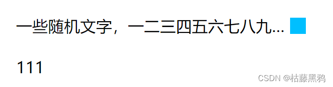
5、跟着element-ui实现单行文本溢出【Vue+CSS+JS】
table中单元格有个show-overflow-tooltip属性,作用是当内容过长被隐藏时显示 tooltip。此组件仅支持单行文本,且超出部分省略仅支持...,不支持自定义。
效果:
// 父组件
<!--template-->
<tooltips :txt="txt1" showOverflow></tooltips>
<tooltips :txt="txt2" showOverflow></tooltips>

<!--script-->
import tooltips from './tooltips'
export default {
  components: {tooltips},
  data () {
    return {
      txt1: '一些随机文字,一二三四五六七八九十。超长测试文本1234567890。',
      txt2: '111'
    }
  }
}
// 子组件 tooltips.vue
<template>
<div>
<div class="flex">
<div ref="cell" class="cell">{
{txt}}</div>
<div class="img" v-show="showFlag"></div>
</div>
</div>
</template>
<script>
export default {
props: {
txt: String, // 超长字符串
showOverflow: { // 当内容过长被隐藏时显示tip
type: Boolean,
default: false
}
},
data () {
return {
showFlag: false
}
},
watch: {
txt (val) {
if (!val || !this.showOverflow) return
this.$nextTick(() => {
this.calcTextWidth()
})
}
},
mounted () {
if (this.showOverflow) {
this.$nextTick(() => {
this.calcTextWidth()
})
}
},
methods: {
calcTextWidth () {
const cellNode = this.$el.querySelector('.cell')
const range = document.createRange()
range.setStart(cellNode, 0)
range.setEnd(cellNode, cellNode.childNodes.length)
const rangeWidth = range.getBoundingClientRect().width
let computed = document.defaultView.getComputedStyle(cellNode, '')
let paddingLeft = parseInt(computed['paddingLeft']) || 0 // computed['paddingLeft']结果是:'10px'
let paddingRight = parseInt(computed['paddingRight']) || 0 // computed['paddingLeft']结果是:'4px'
const padding = paddingLeft + paddingRight
// Element.offsetWidth属性返回一个整数,表示元素的 CSS 水平宽度(单位像素),包括元素本身的高度、padding 和 border,以及垂直滚动条的宽度(如果存在滚动条)
// Element.scrollWidth 属性返回一个整数值(小数会四舍五入),表示当前元素的总宽度(单位像素),包括溢出容器、当前不可见的部分。它包括padding,但是不包括border、margin以及水平滚动条的宽度(如果有垂直滚动条的话),还包括伪元素(::before或::after)的宽度。
if (rangeWidth + padding > cellNode.offsetWidth || cellNode.scrollWidth > cellNode.offsetWidth) {
this.showFlag = true
} else {
this.showFlag = false
}
}
}
}
</script>
<style scoped>
.flex {
width: 300px;
display: flex;
flex-direction: row;
align-items: center;
}
.cell {
overflow: hidden;
text-overflow: ellipsis;
white-space: nowrap;
padding-left: 10px;
padding-right: 4px;
flex: 1;
}
.img {
width: 16px;
height: 16px;
background-color: deepskyblue;
}
</style>
The end