封装一个方法:
import seaborn as sns
import matplotlib.pyplot as plt
import numpy as np
from matplotlib import gridspec

class SeabornFig2Grid():

    def __init__(self, seaborngrid, fig,  subplot_spec):
        self.fig = fig
        self.sg = seaborngrid
        self.subplot = subplot_spec
        if isinstance(self.sg, sns.axisgrid.FacetGrid) or \
            isinstance(self.sg, sns.axisgrid.PairGrid):
            self._movegrid()
        elif isinstance(self.sg, sns.axisgrid.JointGrid):
            self._movejointgrid()
        self._finalize()

    def _movegrid(self):
        """ Move PairGrid or Facetgrid """
        self._resize()
        n = self.sg.axes.shape[0]
        m = self.sg.axes.shape[1]
        self.subgrid = gridspec.GridSpecFromSubplotSpec(n,m, subplot_spec=self.subplot)
        for i in range(n):
            for j in range(m):
                self._moveaxes(self.sg.axes[i,j], self.subgrid[i,j])

    def _movejointgrid(self):
        """ Move Jointgrid """
        h= self.sg.ax_joint.get_position().height
        h2= self.sg.ax_marg_x.get_position().height
        r = int(np.round(h/h2))
        self._resize()
        self.subgrid = gridspec.GridSpecFromSubplotSpec(r+1,r+1, subplot_spec=self.subplot)

        self._moveaxes(self.sg.ax_joint, self.subgrid[1:, :-1])
        self._moveaxes(self.sg.ax_marg_x, self.subgrid[0, :-1])
        self._moveaxes(self.sg.ax_marg_y, self.subgrid[1:, -1])

    def _moveaxes(self, ax, gs):
        #https://stackoverflow.com/a/46906599/4124317
        ax.remove()
        ax.figure=self.fig
        self.fig.axes.append(ax)
        self.fig.add_axes(ax)
        ax._subplotspec = gs
        ax.set_position(gs.get_position(self.fig))
        ax.set_subplotspec(gs)

    def _finalize(self):
        plt.close(self.sg.fig)
        self.fig.canvas.mpl_connect("resize_event", self._resize)
        self.fig.canvas.draw()

    def _resize(self, evt=None):
        self.sg.fig.set_size_inches(self.fig.get_size_inches())
调用:
g0 = sns.jointplot(x = data_MH[data_MH.columns[2]], y = data_MH[data_MH.columns[3]],color='#1E90FF',kind="hex")
g1 = sns.jointplot(x = data_reject[data_reject.columns[2]], y = data_reject[data_reject.columns[3]],color='#1E90FF',kind="hex")
g2 = sns.jointplot(x = data_PMC[data_PMC.columns[2]], y = data_PMC[data_PMC.columns[3]],color='#1E90FF',kind="hex")

fig = plt.figure(figsize=(16,16))
gs = gridspec.GridSpec(2, 2)
mg0 = SeabornFig2Grid(g0, fig, gs[0])
mg1 = SeabornFig2Grid(g1, fig, gs[1])
mg2 = SeabornFig2Grid(g2, fig, gs[2])
plt.show()
效果:

修改每个子图的坐标轴:
g0.ax_joint.set_xticklabels()
g0.ax_joint.tick_params()
g0.ax_joint.set_xlim()
修改每个子图中分布画在框内外:
ax=g.ax_joint 画框里
ax=g.ax_marg_x 画框外
import matplotlib.pyplot as plt
import seaborn as sns

g = sns.JointGrid()
sns.kdeplot(x1, x2, cmap="Reds",
        shade=False, shade_lowest=False, ax=g.ax_joint)
sns.kdeplot(x3, x4, cmap="Blues",
        shade=False, shade_lowest=False, ax=g.ax_joint)
sns.distplot(x1, kde=True, hist=False, color="r", ax=g.ax_marg_x)
sns.distplot(x3, kde=True, hist=False, color="b", ax=g.ax_marg_x)
sns.distplot(x2, kde=True, hist=False, color="r", ax=g.ax_marg_y, vertical=True)
sns.distplot(x4, kde=True, hist=False, color="b", ax=g.ax_marg_y, vertical=True)
plt.show()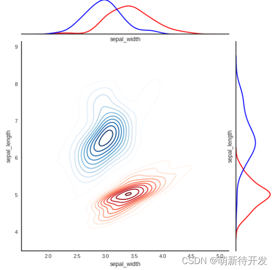
参考: