Android常用控件介绍及使用
控件
TextView 显示文字,相当于Panel
ImageView 显示图片
EditText 输入框,可编辑,可设置软键盘方式
Button 按钮,可附带图片
CheckBox 复选框
RadioButton 单选按钮(和 RadioGroup 配合使用)按用途分类:
文本控件
– TextView
– EditText
按钮控件
– Button
– ImageButton
状态开关按钮
– ToggleButton
单选与复选按钮
– CheckBox和RadioButton
图片控件
– ImageView
时钟控件
– AnalogClock
– DigitalClock日期与时间选择控件
– DatePicker
– TimePicker
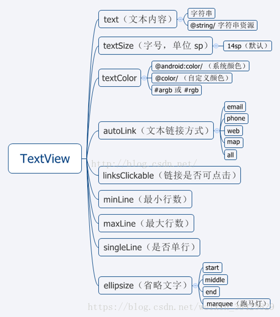
1. Textview
显示文字,相当于Panel。一般用来文本展示,继承自android.view.View,在android.widget包中。
<TextView

//控件id
android:id = "@+id/xxx"  @+id/xxx表示新增控件命名为xxx

//宽度与高度
android:layout_width="wrap_content"  //wrap_content或者match_parent
android:layout_height="wrap_content"  //wrap_content或者match_parent

//文本文字
android:text="@string/hello_world" //两种方式,直接具体文本或者引用values下面的string.xml里面的元素

//字体大小
android:textSize="24sp"  //以sp为单位

//字体颜色
android:textColor="#0000FF"  //RGB颜色

//字体格式
android:textStyle="normal"  //normal,bold,italic分别为正常,加粗以及斜体,默认为normal

//文本显示位置
android:gravity="center"  //来指定文字的对齐方式,可选值有 top、bottom、left、right、center 等

//是否只在一行内显示全部内容
android:singleLine="true"  //true或者false,默认为false
2. EditText
输入框,可编辑,可设置软键盘方式。继承自android.widget.TextView,在android.widget包中。
//控件id
android:id = "@+id/xxx"  @+id/xxx表示新增控件命名为xxx

//宽度与高度
android:layout_width="wrap_content"  //wrap_content或者match_parent
android:layout_height="wrap_content"  //wrap_content或者match_parent

//文本文字
android:text="@string/hello_world" //两种方式,直接具体文本或者引用values下面的string.xml里面的元素

//文本提示内容
android:hint="hello_world" //android:text和android:hint区别是后者只是提示作用,真正需要输入的时候提示的内容会消失

//字体大小
android:textSize="24sp"  //以sp为单位

//字体颜色
android:textColor="#0000FF"  //RGB颜色

//字体格式
android:textStyle="normal"  //normal,bold,italic分别为正常,加粗以及斜体,默认为normal

//文本显示位置
android:gravity="center"  //来指定文字的对齐方式,可选值有 top、bottom、left、right、center 等

//是否只在一行内显示全部内容
android:singleLine="true"  //true或者false,默认为false

//输入内容设置为password类型
android:password="true"  //输入的内容会变成······

//输入内容设置为phoneNumber类型
android:phoneNumber="true"  //只能输入数字

//设定光标为显示/隐藏
android:cursorVisible = "false" //true或者false,默认为true显示
在Activity中的简单用法
public class MainActivity extends Activity {
    //声明一个EditText
    private EditText edittext;
    @Override
    protected void onCreate(Bundle savedInstanceState) {
        super.onCreate(savedInstanceState);
        //给当前的活动加载一个布局
        setContentView(R.layout.activity_main);
        //初始化edittext
        edittext=(EditText) findViewById(R.id.edit_text);
    }

...
...
    //在方法中调用给edittext赋值
    edittext.setText("success");
...
...
}
3. Button
Button是最常用的按钮,继承自android.widget.TextView,在android.widget包中。他的常用子类CheckBox,RadioButton, ToggleButton
<Button

//控件id
android:id = "@+id/xxx"  @+id/xxx表示新增控件命名为xxx

//宽度与高度
android:layout_width="wrap_content"  //wrap_content或者match_parent
android:layout_height="wrap_content"  //wrap_content或者match_parent

//按钮上显示的文字
android:text="theButton" //两种方式,直接具体文本或者引用values下面的string.xml里面的元素@string/button

//按钮字体大小
android:textSize="24sp"  //以sp为单位

//字体颜色
android:textColor="#0000FF"  //RGB颜色

//字体格式
android:textStyle="normal"  //normal,bold,italic分别为正常,加粗以及斜体,默认为normal

//是否只在一行内显示全部内容
android:singleLine="true"  //true或者false,默认为false
我们需要在Activity中为Button的点击事件注册一个监听器,以下介绍两种方式来实现按钮监听事件,更多方法可以参考下Android的按钮单击事件及监听器的实现方式
1.通过匿名内部类作为事件监听器类,这种方法适用于事件监听器只是临时使用一次,因为大部分时候,事件处理器都没有什么利用价值(可利用代码通常都被抽象成了业务逻辑方法),这是一种使用最广泛的方法:
public class MainActivity extends Activity {
    private EditText edittext;
    private Button button;
    @Override
    protected void onCreate(Bundle savedInstanceState) {
        super.onCreate(savedInstanceState);
        setContentView(R.layout.activity_main);
        edittext=(EditText) findViewById(R.id.edit_text);
        button = (Button) findViewById(R.id.button);
        //为button按钮注册监听器,并通过匿名内部类实现
        button.setOnClickListener(new OnClickListener() {
            @Override
            public void onClick(View v) {
            //点击Button会改变edittext的文字为"点击了Button"
            edittext.setText("点击了Button");
            }
        });
    }
}
2.使用实现接口的方式来进行注册,让Activity类实现了OnClickListener事件监听接口,从而可以在该Activity类中直接定义事件处理器方法:onClick(view v),当为某个组件添加该事件监听器对象时,直接使用this作为事件监听器对象即可:
public class MainActivity extends Activity implements OnClickListener {
    private EditText edittext;
    private Button button;
    private Button button2;

    @Override
    protected void onCreate(Bundle savedInstanceState) {
        super.onCreate(savedInstanceState);
        setContentView(R.layout.activity_main);
        edittext=(EditText) findViewById(R.id.edit_text);
        button = (Button) findViewById(R.id.button);
        button2 = (Button) findViewById(R.id.button2);
        button.setOnClickListener(this);
        button2.setOnClickListener(this);
    }

    @Override
    //用switch区分是哪个id
    public void onClick(View v) {
        switch (v.getId()){
        case R.id.button:
            edittext.setText("点击了Button");
            break;
        case R.id.button2:
            edittext.setText("点击了Button2");
            break;
        }
    }
}
4.ImageButton
ImageButton继承自ImageView类,与Button之间的最大区别在于ImageButton中没有text属性。ImageButton控件中设置按钮中显示的图片可以通过android:src属性来设置。也可以通过setImageResource(int)来设置。
<ImageButton
//控件id
android:id = "@+id/xxx" @+id/xxx表示新增控件命名为xxx
//宽度与高度
android:layout_width="wrap_content" //wrap_content或者match_parent
android:layout_height="wrap_content" //wrap_content或者match_parent
//此外,可以具体设置高度和宽度显示的像素,不过这样设置如果图片尺寸大于设置的显示的尺寸,则图片是显示不全的,这是可以配合android:scaleType属性。
android:layout_width="200dp"
android:layout_height="200dp"
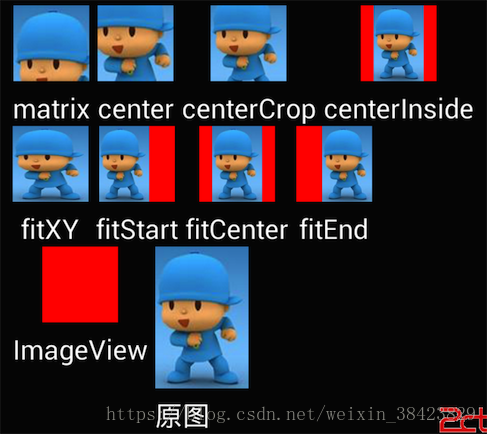
//把原图按照指定的大小在View中显示,拉伸显示图片,不保持原比例,填满ImageButton.
android:scaleType="fitXY"
//其他的关于android:scaleType的参数解释,也可以参考下面的直观图
//android:scaleType="center" 在视图中心显示图片,并且不缩放图片
//android:scaleType="centercrop" 按比例缩放图片,使得图片长 (宽)的大于等于视图的相应维度
//android:scaleType="centerinside" 按比例缩放图片,使得图片长 (宽)的小于等于视图的相应维度
//android:scaleType="fitcenter" 按比例缩放图片到视图的最小边,居中显示
//android:scaleType="fitend" 按比例缩放图片到视图的最小边,显示在视图的下部分位置
//android:scaleType="fitstart" 把图片按比例扩大/缩小到视图的最小边,显示在视图的上部分位置
//android:scaleType="matrix" 用矩阵来绘制
//图片来源,需要将图片复制放到res/drawable文件夹里面,引用的时候不需要写图片的后缀
android:src ="@drawable/beautiful">
5.Checkbox和RadioButton
android.widget. RadioButton单选按钮,继承自android.widget.CompoundButton,在android.widget包中
单选按钮要声明在RadioGroup,RadioGroup是流式布局android.widget.LinearLayout的子类。
单选按钮状态更改的监听,是要给他的RadioGroup添加:
setOnCheckedChangeListener(RadioGroup.OnCheckedChangeListener)监听器。
注意监听器类型和CheckBox是不一样的。
<RadioGroup
        android:id="@+id/radio_group"
        android:layout_width="wrap_content"
        android:layout_height="wrap_content"
        //设置RadioButton的排列方式,分为水平排列horizontal与垂直排列vertical
        android:orientation="horizontal" >
           <RadioButton
               android:id="@+id/rd1"
               android:layout_width="wrap_content"
               android:layout_height="wrap_content"
               //设置单选后紧跟的文本提示文字
               android:text="北京"
               //设置文字的大小
               android:textSize="30sp"
               //设置文字的颜色
               android:textColor="#0000FF"
               //字体格式
               android:textStyle="normal"  //normal,bold,italic分别为正常,加粗以及斜体,默认为normal
                />
           <RadioButton
               android:id="@+id/rd2"
               android:layout_width="wrap_content"
               android:layout_height="wrap_content"
               android:textSize="30sp"
               android:text="上海" />
      </RadioGroup>
public class MainActivity extends Activity{
////对控件对象进行声明
private TextView textView;
private RadioGroup radiogroup;
private RadioButton radiobutton1;
private RadioButton radiobutton2;
@Override
protected void onCreate(Bundle savedInstanceState) {
super.onCreate(savedInstanceState);
setContentView(R.layout.activity_main);
//通过控件的ID来得到代表控件的对象
textView = (TextView) findViewById(R.id.text_view);
radiogroup = (RadioGroup) findViewById(R.id.radio_group);
radiobutton1 = (RadioButton) findViewById(R.id.rd1);
radiobutton2 = (RadioButton) findViewById(R.id.rd2);
//调用setOnCheckedChangeListener来对RadioGroup进行监听的代码
radiogroup.setOnCheckedChangeListener(new RadioGroup.OnCheckedChangeListener() {
@Override
public void onCheckedChanged(RadioGroup group, int checkedId) {
if(checkedId == radiobutton1.getId()){
textView.setText("北京");
}else if(checkedId == radiobutton2.getId()){
textView.setText("上海");
}
}
});
}
}android.widget.CheckBox复选按钮,继承自android.widget.CompoundButton,在android.widget包中。
isChecked() :检查是否被选中
监听状态修改,需要添加:
setOnCheckedChangeListener(CompoundButton.OnCheckedChangeListener);
<CheckBox
    android:id="@+id/cb1"
    android:layout_width="match_parent"
    android:layout_height="wrap_content"
    //设置复选按钮后紧跟的文本提示文字
    android:text="北京"
    //设置文字的大小
    android:textSize="30sp"
    //设置文字的颜色
    android:textColor="#0000FF"
    //字体格式
    android:textStyle="normal"  //normal,bold,italic分别为正常,加粗以及斜体,默认为normal/>
<CheckBox
    android:id="@+id/cb2"
    android:layout_width="match_parent"
    android:layout_height="wrap_content"
    android:text="上海"
    android:textSize="30sp"
    android:textColor="#0000FF"/>

在mainactivity.java中监听按钮

public class MainActivity extends Activity{
    ////对控件对象进行声明
    private TextView textView;
    private CheckBox checkbox1;
    private CheckBox checkbox2;

    @Override
    protected void onCreate(Bundle savedInstanceState) {
        super.onCreate(savedInstanceState);
        setContentView(R.layout.activity_main);

        //通过控件的ID来得到代表控件的对象
        textView = (TextView) findViewById(R.id.text_view);
        checkbox1 = (CheckBox) findViewById(R.id.cb1);
        checkbox2 = (CheckBox) findViewById(R.id.cb2);

        //为第一个 CheckBox 注册监听
        checkbox1.setOnCheckedChangeListener(new OnCheckedChangeListener(){
            @Override
            public void onCheckedChanged(CompoundButton buttonView, boolean isChecked) {
                //如果第一个 CheckBox 被选中
                if(isChecked == true){
                    textView.setText("CheckBox选中北京");
                }
            }
        });

        //为第二个 CheckBox 注册监听
        checkbox2.setOnCheckedChangeListener(new OnCheckedChangeListener(){
            @Override
            public void onCheckedChanged(CompoundButton buttonView, boolean isChecked) {
                //如果第二个 CheckBox 被选中
                if(isChecked == true){
                    textView.setText("CheckBox选中上海");
                }
            }
        });
    }
}
6.ImageView
ImageView控件负责显示图片,其图片的来源可以是在资源文件中的id,也可以是Drawable对象或者位图对象。还可以是Content Provider的URI。
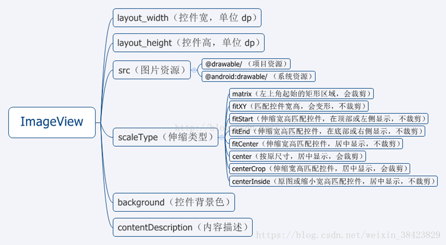
<ImageView
//控件id
android:id = "@+id/xxx"  @+id/xxx表示新增控件命名为xxx

//宽度与高度
android:layout_width="wrap_content"   //wrap_content或者match_parent
android:layout_height="wrap_content"  //wrap_content或者match_parent

//此外,可以具体设置高度和宽度显示的像素,不过这样设置如果图片尺寸大于设置的显示的尺寸,则图片是显示不全的,这是可以配合android:scaleType属性。
android:layout_width="200dp"
android:layout_height="200dp"

//把原图按照指定的大小在View中显示,拉伸显示图片,不保持原比例,填满ImageButton.
android:scaleType="fitXY"

//其他的关于android:scaleType的参数解释,也可以参考下面的直观图
//android:scaleType="center"  在视图中心显示图片,并且不缩放图片
//android:scaleType="centercrop"  按比例缩放图片,使得图片长 (宽)的大于等于视图的相应维度
//android:scaleType="centerinside"  按比例缩放图片,使得图片长 (宽)的小于等于视图的相应维度
//android:scaleType="fitcenter" 按比例缩放图片到视图的最小边,居中显示
//android:scaleType="fitend" 按比例缩放图片到视图的最小边,显示在视图的下部分位置
//android:scaleType="fitstart" 把图片按比例扩大/缩小到视图的最小边,显示在视图的上部分位置
//android:scaleType="matrix" 用矩阵来绘制

//图片来源,需要将图片复制放到res/drawable文件夹里面,引用的时候不需要写图片的后缀
android:src ="@drawable/beautiful">
7.ProgressBar
ProgressBar 用于在界面上显示一个进度条,表示我们的程序正在加载一些数据,运行程序,会看到屏幕中有一个圆形进度条正在旋转。
在布局xml文件中的用法非常简单:
<ProgressBar
    android:id="@+id/pb"
    android:layout_width="match_parent"
    android:layout_height="wrap_content"
    //默认是圆形进度条,可以知道样式设置为水平进度条
    style="?android:attr/progressBarStyleHorizontal"/>
    //指定成水平进度条后,我们还可以通过 android:max属性给进度条设置一个最大值,然后在代码中动态地更改进度条的进度
    android:max="100"
那么如何才能让进度条在数据加载完成时消失呢,这里我们就需要用一开始所讲的Android 控件的可见属性。
可以通过代码来设置控件的可见性,使用的是 setVisibility()方法,可以传入 View.VISIBLE、View.INVISIBLE 和 View.GONE 三种值。
下面实现点击一下按钮让进度条消失,再点击一下按钮让进度条出现的这种效果,这里只给出按钮监听的代码:
button.setOnClickListener(new OnClickListener() {
            @Override
            public void onClick(View v) {
                //通过 getVisibility()方法来判断 ProgressBar 是否可见
                if (progressBar.getVisibility() == View.GONE) {
                    progressBar.setVisibility(View.VISIBLE);
                } else {
                    progressBar.setVisibility(View.GONE);
                }
            }
        });
8DatePicker–日期与时间选择控件
常用方法:
getDayOfMonth():获取当前Day
getMonth():获取当前月
getYear()获取当前年
updateDate(int year, int monthOfYear, int dayOfMonth):更新日期
TimePicker
查看一个在24小时或上午/下午模式下一天的时间。
常用方法
setCurrentMinute(Integer currentMinute)设置当前时间的分钟
getCurrentMinute()获取当前时间的分钟
setEnabled(boolean enabled)设置当前视图是否可以编辑。
m_TimePicker.setIs24HourView(true);设置为24小时制显示
setOnTimeChangedListener(TimePicker.OnTimeChangedListener onTimeChangedListener)当时间改变时调用
相关包类:
TimePickerDialog、DatePickerDialog
以对话框形式显示日期时间视图
Calendar
日历是设定年度日期对象和一个整数字段之间转换的抽象基类,如,月,日,小时等。