因为需要将返回的结果都写进表格,并输出折线图。但因为有较多不同的分类,故而需要创建不同的sheet表,废话不多说,直接上代码:
import openpyxl, os
from openpyxl.chart import LineChart, Reference
class WriteData():
def __init__(self, title, x_title):
self.title = title
self.x_title = x_title
'''
func: 创建结果表
title: 表的名字
'''
def create_excel(self):
# 检查文件是否存在
if os.path.isfile(self.title):
# 存在,则先删除表
os.remove(self.title)
# 创建工作表
self.wb = openpyxl.Workbook() # 创建工作薄
self.wb.save(self.title)
self.wb.close()
'''
打开表,在什么位置创建第n张表,并命名
sheet_title: 表名
index: 在什么位置创建表
x_title: 表头
'''
def open_create_sheet(self, sheet_title, index):
self.wb = openpyxl.load_workbook(self.title)
if os.path.isfile(self.title):
with open(self.title) as f:
# 创建sheet表
self.ws = self.wb.create_sheet(sheet_title, index)
# 写表头
self.ws.append(self.x_title)
self.wb.save(self.title)
self.wb.close()
# 表中逐行写数据
def open_write_data(self, data):
with open(self.title) as f:
self.ws.append(data)
self.wb.save(self.title)
self.wb.close()
# 对比表中画折线图
def open_cs_xs_line_chart(self, min_col, min_row, max_col, max_row):
with open(self.title) as f:
chart = LineChart() #创建图表对象
# 图表样式
chart.width = 30
chart.height = 10
chart.style = 2
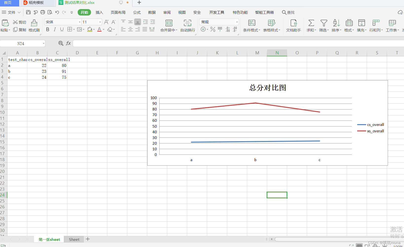
chart.title = "总分对比图"
# 指定创建图表区域(数据所在列,如例中第2,3列,包括表头)
data = Reference(self.ws, min_col=min_col, min_row=min_row, max_col=max_col, max_row=max_row)
#
chart.add_data(data, titles_from_data=True) # 从数据中提取标题
# 获取x轴内容,让x轴显示字母(如例中即a,b,c所在行列)
word = Reference(self.ws, min_col= 1, min_row = min_row + 1 , max_row = max_row)
chart.set_categories(word)
self.ws.add_chart(chart, "H5") # 图表左上角位置
self.wb.save(self.title)
self.wb.close()
# 创建结果表
result_title = "测试结果对比.xlsx"
# 表头
x_title = \
[
"test_char",
"cs_overall",
"xs_overall"
]
ex_file = WriteData(result_title, x_title)
ex_file.create_excel() # 创建表
ex_file.open_create_sheet("第一张sheet", 0) #在默认sheet前创建sheet表
# value1 为如图中前2列数据
# value2 为图中和5列数据
table_info = [
['a', 22, 80],
['b', 23, 91],
['c', 24, 75]
]
for row_data in table_info:
ex_file.open_write_data(row_data) # 添加第表
# 待数据写完后,画折线图
min_col = 2 # 数据所在列
min_row = 1
max_col = 3 # 数据所在列
max_row = len(table_info)+1 # 需要另外加上表头行
ex_file.open_cs_xs_line_chart(min_col, min_row, max_col, max_row)最后效果图: