专栏简介: 前端从入门到进阶
题目来源: leetcode,牛客,剑指offer.
创作目标: 记录学习JavaEE学习历程
希望在提升自己的同时,帮助他人,,与大家一起共同进步,互相成长.
学历代表过去,能力代表现在,学习能力代表未来!
目录
1. CSS 是什么
CSS 全称 "层叠样式表"(Casading Style Sheets) , CSS 能够对网页中元素的排版 , 达到像素级的控制 , 实现美化页面的效果 , 能够做到页面的样式和结构分离. HTML 相当于网页的骨架结构 , CSS 就是皮肤肉体 , 类似于 "东方四大邪术" 之化妆术.
2. 基本语法规范
选择器 + {一条/N条声明}
- 选择器决定针对谁进行修改.
- 声明决定修改啥.
- 声明的属性是键值对. 使用 ; 区分键值对 , 使用 : 区分 键 和 值.
  <style>
    p {
      /* 设置字体颜色 */
      color: red;
      /* 设置字体大小*/
      font-size: 30px;
    }
  </style>
  <p>
    hasdkhkasdhkjashdkjhasjkdlkajsdkjalskdjl
  </p>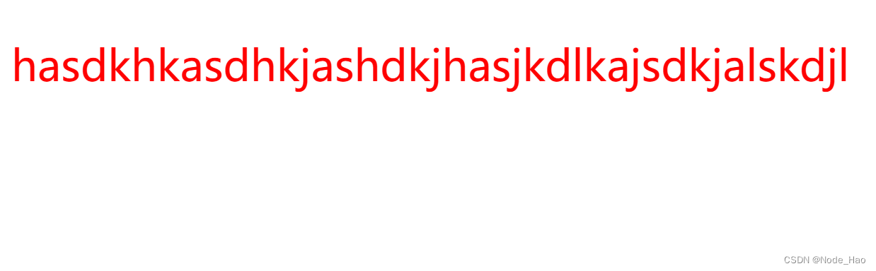
Tips:
- style 标签可以放到页面的任何位置 , 但一般放到 head 标签内.
- CSS 使用 /**/ 作为注释 , 使用 (ctrl + / 快速切换)
2. 引入方式
2.1 内部样式表
通常写到 style 标签中 , 嵌套到 html 内部.
理论上 style 标签可以放到页面的任何位置 , 但一般放到 head 标签内.
这样做的优点是可以让 样式和页面分离 , 但缺点是分离的不够彻底.
  <style>
    p{
      /* 设置字体颜色 */
      color: red;
      /* 设置字体大小*/
      font-size: 30px;
    }
  </style>
  <p>
    hasdkhkasdhkjashdkjhasjkdlkajsdkjalskdjl
  </p>
2.2 行内样式表
通过 style 属性 , 来指定某个标签的样式.
只适合与写简单样式 , 只针对某个标签生效.
缺点: 无法写太过复杂的样式 , 因为这种写法优先级较高 , 会覆盖其他样式.
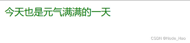
  <style>
    div{
      color: red;
    }
  </style>
  <div style="color: green;">今天也是元气满满的一天</div>
可以看到红色被覆盖了.
2.3 外部样式
这是实际开发中最常用的方式.
- 创建一个 CSS 文件
- 使用 link 标签引入 CSS.
创建 test.html
<head>
    <!DOCTYPE html>
    <html lang="en">
    <head>
        <meta charset="UTF-8">
        <meta http-equiv="X-UA-Compatible" content="IE=edge">
        <meta name="viewport" content="width=device-width, initial-scale=1.0">
        <title>Document</title>
        <link rel="stylesheet" href="style.css">
    </head>
    <body>
        <div>一个人只有不断写作 , 才不会被淹没</div>
    </body>
    </html>
</head>
创建 style.css
div {
    color: rebeccapurple;
}
Tips: 注意不要忘记在 html 文件中使用 link 标签调用 css 文件.
优点: 样式和结构彻底分离了
缺点: 由于浏览器缓存的影响 , 修改后不一定立刻生效.
缓存是计算机常用的一种提高效能的手段.
网页依赖的资源(图片/CSS/JS等)通常是从服务器上获取. 如果频繁的访问该网站 , 那么这些外部资源就没必要从服务器反复的获取. 就可以使用缓冲先存起来(时间上是存到本地磁盘).从而提高访问效率.
可以通过 ctrl + F5 强制刷新页面 , 强制浏览器重新获取 css 文件.
3. 代码风格
3.1 样式格式
1. 紧凑风格
p{ color: red; font-size: 30px;}
2.展开风格(推荐)
p{
    color: red;
    font-size: 30px;
}
3. CSS 不区分大小写 , 因此开发时统一使用小写字母
4. 空格规范
- 冒号之后带空格
- 选择器和 { 之间也有一个空格.
Tips: 以上规范 VsCode 编译器中自带.
4. 选择器
4.1 选择器的功能
选中页面中指定的元素标签.
先选中元素 , 才能设置元素的属性
就好比 , 红警 文明 这类策略型游戏 , 选中己方单位才能指挥该单位行动.

4.2 选择器的种类
1. 基础选择器: 单个选择器的构成
| 作用 | 特点 | |
| 标签选择器 | 能选出所有相同的标签 | 不能差异化选择 |
| 类选择器 | 能选出一个或多个标签 | 根据需求选择 , 最灵活 , 最常用 |
| id 选择器 | 能选出一个标签 | 同一个 id 在一个 HTML 中只出现一次 |
| 通配符选择器 | 选择所有标签 | 特殊情况下使用 |
1) 标签选择器
- 能快速的将同一类标签选择出来.
- 但无法差异化选择.
        <style>
            p {
                color: red;
            }
            div {
                color: green;
            }
        </style>
        <p>张三</p>
        <p>张三</p>
        <p>张三</p>
        <div>李四</div>
        <div>李四</div>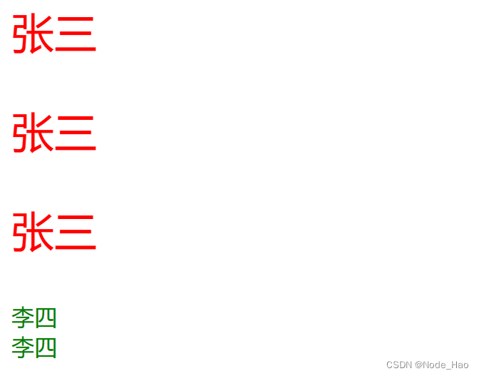
2) 类选择器
- 差异化表示不同的标签
- 可以让多个标签都使用同一个标签
        <style>
            .red {
                color: red;
            }
        </style>
        <div class="red"> 张三</div>
        <div>张三</div>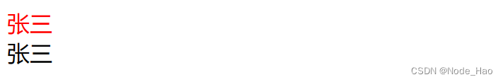
Tips:
- 类名用 . 开头的
- 下方的标签使用 class 属性来调用
- 一个类可以被多个标签使用 , 一个标签也可以使用多个类.(多个类名用空格分割 , 这样做可以更好的实现代码复用)
- 如果类名过长可以使用 - 分割
- 不要使用纯数字 , 或中文 , 以及标签名来命名类名.
代码示例:
- 一个标签可以使用多个类名.
- 这样可以把相同的属性提取出来 , 从而达到代码复用的效果.
        <style>
            .box {
                width: 200px;
                height: 150px;
            }
            .red {
                background-color: red;
            }
            .green {
                background-color: green;
            }
        </style>
        <div class="box red">张三</div>
        <div class="box green">李四</div>
<div class="box red">王五</div> 
3) id 选择器
- CSS 中使用 # 开头表示类选择器.
- id 选择器的值和 html 中某个元素的 id 值相同.
- html 的元素 id 不必带 #
- id 是唯一的 , 不能被多个标签使用.(这是和类选择器最大的区别)
- 例如: 姓名可以重复所以是类选择器 , 身份证号唯一所以是 id 选择器.
        <style>
            #ha {
                color: royalblue;
            }
        </style>
        <div id="ha">hahaha</div>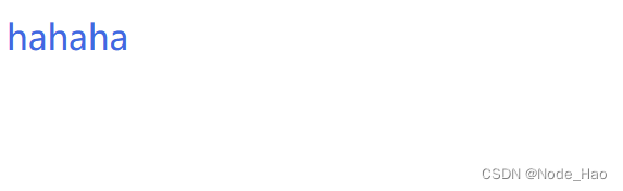
4) 通配符选择器
使用 * 定义 , 选择所有标签.
     * {
            color: red;
        }
页面中所有内容都会被改成红色.
2. 复合选择器:
| 选择器 | 作用 | 主要事项 |
| 后代选择器 | 选择后代元素 | 可以是孙子元素 |
| 子选择器 | 选择子类 | 只能选亲儿子 , 不能选孙子 |
| 并集选择器 | 选择相同样式的元素 | 更好的做到代码重用 |
| 链接伪类选择器 | 选择不同状态的链接 | 重点掌握 a:hover 的写法 |
| :focuse 伪类选择器 | 选择被选中的元素 | 重点掌握 input:focus |
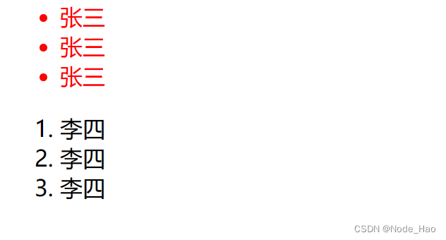
1) 后代选择器
又叫包含选择器 , 选择某个父元素中的子元素.
元素1 元素 2 {样式声明}
- 元素1 和 元素2 要使用空格分割
- 元素1 是父元素 , 元素2 是子元素 , 只选元素2不影响元素1.
代码示例: 将 ul 中的 li 修改颜色 , 不影响 ol.
        <ul>
            <li>张三</li>
            <li>张三</li>
            <li>张三</li>
        </ul>

        <ol>
            <li>李四</li>
            <li>李四</li>
            <li>李四</li>
        </ol>

        ul li {
            color: red;
        }
代码示例: 元素2 不一定非得是儿子 , 也可以是孙子
        <ul>
            <li>张三</li>
            <li>张三</li>
            <li><a href="#">http://www.leetcode.com</a></li>
        </ul>

        ul li a {
            color: red;
        }
代码示例: 也可以是任意基础选择器的组合.(包括类选择器 , id 选择器)
        <ol class="one">
            <li>张三</li>
            <li>李四</li>
            <li><a href="#">http://www.leetcode.com</a></li>
            <li><a href="#">http://www.leetcode.com</a></li>
            <li><a href="#">http://www.leetcode.com</a></li>
        </ol>

        .one li a {
            color: green;
        }
2) 子选择器
和后代选择器类似 , 但只能选择子标签
元素1>元素2 {样式声明}
- 使用大于号分割
- 只能选儿子 , 不能选孙子
        <div class="two">
            <a href="#">链接1</a>
            <p><a href="#">链接2</a></p>
        </div>
后代选择器的写法 , 会将链接1和链接2都选中.
.two a {
    color: red;
}
子选择器的写法 , 只选链接1
.two>a {
    color: red;
}
3) 并集选择器
用于选择多组标签.(集体声明)
元素1 元素2 {样式声明}
- 通过逗号分割多个元素.
- 表示同时选中元素1 和 元素2.
- 任何基础选择器都可以使用并集选择器.
- 并集选择器建议竖着写 , 每个选择器占一行. (最后一个选择器不能加逗号)
代码示例:
        <div>苹果</div>
        <h3>香蕉</h3>
        <ul>
            <li>鸭梨</li>
            <li>橙子</li>
        </ul>
1. 把苹果和香蕉改成红色
div ,h3 {
    color: red;
}
2. 把鸭梨和橙子也改成红色
div,
h3,
ul li {
    color: red;
}
4) 伪类选择器
1. 链接伪类选择器
- a: link 选择未被访问过的链接
- a: visited 选择已被访问过的链接
- a: hover 选择鼠标指针悬停上的链接
- a: active 选择活动链接(鼠标按了 , 但未弹起)
代码示例:
<a href="#">小猫</a>a:link {
/*未点 所以是黑色*/
color: black;
/*去掉 a 标签的下滑线*/
text-decoration: none;
}
a:visited {
/*访问过后是绿色*/
color: green;
}
a:hover {
/*鼠标悬停但不点是红色*/
color: red;
}
a:active {
/*鼠标点击后会有弹起的效果*/
color: blue;
}如何让一个已访问过的标签恢复成尾访问的颜色?
清空流量器记录即可. ctrl + shift + delete
注意事项:
- 必须按照 LVHA 的顺序书写 , 例如: 把 active 写到前面会导致 active 失效.(记录规则"绿化")
- 浏览器的 a 标签都有默认样式 , 实际开发中 需要单独制定样式.
2. :force 伪类选择器
选取获取焦点的 input 表单元素
        <div class="three">
            <input type="text">
            <input type="text">
            <input type="text">
        </div>

        .three>input:focus {
            color: red;
        }
此时被选中的表单字体就会变成红色
5. 常用元素属性
5.1 字体属性
1) 设置字体
/*为 body 标签中的元素设置字体*/
body {
    font-family: '宋体';
    font-family: 'Microsoft YaHei';
}- 字体名称可以是中文 , 但不推荐
- 建议使用常见字体 , 否则兼容性不好
        <style>
            .font-family .one {
                font-family: 'Microsoft YaHei';
            }
            .font-family .two {
                font-family: '宋体';
            }
        </style>
        <div class="font-family">
            <div class="one">
                这是微软雅黑
            </div>
            <div class="two">
                这是宋体
            </div>
        </div>
2) 设置字体大小
p {
    font-size: 20px;
}
- 不同的浏览器默认字号不一样 , 最好给一个明确的值.(chrome 默认 16px)
- 可以给 body 标签单独使用 font-size
- 单位 px 不能忘记
- 标题标签需要单独指定大小
Tips: 实际上 font-size 设置的是字体中字符框的高度; 实际字形可能比这些框高或矮.
        <style>
            .font-family .one {
                font-size: 40px;
            }
            .font-family .two {
                font-size: 20px;
            }
        </style>
        <div class="font-size">
            <div class="one">
                更大
            </div>
            <div class="two">
                更小
            </div>
        </div>
3) 粗细
p {
    font-weight: bold;
    font-weight: 700;
}- 可以使用数字表示粗细
- 700 == bold(加粗) , 400 == normal(普通)
- 取值范围是 100 -> 900
    <style>
        .font-weight .one {
            font-weight: 900;
        }
        .font-weight .two {
            font-weight: 100;
        }
    </style>
    <div class="font-weight">
        <div class="one">
            粗粗粗
        </div>
        <div class="two">
            细细细
        </div>
    </div>
4) 文本样式
/* 设置倾斜 */
font-style: italic;

/* 取消倾斜 */
font-style: normal;
实际开发中 , 很少把某个字体变成倾斜 , 常常是取消倾斜.
    <style>
        .font-style em {
            font-style: normal;
        }
        .font-style div {
            font-style: italic;
        }
    </style>
    <div class="font-style">
        <em>
            斜斜斜
        </em>
        <div class="one">
            我斜了吗?
        </div>
    </div>
5.2 文本属性
1) 文本颜色
我们的显示器是由很多个"像素点"构成的 , 每个像素视为一个点 , 这个点就能反应出一个具体的颜色. 计算机中使用 R(red), G(gree), B(blue) 的方式表示颜色. 三种颜色按不同的比例就能搭配出五彩斑斓的效果. 计算机中使用 R G B 三个分量 , 分别使用一个字节表示(8个比特位 , 表示范围是 0-255 , 十六进制表示为 00-FF).
数值越大 , 表示该分量的颜色越浓. 255, 255, 255 就表示白色, 0, 0, 0 就表示黑色.
设置文本颜色
color: red;
color: #ff0000;
color: rgb(255, 0, 0)- 预定义的颜色值(直接是单词)
- [最常用] 十六进制
- RGB 方式
    <style>
        .color{
            color: red;
            /* color:rgb(255, 0, 0);
            color: #ff0000; */
        }
    </style>
    <div class="color">这时一段佳话</div>
2) 文本对齐
不光能控制文字水平方向的对齐 , 也能控制图片等元素居中或者靠右.
text-align: [值]
- center: 居中对齐
- left: 左对齐
- right: 右对齐
    <style>
        .text-align .one {
            text-align: left;
        }
        .text-align .two {
            text-align: right;
        }
        .text-align .three {
            text-align: center;
        }
    </style>
    <div class="text-align">
        <div class="one">左对齐</div>
        <div class="two">右对齐</div>
        <div class="three">居中对齐</div>
    </div>
3) 文本装饰
text-decoration: [值]
常用取值:
- underline 下划线. [常用]
- none 啥都没有. 可以给标签去装饰.
- overline 上划线.
- line-through 删除线
     <style>
        .text-decoration .one {
            text-decoration: none;
        }
        .text-decoration .two {
            text-decoration: underline;
        }
        .text-decoration .three {
            text-decoration: overline;
        }
        .text-decoration .four {
            text-decoration: line-through;
        }
    </style>
    <div class="text-decoration">
        <div class="one">啥都没有</div>
        <div class="two">下划线</div>
        <div class="three">上划线</div>
        <div class="four"> 删除线</div>
    </div>
4) 文本缩进
控制段落的 首行 缩进(其他行不影响)
text-indent: [值];
- 单位可以用 px 或者 em
- 使用 em 作为单位更好. 1 个 em 就是当前元素文字的大小.
- 缩进可以是负的 , 表示向左缩进 , 肯导致文章冒出去.
    <style>
        .text-indent .one {
            text-indent: 2em;
        }
        .text-indent .two {
            text-indent: -2em;
        }
    </style>
    <div class="text-indent">
        <div class="one">正常缩进</div>
        <div class="two">反向缩进</div>
    </div>
5) 行高
行高指的是上下文之间的基线距离
HTML 中展示文字涉及到这几个基准线:
- 顶线
- 中线
- 基线(相当于英语四线格中倒数第二行)
- 底线
内容区: 顶线和中线包裹的区域 , 即下图中深灰色背景区;
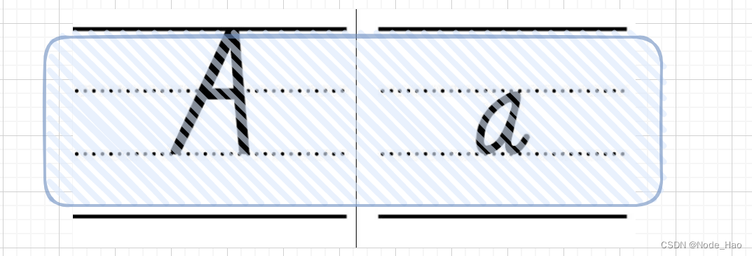
line-height: [值]注意1: 行高 = 上边距 + 下边距 + 字体大小
上下边距是相等的 , 此处字体是 16 px , 行高 40px , 上下边距分别是 12px.
<style>
        .line-height .one {
            line-height: 40px;
            font-size: 16px;
        }
    </style>
    <div class="line-height">
        <div>
            上一行
        </div>
        <div class="one">
            中间行
        </div>
        <div>
            下一行
        </div>
    </div>
</body>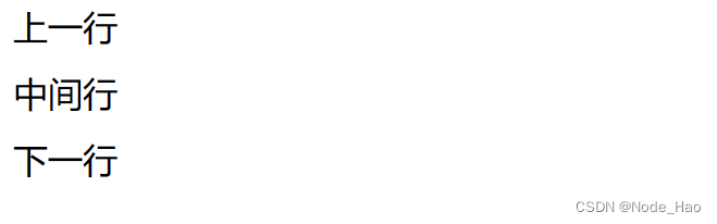
注意2: 行高也可以取 normal 等值
注意3: 行高等于元素高度 , 就可以实现文字居中对齐.
<style>
    .line-height .two {
        height: 100px;
        line-height: 100px;
    }
</style>
<div class="line-height">
    <div class="two">
        文字垂直居中
    </div>
</div> 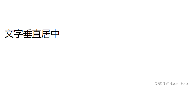
5.3 背景属性
1) 背景颜色
background-color: [指定颜色]默认是 transpaent (透明) 的 , 可以通过设置颜色的方式来修改.
<style>
    body {
        background-color: #f3f3f3;
    }

    .bgc .one {
        background-color: red;
    }
    .bgc .two {
        background-color: #0f0;
    }
    .bgc .three {
        background-color: transparent;
    }
</style>
<div class="bgc">
    <div class="one">红色背景</div>
    <div class="two">绿色背景</div>
    <div class="three">透明背景</div>
</div>
2) 背景图片
background-image:url(....)相比于 image 来说更容易控制图片的位置.
<style>
    .bgi .one {
        background-image: url(壁纸.jpg);
        height: 300px;
    }
</style>
<div class="bgi">
    <div class="one">背景图片</div>
</div>
3) 背景平铺
background-repeat: [平铺方式]- repeat: 平铺
- no-repeat: 不平铺
- repeat-x: 水平平铺
- repeat-y: 垂直平铺
默认为: repeat.
背景颜色和背景图片可以同时存在. 背景图片在背景颜色的上方
<style>
    .bgr .one {
        background-image: url(壁纸.jpg);
        height: 300px;
        background-repeat: no-repeat;
    }
    .bgr .tow {
        background-image: url(壁纸.jpg);
        height: 300px;
        background-repeat: repeat-x;
    }
    .bgr .two {
        background-image: url(壁纸.jpg);
        height: 300px;
        background-repeat: repeat-y;
    }
</style>

<div class="bgr">
    <div class="one">不平铺</div>
    <div class="two">水平平铺</div>
    <div class="three">垂直平铺</div>
</div>
4) 背景位置
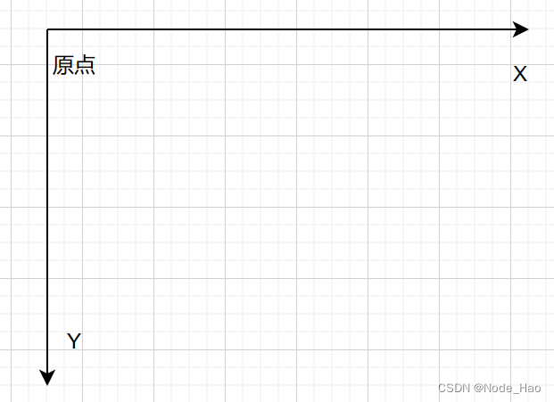
background-position: x y;参数有三种风格:
1. 方位名词: (top, left , right, bottom)
2. 精确单位: 坐标或百分比(以右上角为原点)
3. 混合单位: 同时包含方位名词和精确单位.
 <style>
    .bgp .one {
      background-image: url(壁纸.jpg);
      height: 500px;
      background-repeat: no-repeat;
      background-color: purple;

      background-color: center;
    }
  </style>
  <div class="bgp">
    <div class="one">背景居中</div>
  </div>
Tips: 计算机中华坐标系, 一般是左手系(y 轴向下)
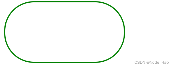
5.4 圆角矩形
1) 基本用法:
border-radius: length
length 是内切圆的半径, 数值越大, 弧线越明显.
2) 生成圆形
div {
    width: 200px;
    height: 200px;
    border: 2px solid green;
    border-radius: 100px;
    /* 或者用 50% 表示半径的一半 */
    border-radius: 50%;

  }
3) 生成圆角矩形
让 border-redius 的值为矩形高度的一半即可.
div {
    width: 200px;
    height: 100px;
    border: 2px solid green;
    border-radius: 50px;

  }
6.元素的显示模式
CSS 中 HTML 的标签显示模式有很多 , 此处重点介绍两点:
- 块级元素
- 行内元素
6.1 块级元素
常见块级元素:
h1 - h6
p
div
ul
li
...
特点:
- 独占一行
- 高度, 宽度, 内外边距, 行高都可以控制
- 宽度默认和父级元素一样.
- 是一个容器, 里面可以放行内和块级元素.
<style>
    .demo1 .parent {
      width: 500px;
      height: 500px;
      background-color: red;
    }
    .demo1 .child {
      /* 不写宽度默认和父类一样 */
      height: 200px;
      background-color: green;
    }
  </style>
  <div class="demo1">
    <div class="parent">
      <div class="child">
        child1
      </div>
      <div class="child">
        child2
      </div>
    </div>
  </div>
Tips:
- 文字类的元素内不能使用块级元素.
- p 标签主要用于存放文字, 内部不能存放块级元素, 尤其是 div.
6.2 行内元素
常见元素:
a
strong
span
u
....
特点:
- 不独占一行, 一行可以显示多个.
- 设置高度, 宽度 , 行高无效.
- 左右外边距有效(上下无效).内边距有效.
- 默认宽度就是本身内容
- 行内元素只能容纳文本和其他行内元素, 不能放块级元素.
<style>
    .demo2 span {
      width: 200px;
      height: 200px;
      background-color: red;
    }
  </style>
  <div class="demo2">
    <span>child1</span>
    <span>child2</span>
    <span>child3</span>
  </div>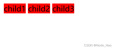
6.3 行内元素和块级元素的区别:
- 块级元素独占一行 , 行内元素不独占一行.
- 块级元素可以设置宽高 , 行内元素不能设置宽高.
- 块级元素四个方向都能设置内外边距, 行内元素垂直方向不能设置.
6.4 改变显示模式:
使用 display 属性可以修改元素的显示模式.
例如: 将 div 等变成行内元素, 把 a, span 等变成块级元素.
- display: block 改成块级元素[常用]
- display: inline 改成行内元素[少用]
- display: inline-block 改成行内块元素.
7.盒模型
每一个 HTML 元素就相当于是一个矩形的"盒子", 该盒子由以下几部分构成:
- 边框: border
- 内容: content
- 内边距: padding
- 外边距: margin

7.1 边框
基础属性
- 粗细: border-width
- 样式: border-style, 默认没有边框, solid 实现边框, dashed 虚线边框, dotted 点线边框.
- 颜色: border-color
<div>test</div>
 div{
  width: 500px;
  height: 250px;
  border-width: 10px;
  border-style: solid;
  border-color: green;
 }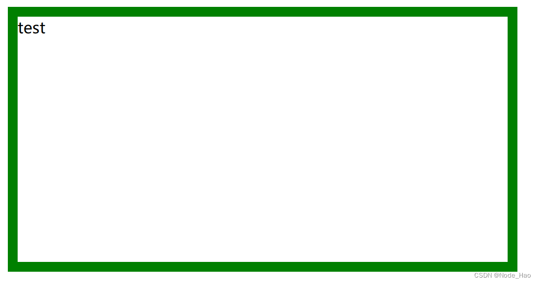
边框会撑大盒子
可以看到, width, height 是 500 * 250, 而最终整个盒子的大小是520 * 270. 边框的 10 个像素导致扩大.
通过 box-sizing 属性可以修改浏览器的行为, 使得边框不再撑大盒子.
* 为通配符选择器
* {
    box-sizing: border-box;
}
7.2 内边距
padding 设置内容和边框之间的距离:
基础写法
默认内容是顶着边框来设置的, 用 padding 来控制这个距离, 四个方向都可以设置.
<div>test</div>
div {
    width: 200px;
    height: 300px;
    /* 表示上边距 5px 右 10px 下 20px..(顺时针) */
    padding: 5px 10px 20px 30px;
   }

Tips:
- 内边距也会影响到盒子的大小, 使用 box-sizing: border-box也可以使得内边距不再影响盒子.
- 外边距也是类似的写法
7.3 块级元素水平居中
前提:
- 指定宽度(如果不指定宽度, 默认和父元素一致)
- 把水平 margin 设为 auto
以下三种写法均可:
margin-left: auto; margin-right: auto;

margin: auto;

margin:0 auto;
代码示例:
<div>呱呱</div>div {
width: 500px;
height: 200px;
background-color: red;
margin: auto;
}
Tips:
- 这个水平居中的方式和 text-align 不同.
- margin: auto 是给块级元素使用的.
- text-align: center 是让行内元素或行内块级元素居中的.
7.4 去除浏览器默认样式
浏览器通常会给元素加上一些默认样式, 尤其是内外边距. 不同浏览器的默认样式存在差别.
因此, 为了保证代码在不同浏览器上都能按照统一的样式显示, 我们往往会去除浏览器的默认样式.
使用通配符即可完成这件事:
* {
    margin: 0;
    padding: 0
}
8.弹性布局
8.1 初体验
创建一个 div, 内部包含三个 span
<div>
  <span>1</span>
  <span>2</span>
  <span>3</span>
</div>
<style>
  div {
    width: 100%;
    height: 150px;
    background-color: red;
  }
  div > span{
    background-color: green;
    width: 100px;
  }
</style>
当我们给 div 加上 display:flex 之后, 效果为:
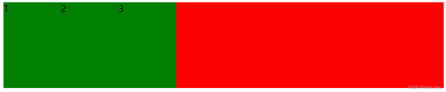
此时可以看到, span 有了高度, 不再是"行内元素了"
再给 div 加上 justify-content: space-around; 此时效果为
此时可以看到这些 span 已经能够水平隔开了.
8.2 flex 布局基本概念
flex 是 flexible box 的缩写. 意思为 "弹性盒子"
任何一个 html 元素, 都可以指定位 display: flex 完成弹性布局.
fiex 布局的本质是给父盒子添加 dispaly: flex 属性, 来控制子盒子的位置和排列方式.
基础概念
- 被设置为 display: flex 属性, 来控制子盒子的位置和排列方式.
- 所有子元素为该容器的成员, 称为flex item.
- flex item 可以纵向排列, 也可以横向排列, 称为 flex direction(主轴)

常用属性
justify-content
设主轴上子元素的排列方式.(使用之前先确定主轴的排列方式)
| 值 | 描述 |
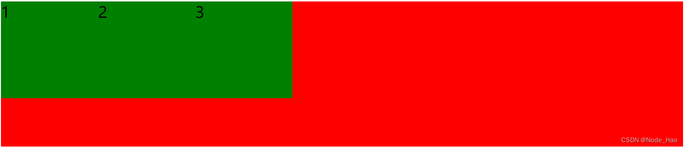
| flex-start | 默认值. 项目位于容器的开头 |
| flex-end | 项目位于容器的结尾 |
| center | 项目位于容器中央 |
| space-between | 项目在行与行之间有间隔 |
| space-around | 项目在行之前, 行之间, 行之后都留有空间 |
未指定 justify-content 时, 默认按照从左到右的方向布局.
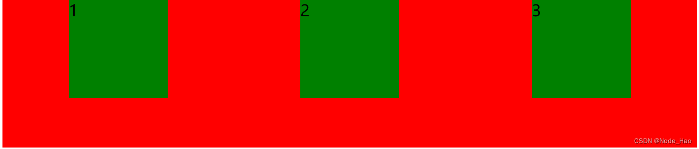
设置 justify-content: flex-end; 此时元素都排列到右侧了

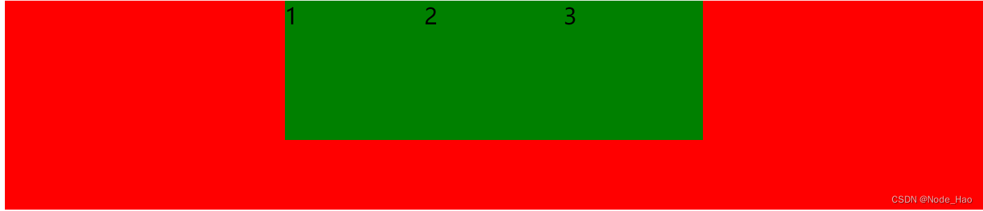
设置 justify-content: center; 此时元素居中.
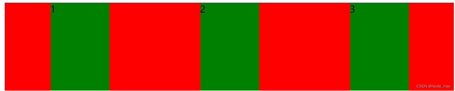
设置 justify-contnet: space-around; 平分剩余空间.
设置 justify-content: space-between; 先两边元素贴近边缘, 再平分剩余空间.

align-item
设纵轴上的元素排列方式
| 值 | 描述 |
| stretch | 默认值, 行拉伸占据剩余空间 |
| center | 朝着纵向居中 |
| flex-start | 朝着纵向开头排列 |
| flex-end | 朝着纵向结尾排列 |
| space-between | 行均匀分布在弹性容器中 |
| space-around | 行均匀分布在弹性容器中, 两端各占一半 |
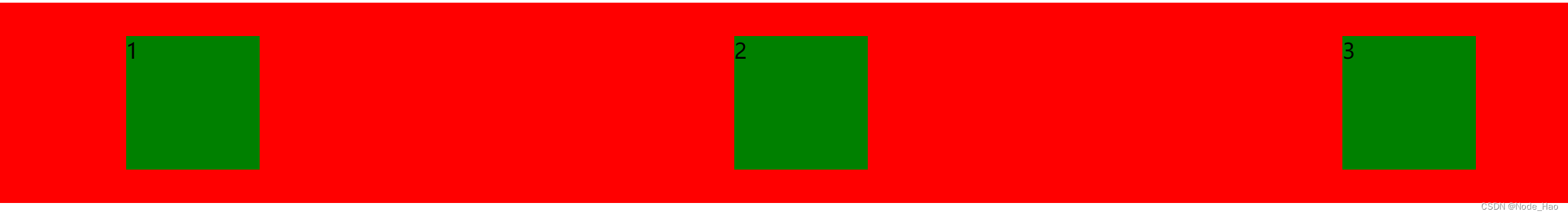
代码示例:
纵向居中
<div>
  <span>1</span>
  <span>2</span>
  <span>3</span>
</div>
<style>
  div {
    width: 100%;
    height: 150px;
    background-color: red;
    display: flex;
    justify-content: space-around;
    align-items: center;
  }
  div span{
    width: 100px;
    height: 100px;
    background-color: green;
  }
</style>