Ⅰ、问题描述:
想要让父盒子里面的子盒子水平或垂直居中,下面就是实现子盒子居中的五种方式;
Ⅱ、实现过程如下:
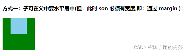
1、通过 margin 属性可使得子盒子可在父盒子中水平居中;
其一、代码为:
<template>
  <div>
    <h4>方式一:子可在父中要水平居中(但:此时 son 必须有宽度,即:通过 margin ):</h4>
    <div class="father1">
      <div class="son1"></div>
    </div>
  </div>
</template>

<style scoped>
.father1 {


  width: 100px;
  height: 100px;
  background-color: green;
  // 注意:此时的 son 一定是有宽度 (width) 值的;
  .son1 {


    width: 50px;
    height: 50px;
    background-color: skyblue;
    margin: 0 auto;
  }
}
</style>
其二、页面效果为:
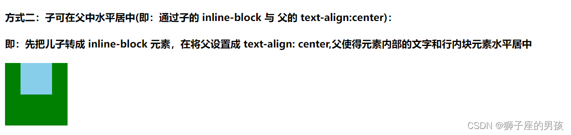
2、通过父盒子的 text-align: center; 及子盒子的 display: inline-block; 属性 可使得子盒子可在父盒子中水平居中;
其一、代码为:
<template>
  <div>
    <h4>方式二:子可在父中水平居中(即:通过子的 inline-block 与 父的 text-align:center):</h4>
    <h4>即:先把儿子转成 inline-block 元素,在将父设置成 text-align: center,父使得元素内部的文字和行内块元素水平居中</h4>
    <div class="father2">
      <div class="son2"></div>
    </div>
  </div>
</template>

<style scoped>
.father2 {


  width: 100px;
  height: 100px;
  background-color: green;
  text-align: center;
  .son2 {


    width: 50px;
    height: 50px;
    background-color: skyblue;
    display: inline-block;
  }
}
}
</style>
其二、页面效果为:
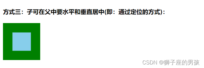
3、通过 定位 的方式可使得子盒子在父盒子中水平和垂直居中;
其一、代码为:
扫描二维码关注公众号,回复:
14736900 查看本文章

<template>
  <div>
    <h4>方式三:子可在父中要水平和垂直居中(即:通过定位的方式):</h4>
    <div class="father3">
      <div class="son3"></div>
    </div>
  </div>
</template>

<style scoped>
.father3 {


  width: 100px;
  height: 100px;
  background-color: green;
  position: relative;
  .son3 {


    width: 50px;
    height: 50px;
    background-color: skyblue;
    position: absolute;
    left: 50%;
    top: 50%;
    // 此时是水平移动宽度和高度的一半;
    transform: translate(-50%,-50%);
  }
}
</style>
其二、页面效果为:
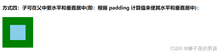
4、通过 padding 属性可使得子盒子在父盒子中水平和垂直居中;
其一、代码为:
<template>
  <div>
    <h4>方式四:子可在父中要水平和垂直居中(即:根据 padding 计算值来使其水平和垂直居中):</h4>
    <div class="father4">
      <div class="son4"></div>
    </div>
  </div>
</template>

<style scoped>
.father4 {


  // 注意:此时父亲的宽高都是加上 padding 后的结果;
  width: 50px;
  height: 50px;
  background-color: green;
  padding: 25px;
  .son4 {


    width: 50px;
    height: 50px;
    background-color: skyblue;
  }
}
</style>
其二、页面效果为:
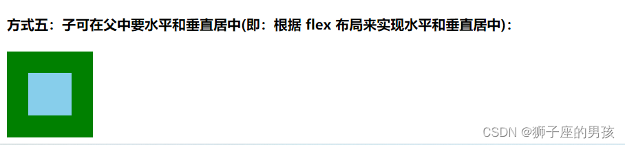
5、通过 flex 布局可使得子盒子在父盒子中水平和垂直居中;
其一、代码为:
<template>
  <div>
    <h4>方式五:子可在父中要水平和垂直居中(即:根据 flex 布局来实现水平和垂直居中):</h4>
    <div class="father5">
      <div class="son5"></div>
    </div>
  </div>
</template>

<style scoped>
.father5 {


  width: 100px;
  height: 100px;
  background-color: green;
  display: flex;
  // justify-content 让子元素水平居中;
  justify-content: center;
  // align-items 让子元素垂直居中;
  align-items: center;
  .son5 {


    width: 50px;
    height: 50px;
    background-color: skyblue;
    margin: 0 auto;
  }
}
</style>
其二、页面效果为:
Ⅲ、整个单文件组件:
其一、整体代码为:
<template>
<div>
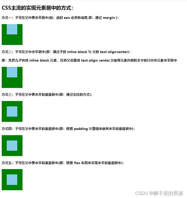
<h2>CSS主流的实现元素居中的方式:</h2>
<h4>方式一:子可在父中要水平居中(但:此时 son 必须有宽度,即:通过 margin ):</h4>
<div class="father1">
<div class="son1"></div>
</div>
<h4>方式二:子可在父中水平居中(即:通过子的 inline-block 与 父的 text-align:center):</h4>
<h4>即:先把儿子转成 inline-block 元素,在将父设置成 text-align: center,父使得元素内部的文字和行内块元素水平居中</h4>
<div class="father2">
<div class="son2"></div>
</div>
<h4>方式三:子可在父中要水平和垂直居中(即:通过定位的方式):</h4>
<div class="father3">
<div class="son3"></div>
</div>
<h4>方式四:子可在父中要水平和垂直居中(即:根据 padding 计算值来使其水平和垂直居中):</h4>
<div class="father4">
<div class="son4"></div>
</div>
<h4>方式五:子可在父中要水平和垂直居中(即:根据 flex 布局来实现水平和垂直居中):</h4>
<div class="father5">
<div class="son5"></div>
</div>
</div>
</template>
<script>
export default {
}
</script>
<style lang="scss" scoped>
.father1 {
width: 100px;
height: 100px;
background-color: green;
.son1 {
width: 50px;
height: 50px;
background-color: skyblue;
margin: 0 auto;
}
}
.father2 {
width: 100px;
height: 100px;
background-color: green;
text-align: center;
.son2 {
width: 50px;
height: 50px;
background-color: skyblue;
display: inline-block;
}
}
.father3 {
width: 100px;
height: 100px;
background-color: green;
position: relative;
.son3 {
width: 50px;
height: 50px;
background-color: skyblue;
position: absolute;
left: 50%;
top: 50%;
// 此时是水平移动宽度和高度的一半;
transform: translate(-50%,-50%);
}
}
.father4 {
// 注意:此时父亲的宽高都是加上 padding 后的结果;
width: 50px;
height: 50px;
background-color: green;
padding: 25px;
.son4 {
width: 50px;
height: 50px;
background-color: skyblue;
}
}
.father5 {
width: 100px;
height: 100px;
background-color: green;
display: flex;
// justify-content 让子元素水平居中;
justify-content: center;
// align-items 让子元素垂直居中;
align-items: center;
.son5 {
width: 50px;
height: 50px;
background-color: skyblue;
margin: 0 auto;
}
}
</style>
其二、页面显示为:
Ⅳ、小结:
其一、哪里有不对或不合适的地方,还请大佬们多多指点和交流!
其二、有兴趣的话,可以多多关注这个专栏(Vue(Vue2+Vue3)面试必备专栏):https://blog.csdn.net/weixin_43405300/category_11525646.html?spm=1001.2014.3001.5482