pandas画图教程
1. 简介
pandas在处理数据上表现出了良好的易用性及优越的性能,他的api简单易用,我们经常会使用pandas框架来处理表格数据,数据处理完成后,通常用matplotlib来进行数据可视化,matplotlib和pandas作为数据科学三剑客,可以说是相辅相成。但是matplotlib给pandas数据画图的时候代码还是显得有点麻烦,而pandas.plot()函数是对matplotlib中plt.plot()函数的一个简单包装 ,可以帮助你在绘图过程中省去那些长长的matplotlib代码。pandas#plot方法绘制图像会为数据的每一列绘制一条曲线,默认按照列名展示图例。
2. plot参数介绍
DataFrame.plot(x=None, y=None, kind='line', ax=None, subplots=False,
                sharex=None, sharey=False, layout=None, figsize=None,
                use_index=True, title=None, grid=None, legend=True,
                style=None, logx=False, logy=False, loglog=False,
                xticks=None, yticks=None, xlim=None, ylim=None, rot=None,
                fontsize=None, colormap=None, position=0.5, table=False, yerr=None,
                xerr=None, stacked=True/False, sort_columns=False,
                secondary_y=False, mark_right=True, **kwds)

参数解释:
x : label or position, default None #x轴,对应的列名标签或列的位置

y : label or position, default None #y轴,对应的列名标签或列的位置

kind : str #作图的类型,有以下这些类型的图
‘line’ : line plot (default)#折线图
‘bar’ : vertical bar plot#条形图
‘barh’ : horizontal bar plot#横向条形图
‘hist’ : histogram#柱状图
‘box’ : boxplot#箱线图
‘kde’ : Kernel Density Estimation plot#Kernel 的密度估计图,主要对柱状图添加Kernel 概率密度线
‘density’ : same as ‘kde’
‘area’ : area plot#不了解此图
‘pie’ : pie plot#饼图
‘scatter’ : scatter plot#散点图  需要传入columns方向的索引
‘hexbin’ : hexbin plot#不了解此图

ax : matplotlib axes object, default None #坐标轴,在坐标轴上绘图。如果没有设置,则使用当前matplotlib subplot的坐标轴

subplots : boolean, default False, Make separate subplots for each column #是否用子图来画图

sharex : boolean, default True if ax is None else False,
In case subplots=True, share x axis and set some x axis labels to invisible; defaults to True if ax is None otherwise False if an ax is passed in; Be aware, that passing in both an ax and sharex=True will alter all x axis labels for all axis in a figure! #如果有子图,子图是否共x轴刻度,标签

sharey : boolean, default False,In case subplots=True, share y axis and set some y axis labels to invisible #如果有子图,子图是否共y轴刻度,标签

layout : tuple (optional) (rows, columns) for the layout of subplots #子图的行列布局

figsize : a tuple (width, height) in inches #图片尺寸大小

use_index : boolean, default True,Use index as ticks for x axis #默认用索引做x轴

title : string,Title to use for the plot,#图片的标题用字符串

grid : boolean, default None (matlab style default),Axis grid lines #图片是否有网格

legend : False/True/’reverse’,Place legend on axis subplots #是否添加图例

style : list or dict,matplotlib line style per column #对每列折线图设置线的类型

logx : boolean, default False#设置x轴刻度是否取对数
Use log scaling on x axis
logy : boolean, default False
Use log scaling on y axis

loglog : boolean, default False,Use log scaling on both x and y axes #同时设置x,y轴刻度是否取对数

xticks : sequence,Values to use for the xticks #设置x轴刻度值,序列形式(比如列表)

yticks : sequence#设置y轴刻度,序列形式(比如列表)
Values to use for the yticks

xlim : 2-tuple/list#设置坐标轴的范围,列表或元组形式
ylim : 2-tuple/list

rot : int, default None#设置轴标签(轴刻度)的显示旋转度数
Rotation for ticks (xticks for vertical, yticks for horizontal plots)

fontsize : int, default None#设置轴刻度的字体大小
Font size for xticks and yticks

colormap : str or matplotlib colormap object, default None#设置图的区域颜色
Colormap to select colors from. If string, load colormap with that name from matplotlib.

colorbar : boolean, optional  #图片柱子
If True, plot colorbar (only relevant for ‘scatter’ and ‘hexbin’ plots)

position : float
Specify relative alignments for bar plot layout. From 0 (left/bottom-end) to 1 (right/top-end). Default is 0.5 (center)

layout : tuple (optional)  #布局
(rows, columns) for the layout of the plot

table : boolean, Series or DataFrame, default False  #如果为正,则选择DataFrame类型的数据并且转换匹配matplotlib的布局。
If True, draw a table using the data in the DataFrame and the data will be transposed to meet matplotlib’s default layout. If a Series or DataFrame is passed, use passed data to draw a table.

yerr : DataFrame, Series, array-like, dict and str
See Plotting with Error Bars for detail.

xerr : same types as yerr.

stacked : boolean, default False in line and
bar plots, and True in area plot. If True, create stacked plot.

sort_columns : boolean, default False  # 以字母表顺序绘制各列,默认使用前列顺序

secondary_y : boolean or sequence, default False  ##设置第二个y轴(右y轴)
Whether to plot on the secondary y-axis If a list/tuple, which columns to plot on secondary y-axis

mark_right : boolean, default True
When using a secondary_y axis, automatically mark the column labels with “(right)” in the legend

kwds : keywords
Options to pass to matplotlib plotting method

Returns:axes : matplotlib.AxesSubplot or np.array of them
3. 案例
3.1 折线图
3.1.1 基本用法
import numpy as np
import pandas as pd
import matplotlib.pyplot as plt
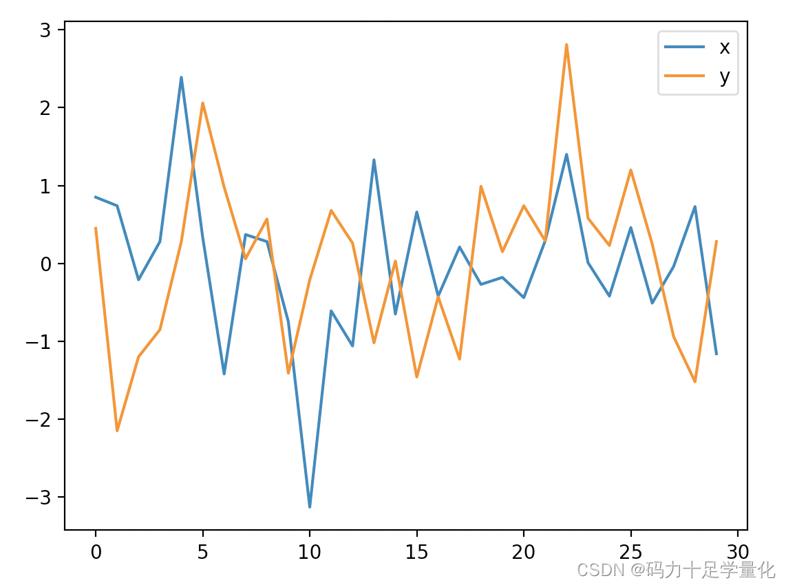
df = pd.DataFrame(np.random.randn(30, 2).round(2),columns = ['x', 'y'])
df.plot(figsize = (8, 6)) #默认将df中所有列的数据都绘成图,X轴默认为index列,figsize指图形尺寸
plt.show()
3.1.2 添加第二根y轴
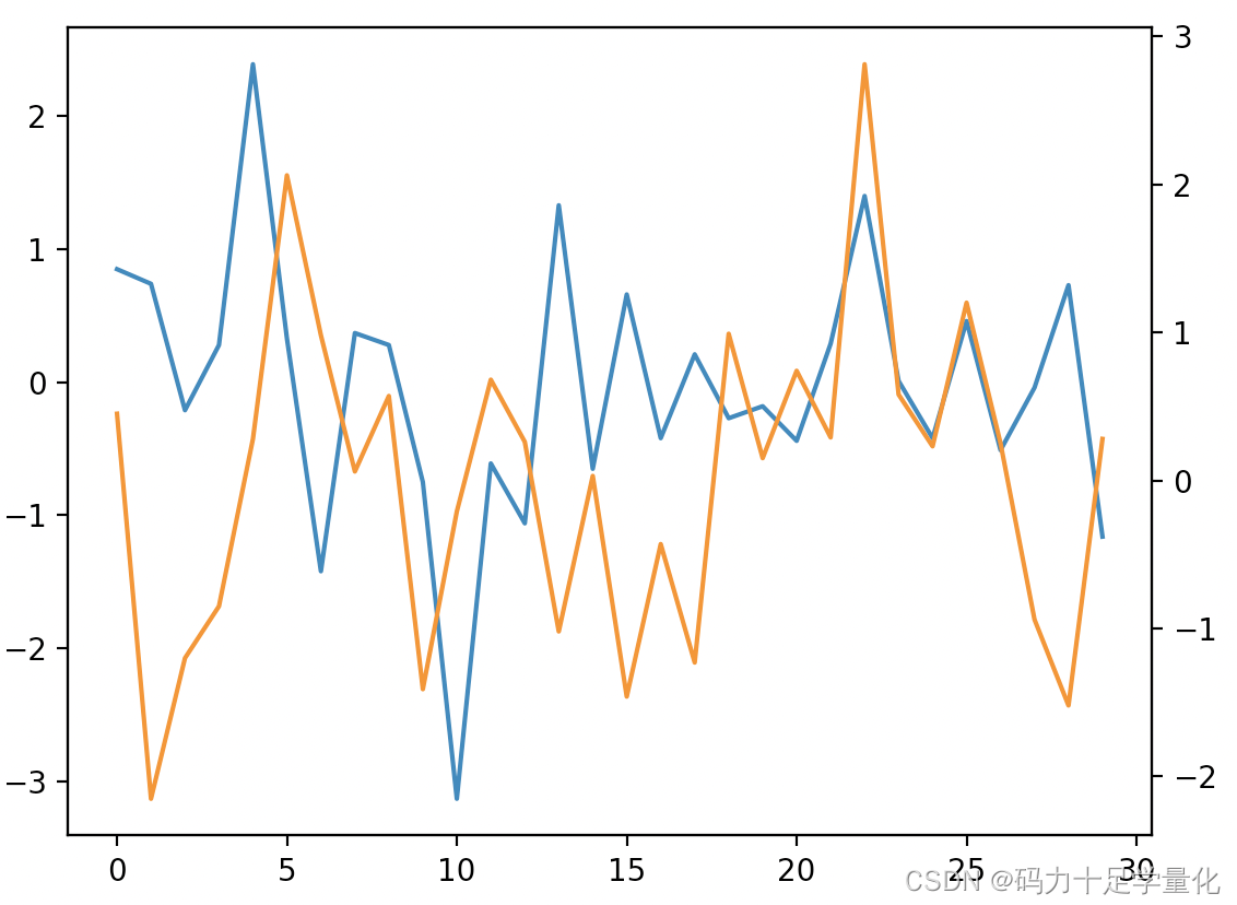
df.x.plot() #对x列作图
df.y.plot(secondary_y=True)  # 对y列作图,并将y列设置第二个y轴
plt.show()
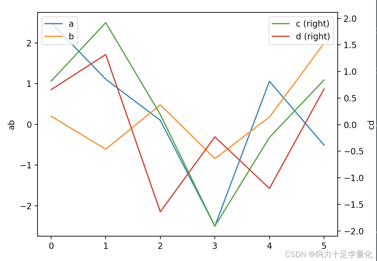
df = pd.DataFrame(np.random.randn(6, 4).round(2),columns = ['a', 'b','c','d'])
ax = df.plot(secondary_y=['c', 'd'])  # c,d列使用右Y轴。
ax.set_ylabel('ab')   # 主y轴标签
ax.right_ax.set_ylabel('cd')  # 第二y轴标签
ax.legend(loc='upper left')  # 主轴图例的位置
ax.right_ax.legend(loc='upper right')   # 设置第二图例的位置
plt.show()
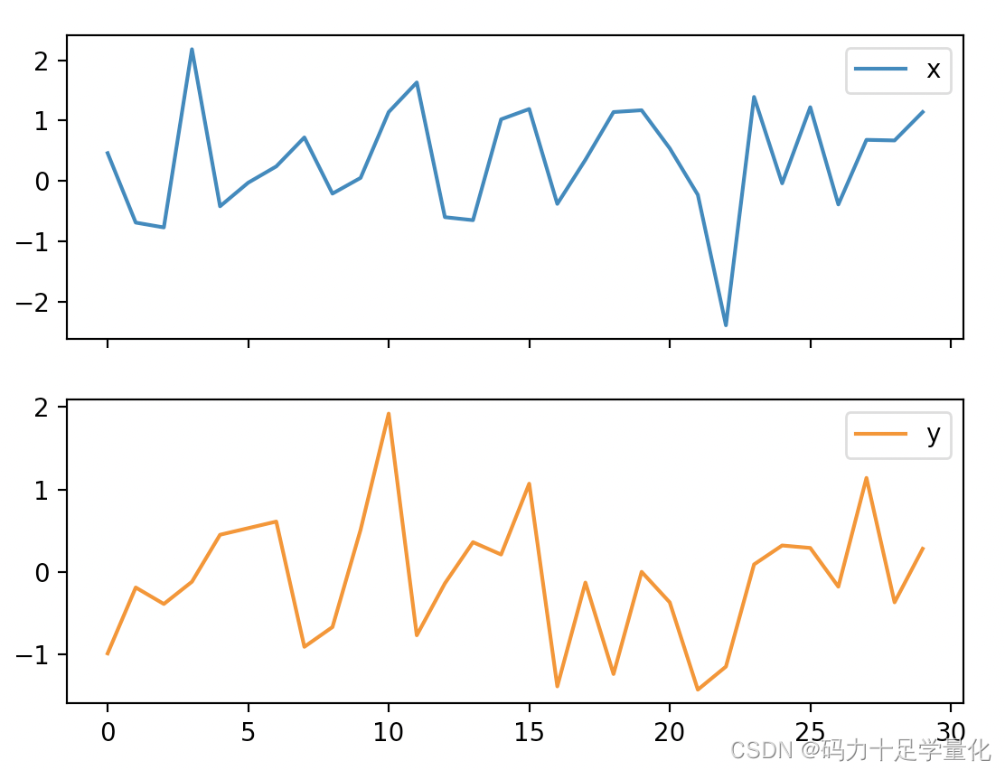
3.1.3 添加子图
df = pd.DataFrame(np.random.randn(30, 2).round(2),columns = ['x', 'y'])
df.plot(subplots=True) # x列y列分别绘制到子图中
plt.show()
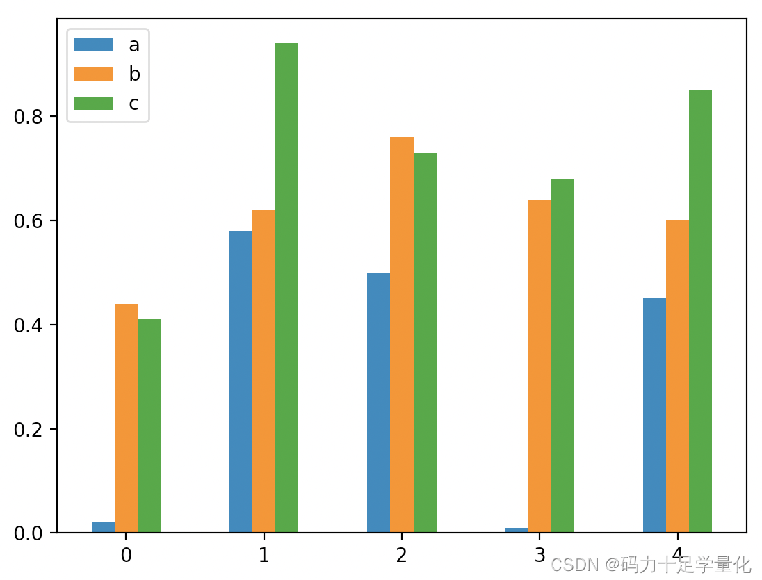
3.2 柱状图
3.2.1 基本用法
柱状图和散点图用法与折线图类似
df = pd.DataFrame(np.random.rand(5, 3).round(2), columns=["a", "b", "c"])
df.plot.bar(rot=0) #rot设置轴标签旋转度数
plt.show()
3.2.2 添加第二根y轴
用法与折线图类似,参考 [3.1.2](#3.1.2 添加第二根y轴)
3.2.3 添加子图
用法与折线图类似,参考 [3.1.3](#3.1.3 添加子图)
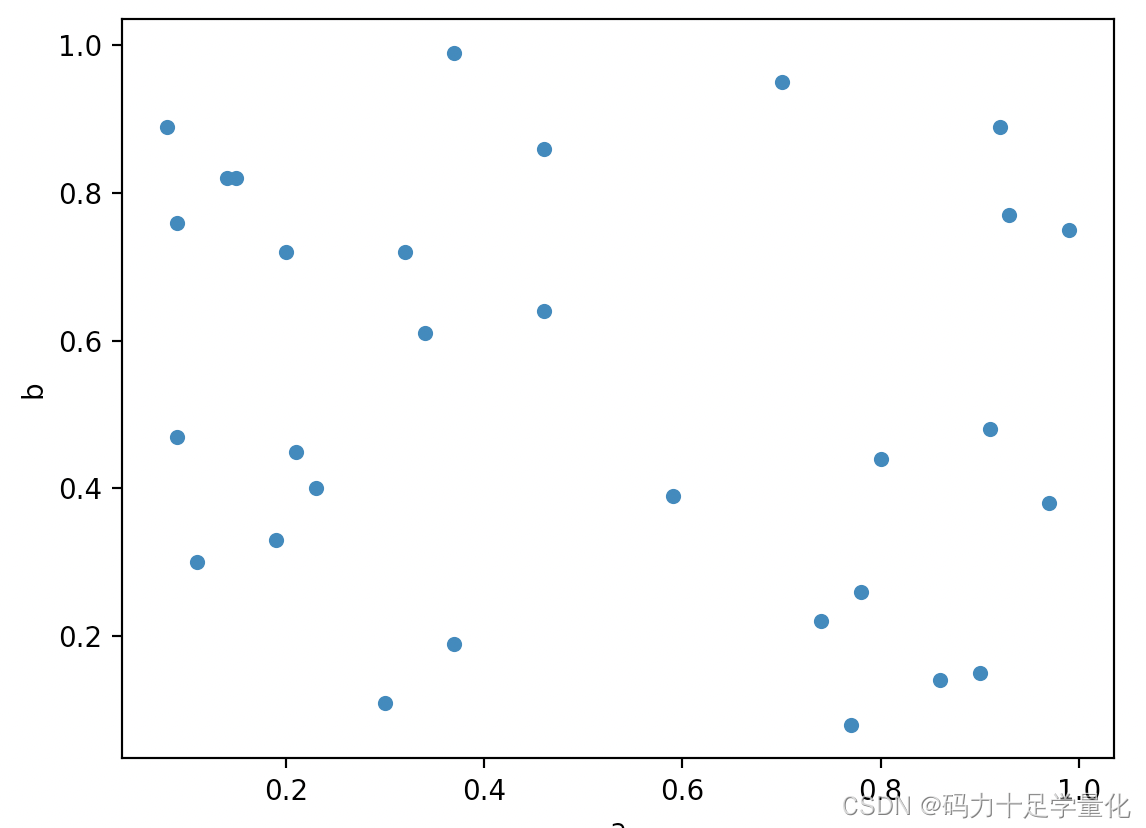
3.3 散点图
3.3.1 基本用法
df = pd.DataFrame(np.random.rand(30, 3).round(2), columns=["a", "b", "c"])
df.plot.scatter(x='a',y='b')
plt.show()
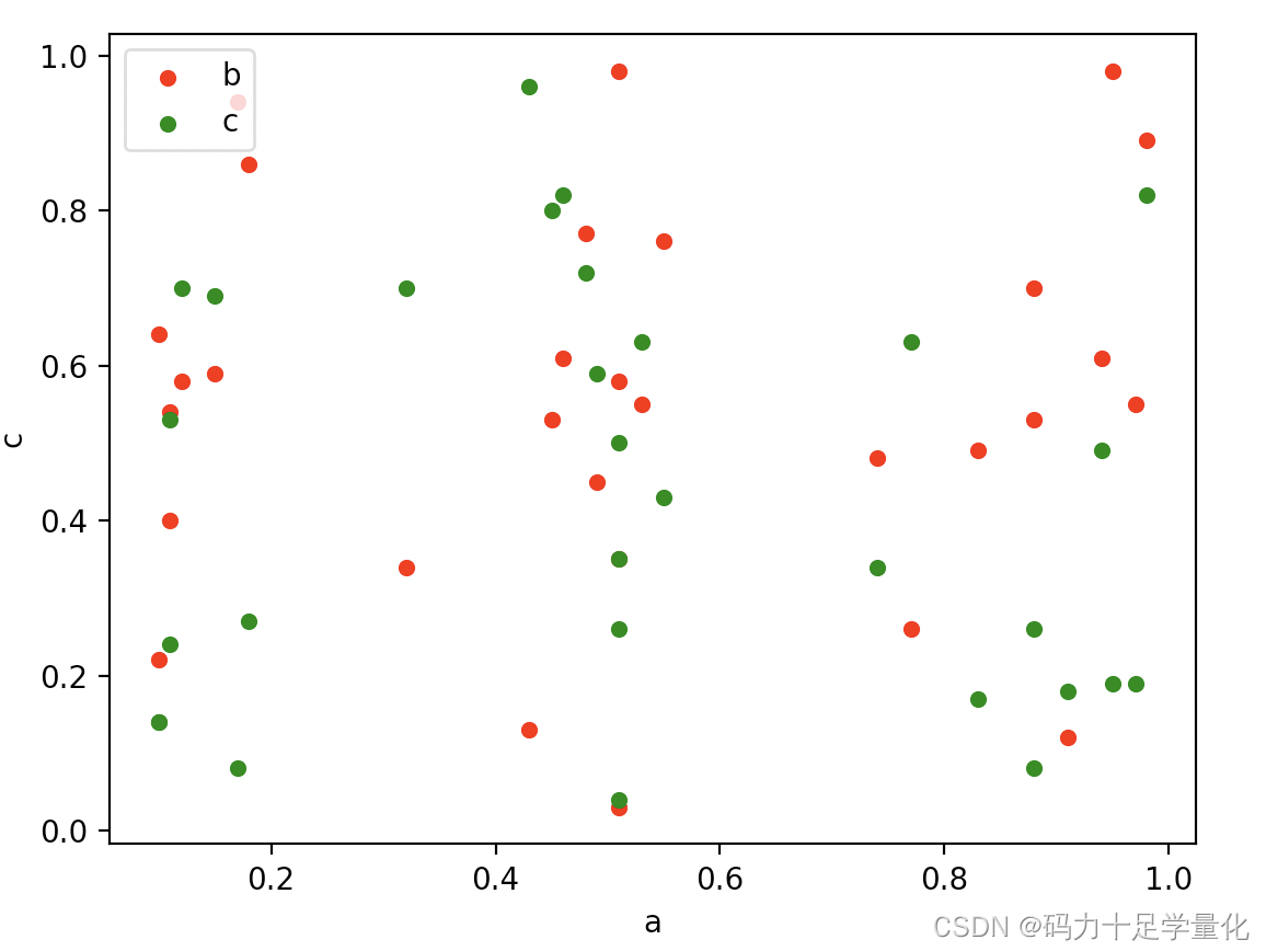
3.3.2 绘制多组数据
df = pd.DataFrame(np.random.rand(30, 3).round(2), columns=["a", "b", "c"])
ax = df.plot.scatter(x="a", y="b", color="red", label="b")
df.plot.scatter(x="a", y="c", color="green", label="c", ax=ax)
ax.legend(loc='upper left')
plt.show()