动态列表是各种社交属性软件中最常见的场景,其中用户在发布动态时一般会添加1-9张图片,不同的数量图片显示大小也会不同,下面就聊一下如何根据不同的图片数量动态改变图片大小。以下案例中最多支持9张图显示,每行做多显示3张,多余则进行换行,图片默认的宽高比为1:1.2。
首先看下0-9张图片时对应的图片显示尺寸(以下展示按照图片数量从小到大展示)


简单说下实现思路:
根据图片数量进行划分等级,具体实现内容如下:
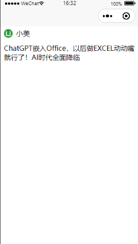
没有图片时图片盒子设置默认值; 1张图片时图片固定宽高为200px,240px.
2-3张图片时图片固定宽高为(屏幕宽度-左右padding)/图片个数.盒子高度为图片高度,不需换行;
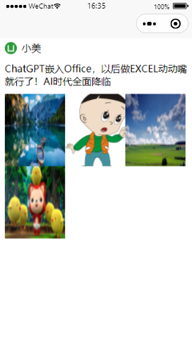
4-6张图片时图片固定宽高为(屏幕宽度-左右padding)/3.盒子高度为图片高度的两倍,需要设置换行;
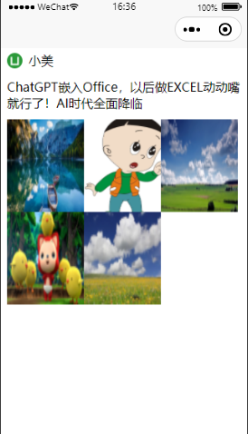
7-9张图片时图片固定宽高为(屏幕宽度-左右padding)/3.盒子高度为图片高度的三倍,需要设置换行;
屏幕宽度可以使用uni.getSystemInfo进行获取,注意单位为px.说下实现过程中遇到的问题:uni.getSystemInfo的success回调函数中是获取不到data中的属性的,这里处理的方式是重新定义一个变量that进行赋值.具体实现可参考代码.用户的头像使用的是uview中的u-avatar,使用时需要引入uview相关文件.
下面直接上代码:
<template>
	<view>
		<view class="user_class">
			<u-avatar src="/static/logo.png" size="20"></u-avatar>
			<text>小美</text>
		</view>
		<view class="content">
			<text>ChatGPT嵌入Office,以后做EXCEL动动嘴就行了!AI时代全面降临</text>
		</view>
		<view class="img_class" :style="'heigt:'+imgClassHeight+'rpx;'">
			<view class="img_content" v-if="imgClassHeight != 5" :style="'flex-wrap:'+imgClassFlexWrap">
				<image src="../../static/dynamic_1.png" mode="scaleToFill" :style="'height:'+imgHeight+'px;'+'width:'+imgWidth+'px'"></image>
				<image src="../../static/dynamic_2.png" mode="scaleToFill" :style="'height:'+imgHeight+'px;'+'width:'+imgWidth+'px'"></image>
				<image src="../../static/dynamic_3.png" mode="scaleToFill" :style="'height:'+imgHeight+'px;'+'width:'+imgWidth+'px'"></image>
				<image src="../../static/dynamic_4.png" mode="scaleToFill" :style="'height:'+imgHeight+'px;'+'width:'+imgWidth+'px'"></image>
				<image src="../../static/dynamic_5.png" mode="scaleToFill" :style="'height:'+imgHeight+'px;'+'width:'+imgWidth+'px'"></image>
				<image src="../../static/dynamic_6.png" mode="scaleToFill" :style="'height:'+imgHeight+'px;'+'width:'+imgWidth+'px'"></image>
				<image src="../../static/dynamic_7.png" mode="scaleToFill" :style="'height:'+imgHeight+'px;'+'width:'+imgWidth+'px'"></image>
				<image src="../../static/dynamic_8.png" mode="scaleToFill" :style="'height:'+imgHeight+'px;'+'width:'+imgWidth+'px'"></image>
				<image src="../../static/dynamic_9.png" mode="scaleToFill" :style="'height:'+imgHeight+'px;'+'width:'+imgWidth+'px'"></image>
			</view>
		</view>
	</view>
</template>

<script>
	export default {


		data() {


			return {


				// 图片区域大小,根据图片数量动态变化
				imgClassHeight: 0,
				// 图片区域是否换行
				imgClassFlexWrap: '',
				// 图片宽度
				imgWidth: 400,
				// 图片高度
				imgHeight: 400,
				// 屏幕宽度大小
				screenWith: 0
			};
		},
		onLoad() {


			// 处理success中无法获取data中属性问题,success中this非vue实例
			let that = this
			// 获取屏幕宽度信息
			uni.getSystemInfo({


				success:function(res) {


					console.log("屏幕宽度:"+res.windowWidth); // 单位:px
					that.screenWith=res.windowWidth;
					console.log("screenWith:"+that.screenWith);
				}
			})
			// 模拟服务器获取的图片数量
			const imgSize=9;
			// 宽高比:1:1.2
			const WidthHeightRtio=1.2;
			//设置图片区域大小
			if(imgSize == 0){

     // 无图片时图片区域大小,默认不显示
				this.imgClassHeight=5;
			}
			if(imgSize == 1){

     // 1张,一行展示
				this.imgClassHeight=240;
				// 宽高比:1:1.2
				this.imgWidth=200;
				this.imgHeight=240
			}
			if(imgSize >= 2 && imgSize <=3){

     // 2-3张,一行展示

				this.imgWidth=(this.screenWith-20)/imgSize;
				// 按照页面实际显示保持宽高比
				console.log("图片个数:"+imgSize+",每张图大小:"+(this.imgWidth));
				this.imgHeight=this.imgWidth * WidthHeightRtio
				this.imgClassHeight=this.imgHeight;
			}
			if(imgSize >= 4 && imgSize <=6){

     // 4-6张两行
				// 左右padding为20rpx,所以屏幕宽度需要减去20px,1rpx=0.5px
				this.imgWidth=(this.screenWith-20)/3;  // 每张图片宽度
				console.log("图片个数:"+imgSize+",每张图	大小:"+(this.imgWidth));
				this.imgHeight=this.imgWidth*WidthHeightRtio;
				this.imgClassFlexWrap='wrap';
				this.imgClassHeight=this.imgHeight * 2;
			}
			if(imgSize >= 7 && imgSize <=9){

     // 7-9张三行
				this.imgWidth=(this.screenWith-20)/3;  // 每张图片宽度
				this.imgHeight=this.imgWidth*WidthHeightRtio;
				this.imgClassFlexWrap='wrap';
				this.imgClassHeight=this.imgHeight * 3;
			}

		}
	}
</script>

<style lang="scss">
.user_class{


	padding-top: 10rpx;
	height: 60rpx;
	width: 100%;
	display: flex;
	justify-content: flex-start;
	align-items: center;
	padding-left: 20rpx;
	text{


		padding-left: 20rpx;
	}
}
.content{


	height: 150rpx;
	width: 100%;
	display: flex;
	justify-content: center;
	align-items: center;
	text{


		padding: 20rpx;
	}
}
.img_class{


	width: 100%;
	.img_content{


		display: flex;
		flex-direction:row;
		justify-content: flex-start;
		align-items: center;
		padding-left: 20rpx;
		padding-right: 20rpx;
	}


}
</style>
以上是处理多张图片动态改变图片大小的实现方案,看完希望对你有所帮助或启发,欢迎评论区留言交流或是点赞收藏!