Android Design Support Library 详解
一、简介
Android Design Support Library 是Google在2015年的IO大会上,带来的全新适应Material Design设计规范的支持库。在这个支持库中,给我们提供了更加规范的MD设计风格控件,主要包含下面几大控件:
Snackbar
FloatingActionButton
TextInputLayout
TabLayout
AppBarLayout
CollapsingToolbarLayout
NavigationView
CoordinatorLayout
在使用Android Design Support Library之前,我们只需要在AS中添加引用即可:
compile 'com.android.support:design:23.3.0'
二、Snakbar
Snackbar与Toast相似,它可以从屏幕底部弹出一个简短的消息
当它显示一段时间后或者用户与屏幕交互时,它会自动消失
可以包含一个动作action
Snackbar出现在屏幕所有其他元素之上,同一时间内只有一个Snackbar显示
使用Snakbar
// view Snackbar会通过该view寻找一个父View来持有Snackbar的view
Snackbar snackbar = Snackbar.make(view, "网络开车了,请检查网络设置", Snackbar.LENGTH_LONG);
snackbar.setAction("确定", new View.OnClickListener() {
    @Override
    public void onClick(View view) {
        Toast.makeText(DesignSupportLibraryActivity.this, "点击了SnackBar", Toast.LENGTH_LONG).show();
    }
});
// 设置Aciton的字体颜色值
snackbar.setActionTextColor(Color.WHITE);
// 设置Snackbar的背景色
Snackbar.SnackbarLayout layout = (Snackbar.SnackbarLayout) snackbar.getView();
layout.setBackgroundColor(Color.RED);
// 设置Snackbar文字的颜色
TextView textView = (TextView) layout.findViewById(R.id.snackbar_text);
textView.setTextColor(Color.WHITE);
snackbar.show();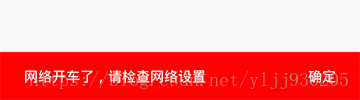
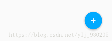
三、FloatingActionButton
FloatingActionButton是悬浮按钮,用来强调当前屏幕中最重要的动作,吸引用户的注意。FloatingActionButton现在是继承自控件ImageButton,所以它也会拥有该控件的所有属性。
使用FloatingActionButton
<android.support.design.widget.FloatingActionButton
    android:id="@+id/fabutton"
    android:layout_width="wrap_content"
    android:layout_height="wrap_content"
    android:layout_margin="@dimen/fab_margin"
    android:src="@android:drawable/ic_dialog_email" />
其它的属性:
- app:backgroundTint:设置FAB的背景颜色。
- app:rippleColor:设置FAB点击时的背景颜色。
- app:elevation:设置默认状态下FAB的阴影大小。
- app:pressedTranslationZ:点击时候FAB的阴影大小。
- app:fabSize:设置FAB的大小,该属性有两个值,分别为normal和mini,对应的FAB大小分别为56dp和40dp。
- app:layout_anchor:设置FAB的锚点,即以哪个控件为参照点设置位置,该属性需要在CoordinatorLayout布局中使用才生效
- app:layout_anchorGravity:设置FAB相对锚点的位置,值有 bottom、center、right、left、top等,该属性需要在CoordinatorLayout布局中使用才生效
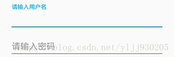
四、TextInputLayout
TextInputLayout继承自LinearLayout,用来把EditText包裹在该布局中,可以让hint文字变成一个在EditText上方的浮动标签,同时还包括一个漂亮的material动画。TextInputLayout只接受一个子元素。子元素需要是一个EditText元素
1、使用TextInputLayout
<android.support.design.widget.TextInputLayout
    android:id="@+id/til_username"
    android:layout_width="match_parent"
    android:layout_height="wrap_content"
    android:layout_marginTop="10dp">
    <EditText
        android:layout_width="match_parent"
        android:layout_height="wrap_content"
        android:layout_marginLeft="20dp"
        android:layout_marginRight="20dp"
        android:hint="请输入用户名"
        android:maxLength="25" />
</android.support.design.widget.TextInputLayout>
2、获取控件EditText对象
TextInputLayout和LinearLayout和ScrollView不同,你可以使用一个特殊的方法获得子元素EditText,getEditText,不需要使用findViewById
textinput_username= (TextInputLayout)findViewById(R.id.til_username);
EditText username = textinput_username.getEditText();
3、显示错误信息
TextInputLayout的错误处理简单快速。需要的方法是setErrorEnabled和setError
使用setError时,错误信息会出现在EditText的下面。使用setErrorEnabled可以隐藏错误信息
if (TextUtils.isEmpty(username)) {
    textinput_username.setError("请输入用户名!");
} else {
    //必须添加,否则出现错误信息第二次不显示的问题
    textinput_username.setError(null);
    textinput_username.setErrorEnabled(false);
}
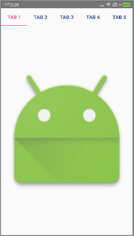
五、TabLayout
TabLayout提供了一个水平布局来显示tabs,与ViewPager配合使用可发挥它的优势
<?xml version="1.0" encoding="utf-8"?>
<LinearLayout xmlns:android="http://schemas.android.com/apk/res/android"
    xmlns:app="http://schemas.android.com/apk/res-auto"
    android:layout_width="match_parent"
    android:layout_height="match_parent"
    android:orientation="vertical">
    <android.support.design.widget.TabLayout
        android:id="@+id/tablayout"
        android:layout_width="match_parent"
        android:layout_height="wrap_content"
        app:tabIndicatorColor="@color/colorAccent"
        app:tabSelectedTextColor="@color/colorAccent"
        app:tabTextColor="@color/colorPrimaryDark">
    </android.support.design.widget.TabLayout>
    <android.support.v4.view.ViewPager
        android:id="@+id/viewpager"
        android:layout_width="match_parent"
        android:layout_height="match_parent">
    </android.support.v4.view.ViewPager>
</LinearLayout>
常用的属性:
- app:tabIndicatorColor:Tab指示器下标的颜色
- app:tabSelectedTextColor:Tab被选中时字体的颜色
- app:tabTextColor:Tab未被选中时字体的颜色
Activity中使用
tablayout = (TabLayout) findViewById(R.id.tablayout);
tablayout.setTabMode(TabLayout.MODE_FIXED);
tablayout.addTab(tablayout.newTab().setText("Tab 1"));
tablayout.addTab(tablayout.newTab().setText("Tab 2"));
tablayout.addTab(tablayout.newTab().setText("Tab 3"));
tablayout.addTab(tablayout.newTab().setText("Tab 4"));
tablayout.addTab(tablayout.newTab().setText("Tab 5"));
tablayout.addTab(tablayout.newTab().setText("Tab 6"));
注意:
设置tab栏信息时,要在
viewpager.setAdapter(pagerAdapter)
tablayout.setupWithViewPager(viewpager);之后,否则会出现tab上的文字不显示的问题
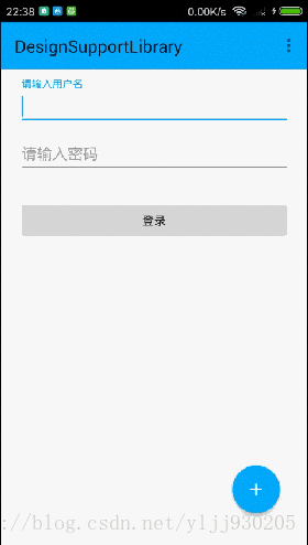
六、AppBarLayout
AppBarLayout是一个垂直的线性布局,实现了许多MD的特性,包括滚动手势。
它的子View通过 setScrollFlags(int) 方法或者设置app:layout_scrollFlags属性来提供滚动的行为。但是必须是作为CoordinatorLayout的直接子view,这些行为才会生效
实现上滑隐藏,下滑显示的效果(CoordinatorLayout + AppBarLayout + Toolbar + TabLayout)
布局文件设置:
<?xml version="1.0" encoding="utf-8"?>
<android.support.design.widget.CoordinatorLayout xmlns:android="http://schemas.android.com/apk/res/android"
    xmlns:app="http://schemas.android.com/apk/res-auto"
    android:id="@+id/act_design_cl"
    android:layout_width="match_parent"
    android:layout_height="match_parent">

    <android.support.design.widget.AppBarLayout
        android:id="@+id/appbar"
        android:layout_width="match_parent"
        android:layout_height="wrap_content"
        android:theme="@style/AppTheme">

        <android.support.v7.widget.Toolbar
            android:id="@+id/toolbar"
            android:layout_width="match_parent"
            android:layout_height="?attr/actionBarSize"
            android:background="?attr/colorPrimary"
            app:layout_scrollFlags="scroll|enterAlways"
            app:popupTheme="@style/AppTheme" />

    </android.support.design.widget.AppBarLayout>

    <android.support.v4.widget.NestedScrollView
        android:id="@+id/act_design_nsv"
        android:layout_width="match_parent"
        android:layout_height="match_parent"
        android:fillViewport="true"
        app:layout_behavior="@string/appbar_scrolling_view_behavior">

        <LinearLayout
            android:layout_width="match_parent"
            android:layout_height="match_parent"
            android:orientation="vertical">

            <android.support.design.widget.TextInputLayout
                android:id="@+id/til_username"
                android:layout_width="match_parent"
                android:layout_height="wrap_content"
                android:layout_marginTop="10dp">

                <EditText
                    android:layout_width="match_parent"
                    android:layout_height="wrap_content"
                    android:layout_marginLeft="20dp"
                    android:layout_marginRight="20dp"
                    android:hint="请输入用户名"
                    android:maxLength="25" />
            </android.support.design.widget.TextInputLayout>

            <android.support.design.widget.TextInputLayout
                android:layout_width="match_parent"
                android:layout_height="wrap_content">

                <EditText
                    android:layout_width="match_parent"
                    android:layout_height="wrap_content"
                    android:layout_marginLeft="20dp"
                    android:layout_marginRight="20dp"
                    android:hint="请输入密码"
                    android:maxLength="25" />
            </android.support.design.widget.TextInputLayout>

            <Button
                android:layout_width="match_parent"
                android:layout_height="wrap_content"
                android:layout_marginLeft="20dp"
                android:layout_marginRight="20dp"
                android:layout_marginTop="30dp"
                android:onClick="onSnackbar"
                android:text="登录" />

        </LinearLayout>
    </android.support.v4.widget.NestedScrollView>

    <android.support.design.widget.FloatingActionButton
        android:layout_width="wrap_content"
        android:layout_height="wrap_content"
        android:layout_margin="20dp"
        android:src="@drawable/ic_add_write"
        app:layout_anchor="@id/act_design_nsv"
        app:layout_anchorGravity="bottom|right" />
</android.support.design.widget.CoordinatorLayout>
总结如下:
- 根布局控件必须是CoordinatorLayout;
- toolbar要放在布局AppBarLayout中;
- toolbar需要设置属性app:layout_scrollFlags=”scroll|enterAlways”;
- 在RecyclerView或者任意支持嵌套滚动的view比如NestedScrollView上添加属性app:layout_behavior=”@string/appbar_scrolling_view_behavior”,这样才能和AppBarLayout联动
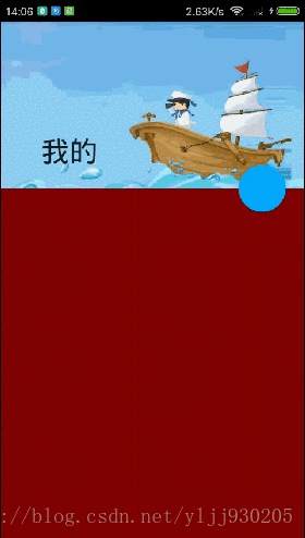
七、CollapsingToolbarLayout
CollapsingToolbarLayout被用来包裹Toolbar,实现了一个可折叠的app bar
它用来作为AppBarLayout的子类
CollapsingToolbarLayout还可以包含一个ImageView,用来作为滑动时的背景
在CollapsingToolbarLayout中有几个常见的属性设置
- 设置当CollapsingToolbarLayout完全折叠(收缩)后的背景颜色
app:contentScrim="@color/colorPrimary"- 设置CollapsingToolbarLayout处于扩张时(未收缩)时,title距离左边的距离
app:expandedTitleMarginStart="48dp" - 设置滚动标志,这里面有几个值
scroll:想滚动就必须设置这个。
enterAlways:实现quick return效果, 当向下移动时,立即显示View
exitUntilCollapsed:向上滚动时收缩View时,View一直固定在上面。
enterAlwaysCollapsed:当你的View已经设置minHeight属性又使用此标志时,
你的View只能以最小高度进入,只有当滚动视图到达顶部时才扩大到完整高度。
app:layout_scrollFlags="scroll|exitUntilCollapsed"在CollapsingToolbarLayout中子ImageView的常见设置
- 设置子布局设置折叠模式
parallax:视差模式,在折叠的时候会有个视差折叠的效果
pin:固定模式,在折叠的时候最后固定在顶端
app:layout_collapseMode="parallax"- 设置视差的系数,介于0.0-1.0之间
app:layout_collapseParallaxMultiplier="0.7"在CollapsingToolbarLayout中Toolbar的设置:
- 当CollapsingToolbarLayout完全收缩后, Toolbar还可以保留在屏幕上
app:layout_collapseMode="pin"设置扩张时候的title颜色
mCollapsingToolbarLayout.setExpandedTitleColor();收缩后在Toolbar上显示时的title的颜色
mCollapsingToolbarLayout.setCollapsedTitleTextColor();注
使用CollapsingToolbarLayout时,必须把title设置到CollapsingToolbarLayout上,如果设置在Toolbar上不显示
如果存在FloatingActionButton,指定属性
app:layout_anchor=”@id/appbar_layout” //锚点定在AppBarLayout上,则可以随视差滚动联动
<?xml version="1.0" encoding="utf-8"?>
<android.support.design.widget.CoordinatorLayout xmlns:android="http://schemas.android.com/apk/res/android"
    xmlns:app="http://schemas.android.com/apk/res-auto"
    android:layout_width="match_parent"
    android:layout_height="match_parent">

    <android.support.design.widget.AppBarLayout
        android:id="@+id/appbar"
        android:layout_width="match_parent"
        android:layout_height="200dp">

        <android.support.design.widget.CollapsingToolbarLayout
            android:layout_width="match_parent"
            android:layout_height="match_parent"
            app:contentScrim="@color/colorAccent"
            app:expandedTitleMarginStart="48dp"
            app:expandedTitleTextAppearance="@mipmap/timg"
            app:layout_scrollFlags="scroll|exitUntilCollapsed"
            app:title="我的">

            <ImageView
                android:layout_width="match_parent"
                android:layout_height="match_parent"
                android:scaleType="centerCrop"
                android:src="@mipmap/timg"
                app:layout_collapseMode="parallax"
                app:layout_collapseParallaxMultiplier="0.7" />

            <android.support.v7.widget.Toolbar
                android:id="@+id/toolbar"
                android:layout_width="match_parent"
                android:layout_height="?attr/actionBarSize"
                app:layout_collapseMode="pin" />
        </android.support.design.widget.CollapsingToolbarLayout>
    </android.support.design.widget.AppBarLayout>

    <android.support.v4.widget.NestedScrollView
        android:layout_width="match_parent"
        android:layout_height="match_parent"
        app:layout_behavior="@string/appbar_scrolling_view_behavior">

        <LinearLayout
            android:layout_width="match_parent"
            android:layout_height="match_parent">

            <TextView
                android:layout_width="match_parent"
                android:layout_height="800dp"
                android:background="#800000" />
        </LinearLayout>
    </android.support.v4.widget.NestedScrollView>

    <android.support.design.widget.FloatingActionButton
        android:layout_width="wrap_content"
        android:layout_height="wrap_content"
        android:layout_margin="10dp"

        android:background="#ff0036"
        app:layout_anchor="@id/appbar"
        app:layout_anchorGravity="bottom|right" />
</android.support.design.widget.CoordinatorLayout>