这是一个很常见的登录页面,自然想到了Flutter的表单组件Form。
想使用Form 组件,就要修改TextFormField的样式了。
TextFormField是TextField的一个包装类,除了FormField定义的属性之外,它还包括TextField的属性。
TextField的decoration属性可以用于控制TextField的外观显示,如提示文本、背景颜色、边框等,它继承自InputDecoration。
TextField(
  decoration:InputDecoration(
    labelText:"请输入用户名",
    prefixIcon:Icon(Icons.person),// 未获得焦点下划线设为灰色
    enabledBorder:UnderlineInputBorder(
      borderSide:BorderSide(color:Colors.grey)),//获得焦点下划线设为蓝色
    focusedBorder:UnderlineInputBorder(
      borderSide:BorderSide(color:Colors.blue)),
  ),
)
设置背景色
设计图上要求灰色背景,通过查看InputDecoration的定义,可以修改背景色的只有fillColor这个属性。但是只设置fillColor属性是不行的,还必须同时设置filled为 true。
TextField(
  decoration:InputDecoration(
    labelText:"请输入用户名",
    filled: true,
    fillColor: const Color(0xffF6F6F8),
   )
)
设置圆角
想要设置圆角,发现没有BorderRadius直接相关的属性设置,但是找到了border属性,border继承自InputBorder,想要设置圆角只能想办法在边框相关的属性里面去设置。
注意InputDecoration里面的border都是继承自InputBorder的。
/// Typically one of [UnderlineInputBorder] or [OutlineInputBorder].
/// If null, InputDecorator's default is `const UnderlineInputBorder()`.
///
/// See also:
///
///  * [InputBorder.none], which doesn't draw a border.
///  * [UnderlineInputBorder], which draws a horizontal line at the
///    bottom of the input decorator's container.
///  * [OutlineInputBorder], an [InputDecorator] border which draws a
///    rounded rectangle around the input decorator's container.
final InputBorder? border;可以看到有3种方式设置border:
InputBorder.none: 无边框。
UnderlineInputBorder:带下划线的边框。没有设置默认是此值。
OutlineInputBorder:可以设置外边框。
1,2可以忽略。我们需要圆角,但不需要边框,还是可以选择OutlineInputBorder,配置OutlineInputBorder里面的边框属性:
OutlineInputBorder(
    borderRadius: BorderRadius.circular(24),
    borderSide: const BorderSide(style: BorderStyle.none)
)
borderRadius属性配置圆角,borderSide属性配置边框的样式为none既可。
还有个问题是我们只设置InputDecoration.border属性是不够的的。
InputDecoration还提供了不同场景下的边框,比如未获得焦点,获得了焦点,边框可用,出现错误的时候的几种情况需要设置:
/// This property is only used when the appropriate one of [errorBorder],
/// [focusedBorder], [focusedErrorBorder], [disabledBorder], or [enabledBorder]
/// is not specified. This border's [InputBorder.borderSide] property is
/// configured by the InputDecorator, depending on the values of
/// [InputDecoration.errorText], [InputDecoration.enabled],
/// [InputDecorator.isFocused] and the current [Theme].也就是errorBorder,focusedBorder,focusedErrorBorder,disabledBorder,enabledBorder。
为了统一设置这些属性,定一个OutlineInputBorder变量分别赋值配置:
//统一定义一个圆角样式
var customBorder = OutlineInputBorder(
borderRadius: BorderRadius.circular(24),
borderSide: const BorderSide(style: BorderStyle.none));
TextFormField(
autofocus: true,
controller: _unameController,
decoration: InputDecoration(
border: customBorder,
enabledBorder:customBorder,
focusedBorder:customBorder,
focusedErrorBorder: customBorder,
errorBorder: customBorder,
hintText: "请输入账号",
filled: true,
fillColor: const Color(0xffF6F6F8),
//隐藏下划线
//border: InputBorder.none,
hintStyle: const TextStyle(fontSize: 15, color: Color(0xffAEAEAE)),
contentPadding: const EdgeInsets.symmetric(vertical: 12, horizontal: 20),
),
// 校验用户名,校验成功返回null,失败则返回错误信息
validator: (value) {
return value!.trim().isNotEmpty ? null : "用户名不能为空";
},
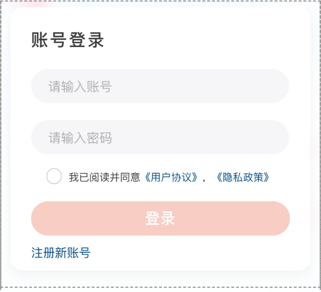
),最终的效果就是:

还有的思路是在TextField外面套一层DecoratedBox来设置背景色和圆角,但是这种设置背景色和圆角会把错误提醒信息包裹在里面。
以上就是我设置背景色和圆角的一种方式吧,希望如果有更好的实现方式的童鞋可以分享!