
前要反思: 最近在写商城专题,有PC端和移动端!由于本人移动端写的页面比较多,一般都是使用弹性布局来适配不同分辨率的!所以我写PC端的时候也使用弹性布局+绝对定位来画页面的!但是在我电脑上正常,到了测试那边由于分辨率不一样出现了表单错位的现象!后来想到还有一个浮动布局,只不过我基本没有用过!说真的这次解决掉的适配还是浮动布局搞定的!所以要好好复习一下浮动布局!
相关属性介绍:
-
属性名:float
-
属性值:
1、向左浮动:left
2、向右浮动:right
3、默认值不浮动:none
4、继承父元素:inherit -
目的: 浮动布局的主要用法是为了让块级元素在一行中显示(列级布局),或者让文字在图片的周围 显示。浮动元素用来解决块级元素在X轴上的排列问题ted
-
使用方法:浮动布局通常出现在div这种父子结构中,为子元素添加浮动特性
-
特点:(脱离文档流) 当一个元元素是浮动元素的时候,他会失去对父元素的支撑
-
清除浮动:
1、给父元素添加overflow:hidden
2、使用伪元素 例:clear:both(left、right)
3、如果没有指定宽度,宽度由内容所决定
4、多个浮动元素在一行排列,如果放不下再换行
5、不再占据屏幕空间
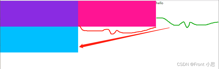
<body>
    <div class="main">
        <div class="one"></div>
   <div class="two"></div>
   <div class="three"></div>
    </div>
   <div> hello</div>
</body>
 body{


   margin:0;
 }
 .one,.two,.three{


       width: 300px;
      height: 100px;
      float: left;
  }
  .one{


     background-color: blueviolet;
 }
 .two{


     background-color: deeppink;
 }
  .three{


      background-color: deepskyblue;
  }
  /*.main{


       overflow: hidden;
   }*/
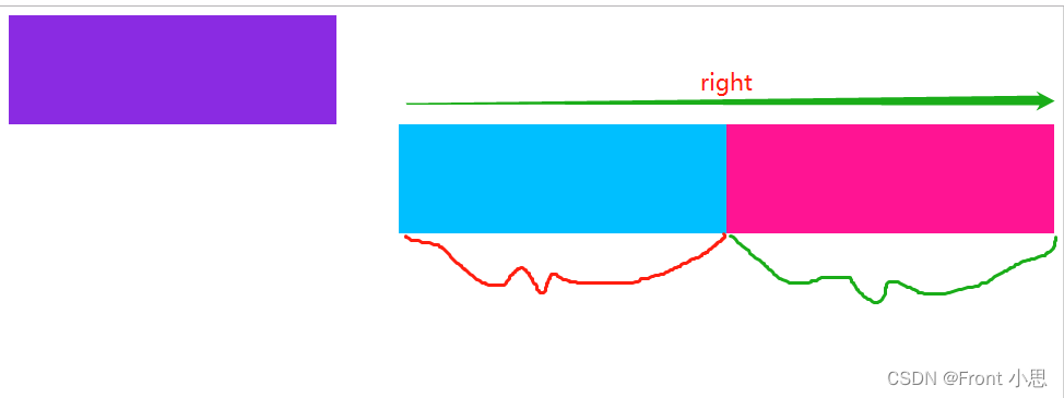
<body>
    <div class="in">
        <div class="one"></div>
   <div class="two"></div>
   <div class="three"></div>
    </div>
</body>
.one,.two,.three{


    width: 300px;
   height: 100px;
}
.one{


    background-color: blueviolet;
}
.two{


     background-color: deeppink;
     float: right;
}
.three{


    background-color: deepskyblue;
    float: right;
}
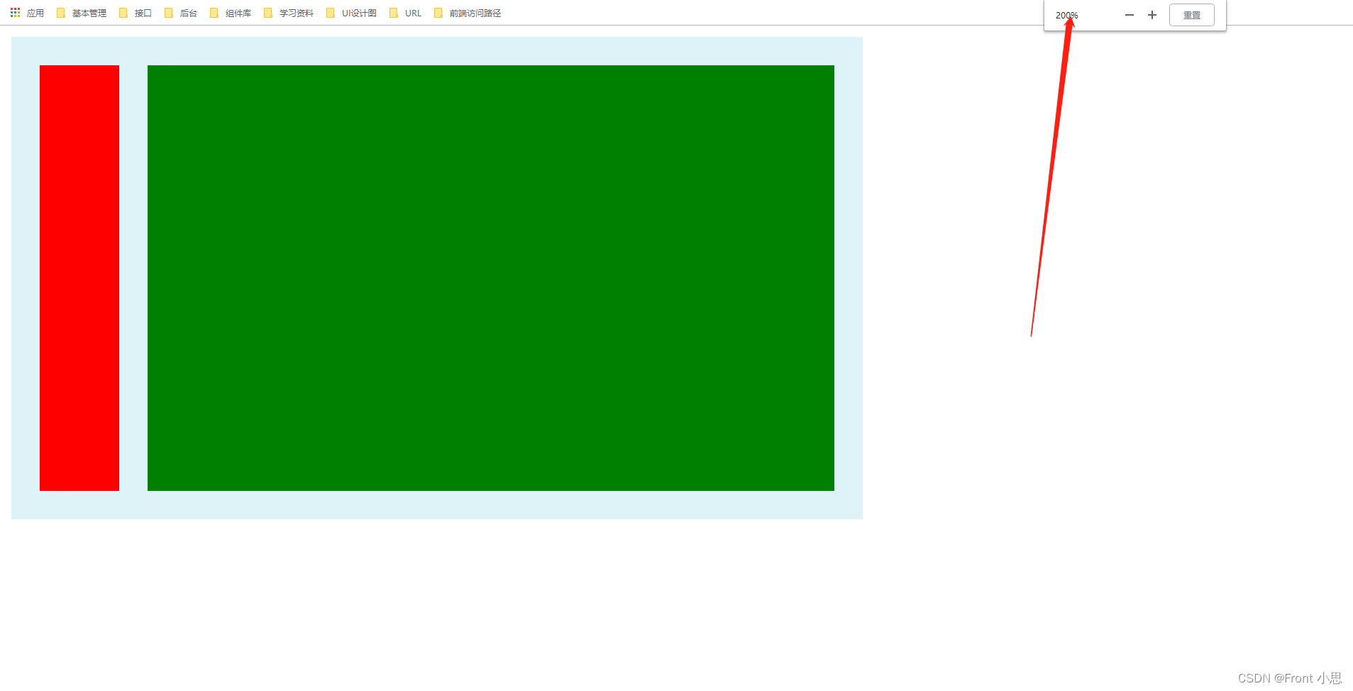
一、固定布局
特征:不管浏览器窗口如何缩小放大以及电脑分辨率如何变化,其模块的大小随着浏览器窗口缩小放大而变化,随着窗口推动而固定不变被盖住!
<div class="container">
	<div class="wrap clearfix">
		<div class="box1"></div>
		<div class="box2"></div>
	</div>
</div>
.container {


	width: 600px;
	background-color: #DDF3F7;
}
.wrap {


	padding: 20px;
	overflow: hidden;
}
.box1 {


	float: left;
	width: 56px;
	background-color: red;
	height: 300px;
}
/* 固定布局写法 */
.box2 {


	float: right;
	width: 484px;
	background-color: green;
	height: 300px;
}
/*清除浮动造成的影响*/
.clearfix:after {


	content: '';
	display: table;
	clear: both;
}
.clearfix {


	*zoom: 1;
}
100%正常窗口:
推动窗口:被盖住
窗口放大200%:
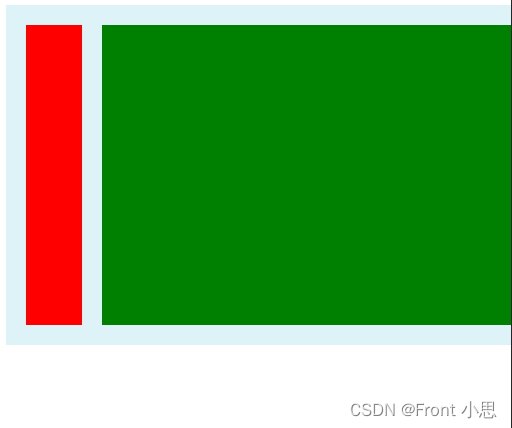
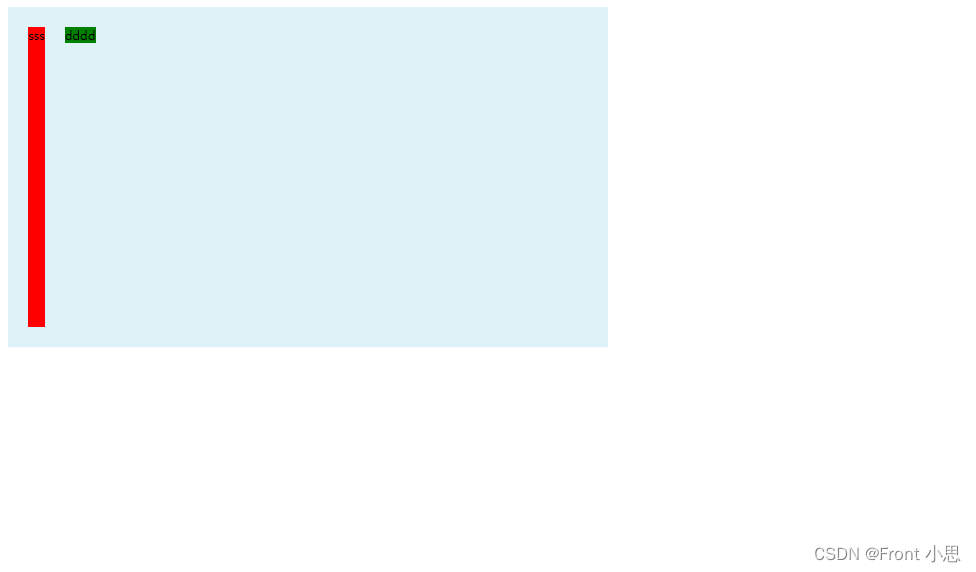
二、流体布局
特征:和固定布局基本一样的,只是第二个模块没有对应的浮动,直接距第一个模块脱离形成效果!
.container {


	width: 600px;
	background-color: #DDF3F7;
}
.wrap {


	padding: 20px;
	overflow: hidden;
}
.box1 {


	float: left;
	width: 56px;
	background-color: red;
	height: 300px;
}
/* 流体布局写法 */
.box2 {


	margin-left: 76px;
	background-color: green;
	height: 300px;
}
/*清除浮动造成的影响*/
.clearfix:after {


	content: '';
	display: table;
	clear: both;
}
.clearfix {


	*zoom: 1;
}
三、浮动与两侧皆自适应的流体布局
特征:和固定布局基本一样的,只是里面的撑开是靠内容而定的,所以盒子一定得要有内容!
.container {


	width: 600px;
	background-color: #DDF3F7;
}
.wrap {


	padding: 20px;
	overflow: hidden;
}
/* 浮动与两侧皆自适应的流体布局写法*/
.box1 {


	float: left;
	margin-right: 20px;
	background-color: red;
	height: 300px;
}
.box2 {


	display: table-cell;
	*display: inline-block;
	width: auto;
	background-color: green;
}
/*清除浮动造成的影响*/
.clearfix:after {


	content: '';
	display: table;
	clear: both;
}
.clearfix {


	*zoom: 1;
}
四、右浮动,改变DOM位置的流体布局
特征:和固定布局基本一样的,说白了就是流体布局倒过来而已!
.container {


	width: 600px;
	background-color: #DDF3F7;
}
.wrap {


	padding: 20px;
	overflow: hidden;
}
/* 浮动与两侧皆自适应的流体布局写法*/
.box1 {


	width: 56px;
	float: right;
	background-color: red;
	height: 300px;
}
.box2 {


	margin-right: 76px;
	background-color: green;
	height: 300px;
}
/*清除浮动造成的影响*/
.clearfix:after {


	content: '';
	display: table;
	clear: both;
}
.clearfix {


	*zoom: 1;
}
总结
这几种方法中“浮动与两侧皆自适应的流体布局”为最佳,因为它自适应强,可以不需要设置左右盒子的宽度,根据盒子内容来确定它们的排版。微博中采用这种方式可以实现盒子中个人头像大小替换,替换的同时并不会破坏网页的排版。