ShapeView组件:
自定义带圆角背景的ShapeTextView、ShapeEditText;
自定义根据状态切换背景色、字体色的ShapeCheckBox、ShapeRadioButton;
UI设计图会经常出现不同圆角、不同背景色的按钮和输入框。
甚至还有很多会根据状态来切换字体颜色和背景颜色的按钮。
最常见的做法就是定义好需要的Shape后,在XML中设置属性使用,但是如果有很多个不同样式的时候,我们就需要定义很多个Shape,写起来很是麻烦的。
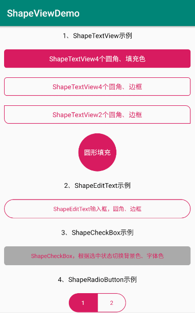
ShapeView组件效果
源码传送门
如何使用ShapeView组件
1、在根目录 build.gradle 添加:
allprojects {
		repositories {
			...
			maven { url 'https://jitpack.io' }
		}
	}
2、在app项目下的build.gradle中添加:
dependencies {
	        implementation 'com.github.mtjsoft:ShapeView:v1.0.0'
	}
3、在需要使用的布局xml中添加ShapeView组件,根据需要设置相关属性
ShapeTextView4个圆角、填充色
<cn.mtjsoft.www.shapeview.ShapeTextView
            android:layout_width="match_parent"
            android:layout_height="wrap_content"
            android:layout_margin="10dp"
            android:gravity="center"
            android:padding="10dp"
            android:text="ShapeTextView4个圆角、填充色"
            android:textColor="@android:color/white"
            android:textSize="14sp"
            app:radius="5dp"
            app:solidColor="@color/colorAccent" />
ShapeTextView2个圆角、边框
<cn.mtjsoft.www.shapeview.ShapeTextView
            android:layout_width="match_parent"
            android:layout_height="wrap_content"
            android:layout_margin="10dp"
            android:gravity="center"
            android:padding="10dp"
            android:text="ShapeTextView2个圆角、边框"
            android:textColor="@color/colorAccent"
            android:textSize="14sp"
            app:bottomLeftRadius="10dp"
            app:strokeColor="@color/colorAccent"
            app:strokeWidth="1dp"
            app:topRightRadius="10dp" />
ShapeEditText输入框,圆角、边框
<cn.mtjsoft.www.shapeview.ShapeEditText
            android:layout_width="match_parent"
            android:layout_height="40dp"
            android:layout_margin="10dp"
            android:gravity="center"
            android:text="ShapeEditText输入框,圆角、边框"
            android:textColor="@color/colorAccent"
            android:textSize="12sp"
            app:radius="20dp"
            app:strokeColor="@color/colorAccent"
            app:strokeWidth="1dp" />
ShapeCheckBox,根据选中状态切换背景色、字体色
<cn.mtjsoft.www.shapeview.ShapeCheckBox
            android:layout_width="match_parent"
            android:layout_height="40dp"
            android:layout_margin="10dp"
            android:gravity="center"
            android:text="ShapeCheckBox,根据选中状态切换背景色、字体色"
            android:textSize="12sp"
            app:radius="5dp"
            app:strokeWidth="1dp"
            app:strokeColor="@color/colorAccent"
            app:openSelector="true"
            app:solidSelectColor="@android:color/darker_gray"
            app:strokeSelectColor="@android:color/darker_gray"
            app:textNormalColor="@color/colorPrimary"
            app:textSelectColor="@color/colorAccent"/>
ShapeRadioButton示例
<RadioGroup
            android:layout_width="wrap_content"
            android:layout_height="wrap_content"
            android:layout_margin="10dp"
            android:orientation="horizontal">

            <cn.mtjsoft.www.shapeview.ShapeRadioButton
                android:layout_width="60dp"
                android:layout_height="40dp"
                android:gravity="center"
                android:textSize="12sp"
                android:text="1"
                app:topLeftRadius="20dp"
                app:bottomLeftRadius="20dp"
                app:strokeWidth="1dp"
                app:strokeColor="@color/colorAccent"
                app:openSelector="true"
                app:solidSelectColor="@color/colorAccent"
                app:strokeSelectColor="@color/colorAccent"
                app:textNormalColor="@color/colorAccent"
                app:textSelectColor="@android:color/white"/>

            <cn.mtjsoft.www.shapeview.ShapeRadioButton
                android:layout_width="60dp"
                android:layout_height="40dp"
                android:gravity="center"
                android:textSize="12sp"
                android:text="2"
                app:topRightRadius="20dp"
                app:bottomRightRadius="20dp"
                app:strokeWidth="1dp"
                app:strokeColor="@color/colorAccent"
                app:openSelector="true"
                app:solidSelectColor="@color/colorAccent"
                app:strokeSelectColor="@color/colorAccent"
                app:textNormalColor="@color/colorAccent"
                app:textSelectColor="@android:color/white"/>
        </RadioGroup>
4、GridPager组件的版本及属性说明
V1.0.0
| 1.0.0 属性 | 属性说明 | 备注 |
|---|---|---|
| solidColor | 填充色 | 2019-10-10 12:22:12 |
| strokeColor | 边框色 | |
| strokeWidth | 边框宽度 | |
| radius | 圆角弧度(4个角的弧度) | |
| topLeftRadius | 单独设置左上角弧度 | |
| topRightRadius | 单独设置右上角弧度 | |
| bottomLeftRadius | 单独设置左下角弧度 | |
| bottomRightRadius | 单独设置右下角弧度 | |
| openSelector | 是否使用Selector选择器 | |
| textNormalColor | 使用选择器时的默认字体色 | |
| textSelectColor | 使用选择器时的选中字体色 | |
| solidSelectColor | 使用选择器时的选中填充色 | |
| strokeSelectColor | 使用选择器时的选中边框色 |
添加我个人微信号交流,记得添加时备注一下哦

本人公众号,也可关注一波,共同交流吧。