CircleIndicator组件,使指示器风格更加多样化
UI界面是应用程序可视化必不可少的部分。设计精致的UI界面可以使得整个可视化应用程序给用户留下深刻的印象,是改善用户界面体验最直接的方式。
ArkUI开发框架为开发者提供了丰富的UI原生组件,如Navigation(Page页面的根容器)、ScrollBar(滚动条组件)、Swiper(滑动容器)及Tabs(通过页签进行内容视图切换的容器组件)等。其中,Swiper组件和Tabs组件在应用程序开发中对于指示器的使用引入较多,但是直接使用原生的Swiper组件和Tabs组件不适用于表现复杂的UI指示器交互变化。因此,我们针对Swiper组件和Tabs组件在指示器应用方向做了一个简单的封装,以CiecleIndicator三方组件的形式提供应用程序依赖使用,从而提升了ArkUI开发框架的UI界面之指示器风格多样化的能力。
CircleIndicator介绍
CircleIndicator组件UI效果展示
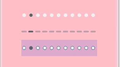
圆形指示器:
长条指示器:

横幅指示器:

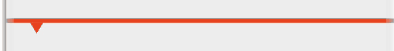
三角指示器:

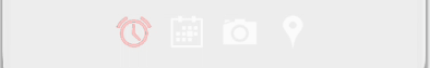
图标指示器:
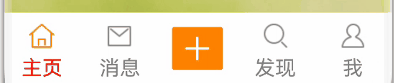
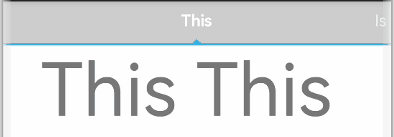
携带中央视图的Tabs指示器:
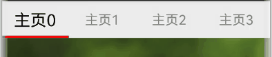
固定位置Tabs指示器:
固定位置Tabs指示器(胶囊风格):

固定位置Tabs指示器(携带角标):

可滑动Tabs指示器:
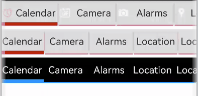
可滑动Tabs指示器(水滴滑块):

可滑动Tabs指示器(首列固定):
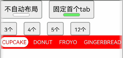
titles指示器:
什么是CircleIndicator?
CircleIndicator顾名思义,它指的是圆形指示器。不过在我们OpenHarmony三方组件中的CircleIndicator组件不再是狭义的圆形指示器,而是将多种表现形式的指示器汇集为一体的归一化指示器合集组件。
CircleIndicator的源码实现
这里我们以CircleIndicator组件源码中的TriangularIndicator.ets文件为源码解析样例对象展开分析。首先创建TriangularIndicator.ets文件,使用命名空间建立TriangularIndicator初始化模型:
namespace TriangularIndicator {
 export class Model {
//设置指示器高度
 mHeight: number = 18
//设置指示器宽度
 mWidth: number = lpx2px(720)
//设置指示器背景色
 mBackgroundColor: string
//字段过多,此处进行省略
//各字段set与get方法,此处只以height字段为例
 public getHeight(): number {
 return this.mHeight
 }
 public setHeight(height: number): Model {
 this.mHeight = height
 return this
 }
 //触摸事件拦截
 onPageTouch: (event: TouchEvent, currentIndicator: number) => void
 public notifyTouch(event: TouchEvent, currentIndex: number) {
 this.onPageTouch(event, currentIndex)
 }
 //设置构造器
 private tabsController: TabsController
 (tabsController: TabsController) {
 this.tabsController = tabsController
 }
 //页面切换监听
 indexChange: (itemIndex: number) => void
 public setChangeListener(callback: (index: number) => void): Model{
 this.indexChange = callback
 return this
 }
}
将TriangularIndicator应用组件化:
@Component
struct TriangularIndicator {
//获取TriangularIndicator实例
 @State model: TriangularIndicator.Model = new TriangularIndicator.Model(null)
//初始化指示器当前index
 @Link @Watch("itemIndexChange") itemIndex: number
//设置指示器总条数
 @State count: number = 0
//再分别实现itemIndexChange、aboutToAppear、onTouch、getOffset方法,此处实现不做展示
//再在build方法里面描述UI结构
 build() {
 Column() {
 Rect({ width: this.model.mWidth, height: this.model.mLineHeight }).fill(this.model.mLineColor)
 Polygon()
 .points(this.model.mReverse ?
 [[px2vp(this.model.mWidth) / (this.count * 2) - this.model.mTriangleWidth / 2, this.model.mLineHeight - this.model.mYOffset],
 [px2vp(this.model.mWidth) / (this.count * 2), this.model.mLineHeight + this.model.mTriangleHeight - this.model.mYOffset],
 [px2vp(this.model.mWidth) / (this.count * 2) + this.model.mTriangleWidth / 2, this.model.mLineHeight - this.model.mYOffset]] :
 [[px2vp(this.model.mWidth) / (this.count * 2) - this.model.mTriangleWidth / 2, -this.model.mYOffset],
 [px2vp(this.model.mWidth) / (this.count * 2), -this.model.mTriangleHeight - this.model.mYOffset],
 [px2vp(this.model.mWidth) / (this.count * 2) + this.model.mTriangleWidth / 2, -this.model.mYOffset]])
 .offset(this.model.mStartInterpolator ?
 { x: px2vp(this.model.mWidth) / this.count * (this.itemIndex - this.model.mStartInterpolator.interpolate(Math.abs(this.model.offs et / this.model.mWidth)) * Math.sign(this.model.offset)),
 y: 0 } :
 { x: px2vp(this.model.mWidth) / this.count * (this.itemIndex - this.model.offset / this.model.mWidth),
 y: 0 })
 .fill(this.model.mLineColor)
 .height(this.model.mHeight)
 .width(this.model.mWidth)
 }.width('100%').height(this.model.mHeight)
 .backgroundColor(this.model.mBackgroundColor)
 }
}
最后将TriangularIndicator暴露出来供外部引用:
export default TriangularIndicator
CircleIndicator实战
创建项目
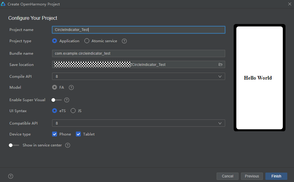
如图所示,在DevEco Studio中新建CircleIndicator_Test项目,项目类型选择Application,语言选择eTS,点击Finish完成创建。
创建工程
添加依赖
成功创建项目后,接下来就是将CircleIndicator组件下载至项目中。请在添加依赖之前参考如何安装OpenHarmony npm包(https://gitee.com/openharmony-tpc/docs/blob/master/OpenHarmony_npm_usage.md)完成OpenHarmony npm环境配置。完成OpenHarmony npm环境配置之后,在DevEco Studio的底部导航栏,点击“Terminal”(快捷键Alt+F12), 键入命令:npm install @ohos/circle-indicator --save并回车,此时CircleIndicator组件会自动下载至项目中。下载完成后工程根目录下会生成node_modules/@ohos/CircleIndicator目录。
编写逻辑代码
提供多种Indicator,使用方法类似,以TriangularIndicator为例
1. 初始化:实例化TabsController和对应的Indicator.Model 对象, 并添加number类型成员以记录当前页下标
private controller: TabsController = new TabsController()
@State model: TriangularIndicator.Model = new TriangularIndicator.Model(this.controller)
@State itemIndex: number = 0
2. 属性设置:通过Model类对象设置UI属性来自定义所需风格,也可以添加所需的回调
aboutToAppear() {
 this.model
 .setReverse(true)
 .setLineHeight(4)
 .setTriangleHeight(10)
 .setLineColor("#e94220")
 .setBackgroundColor("#eeeeee")
 .setChangeListener((itemIndex) => {
 console.info("change page to " + this.data[itemIndex])
 })
}
3. 界面绘制:在Tabs组件旁放置Indicator组件,注意需要关闭原生的bar。并监听Tabs组件的touch事件,通知给Model类,以统一处理滑动逻辑
build() {
 Column() {
 TriangularIndicator({ itemIndex: $itemIndex, count: this.data.length, model: this.model })
 Tabs({ index: this.itemIndex, controller: this.controller }) {
 ……
 }
 .barWidth(0)
 .onTouch((event: TouchEvent) => {
 this.model.notifyTouch(event, this.itemIndex)
 })
 }.padding({ top: 40 })
 .backgroundColor("#eeeeee")
}
本期基于OpenHarmony API8的CircleIndicator组件1.0.3(https://gitee.com/openharmony-sig/CircleIndicator/tree/1.0.3)就为大家介绍到这,欢迎大家积极参与贡献。了解更多三方组件动态,请关注三方组件资源汇总(https://gitee.com/openharmony-tpc/tpc_resource),更多优秀的组件等你来发现!