小伙伴们,对于省略号呢,咱们前端攻城狮的实现方法可就是多种多样了,那接下来呢我就给你罗列一下如果用css书写这些特殊效果,来一起看看吧~~~
1.单行文本超出显示省略号
效果图:

实现代码:
HTML部分
<h3>使用css实现单行省略号</h3>
<div class="box1">
    <a href="#" class="a1">Lorem ipsum dolor sit amet consectetur adipisicing elit. Ipsam ipsaexplicabo quos sapiente ea error, mollitia necessitatibus animi facere rem non sed velit aperiam laboriosamdebitis. Quae deleniti doloremque nisi.
    </a>
</div>
CSS部分
h3 {
    padding-left: 10px;
    }
.a1 {
    text-decoration: none;
    color: #000;
    padding-left: 20px;
    }
.box1 {
     height: 40px;
     line-height: 40px;
     background-image: linear-gradient(white, gray);
     box-shadow: 0 0 2px 2px rgb(148, 145, 145);
     box-sizing: border-box;
     /* 单行显示省略号 */
     overflow: hidden;
     text-overflow: ellipsis;
     white-space: nowrap;
     }
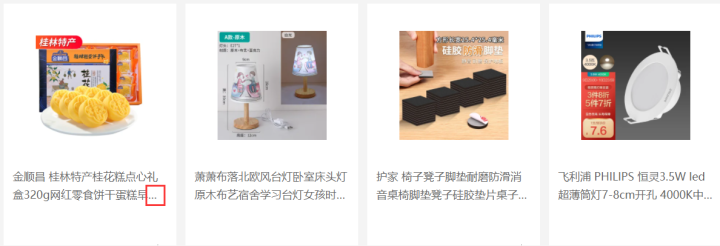
注:此案例为京东首页的部分切图,此时的省略号可以用上述代码实现
2.多行显示省略号
效果图:

HTML部分
<h3>使用css实现三行之后显示省略号</h3>
<div class="box2">
    <a href="#" class="a1">Lorem, ipsum dolor sit amet consectetur adipisicing elit. Fugit dicta laudantium aspernatur illo id, beatae mollitia magnam, laboriosam cupiditate harum veritatis ullam delectus adipisci quasi, laborum ipsum quis est molestiae.
    </a>
</div>
CSS部分
h3 {
    padding-left: 10px;
    }
.a1 {
    text-decoration: none;
    color: #000;
    padding-left: 20px;
    }
.box2 {
    height: 60px;
    line-height: 30px;
    background-image: linear-gradient(white, gray);
    box-shadow: 0 0 2px 2px rgb(148, 145, 145);
    overflow: hidden;
    /* 三行显示省略号 */
    display: -webkit-box;
    -webkit-box-orient: vertical;
    -webkit-line-clamp: 2;
    }
实际案例应用场景说明:
注:此时明显是折行后在第二行多余的部分显示省略号,那由于内容不固定字数不固定,所以需要动态设置,那么就应用到了上述的多行显示省略号的方法
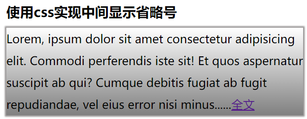
3.内容中间显示省略号(方法一)
效果图:
HTML部分
<h3>使用css实现中间显示省略号方法一</h3>
<div class="box3">Lorem, ipsum dolor sit amet consectetur adipisicing elit. Commodi perferendis iste sit! Et quos aspernatur suscipit ab qui? Cumque debitis fugiat ab fugit repudiandae, vel eius error nisi minus<span></span><a href="#">全文</a>
</div>
css部分
.box3 {
        /* height: 120px; */
        line-height: 30px;
        background-image: linear-gradient(white, gray);
        box-shadow: 0 0 2px 2px rgb(148, 145, 145);
       }
.box3 span::after {
        content: '......';
       }
实际案例应用场景说明:

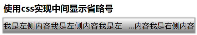
4.内容中间显示省略号(方法二)
效果图:
HTML部分
<h3>使用css实现中间显示省略号方法二</h3>
<div class="box4">
    <a href="#">
        <span class="span1" title="我是左侧内容我是左侧内容我是左侧内容">我是左侧内容我是左侧内容我是左侧内容</span>
        <span class="span2" title="我是右侧内容我是右侧内容"></span>
    </a>
</div>
css部分
.box4 {
height: 30px;
line-height: 30px;
background-image: linear-gradient(white, gray);
box-shadow: 0 0 2px 2px rgb(148, 145, 145);
}
.box4 .span1 {
float: left;
width: 62%;
height: 30px;
line-height: 30px;
overflow: hidden;
}
.box4 a {
color: #000;
}
.box4 .span2::before {
content: attr(title);
width: 38%;
float: right;
overflow: hidden;
text-overflow: ellipsis;
white-space: nowrap;
direction: rtl;
}
/* 优化两个span中间的间距 */
.box4 {
text-align: justify;
}
实际案例应用场景说明:

综上所述:以上四种方案是目前页面中应用较多的实现省略号的方法,仅代表个人观点,如您有更优的方法欢迎联系我们。