实现抽奖幸运大转盘功能。
效果图:

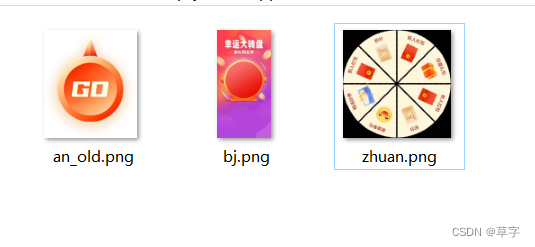
资源图片:
如果奖品是支持动态的,需要自己重新改一下布局,逻辑不变。
代码:
<template>
	<view class="relative">
		<image :src="require('@/static/newPerson/bj.png')" mode="widthFix" class="" style="width: 100%;"></image>
		<view class="zhuan flexCenter">
			<image :src="require('@/static/newPerson/zhuan.png')" mode="aspectFill" class="zhuanBox" :class="{'rotate':isRotate}" :style="{transform:`rotate(${angle}deg)`}" style="width:470rpx;height:470rpx;"></image>
			<image :src="require('@/static/newPerson/an.png')" mode="widthFix" @click="rotate()" class="an " style="width:218rpx;height:218rpx;"></image>
		</view>
		<!-- <view>1. 注册或未参与过此活动的用户</view>
		<view>2. 红包奖励直接到用户账号,可以用于商城购物</view>
		<view>3. 参与活动时,需要分享给好友一起参与</view> -->
	</view>
</template>

<script>
	//生成随机数(下面也有一个)
	function rand(min, max) {
	    return parseInt(Math.random() * (max - min + 1) + min);
	}
	export default {
		data() {
			return {
				isRotate:false,//是否旋转
				prizeList:['积分','新人红包','精选好券','谢谢参与','积分','新人红包','惊喜礼包','新人红包'],//奖品列表,决定旋转角度
				angle:0,//旋转角度
			}
		},
		methods: {
			rotate(){
				if(this.isRotate)return;
				this.angle=0;
				setTimeout(()=>{
					let len=this.prizeList.length;
					let num=rand(0,len-1);	//随机奖品,可以改成后端返回的。
					// let num=7;	//随机奖品,可以改成后端返回的。
					let prize=this.prizeList[num];
					// let angle=360/8*num+rand(0,44);//不排除转到中间线
					let angle=360/len*num+rand(4,40);//排除转到中间线
					this.angle=(8*360+angle);//旋转圈数8 + 奖品角度
					console.log('奖品:',prize,num,angle,this.angle,len)
					this.isRotate=true;
					setTimeout(()=>{
						this.isRotate=false;
						uni.showToast({
							title:prize,
							icon:'none',
							duration:3000
						})
					},5000)
				},300)
			}
		}
	}
</script>

<style>
.zhuan{

	position:absolute;
	/* top:50%; */
	top:46.5%;
	left:50%;
	transform: translate(-50%,-50%);
}
.zhuanBox{
	position: absolute;
	width: 100%;
	height: 100%;
}
.an{
	position: relative;
	/* position:absolute;
	top:50%;
	left:50%;
	transform: translate(-50%,-50%); */
	transform: rotate(0deg);
}
.an:active{
	transform: scale(0.95);
}
.rotate{
	/* animation: rotate 5s infinite linear; */
	/* animation-timing-function: ease-in-out; */
	/* animation-timing-function: cubic-bezier(0.42, 0, 0.58, 0.9); */
	/* animation-timing-function: cubic-bezier(0.25,0.1,0.25,1); */
	transform: rotate(3800deg);
	transition: transform 5s ease;
}

@keyframes rotate {
	0%{
		transform: rotate(0deg);
	}
	100%{
		/* transform: rotate(360deg); */
		transform: rotate(3800deg);
	}
}
</style>