简介
导航栏组件,主要用于头部导航。
导航栏(Nav_bar)组件结构大致分为两部分,一部分是图标,另一部分是文本,子组件实现,父组件引用。
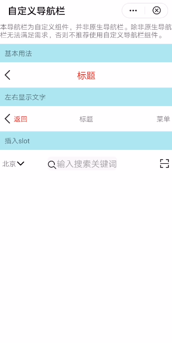
效果图如下:
基本布局代码如下:
<template>
  <div class="container">
    <text>本导航栏为自定义组件,并非原生导航栏。除非原生导航栏无法满足需求,否则不推荐使用自定义导航栏组件。</text>
    <text class="section">基本用法</text>
    <div class="example-body">
      <nav_bar height="50px" backgroundcolor="#ffffff" left-icon="{{leftIcon}}" title="标题"
          @clickleft="back" title-style="font-size: 40px; color:red"></nav_bar>
</div>
</div>
<template>
开发指引
自定义子组件
1.定义布局样式。
导航栏组件布局包括三个部分:左侧图标内容部分、标题内容部分、右侧图标内容部分。
左侧图标内容部分、右侧图标内容部分通过image+text+slot组件实现
标题内容部分由text+slot组件实现。
代码如下:
<template>
  <div>
    <div class="navbar_content" style="height:{{height}};background-color:{{backgroundcolor}}">
      <div class="navbar_btns_left" onclick="clickLeft">
        <div if="leftIcon.length">
          <image style="height: 50px" src="{{leftIcon}}"></image>
        </div>
        <div if="leftText.length">
          <text style="{{leftTextStyle}}">{{ leftText }}</text>
        </div>
        <slot name="left"></slot>
      </div>
      <div class="navbar_container" onclick="clickTitle">
        <text class="text_context" style="{{titleStyle}}"
            if="title.length">{{ title }}</text>
        <slot name="mid"></slot>
      </div>
      <div class="navbar_btns_right" onclick="clickRight">
        <div if="rightIcon.length">
          <image style="height: 50px" src="{{rightIcon}}"></image>
        </div>
        <div class="*" if="rightText.length && !rightIcon.length">
          <text style="{{rightTextStyle}}">{{ rightText }}</text>
        </div>
        <slot name="right"></slot>
      </div>
    </div>
  </div>
</template>
子组件设计
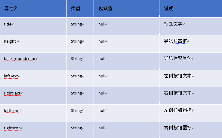
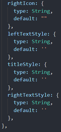
支持的属性如下:
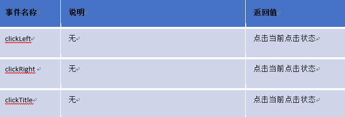
支持的事件:
父子组件通信
父组件给子组件传递数据
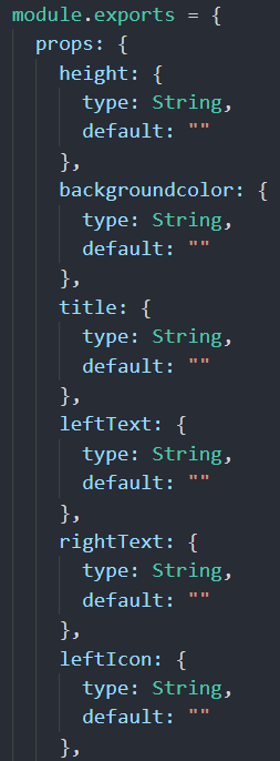
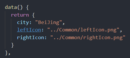
子组件通过在props定义参数,接收来自父组件的传值数据,如height、title等。如下图所示:
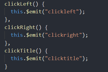
子组件通过this.$emit方法触发父组件的自定义事件
3.总结
实现导航栏组件,您可以从中学会如下知识点:
- 熟悉快应用子组件的设计和属性定义;
- 熟悉父子组件通信;
- 熟悉slot组件的运用;
想欲了解更多详情,请参见:
华为快应用官网:
最后附上完整的实现代码:
导航栏组件nav_bar.ux
<template>
  <div>
    <div class="navbar_content" style="height:{{height}};background-color:{{backgroundcolor}}">
      <div class="navbar_btns_left" onclick="clickLeft">
        <div if="leftIcon.length">
          <image style="height: 50px" src="{{leftIcon}}"></image>
        </div>
        <div if="leftText.length">
          <text style="{{leftTextStyle}}">{{ leftText }}</text>
        </div>
        <slot name="left"></slot>
      </div>
      <div class="navbar_container" onclick="clickTitle">
        <text class="text_context" style="{{titleStyle}}"
            if="title.length">{{ title }}</text>
        <slot name="mid"></slot>
      </div>
      <div class="navbar_btns_right" onclick="clickRight">
        <div if="rightIcon.length">
          <image style="height: 50px" src="{{rightIcon}}"></image>
        </div>
        <div class="*" if="rightText.length && !rightIcon.length">
          <text style="{{rightTextStyle}}">{{ rightText }}</text>
        </div>
        <slot name="right"></slot>
      </div>
    </div>
  </div>
</template>
<script>
  /**
   * NavBar 自定义导航栏
   * @description 导航栏组件,主要用于头部导航
   * @tutorial https://ext.dcloud.net.cn/plugin?id=52
   * @property {String} title 标题文字
   * @property {String} height 导航栏高度
   * @property {String} backgroundcolor 导航栏背景色
   * @property {String} leftText 左侧按钮文本
   * @property {String} rightText 右侧按钮文本
   * @property {String} leftIcon 左侧按钮图标
   * @property {String} rightIcon 右侧按钮图标
   * @property {String} leftTextStyle 左侧按钮文本样式
   * @property {String} titleStyle 中间标题文本样式
   * @property {String} rightTextStyle 右侧按钮文本样式
   * @event {Function} clickLeft 左侧按钮点击时触发
   * @event {Function} clickRight 右侧按钮点击时触发
   * @event {Function} clickTitle 中间标题点击时触发
  */
  module.exports = {
    props: {
      height: {
        type: String,
        default: ""
      },
      backgroundcolor: {
        type: String,
        default: ""
      },
      title: {
        type: String,
        default: ""
      },
      leftText: {
        type: String,
        default: ""
      },
      rightText: {
        type: String,
        default: ""
      },
      leftIcon: {
        type: String,
        default: ""
      },
      rightIcon: {
        type: String,
        default: ""
      },
      leftTextStyle: {
        type: String,
        default: ''
      },
      titleStyle: {
        type: String,
        default: ''
      },
      rightTextStyle: {
        type: String,
        default: ''
      },
    },

    onInit() {
      this.$page.setTitleBar({ text: '自定义导航栏' })
    },
    clickLeft() {
      this.$emit("clickleft");
    },
    clickRight() {
      this.$emit("clickright");
    },
    clickTitle() {
      this.$emit("clicktitle");
    }
  }
</script>

<style>
  .navbar_content {
    display: flex;
    align-items: center;
    flex-direction: row;
  }

  .navbar_btns_left {
    width: 150px;
  }
  .navbar_container {
    width: 500px;
  }
  .text_context {
    width: 480px;
    text-align: center;
  }
  .navbar_btns_right {
    width: 150px;
    justify-content: flex-end;
  }
</style>主页面hello.ux
<import name="nav_bar" src="./Nav_bar/nav_bar.ux"></import>
<template>
<div class="container">
<text>本导航栏为自定义组件,并非原生导航栏。除非原生导航栏无法满足需求,否则不推荐使用自定义导航栏组件。</text>
<text class="section">基本用法</text>
<div class="example-body">
<nav_bar height="50px" backgroundcolor="#ffffff" left-icon="{{leftIcon}}" title="标题" @clickleft="back" title-style="font-size: 40px; color:red"></nav_bar>
</div>
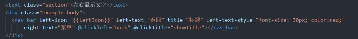
<text class="section">左右显示文字</text>
<div class="example-body">
<nav_bar left-icon="{{leftIcon}}" left-text="返回" title="标题" left-text-style="font-size: 30px; color:red;" right-text="菜单" @clickleft="back" @clickTitle="showTitle"></nav_bar>
</div>
<text class="section">插入slot</text>
<div class="example-body">
<nav_bar right-icon="{{rightIcon}}" @clickleft="showCity" @clickright="scan">
<div slot="left">
<div>
<text>北京</text>
<image src="../Common/arrowdown.png"></image>
</div>
</div>
<div slot="mid">
<div class="input-view">
<image style="height: 40px; margin-top: 15px" src="../Common/search.png"></image>
<input enterkeytype="search" placeholder="输入搜索关键词" @enterkeyclick="confirm" />
</div>
</div>
</nav_bar>
</div>
</div>
</template>
<script>
import router from '@system.router'
import prompt from '@system.prompt'
export default {
data() {
return {
city: "BeiJing",
leftIcon: "../Common/leftIcon.png",
rightIcon: "../Common/rightIcon.png"
}
},
back() {
router.back()
},
scan() {
prompt.showToast({
message: '扫码',
duration: "100000",
gravity: 'center'
})
},
showCity() {
prompt.showToast({
message: '选择城市',
duration: "100000",
gravity: 'center'
})
},
showTitle() {
prompt.showToast({
message: '标题',
duration: "100000",
gravity: 'center'
})
},
confirm() {
prompt.showToast({
message: '搜索',
duration: "100000",
gravity: 'center'
})
}
}
</script>
<style>
.container {
flex: 1;
flex-direction: column;
background-color: #ffffff;
}
.section {
background-color: #afeeee;
margin-top: 20px;
margin-bottom: 20px;
font-size: 30px;
padding: 20px;
width: 100%;
}
.example-body {
flex-direction: row;
padding: 10px;
background-color: #ffffff;
width: 100%;
}
.input-view {
flex-direction: row;
background-color: #f8f8f8;
height: 60px;
border-radius: 15px;
margin-left: 60px;
margin-right: 60px;
line-height: 30px;
}
</style>欲了解更多更全技术文章,欢迎访问https://developer.huawei.com/consumer/cn/forum/?ha_source=zzh
{{o.name}}
{{m.name}}