CSS零碎知识点记录
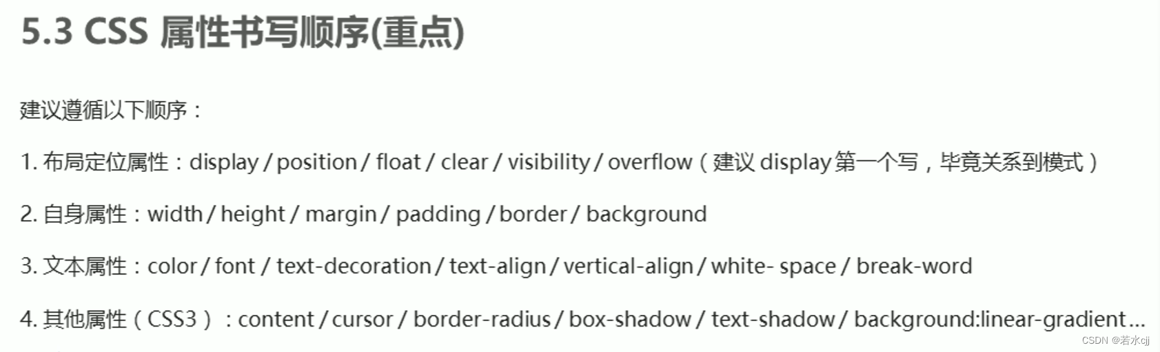
1. CSS属性书写顺序
2.padding不会撑开盒子的情况
若盒子本身没有指定width/height属性,则此时padding不会撑开盒子大小
例:只指定高度,不指定宽度,则padding只会撑开高度,不会撑开宽度
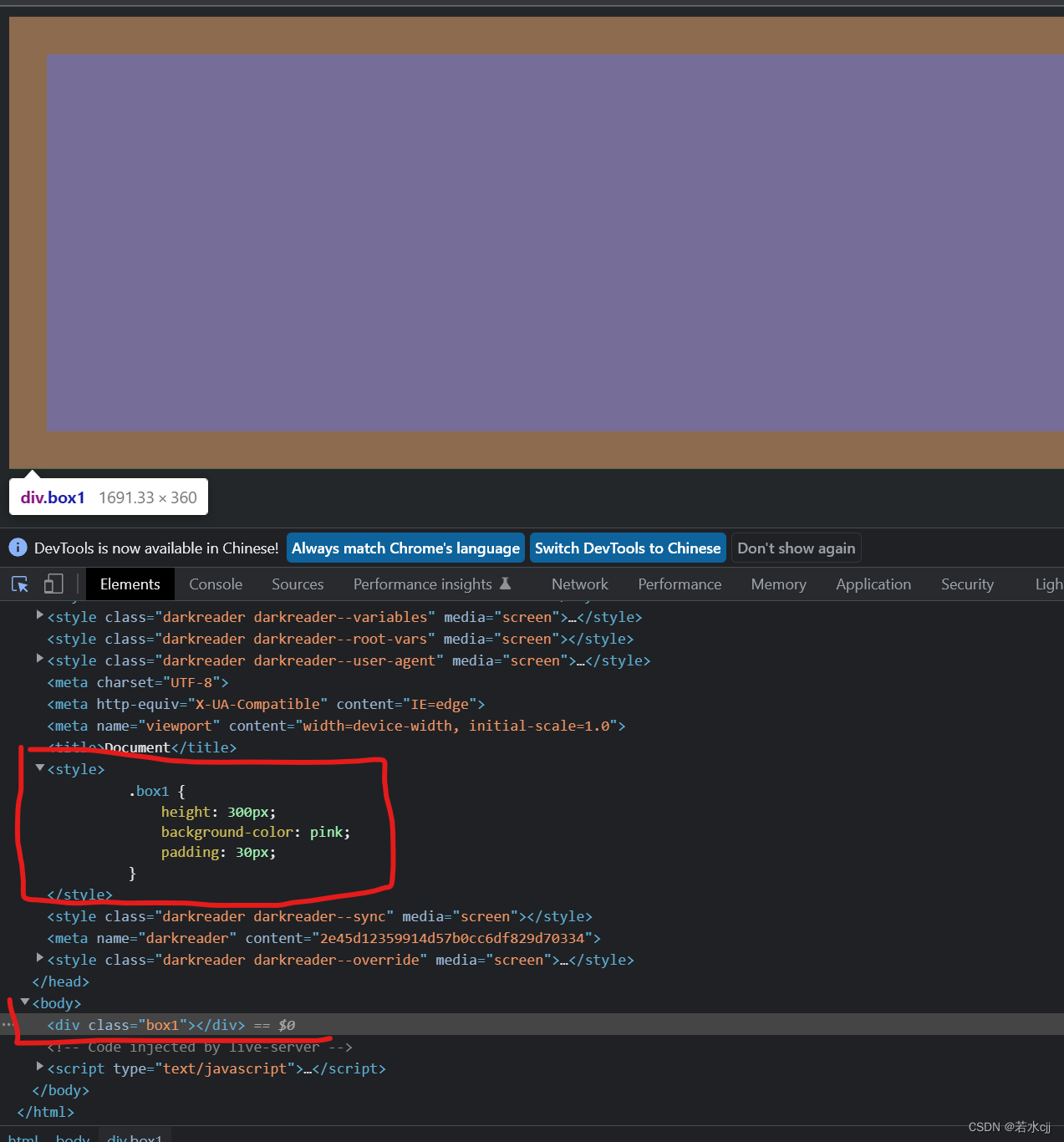
对于在div中的p元素来说,既不指定宽度也不指定高度,只给padding,会撑高盒子,但是不会撑宽盒子。

疑问:若对p不指定宽高和padding,那么p的宽度为父元素的宽度,高度为0,为什么指定了padding会改变p的高度,前提不是不指定高度,就不会撑开高度吗???
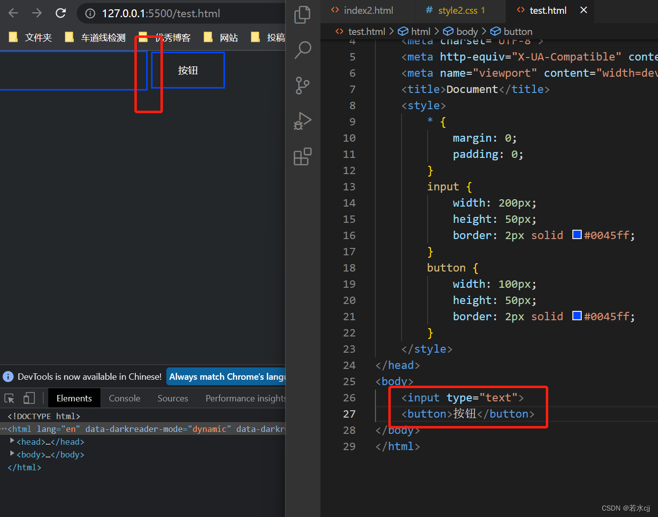
3.行内块元素之间默认有缝隙
行内块元素(表单元素,单元格、img)之间默认有空白缝隙
解决办法:
1.给两个盒子都加浮动,浮动的盒子之间没有缝隙
例子:
页面中只放入input和button标签,可以看到有缝隙
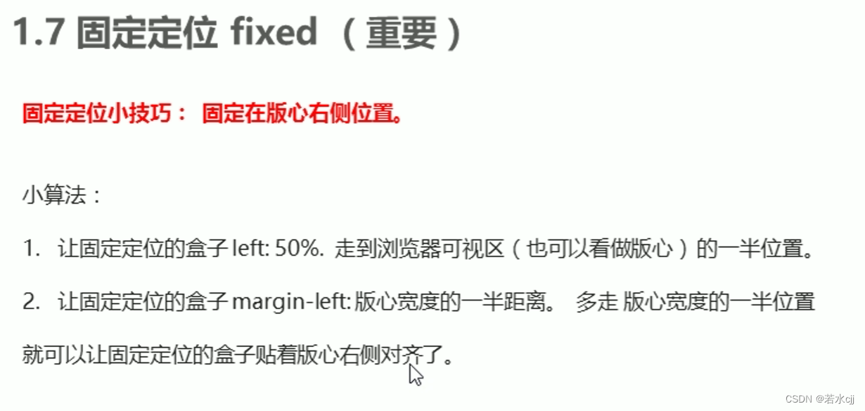
4.将按钮固定在版心右侧位置
例如

<!DOCTYPE html>
<html lang="en">
<head>
    <meta charset="UTF-8">
    <meta http-equiv="X-UA-Compatible" content="IE=edge">
    <meta name="viewport" content="width=device-width, initial-scale=1.0">
    <title>Document</title>
    <style>

        .w {


            width: 1200px;
            height: 1500px;
            background-color: pink;
            margin: 0 auto;
        }
        .fix {


            position: fixed;
            /* 1.走浏览器宽度的一半 */
            left: 50%;
            top: 700px;
            /* 2.利用margin走版心盒子宽度的一半距离 */
            margin-left: 605px;
            width: 50px;
            height: 50px;
            background-color: blue;
        }

    </style>
</head>
<body>
    <div class="fix"></div>
    <div class="w"></div>
</body>
</html>
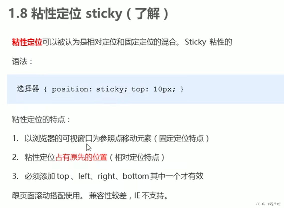
5. 粘性定位
<!DOCTYPE html>
<html lang="en">
<head>
    <style>
        body {


            height: 1200px;
        }
        .fix {


            position: sticky;
            top: 10px;
            width: 50px;
            height: 50px;
            margin: 100px auto;
            background-color: blue;
        }

    </style>
</head>
<body>
    <div class="fix"></div>
</body>
</html>
6.定位水平垂直居中的方法
<!DOCTYPE html>
<html lang="en">
<head>
    <meta charset="UTF-8">
    <meta http-equiv="X-UA-Compatible" content="IE=edge">
    <meta name="viewport" content="width=device-width, initial-scale=1.0">
    <title>绝对定位水平垂直居中</title>
    <style>
        body {


            height: 1200px;
        }
        /* 方式一 */
        /* .box {
            position: absolute;
            width: 200px;
            height: 200px;
            background-color: skyblue;
            margin: auto auto;
            left: 0;
            right: 0;
            top: 0;
            bottom: 0;
        } */

        /* 方式二 */
        .box {


            position: absolute;
            width: 200px;
            height: 200px;
            background-color: skyblue;
            /* 1.left走50% 为父容器宽度的一半 */
            left: 50%;
            /* 2.margin-left设为负值,往左边走自己盒子宽度的一半 */
            margin-left: -100px;

            /* 1.top走50% 为父容器高度的一半 */
            top: 50%;
            /* 2.margin-top设为负值,往上边走自己盒子高度的一半 */
            margin-top: -100px;
        }

    </style>
</head>
<body>
    <div class="box"></div>
</body>
</html>
7.网页布局总结
