
没关注?伸出手指点这里---


1引言
在文献里会看到一些 旋转的三角形的相关性图, 网上搜索了一下,分享给大家。
2绘图
library(ggplot2)
library(grid)

# 加载内置数据集
data('mtcars')

# 计算相关性系数
corda <- data.frame(cor(mtcars))

# 上三角操作
corda[upper.tri(corda)] <- NA

# # 计算相关性系数
# corda <- data.frame(cor(mtcars))
#
# # 下三角操作
# corda[lower.tri(corda)] <- NA

# 加载R包
library(reshape2)
library(tidyverse)

# 增加行名列
corda$y <- rownames(corda)

# 宽数据转长数据
da <- melt(data = corda) %>% na.omit()

# 因子化
da$variable <- factor(da$variable,levels = unique(da$variable))
da$y <- factor(da$y,levels = unique(da$y))

# squre
p <- ggplot(da) +
  # 矩形图层
  geom_tile(aes(x = variable,y = y),fill = 'white',
            show.legend = F,
            color = 'grey80',size = 1) +
  # 点图层
  geom_point(aes(x = variable,y = y,fill = value,size = value),
             show.legend = F,
             shape = 21,color = 'black') +
  theme_minimal() +
  # 主题调整
  theme(panel.grid = element_blank(),
        aspect.ratio = 1,
        axis.text = element_text(color = 'black',size = 20),
        axis.text.x = element_text(angle = 45,hjust = 0),
        axis.text.y = element_text(angle = 45,hjust = 1)) +
  # x轴标签位置
  scale_x_discrete(position = 'top') +
  # 点颜色
  scale_fill_gradientn(colors = colorRampPalette(c("#019267", "white", "red"))(10)) +
  # 点大小范围
  scale_size(range = c(7,14)) +
  # 图例设置
  guides(size = 'none',fill = guide_colorbar(title = 'Corr',
                                             barwidth = 1.5,barheight = 15,
                                             frame.colour = 'black',
                                             ticks.colour = "black")) +
  xlab('') + ylab('')


print(p, vp = viewport(width = unit(0.5, "npc"),
                       height = unit(0.5, "npc"), angle = -45))
矩形:
p <- ggplot(da) +
  # 矩形图层
  geom_tile(aes(x = variable,y = y,fill = value),
            show.legend = F,
            color = 'grey80',size = 1) +
  # # 点图层
  # geom_point(aes(x = variable,y = y,fill = value,size = value),
  #            show.legend = F,
  #            shape = 21,color = 'black') +
  theme_minimal() +
  # 主题调整
  theme(panel.grid = element_blank(),
        aspect.ratio = 1,
        axis.text = element_text(color = 'black',size = 16),
        axis.text.x = element_text(angle = 45,hjust = 0),
        axis.text.y = element_text(angle = 45,hjust = 1)) +
  # x轴标签位置
  scale_x_discrete(position = 'top') +
  # 点颜色
  scale_fill_gradientn(colors = colorRampPalette(c("#398AB9", "white", "red"))(10)) +
  # 点大小范围
  scale_size(range = c(7,14)) +
  xlab('') + ylab('')

print(p, vp = viewport(width = unit(0.8, "npc"),
                       height = unit(0.8, "npc"), angle = -45))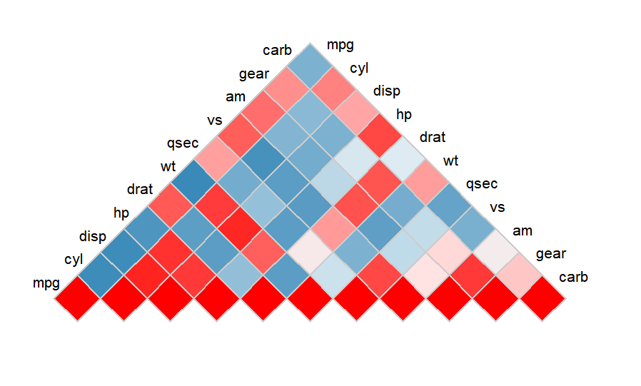
3结尾
看着还行哈。


欢迎加入生信交流群。加我微信我也拉你进 微信群聊 老俊俊生信交流群 哦,数据代码已上传至QQ群,欢迎加入下载。
群二维码:

老俊俊微信:

知识星球:

所以今天你学习了吗?
今天的分享就到这里了,敬请期待下一篇!
最后欢迎大家分享转发,您的点赞是对我的鼓励和肯定!
如果觉得对您帮助很大,赏杯快乐水喝喝吧!
往期回顾
◀pysam 读取 bam 文件准备 Ribo-seq 质控数据
◀跟着 Cell Reports 学做图-CLIP-seq 数据可视化
◀m6A enrichment on peak center
◀m6A metagene distribution 纠正坐标
◀...