
上一节师兄给大家介绍了在R语言中,常用的柱状图绘图技巧!如柱状图分组、调色、堆积柱状图、柱状图加误差棒等等!这一小节师兄准备带大家「玩点有意思的」!把「柱状图画成环状的」!别看成了饼图哦!它们还是柱状图哦!
❝本期「代码+示例数据+效果图+课程笔记」,均可在公众号「可视化艺术」后台回复「20220228」获得!
❞
本期效果展示


❝制作不易,欢迎「点赞+在看」!您的支持是师兄持续更新的动力!
❞
绘图代码
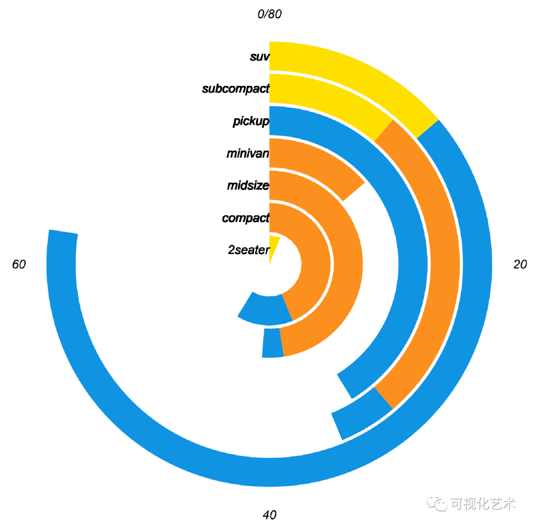
图1
# 载入R包:
library(ggplot2)

################################
# plot1:把y轴方向扭曲了,柱子都变成了弯的:加上颜色分组:
ggplot(mpg, aes(class))+
  geom_bar(aes(fill=drv))+
  coord_polar(theta = "y")

ggsave("plot1.pdf", height = 6, width = 6)

# plot1.1:修饰
ggplot(mpg, aes(class))+
  geom_bar(aes(fill=drv))+
  coord_polar(theta = "y")+
  theme_bw()+
  # 调整标签字体和位置:
  geom_text(hjust = 1, size = 3,
            aes(x = class, y = 0, label = class, fontface="italic")) +
  # 设置主题:
  theme_minimal() +
  # 去掉x轴和y轴标题:
  xlab("") +
  ylab("") +
  # 调整主题:
  theme(legend.position = "none",  # 去掉图例
        panel.grid.major = element_blank(),
        panel.grid.minor = element_blank(),
        axis.text.y = element_blank(),
        axis.text.x = element_text(color="black", face="italic"))+
  # 设置y轴范围:
  ylim(c(0,80))+
  # 设置填充颜色:
  scale_fill_manual(values = c("#1093e1","#fb901e","#fee000"))

ggsave("plot1.1.pdf", height = 6, width = 6)
图2
################################
# plot2:把x轴方向扭曲了,柱子都从同一个中心出发,加上颜色分组:
ggplot(mpg, aes(class))+
  geom_bar(aes(fill=drv))+
  coord_polar(theta = "x")

ggsave("plot2.pdf", height = 6, width = 6)

# plot2.1:修饰
ggplot(mpg, aes(class))+
  geom_bar(aes(fill=drv))+
  coord_polar(theta = "x")+
  theme_bw()+
  # 设置主题:
  theme_minimal() +
  # 去掉x轴和y轴标题:
  xlab("") +
  ylab("") +
  # 调整主题:
  theme(legend.position = "none",  # 去掉图例
        panel.grid.major = element_blank(),
        panel.grid.minor = element_blank(),
        axis.text.y = element_blank(),
        axis.text.x = element_text(color="black", face="bold.italic", size= 8))+
  # 设置y轴范围:
  ylim(c(0,80))+
  # 设置填充颜色:
  scale_fill_manual(values = c("#1093e1","#fb901e","#fee000"))


ggsave("plot2.1.pdf", height = 6, width = 6)
图3
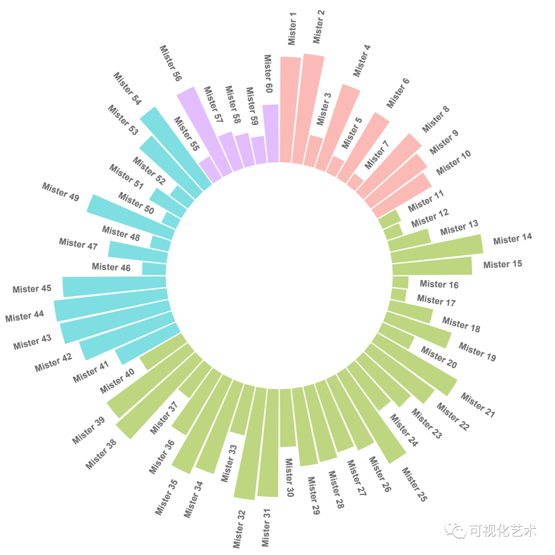
####################### 分组环形柱状图 ##############################
library(tidyverse)

# 创建数据:
data <- data.frame(
  individual=paste( "Mister ", seq(1,60), sep=""),
  group=c( rep('A', 10), rep('B', 30), rep('C', 14), rep('D', 6)) ,
  value=sample( seq(10,100), 60, replace=T)
)

# 设置一些“空栏”添加到每个组的末尾
empty_bar <- 4
to_add <- data.frame( matrix(NA, empty_bar*nlevels(data$group), ncol(data)) )
colnames(to_add) <- colnames(data)
to_add$group <- rep(levels(data$group), each=empty_bar)
data <- rbind(data, to_add)
data <- data %>% arrange(group)
data$id <- seq(1, nrow(data))

# 获取每个标签的名称和y位置
label_data <- data
number_of_bar <- nrow(label_data)
angle <- 90 - 360 * (label_data$id-0.5) /number_of_bar     # I substract 0.5 because the letter must have the angle of the center of the bars. Not extreme right(1) or extreme left (0)
label_data$hjust <- ifelse( angle < -90, 1, 0)
label_data$angle <- ifelse(angle < -90, angle+180, angle)

# 绘图
ggplot(data, aes(x=as.factor(id), y=value, fill=group)) +       # Note that id is a factor. If x is numeric, there is some space between the first bar
  geom_bar(stat="identity", alpha=0.5) +
  ylim(-100,120) +
  theme_minimal() +
  theme(
    legend.position = "none",
    axis.text = element_blank(),
    axis.title = element_blank(),
    panel.grid = element_blank(),
    plot.margin = unit(rep(-1,4), "cm")
  ) +
  coord_polar() +
  geom_text(data=label_data, aes(x=id, y=value+10, label=individual, hjust=hjust), color="black", fontface="bold",alpha=0.6, size=2.5, angle= label_data$angle, inherit.aes = FALSE )

ggsave("plot3.1.pdf", height = 6, width = 6)
图4
################
# 加载包
library(ggplot2)
library(tidyverse)
# install.packages('ragg')
library(ragg)

# 创建一个数据
data <- data.frame(
  individual=paste( "Mister ", seq(1,60), sep=""),
  group=c( rep('A', 10), rep('B', 30), rep('C', 14), rep('D', 6)) ,
  value=sample( seq(10,100), 60, replace=TRUE)
)

head(data)
#   individual group value
#1    Mister 1     A    70
#2    Mister 2     A    79
#3    Mister 3     A    64
#4    Mister 4     A    92
#5    Mister 5     A    64
#6    Mister 6     A    83


# 对数据做转换
datagroup <- data$group %>% unique() #"A" "B" "C" "D"

allplotdata <- tibble('group' = datagroup,
                      'individual' = paste0('empty_individual_', seq_along(datagroup)),
                      'value' = 0) %>%
  bind_rows(data) %>% arrange(group) %>% mutate(xid = 1:n()) %>%
  mutate(angle = 90 - 360 * (xid - 0.5) / n()) %>%
  mutate(hjust = ifelse(angle < -90, 1, 0)) %>%
  mutate(angle = ifelse(angle < -90, angle+180, angle))

head(allplotdata)
# A tibble: 6 x 6
#  group individual         value   xid angle hjust
#  <chr> <chr>              <dbl> <int> <dbl> <dbl>
#1 A     empty_individual_1     0     1  87.2     0
#2 A     Mister 1              70     2  81.6     0
#3 A     Mister 2              79     3  75.9     0
#4 A     Mister 3              64     4  70.3     0
#5 A     Mister 4              92     5  64.7     0
#6 A     Mister 5              64     6  59.1     0

# 提取出空的数据,做一些调整
firstxid <- which(str_detect(allplotdata$individual, pattern = "empty_individual")) # 1 12 43 58

segment_data <- data.frame('from' = firstxid + 1,
                           'to' = c(c(firstxid - 1)[-1], nrow(allplotdata)),
                           'label' = datagroup) %>%
  mutate(labelx = as.integer((from + to)/2))

#  from to label labelx
#1    2 11     A      6
#2   13 42     B     27
#3   44 57     C     50
#4   59 64     D     61


# 自定坐标轴
coordy <- tibble('coordylocation' = seq(from = min(allplotdata$value), to = max(allplotdata$value), 10),
                 'coordytext' = as.character(round(coordylocation, 2)),
                 'x' = 1)

# 自定义坐标轴的网格
griddata <- expand.grid('locationx' = firstxid[-1], 'locationy' = coordy$coordylocation)

# 绘图
ggplot() +
  geom_bar(data = allplotdata, aes(x = xid, y = value, fill = group), stat = 'identity') +
  geom_text(data = allplotdata %>% filter(!str_detect(individual, pattern = "empty_individual")),
            aes(x = xid, label = individual, y = value+10, angle = angle, hjust = hjust),
            color="black", fontface="bold",alpha=0.6, size=2.5) +
  geom_segment(data = segment_data, aes(x = from, xend = to), y = -5, yend=-5) +
  geom_text(data = segment_data, aes(x = labelx, label = label), y = -15) +
  geom_text(data = coordy, aes(x = x, y = coordylocation, label = coordytext),
            color="grey", size=3 , angle=0, fontface="bold") +
  geom_segment(data = griddata,
               aes(x = locationx-0.5, xend = locationx + 0.5, y = locationy, yend = locationy),
               colour = "grey", alpha=0.8, size=0.6) +
  scale_x_continuous(expand = c(0, 0)) +
  scale_y_continuous(limits = c(-50,100)) +
  coord_polar() +
  theme_void() +
  theme(legend.position = 'none')


# 保存
ggsave('plot3.2.pdf',width = 6, height = 6, device = ragg::agg_png())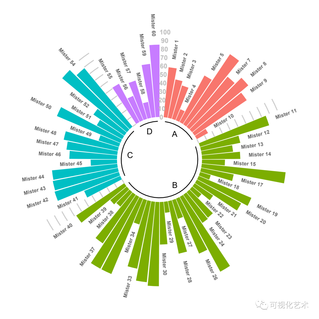
❝本期「代码+示例数据+效果图+课程笔记」,均可在公众号「可视化艺术」后台回复「20220228」获得!
❞