一个Activity中,有多个tab页,这个可谓是现在最常用的方式。今天来推荐一个第三方组件:SmartTabLayout
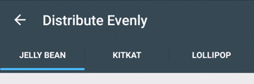
看一下效果:
下面是具体实现:
首先,添加依赖:
// 支持androidx版本 (1.0.0)
dependencies {
    compile 'com.ogaclejapan.smarttablayout:library:2.0.0@aar'

    //Optional: see how to use the utility.
    compile 'com.ogaclejapan.smarttablayout:utils-v4:2.0.0@aar'
}

// 对于旧版本的支持 (28.0.0)
dependencies {
    compile 'com.ogaclejapan.smarttablayout:library:1.7.0@aar'

    //Optional: see how to use the utility.
    compile 'com.ogaclejapan.smarttablayout:utils-v4:1.7.0@aar'

    //Deprecated since 1.7.0
    compile 'com.ogaclejapan.smarttablayout:utils-v13:1.7.0@aar'
}
下面是xml,注意:SmartTabLayout一般是放在ViewPager之上:
<com.ogaclejapan.smarttablayout.SmartTabLayout
    android:id="@+id/viewpagertab"
    android:layout_width="match_parent"
    android:layout_height="48dp"
    app:stl_indicatorAlwaysInCenter="false"
    app:stl_indicatorWithoutPadding="false"
    app:stl_indicatorInFront="false"
    app:stl_indicatorInterpolation="smart"
    app:stl_indicatorGravity="bottom"
    app:stl_indicatorColor="#40C4FF"
    app:stl_indicatorThickness="4dp"
    app:stl_indicatorWidth="auto"
    app:stl_indicatorCornerRadius="2dp"
    app:stl_overlineColor="#4D000000"
    app:stl_overlineThickness="0dp"
    app:stl_underlineColor="#4D000000"
    app:stl_underlineThickness="1dp"
    app:stl_dividerColor="#4D000000"
    app:stl_dividerThickness="1dp"
    app:stl_defaultTabBackground="?attr/selectableItemBackground"
    app:stl_defaultTabTextAllCaps="true"
    app:stl_defaultTabTextColor="#FC000000"
    app:stl_defaultTabTextSize="12sp"
    app:stl_defaultTabTextHorizontalPadding="16dp"
    app:stl_defaultTabTextMinWidth="0dp"
    app:stl_distributeEvenly="false"
    app:stl_clickable="true"
    app:stl_titleOffset="24dp"
    app:stl_drawDecorationAfterTab="false"
    />

<androidx.viewpager.widget.ViewPager
    android:id="@+id/viewpager"
    android:layout_width="match_parent"
    android:layout_height="match_parent"
    android:layout_below="@id/viewpagertab"
    />
下面是使用方法,直接绑定在ViewPager上即可。
FragmentPagerItemAdapter adapter = new FragmentPagerItemAdapter(
        getSupportFragmentManager(), FragmentPagerItems.with(this)
        .add(R.string.titleA, PageFragment.class)
        .add(R.string.titleB, PageFragment.class)
        .create());

ViewPager viewPager = (ViewPager) findViewById(R.id.viewpager);
viewPager.setAdapter(adapter);

SmartTabLayout viewPagerTab = (SmartTabLayout) findViewById(R.id.viewpagertab);
viewPagerTab.setViewPager(viewPager);
属性:
属性 描述
- stl_indicatorAlwaysInCenter 如果设置为true,则活动选项卡始终显示在中心(如书报摊google app),默认为false
- stl_indicatorWithoutPadding 如果设置为true,则绘制指标时不使用制表符填充,默认为false
- stl_indicatorInFront 在下划线前绘制指示器,默认为false
- stl_indicatorInterpolation 指标的行为:“线性”或“智能”
- stl_indicatorGravity 指标的绘图位置:“底部”或“顶部”或“中心”,默认为“底部”
- stl_indicatorColor 指示灯颜色
- stl_indicatorColors 指示器的多种颜色,可以为每个选项卡设置颜色
- stl_indicatorThickness 指示器厚度
- stl_indicatorWidth 指标宽度,默认为“自动”
- stl_indicatorCornerRadius 圆角半径指示器
- stl_overlineColor 第一行的颜色
- stl_overlineThickness 顶线厚度
- stl_underlineColor 底线颜色
- stl_underline厚度 底线粗细
- stl_dividerColor 标签之间的分隔线颜色
- stl_dividerColors 标签之间的分隔线有多种颜色,可以为每个标签设置颜色
- stl_dividerThickness 分隔线的厚度
- stl_defaultTabBackground 每个选项卡的背景可绘制。通常,它设置StateListDrawable
- stl_defaultTabTextAllCaps 如果设置为true,则所有标签标题均为大写,默认为true
- stl_defaultTabTextColor 默认包含的选项卡的文本颜色
- stl_defaultTabTextSize 默认包含的选项卡的文本大小
- stl_defaultTabTextHorizontalPadding 默认情况下包含的选项卡的文本布局填充
- stl_defaultTabTextMinWidth 标签的最小宽度
- stl_customTabTextLayoutId 布局ID定义的自定义标签。如果未指定布局,请使用默认选项卡
- stl_customTabTextViewId 自定义标签布局中的文本视图ID。如果您未使用customTabTextLayoutId进行定义,则无法正常工作
- stl_distribute甚至 如果设置为true,则每个选项卡都具有相同的权重,默认为false
- stl_clickable 如果设置为false,则禁用对选项卡单击的选择,默认为true
- stl_titleOffset 如果设置为“ auto_center”,则标签在中间的滑动位置将保持在中心位置。如果指定尺寸,它将从左边缘偏移,默认为24dp
- stl_drawDecorationAfterTab 绘制选项卡后绘制装饰(指示器和线条),默认为false
注意:如果将’stl_indicatorAlwaysInCenter’和’stl_distributeEvenly’都设置为true,它将抛出UnsupportedOperationException。
到此。基本使用就介绍完了。更详细的请阅读 GitHub