listwidget
/* QSS:*/
QListWidget{

    border:1px solid gray; color:black; }
QListWidget::Item{

    padding-top:-2px; padding-bottom:-1px;}
QListWidget::Item:hover{

    background:skyblue;padding-top:0px; padding-bottom:0px; }
QListWidget::item:selected{

    background:lightgray; color:red; }
QListWidget::item:selected:!active{

    active{

    border-width:0px;background:lightgreen; }

/* qt4 背景透明*/
#list_widget {

    background-color: rgb(255, 255, 255, 0);}
#list_widget:item:selected {

    background-color: rgb(255, 255, 255, 0);}
pushbutton
/* 设置字体大小,按键按下和松开展示图片*/
QPushButton {

     font-size: 28px;
color: rgb(255, 255, 255);}
QPushButton {

    border-image: url(:/icon/yt328_setting/list_bt.png);}
QPushButton:pressed {

    border-image: url(:/icon/yt328_setting/list_bt_press.png);}
tabWidget
/* 配置tab */
QTabBar::tab {

    font-size:16px;color:rgb(89,119,176);width:160px;height:60px;background-color: rgb(0, 0, 0,0);}
QTabBar::tab:selected {

    font-size:28px;color:rgb(255,255,255);}
/* 配置QTabWidget窗口 */
#tabWidget {

    background-color: rgb(0, 0, 0, 0);}

QTabWidget::pane{


border:none;
}
checkbox
QCheckBox {


    spacing: 5px;  # 在这里我们也可以设置复选的文本样式
}
QCheckBox::indicator {


    width: 15px;
    height: 15px;
}
QCheckBox::indicator:unchecked {


    image: url(:/buttonbg/checkbox_normal);
}
QCheckBox::indicator:unchecked:disabled {


    image: url(:/buttonbg/checkbox_disable);
}
QCheckBox::indicator:unchecked:hover {


    image: url(:/buttonbg/checkbox_hover);
}
QCheckBox::indicator:checked {


    image: url(:/buttonbg/checkbox_down);
}
QCheckBox::indicator:indeterminate {


    image: url(:/buttonbg/checkbox_indeterminate);
}
QRadioButton
关于分组:
1、使用QButtonGroup进行分组,此方式QButtonGroup有信号可以获取点击的是哪个按键;
2、使用QGroupBox进行分组,此方式必须为每个radiobutton绑定槽函数处理;
QRadioButton{


    spacing: 2px;
    color: white;
}
QRadioButton::indicator {


    width: 45px;
    height: 30px;
}
QRadioButton::indicator:unchecked {


    image: url(:/Images/switchOff);
}
QRadioButton::indicator:unchecked:hover {


    image: url(:/Images/switchOffHover);
}
QRadioButton::indicator:unchecked:pressed {


    image: url(:/Images/switchOffPressed);
}
QRadioButton::indicator:checked {


    image: url(:/Images/switchOn);
}
QRadioButton::indicator:checked:hover {


    image: url(:/Images/switchOnHover);
}
QRadioButton::indicator:checked:pressed {


    image: url(:/Images/switchOnPressed);
}
QSlider
部件说明

QSlider::handle:horizontal {

    width:20px;height:30px;border-image: url(:/icon/yt328_setting/slider_bar.png);margin-top:60px;margin-bottom:60px}
QSlider::groove:horizontal {

    height:6px;background-color: rgb(255, 255, 255)}
倒圆角
border-radius:6px;
QSpinbox
QSpinBox {


    /* 为箭头保留空间 */
    padding-right:20px;
    border:3px solid green;
    background:#FD5687;
    min-width:40px;
}

/* 向上按钮 */
QSpinBox::up-button {


    subcontrol-origin:border;
    subcontrol-position:top right;
    width:16px;
    border-image:url(:/images/02.bmp);
    border-width:1px;
}

/* 向上按钮 */
QSpinBox::up-button:hover {


    border-image:url(:/images/111.bmp) 1;
}
/* 向上按钮 */
QSpinBox::up-button:pressed {


    border-image:url(:/images/222.bmp) 1;
}
/* 向上按钮里的小箭头 */
QSpinBox::up-arrow {


    image:url(:/images/333.bmp);
    width:7px;
    height:7px;
}
/* 向下按钮 */
QSpinBox::down-button {


    subcontrol-origin:border;
    subcontrol-position:bottom right;
    width:16px;
    border-image:url(:/images/02.bmp);
    border-width:1px;
    border-top-width:0;
}
/* 向下按钮 */
QSpinBox::down-button:hover {


    border-image:url(:/images/111.bmp) 1;
}
/* 向下按钮 */
QSpinBox::down-button:pressed {


    border-image:url(:/images/222.bmp) 1;
}
/* 向下按钮里的小箭头 */
QSpinBox::down-arrow {


    image:url(:/images/333.bmp);
    width:7px;
    height:7px;
}
transparent 透明
qlineargradient 线性渐变
QRadialGradient 圆形渐变
QConicalGradient 圆锥形渐变
Qframe有重要作用
border、padding、margin
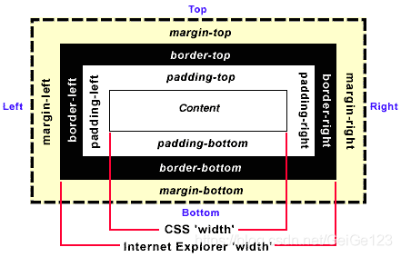
border:(轮廓)边框宽度
margin:边框外距
padding:边框内距