效果图:
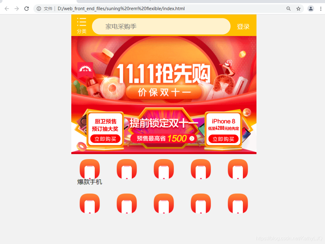
- less+媒体查询+rem
步骤:
(1)下载node(本版本为node-v14.16.0-x64)下载完直接双击下一步直到安装完成(在cmd中输入node -v确认是否安装成功,若安装成功会提示当前版本号,否则安装不成功)
https://pan.baidu.com/s/1rSeVOqsoLuLCqjsYhlNDEQ
提取码:8iyz
(2)在cmd中安装less,命令行中输入npm install -g less,安装完成后输入lessc -v确认安装是否成功,如果出现当前less版本号则说明成功,否则安装不成功
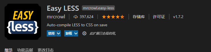
(3) 在VSCODE 中安装easyless插件,安装步骤就不详说了,直接在vscode里面搜索easyless安装即可
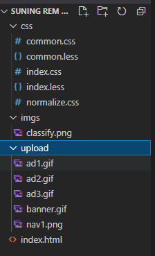
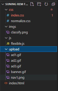
(4)创建目录(里面的CSS文件,是less文件保存后自动生成的,一开始是没有的)
index.html
<!DOCTYPE html>
<html lang="en">

<head>
    <meta charset="UTF-8">
    <meta http-equiv="X-UA-Compatible" content="IE=edge">
    <meta name="viewport" content="width=device-width, initial-scale=1.0">
    <link rel="stylesheet" href="css/normalize.css">
    <link rel="stylesheet" href="css/index.css">
    <title>苏宁易购</title>
</head>

<body>
    <div class="header">
        <a href="#" class="classify"></a>
        <div class="search">
            <form action="">
                <input type="search" class="input" value="家电采购季">
            </form>
        </div>
        <a href="#" class="login">登录</a>
    </div>
    <div class="banner">
        <img src="upload/banner.gif" alt="">
    </div>
    <div class="ad">
        <a href="#">
            <img src="upload/ad1.gif" alt="">
        </a>
        <a href="#">
            <img src="upload/ad2.gif" alt="">
        </a>
        <a href="#">
            <img src="upload/ad3.gif" alt="">
        </a>
    </div>

    <div class="nav">
        <a href="#"><img src="upload/nav1.png" alt=""> <span>爆款手机</span></a>
        <a href="#"><img src="upload/nav1.png" alt=""></a>
        <a href="#"><img src="upload/nav1.png" alt=""></a>
        <a href="#"><img src="upload/nav1.png" alt=""></a>
        <a href="#"><img src="upload/nav1.png" alt=""></a>
        <a href="#"><img src="upload/nav1.png" alt=""></a>
        <a href="#"><img src="upload/nav1.png" alt=""></a>
        <a href="#"><img src="upload/nav1.png" alt=""></a>
        <a href="#"><img src="upload/nav1.png" alt=""></a>
        <a href="#"><img src="upload/nav1.png" alt=""></a>
    </div>
</body>

</html>
common.less
// 先写上PC端常规尺寸的html文字大小
html{


    font-size: 50px;
}
//写上移动端常用尺寸的html文字大小
@pieces: 15;

@media screen and (min-width:320px){


    html{


        font-size:(320px / @pieces);
    }
}

@media screen and (min-width:340px){


    html{


        font-size:(340px / @pieces);
    }
}

@media screen and (min-width:360px){


    html{


        font-size:(360px / @pieces);
    }
}

@media screen and (min-width:375px){


    html{


        font-size:(375px / @pieces);
    }
}

@media screen and (min-width:384px){


    html{


        font-size:(384px / @pieces);
    }
}

@media screen and (min-width:400px){


    html{


        font-size:(400px / @pieces);
    }
}

@media screen and (min-width:414px){


    html{


        font-size:(414px / @pieces);
    }
}

@media screen and (min-width:424px){


    html{


        font-size:(424px / @pieces);
    }
}

@media screen and (min-width:480px){


    html{


        font-size:(480px / @pieces);
    }
}

@media screen and (min-width:540px){


    html{


        font-size:(540px / @pieces);
    }
}

@media screen and (min-width:720px){


    html{


        font-size:(720px / @pieces);
    }
}

@media screen and (min-width:750px){


    html{


        font-size:(750px / @pieces);
    }
}

a{


    text-decoration: none;
    color: black;
}
index.less
@import "common";


body {


    min-width: 320px;
    width: 15rem;
    margin: 0 auto;
    line-height: 1.5;
    font-family: Arial, Helvetica, sans-serif;
    background: #F2F2F2;
}
@baseFontsize: 50;
.header{


    display: flex;
    position: fixed;
    top: 0;
    left: 50%;
    transform: translateX(-50%);
    // min-width: 320px;
    width: 15rem;
    height: (88rem / @baseFontsize);
    background:#FFC001 ;
.classify{


    width: (44rem / @baseFontsize);
    height: (70rem /@baseFontsize);
    // background: blueviolet;
    margin: (10rem / @baseFontsize) (20rem / @baseFontsize) ;
    background: url('../imgs/classify.png') no-repeat;
    background-size: 100%;
}
.search{


    flex: 1;
    width: 100%;
    // background-color: cornflowerblue;
    input{


        outline: none;
        border: 0;
        width: 100%;
        height: (66rem / @baseFontsize);
        margin-top: (12rem / @baseFontsize);
        border-radius: (33rem / @baseFontsize);
        background-color: #fff2cc;
        font-size: (25rem / @baseFontsize);
        color: rgb(117, 117, 117);
        padding-left: (55rem / @baseFontsize);

    }
}

.login{


    width: (75rem / @baseFontsize);
    height: (70rem / @baseFontsize);
    // background-color: blue;
    margin: (10rem / @baseFontsize);
    color: white;
    font-size: (25rem / @baseFontsize);
    text-align: center;
    line-height:(70rem / @baseFontsize) ;
}

}

.banner{


    width: (750rem / @baseFontsize);
    height: (368rem / @baseFontsize);
    img{


        width: 100%;
    }
}

.ad{


    display: flex;
    width: (750rem / @baseFontsize);
    height: (199rem / @baseFontsize);
    a{


        flex: 1;
        img{


            width: 100%;
        }

    }
}

.nav{


    margin-top: (10rem / @baseFontsize);
    width: (750rem / @baseFontsize);
    // height: (280rem / @baseFontsize);
    a{


        float: left;
        width: (150rem / @baseFontsize);
        height: (140rem / @baseFontsize);
        // background-color: green;
        text-align: center;
        line-height: (25rem / @baseFontsize);
        img{


            display: block;
            margin-top:(10rem / @baseFontsize);
            margin-left: 50%;
            transform: translateX(-50%);
            width: (82rem / @baseFontsize);
            height: (82rem / @baseFontsize);
        }
        span{


            font-size: (25rem / @baseFontsize);
            // line-height: (140rem / @baseFontsize);


        }
    }
}
normalize.css同https://blog.csdn.net/KathyLJQ/article/details/115219233的normalize.css
- flexible.js+rem
步骤:
(1)下载flexible.js (版本lib-flexible-2.0)
下载地址:https://pan.baidu.com/s/1LBlVcIPJYmx2cxvZt_CPHg
提取码:snxt
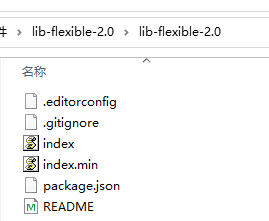
(2)创建目录(js文件夹中的flexible.js 是由步骤(1)文件夹中的index.js 重命名为flexible.js后拷贝进来的)
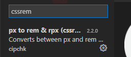
(3)在VScode中安装cssrem插件,此处就不详细说了,直接搜索cssrem安装即可
如何设置cssrem的html基础字体:https://www.bilibili.com/video/BV1jU4y1Y7h9
html 代码同上述的第一个方案,下面直接放index.css
/*  */

a {


    text-decoration: none;
    color: black;
}


/* 限定屏幕宽度超过750px的html字体大小 */

@media screen and (min-width:750px) {


    html {


        font-size: 75px !important;
    }
}

body {


    min-width: 320px;
    max-width: 750px;
    width: 10rem;
    margin: 0 auto;
    line-height: 1.5;
    font-family: Arial, Helvetica, sans-serif;
    background: #F2F2F2;
}

.header {


    display: flex;
    position: fixed;
    top: 0;
    left: 50%;
    transform: translateX(-50%);
    width: 10rem;
    height: 1.173333rem;
    background: #FFC001;
}

.header .classify {


    width: .586667rem;
    height: .933333rem;
    margin: .133333rem .266667rem;
    background: url('../imgs/classify.png') no-repeat;
    background-size: 100%;
}

.header .search {


    flex: 1;
    width: 100%;
}

.header .search input {


    outline: none;
    border: 0;
    width: 100%;
    height: .88rem;
    margin-top: .2rem;
    border-radius: .44rem;
    background-color: #fff2cc;
    font-size: .333333rem;
    color: #757575;
    padding-left: .733333rem;
}

.header .login {


    width: 1rem;
    height: .933333rem;
    margin: .2rem;
    color: white;
    font-size: .333333rem;
    text-align: center;
    line-height: .933333rem;
}

.banner {


    width: 10rem;
    height: 4.906667rem;
}

.banner img {


    width: 100%;
}

.ad {


    display: flex;
    width: 10rem;
    height: 2.653333rem;
}

.ad a {


    flex: 1;
}

.ad a img {


    width: 100%;
}

.nav {


    margin-top: .133333rem;
    width: 10rem;
}

.nav a {


    float: left;
    width: 2rem;
    height: 1.866667rem;
    text-align: center;
    line-height: .333333rem;
}

.nav a img {


    display: block;
    margin-top: .133333rem;
    margin-left: 50%;
    transform: translateX(-50%);
    width: 1.093333rem;
    height: 1.093333rem;
}

.nav a span {


    font-size: .333333rem;
}

*/