1、准备
tabbar按钮的设计详情可查看上一篇博客:
https://blog.csdn.net/Twinkle_sone/article/details/113981042?spm=1001.2014.3001.5501
2、组件封装
(1)tabbartbn.wxml
这里只是将原本的页面代码抽取过来:
<!-- --------------------------底部按钮--------------------------- -->
<view class="tabBar">
  <block wx:for="{

     {tabinf}}" wx:key="index" >
    <view class="tabBar-item" bindtap="changeTab" data-id="{

     {item.id}}">
      <view>
          <image wx:if="{

     {tabind != item.id}}" class="tabBar-icon" src='{

     {item.img}}'>
          </image>
          <image wx:if="{

     {tabind == item.id}}" class="tabBar-icon" src='{

     {item.img1}}'>
          </image>
      </view>
      <view class="" bindtap="changeTab" data-id="{

     {item.id}}" style="color:{

       {

       tabind == item.id ? 'blue' : 'grey'}};">{

   {item.title}}</view>
    </view>
  </block>
</view>
<!-- --------------------------底部按钮--------------------------- -->
(2)tabbartbn.wxss
还是将原来的css代码拿过来。
.tabBar-icon{


  width:54rpx;
  height: 54rpx;
}
.tabBar{


  width:100%;
  position: fixed;
  bottom:0;
  padding:10rpx;
  margin-left:-4rpx;
  background:pink;
  font-size:24rpx;
  color:#8A8A8A;
  box-shadow: 3rpx 3rpx 3rpx 3rpx #aaa;
  z-index: 9999;
  display: flex;
}

 .tabBar-item{


  float:left;
  width: 100%;
  text-align: center;
  overflow: hidden;
}
(3)tabbartbn.js
重点是在js代码的修改上
// components/tabbarbtn/tabbarbtn.js
Component({


  /**
   * 组件的属性列表
   */
  properties: {


      //接收父组件传来的值
    tabinf:{


      type:Array,
      value:[]
    }
  },

  /**
   * 组件的初始数据
   */
  data: {


    tabind:0,
  },
  /**
   * 组件的方法列表
   */
  methods: {


    //切换tab页
    changeTab(e){


      let ind = e.currentTarget.dataset.id;
      this.setData({


        tabind:ind,
      })
       //发送事件监听,父组件触发事件时,子组件传递参数ind给父组件
      this.triggerEvent('changeTabs',{

    ind})
    },
  }
})
3、组件调用
1、test.wxml
<!--
	调用tabbarbtn组件,需要先在json文件中引用
	tabinf = "{

    {tabinf}}" 将tabinf值传递给子组件
	bind:changeTabs="changeTabs" 绑定子组件的changeTabs方法
-->
<tabbarbtn id = "tabbarbtn" tabinf = "{

   {tabinf}}" bind:changeTabs="changeTabs"></tabbarbtn>
<view wx:if="{

     {tabind == 0}}">
  page0
</view>
<view wx:if="{

     {tabind == 1}}">
  page1
</view>
<view wx:if="{

     {tabind == 2}}">
  page2
</view>
<view wx:if="{

     {tabind == 3}}">
  page3
</view>
2、test.json
{


  "usingComponents": {


    "tabbarbtn":"../../../components/tabbarbtn/tabbarbtn"
  }
}
3、test.js
Page({


  /**
   * 页面的初始数据
   */
  data: {


    tabind:0,
    tabinf:[
        {


            //原始图标图片
            img:'cloud://it-cloud-hdrd7.6974-it-cloud-hdrd7-1300036058/记账本/标记.png',
            //点击激活状态时的图标图片
            img1:'cloud://it-cloud-hdrd7.6974-it-cloud-hdrd7-1300036058/记账本/标记1.png',
            //按钮id
            id:0,
            //按钮图标下方显示文字
            title:'页面0'
        },
        {


            img:'cloud://it-cloud-hdrd7.6974-it-cloud-hdrd7-1300036058/记账本/标记.png',
            img1:'cloud://it-cloud-hdrd7.6974-it-cloud-hdrd7-1300036058/记账本/标记1.png',
            id:1,
            title:'页面1'
        },
        {


            img:'cloud://it-cloud-hdrd7.6974-it-cloud-hdrd7-1300036058/记账本/标记.png',
            img1:'cloud://it-cloud-hdrd7.6974-it-cloud-hdrd7-1300036058/记账本/标记1.png',
            id:2,
            title:'页面2'
        },
        {


            img:'cloud://it-cloud-hdrd7.6974-it-cloud-hdrd7-1300036058/记账本/标记.png',
            img1:'cloud://it-cloud-hdrd7.6974-it-cloud-hdrd7-1300036058/记账本/标记1.png',
            id:3,
            title:'页面3'
        }
    ]
  },
  //接收子组件传来的参数
  changeTabs(e){


      this.setData({


          tabind:e.detail.ind
      })
  },
  /**
   * 生命周期函数--监听页面加载
   */
  onLoad: function (options) {


  },

  /**
   * 生命周期函数--监听页面初次渲染完成
   */
  onReady: function () {


  },

  /**
   * 生命周期函数--监听页面显示
   */
  onShow: function () {


  },

  /**
   * 生命周期函数--监听页面隐藏
   */
  onHide: function () {


  },

  /**
   * 生命周期函数--监听页面卸载
   */
  onUnload: function () {


  },

  /**
   * 页面相关事件处理函数--监听用户下拉动作
   */
  onPullDownRefresh: function () {


  },

  /**
   * 页面上拉触底事件的处理函数
   */
  onReachBottom: function () {


  },

  /**
   * 用户点击右上角分享
   */
  onShareAppMessage: function () {


  }
})
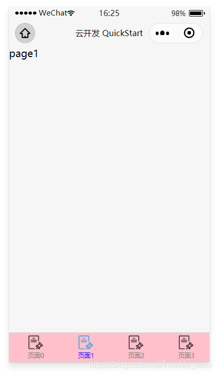
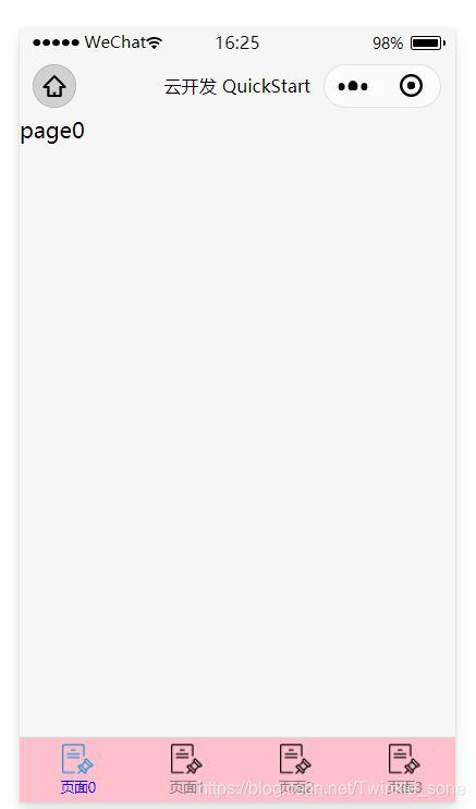
4、效果