博客说明
文章内容输出来源:拉勾教育Java就业急训营
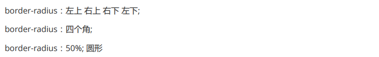
圆角
<style>
    div {


        width: 500px;
        height: 500px;
        background-color: chartreuse;
        /* border-radius: 1px 10px 30px 50px; 左上、右上、右下、左上:顺时针 */
        /* border-radius: 35px;四个角 */
        border-radius:50%;/* 圆 */
    }
</style>

<body>
    <div></div>
</body>
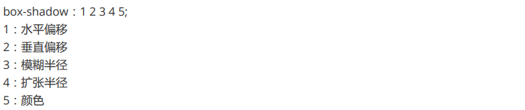
阴影
<style>
    div{


        width: 100px;
        height: 100px;

        box-shadow: 20px 20px 30px 10px gray;
    }
</style>

<body>
    <div></div>
</body>
渐变
线性渐变
background:linear-gradient([方向/角度],颜色列表);
<style>
    div {


        width: 200px;
        height: 100px;
        margin: 10px;
    }

    .a {


        background: linear-gradient(red, black);/* 两种颜色,从左往右渐变[默认] */
    }

    .b {


        background: linear-gradient(red, black, pink, green);/* 四种颜色,从左往右渐变 */
    }

    .c {


        background: linear-gradient(to left, red, black);/* 从右往左渐变 */
    }

    .d {


        background: linear-gradient(to top left, red, black);/* 从右下往左上渐变 */
    }

    .e {


        background: linear-gradient(30deg, red, black);/* 从下往上30度开始 右上渐变 */
    }
</style>

<body>
    <div class="a"></div>
    <div class="b"></div>
    <div class="c"></div>
    <div class="d"></div>
    <div class="e"></div>
</body>
径向渐变
background: radial-gradient(颜色列表);
<style>
    div {


        width: 200px;
        height: 200px;
        margin: 10px;
    }

    .a {


        background: radial-gradient(red, black);/* 两种颜色,从内往外渐变 */
    }

    .b {


        background: radial-gradient(red, black, pink, green);/* 四种颜色,从内往外渐变  */
    }

    .c {


        border-radius: 50%;
        background: radial-gradient(red, black);/* 渐变球 */
    }
</style>

<body>
    <div class="a"></div>
    <div class="b"></div>
    <div class="c"></div>
</body>
背景
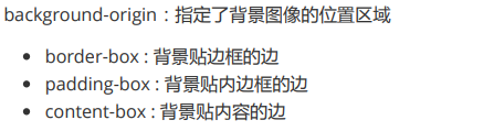
背景位置
<style>
    div{


        width: 500px;
        height: 353px;
        background:url("img/1.jpg") no-repeat;/* 设置图片以及墙纸效果为仅显示一次 */
        background-size: cover;/* 图片大小 */
        border: 5px dashed black;/* 边框大小为5px、虚线、黑色 */
        margin: 20px;/* 与下一个div相隔20px */

        padding: 10px;/* 内边距 */
    }

    .a{


        background-origin: border-box;/* 背景贴边框的边 */
    }
    .b{


        background-origin: padding-box;/* 背景贴内边框的边 */
    }
    .c{


        background-origin: content-box;/* 背景贴内容的边 */
    }
</style>

<body>
    <div class="a"></div>
    <div class="b"></div>
    <div class="c"></div>
</body>
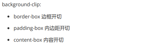
背景裁切
<style>
    div{


        width: 500px;
        height: 353px;
        background:url("img/1.jpg") no-repeat;/* 设置图片以及墙纸效果为仅显示一次 */
        background-size: cover;/* 图片大小 */
        border: 5px dashed black;/* 边框大小为5px、虚线、黑色 */
        margin: 20px;/* 与下一个div相隔20px */

        padding: 10px;/* 内边距 */
    }

    .a{


        background-clip: border-box;/* 边框开切 */
    }
    .b{


        background-clip: padding-box;/* 内边距开切 */
    }
    .c{


        background-clip: content-box;/* 内容开切 */
    }
</style>

<body>
    <div class="a"></div>
    <div class="b"></div>
    <div class="c"></div>
</body>
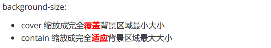
背景大小
过渡动画
过度


<style>
    div{


        width: 100px;
        height: 50px;
        border: 1px solid black;
    }
    .a{


        transition: width 1s ease-in-out 0s;
    }

    /* 使用伪类触发 */
    div:hover{


        width: 500px;
    }
</style>

<body>
    <div class="a">123456789</div>
</body>
动画

例子一:一个元素从左向右移动,3秒内执行2次
<style>
    .a {


        width: 700px;
        height: 50px;
        border: 1px solid red;
        float: left;/* 取消块独占一行的特性 */
    }

    .b {


        width: 50px;
        height: 50px;
        background-color: yellow;
        /* 动画属性:关键字、执行时间、过度函数、执行次数 */
        animation: x 3s linear 2;
    }

    /* 关键帧 */
    @keyframes x {


        from{

     margin-left:0px;}
        to {

     margin-left:650px;}
    }
</style>

<body>
    <div class="a"></div>
    <div class="b"></div>

    <div class="c"></div>
    <div class="d"></div>
</body>
例子二:一个元素从左向右移动,3秒内执行完成。无限次交替执行
<style>
    .a {


        width: 700px;
        height: 49px;
        border: 1px solid red;
        float: left;/* 取消块独占一行的特性 */
    }

    .b {


        width: 50px;
        height: 50px;
        background-color: yellow;
        /* 动画属性:关键字、执行时间、过度函数、执行次数 */
        animation: x 3s linear infinite alternate;
    }

    /* 关键帧 */
    @keyframes x {


        0%{

     margin-left:0px;}
        25%{

     background-color: darkblue;}
        50%{

     background-color: seashell;}
        75%{

     background-color: darkslategray;}
        100%{


            background-color: violet;
            margin-left: 650px;
        }
    }
</style>

<body>
    <div class="a"></div>
    <div class="b"></div>

    <div class="c"></div>
    <div class="d"></div>
</body>