一 、移动端开发要配置meta
 <!-- 移动端开发要先配置meta -->
    <!-- minimum-scale=1.0,maximum-scale=1.0,user-scalable=no 这样的话用户通过手指放大缩小是没用的页面的比例始终是1比1 -->
    <meta name="viewport" content="width=device-width,initial-scale=1.0,minimum-scale=1.0,maximum-scale=1.0,user-scalable=no">
二、配置reset.css文件
重置页面的样式表,也就是说在不同型号的手机上默认样式是不同的,我们需要把不同手机的初始化样式做一个统一,所以我们要引入一个reset.css文件
@charset "utf-8";
html {


    background-color: #fff;
    color: #000;
    font-size: 12px;
    touch-action: manipulation;
}

body,
ul,
ol,
dl,
dd,
h1,
h2,
h3,
h4,
h5,
h6,
figure,
form,
fieldset,
legend,
input,
textarea,
button,
p,
blockquote,
th,
td,
pre,
xmp {


    margin: 0;
    padding: 0
}

body,
input,
textarea,
button,
select,
pre,
xmp,
tt,
code,
kbd,
samp {


    line-height: 1.5;
    font-family: tahoma, arial, "Hiragino Sans GB", simsun, sans-serif
}

h1,
h2,
h3,
h4,
h5,
h6,
small,
big,
input,
textarea,
button,
select {


    font-size: 100%
}

h1,
h2,
h3,
h4,
h5,
h6 {


    font-family: tahoma, arial, "Hiragino Sans GB", "微软雅黑", simsun, sans-serif
}

h1,
h2,
h3,
h4,
h5,
h6,
b,
strong {


    font-weight: normal
}

address,
cite,
dfn,
em,
i,
optgroup,
var {


    font-style: normal
}

table {


    border-collapse: collapse;
    border-spacing: 0;
    text-align: left
}

caption,
th {


    text-align: inherit
}

ul,
ol,
menu {


    list-style: none
}

fieldset,
img {


    border: 0
}

img,
object,
input,
textarea,
button,
select {


    vertical-align: middle
}

article,
aside,
footer,
header,
section,
nav,
figure,
figcaption,
hgroup,
details,
menu {


    display: block
}

audio,
canvas,
video {


    display: inline-block;
    *display: inline;
    *zoom: 1
}

blockquote:before,
blockquote:after,
q:before,
q:after {


    content: "\0020"
}

textarea {


    overflow: auto;
    resize: vertical
}

input,
textarea,
button,
select,
a {


    outline: 0 none;
    border: none;
}

button::-moz-focus-inner,
input::-moz-focus-inner {


    padding: 0;
    border: 0
}

mark {


    background-color: transparent
}

a,
ins,
s,
u,
del {


    text-decoration: none
}

sup,
sub {


    vertical-align: baseline
}

html {


    overflow-x: hidden;
    height: 100%;
    font-size: 50px;
    -webkit-tap-highlight-color: transparent;
}

body {


    font-family: Arial, "Microsoft Yahei", "Helvetica Neue", Helvetica, sans-serif;
    color: #333;
    font-size: .28em;
    line-height: 1;
    -webkit-text-size-adjust: none;
}

hr {


    height: .02rem;
    margin: .1rem 0;
    border: medium none;
    border-top: .02rem solid #cacaca;
}

a {


    color: #25a4bb;
    text-decoration: none;
}
三、配置border.css
该css样式用于解决移动端1像素边框问题。问题分析:有些手机的屏幕分辨率较高,是2-3倍屏幕。css样式中border:1px solid red;在2倍屏下,显示的并不是1个物理像素,而是2个物理像素。为了解决这个问题,引入border.css是非常有必要的。
@charset "utf-8";
.border,
.border-top,
.border-right,
.border-bottom,
.border-left,
.border-topbottom,
.border-rightleft,
.border-topleft,
.border-rightbottom,
.border-topright,
.border-bottomleft {


    position: relative;
}
.border::before,
.border-top::before,
.border-right::before,
.border-bottom::before,
.border-left::before,
.border-topbottom::before,
.border-topbottom::after,
.border-rightleft::before,
.border-rightleft::after,
.border-topleft::before,
.border-topleft::after,
.border-rightbottom::before,
.border-rightbottom::after,
.border-topright::before,
.border-topright::after,
.border-bottomleft::before,
.border-bottomleft::after {


    content: "\0020";
    overflow: hidden;
    position: absolute;
}
/* border
 * 因,边框是由伪元素区域遮盖在父级
 * 故,子级若有交互,需要对子级设置
 * 定位 及 z轴
 */
.border::before {


    box-sizing: border-box;
    top: 0;
    left: 0;
    height: 100%;
    width: 100%;
    border: 1px solid #eaeaea;
    transform-origin: 0 0;
}
.border-top::before,
.border-bottom::before,
.border-topbottom::before,
.border-topbottom::after,
.border-topleft::before,
.border-rightbottom::after,
.border-topright::before,
.border-bottomleft::before {


    left: 0;
    width: 100%;
    height: 1px;
}
.border-right::before,
.border-left::before,
.border-rightleft::before,
.border-rightleft::after,
.border-topleft::after,
.border-rightbottom::before,
.border-topright::after,
.border-bottomleft::after {


    top: 0;
    width: 1px;
    height: 100%;
}
.border-top::before,
.border-topbottom::before,
.border-topleft::before,
.border-topright::before {


    border-top: 1px solid #eaeaea;
    transform-origin: 0 0;
}
.border-right::before,
.border-rightbottom::before,
.border-rightleft::before,
.border-topright::after {


    border-right: 1px solid #eaeaea;
    transform-origin: 100% 0;
}
.border-bottom::before,
.border-topbottom::after,
.border-rightbottom::after,
.border-bottomleft::before {


    border-bottom: 1px solid #eaeaea;
    transform-origin: 0 100%;
}
.border-left::before,
.border-topleft::after,
.border-rightleft::after,
.border-bottomleft::after {


    border-left: 1px solid #eaeaea;
    transform-origin: 0 0;
}
.border-top::before,
.border-topbottom::before,
.border-topleft::before,
.border-topright::before {


    top: 0;
}
.border-right::before,
.border-rightleft::after,
.border-rightbottom::before,
.border-topright::after {


    right: 0;
}
.border-bottom::before,
.border-topbottom::after,
.border-rightbottom::after,
.border-bottomleft::after {


    bottom: 0;
}
.border-left::before,
.border-rightleft::before,
.border-topleft::after,
.border-bottomleft::before {


    left: 0;
}
@media (max--moz-device-pixel-ratio: 1.49), (-webkit-max-device-pixel-ratio: 1.49), (max-device-pixel-ratio: 1.49), (max-resolution: 143dpi), (max-resolution: 1.49dppx) {


    /* 默认值,无需重置 */
}
@media (min--moz-device-pixel-ratio: 1.5) and (max--moz-device-pixel-ratio: 2.49), (-webkit-min-device-pixel-ratio: 1.5) and (-webkit-max-device-pixel-ratio: 2.49), (min-device-pixel-ratio: 1.5) and (max-device-pixel-ratio: 2.49), (min-resolution: 144dpi) and (max-resolution: 239dpi), (min-resolution: 1.5dppx) and (max-resolution: 2.49dppx) {


    .border::before {


        width: 200%;
        height: 200%;
        transform: scale(.5);
    }
    .border-top::before,
    .border-bottom::before,
    .border-topbottom::before,
    .border-topbottom::after,
    .border-topleft::before,
    .border-rightbottom::after,
    .border-topright::before,
    .border-bottomleft::before {


        transform: scaleY(.5);
    }
    .border-right::before,
    .border-left::before,
    .border-rightleft::before,
    .border-rightleft::after,
    .border-topleft::after,
    .border-rightbottom::before,
    .border-topright::after,
    .border-bottomleft::after {


        transform: scaleX(.5);
    }
}
@media (min--moz-device-pixel-ratio: 2.5), (-webkit-min-device-pixel-ratio: 2.5), (min-device-pixel-ratio: 2.5), (min-resolution: 240dpi), (min-resolution: 2.5dppx) {


    .border::before {


        width: 300%;
        height: 300%;
        transform: scale(.33333);
    }
    .border-top::before,
    .border-bottom::before,
    .border-topbottom::before,
    .border-topbottom::after,
    .border-topleft::before,
    .border-rightbottom::after,
    .border-topright::before,
    .border-bottomleft::before {


        transform: scaleY(.33333);
    }
    .border-right::before,
    .border-left::before,
    .border-rightleft::before,
    .border-rightleft::after,
    .border-topleft::after,
    .border-rightbottom::before,
    .border-topright::after,
    .border-bottomleft::after {


        transform: scaleX(.33333);
    }
}
四、解决移动端300毫秒点击延迟
在移动端的某些机型上、某些浏览器上当你使用click事件的时候,这个click回延迟300毫秒然后才执行
// 在终端
npm install fastclick --save
// 把fastclick这个包安装到我项目的依赖中 --save的意思是不管我们在开发环境中还是线上版本的代码都需要使用fastclick
// 这个时候我们就要用--save 把fastclick存到package.json中的devDependencies中

//在main.js中引入fastclick
import fastClick from 'fastclick'
// 使用fastclick   attach 是fastclick自带的一个方法 把他绑定到document.body上
fastClick.attach(document.body)
五、iconfont
新建项目图标库,把需要的图标添加到项目中并下载
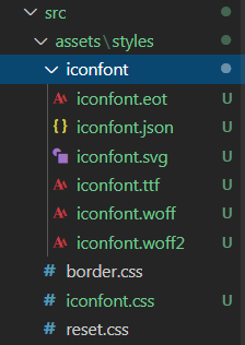
把字体文件都放进iconfont中
iconfont.css放到styles中
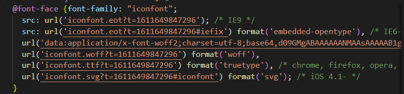
打开iconfont.css 由于引入的不在当前路径所以要修改路径 改为:
./iconfont/iconfont.eot?t=1611649847296
// 使用 在main.js中引入iconfont (因为基本上每个页面都需要引入iconfont)
import './assets/styles/iconfont.css'
// 使用
<span class="iconfont"></span>
六、初始化完成
- 清理没有必要的代码
- 上传
git add . // 把本地的修改提交到本地git的缓冲区
git commit -m 'project init' // 把本地缓冲区的内容提交到本地的仓库
git push