一、自定义组合控件(通用标题栏)
自定义组合控件就是将多个控件组合成为一个新的控件,主要解决多次重复使用同一类型的布局。如我们顶部的HeaderView以及dailog等,我们都可以把他们组合成一个新的控件。通常是继承一个系统现有的ViewGroup(LinearLayout...)
1.编写通用标题栏的布局文件:左边是返回按钮、中间是文字标题、右边可能是文本可能是图标
<?xml version="1.0" encoding="utf-8"?>
<RelativeLayout xmlns:android="http://schemas.android.com/apk/res/android"
    android:id="@+id/header_root_layout"
    android:layout_width="match_parent"
    android:layout_height="48dp">

    <ImageView
        android:id="@+id/backIv"
        android:layout_width="wrap_content"
        android:layout_height="match_parent"
        android:layout_marginStart="10dp"
        android:src="@mipmap/icon_title_back_2" />

    <TextView
        android:id="@+id/titleTv"
        android:layout_width="wrap_content"
        android:layout_height="wrap_content"
        android:layout_centerInParent="true"
        android:text="标题"
        android:textColor="#000000"
        android:textSize="18dp" />

    <TextView
        android:id="@+id/rightTv"
        android:layout_width="wrap_content"
        android:layout_height="wrap_content"
        android:layout_alignParentEnd="true"
        android:layout_centerVertical="true"
        android:layout_marginEnd="10dp"
        android:text="完成"
        android:textColor="#f0000000"
        android:textSize="16dp"
        android:visibility="gone" />

    <ImageView
        android:id="@+id/rightIv"
        android:layout_width="wrap_content"
        android:layout_height="wrap_content"
        android:layout_alignParentEnd="true"
        android:layout_centerVertical="true"
        android:layout_marginEnd="10dp"
        android:src="@mipmap/icon_setting" />

</RelativeLayout>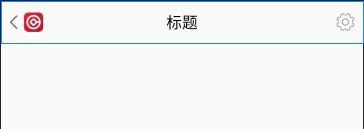
2.自定义View的java代码:CommonTitleBarLayout.java
public class CommonTitleBarLayout extends LinearLayout {
    private TextView titleTv, rightTv;
    private ImageView backIv, rightIv;
    private RelativeLayout rootLayout;

    public CommonTitleBarLayout(Context context) {
        this(context, null);
    }

    public CommonTitleBarLayout(Context context, @Nullable AttributeSet attrs) {
        this(context, attrs, 0);
    }

    public CommonTitleBarLayout(Context context, @Nullable AttributeSet attrs, int defStyleAttr) {
        super(context, attrs, defStyleAttr);
        initView(context);
        initAttrs(context, attrs);
    }

    /**
     * @param context 上下文文本
     */
    private void initView(Context context) {
        LayoutInflater.from(context).inflate(R.layout.layout_common_title_bar, this, true);
        titleTv = findViewById(R.id.titleTv);
        rightTv = findViewById(R.id.rightTv);
        backIv = findViewById(R.id.backIv);
        rightIv = findViewById(R.id.rightIv);
        rootLayout = findViewById(R.id.header_root_layout);
    }

    /**
     * @param context 上下文文本
     * @param attrs   如果需要自定义属性,可以从attrs参数获取属性值
     */
    private void initAttrs(Context context, AttributeSet attrs) {
        //获取自定义的各个属性值
        TypedArray typedArray = context.obtainStyledAttributes(attrs, R.styleable.CommonTitleBarLayout);
        String title = typedArray.getString(R.styleable.CommonTitleBarLayout_titleText);//获取format="string"
        int titleColor = typedArray.getColor(R.styleable.CommonTitleBarLayout_titleTextColor, 0x000000);//获取format="color"
        int titleSize = (int) typedArray.getDimension(R.styleable.CommonTitleBarLayout_titleTextSize, 18f);//获取format="dimension"
        int backgroundColor = typedArray.getColor(R.styleable.CommonTitleBarLayout_backgroundColor, 0xFFFFFF);//获取format="color"
        int type = typedArray.getInt(R.styleable.CommonTitleBarLayout_rightShowImgOrText, 0);//获取枚举类型值
        if (type == 1) {//右边按钮显示图片icon
            rightTv.setVisibility(GONE);
            rightIv.setVisibility(VISIBLE);
            int rightIcon = typedArray.getResourceId(R.styleable.CommonTitleBarLayout_rightIcon, R.drawable.ic_launcher_background);//获取format="reference"
        } else if (type == 2) {//右边按钮显示文本
            rightTv.setVisibility(VISIBLE);
            rightIv.setVisibility(GONE);
            String rightText = typedArray.getString(R.styleable.CommonTitleBarLayout_rightText);//获取format="string"
            int rightColor = typedArray.getColor(R.styleable.CommonTitleBarLayout_rightTextColor, 0x000000);//获取format="color"
            int rightSize = (int) typedArray.getDimension(R.styleable.CommonTitleBarLayout_rightTextSize, 16f);//获取format="dimension"
        } else {//都不显示
            rightTv.setVisibility(GONE);
            rightIv.setVisibility(GONE);
        }

        Log.i("AttributeSet", "title=" + title + "titleColor=" + titleColor + "type=" + type + "titleSize" + titleSize);
    }

    //以下这些方法:对外提供设置的接口,可以看自己需求补充
    public void setLeftListener(OnClickListener onClickListener) {
        if (onClickListener != null) {
            backIv.setOnClickListener(onClickListener);
        }
    }

    public void setRightListener(OnClickListener onClickListener) {
        if (onClickListener != null) {
            rightTv.setOnClickListener(onClickListener);
        }
    }

    public void setTitle(String title) {
        titleTv.setText(title);
    }

    public void setTitleColor(@ColorInt int color) {
        titleTv.setTextColor(color);
    }

    public void setRightBtnText(String text) {
        rightTv.setText(text);
    }

    public void setRightBtnColor(@ColorInt int color) {
        rightTv.setTextColor(color);
    }

    public void setBackgroundColor(int color) {
        rootLayout.setBackgroundColor(color);
    }
}
3.自定义属性
<?xml version="1.0" encoding="utf-8"?>
<resources>
    <declare-styleable name="CommonTitleBarLayout">
        <!--中间标题文本-->
        <attr name="titleText" format="string"/>
        <!--中间标题文本颜色-->
        <attr name="titleTextColor" format="color"/>
        <!--中间标题文本大小-->
        <attr name="titleTextSize" format="dimension"/>
        <!--右边文本-->
        <attr name="rightText" format="string"/>
        <!--右边文本颜色-->
        <attr name="rightTextColor" format="color"/>
        <!--右边文本大小-->
        <attr name="rightTextSize" format="dimension"/>
        <!--标题栏背景色-->
        <attr name="backgroundColor" format="color"/>
        <!--右边按钮是显示TextView还是ImageView-->
        <attr name="rightShowImgOrText">
            <enum name="showImageView" value="1"/>
            <enum name="showTextView" value="2"/>
            <enum name="allNotShow" value="0"/>
        </attr>
        <!--右边图片icon-->
        <attr name="rightIcon" format="reference"/>
    </declare-styleable>
</resources>
4.使用
<?xml version="1.0" encoding="utf-8"?>
<LinearLayout xmlns:android="http://schemas.android.com/apk/res/android"
    xmlns:custom="http://schemas.android.com/apk/res-auto"
    android:layout_width="match_parent"
    android:layout_height="match_parent"
    android:orientation="vertical">

    <com.example.testproject.CommonTitleBarLayout
        android:id="@+id/title_bar"
        android:layout_width="match_parent"
        android:layout_height="wrap_content"
        custom:backgroundColor="#FFFFFF"
        custom:rightShowImgOrText="showTextView"
        custom:rightText="设置"
        custom:rightTextColor="#000000"
        custom:rightTextSize="16dp"
        custom:titleText="今日新闻"
        custom:titleTextColor="#000000"
        custom:titleTextSize="18dp" />
</LinearLayout>
public class TestActivity extends AppCompatActivity {
@Override
protected void onCreate(@Nullable Bundle savedInstanceState) {
super.onCreate(savedInstanceState);
setContentView(R.layout.activity_main);
CommonTitleBarLayout titleBarLayout = findViewById(R.id.title_bar);
titleBarLayout.setTitle("2121212");
titleBarLayout.setLeftListener(new View.OnClickListener() {
@Override
public void onClick(View v) {
finish();
}
});
}
}以上就是实现一个自定义组合控件的代码:可以发现我们通过了两种方式来控制标题栏的内容和样式:1、自定义属性;2、对外提供相关设置接口(二者选其一或者都选,因为xml是布局的时候配置的,比较固定;提供java接口可以灵活进行设置)
二、继承系统控件(如:拓展TextView功能)
继承系统的控件可以分为继承View子类(如TextVIew等)和继承ViewGroup子类(如LinearLayout等),根据业务需求的不同,实现的方式也会有比较大的差异。这里介绍一个比较简单的,继承自View的实现方式。
业务需求:为文字中间添加一条横线。
因为这种实现方式会复用系统的逻辑,大多数情况下我们希望复用系统的onMeaseur和onLayout流程,所以我们只需要重写onDraw方法 ,实现非常简单
/**
 * Created by BinKang on 2021/1/12.
 * Des :文本中间划横线
 */
public class LineTextView extends TextView {

    private Paint mPaint;
    public LineTextView(Context context) {
        super(context);
        init();
    }

    public LineTextView(Context context, @Nullable AttributeSet attrs) {
        super(context, attrs);
        init();
    }

    public LineTextView(Context context, @Nullable AttributeSet attrs, int defStyleAttr) {
        super(context, attrs, defStyleAttr);
        init();
    }

    //构造方法中初始化工作
    private void init() {
        mPaint = new Paint();
        mPaint.setColor(Color.RED);
    }

    //重写draw方法,绘制我们需要的中间线
    //这里我们只需要重写onDraw方法就行,一些onMeasure方法已经在父类TextView做好了,不需要我们去管,和平常使用TextView正常使用就行
    @Override
    protected void onDraw(Canvas canvas) {
        super.onDraw(canvas);
        int width = getWidth();
        int height = getHeight();
        //绘制中心曲线,起点坐标(0,height/2),终点坐标(width,height/2)
        canvas.drawLine(0, height / 2, width, height / 2, mPaint);
    }
}
使用:
<com.example.testproject.LineTextView
        android:layout_width="wrap_content"
        android:layout_height="wrap_content"
        android:text="这段话没用了" />
效果:
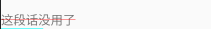
三、直接继承View
直接继承View会比上一种实现方复杂一些,这种方法的使用情景下,完全没有复用系统控件的逻辑,除了要重写onDraw外还需要对onMeasure方法进行重写。
我们用自定义View来绘制一个圆形。
public class RoundView extends View {

    private Paint mPaint;

    public RoundView(Context context) {
        super(context);
        init();
    }

    public RoundView(Context context, @Nullable AttributeSet attrs) {
        super(context, attrs);
        init();
    }

    public RoundView(Context context, @Nullable AttributeSet attrs, int defStyleAttr) {
        super(context, attrs, defStyleAttr);
        init();
    }

    private void init() {
        mPaint = new Paint();
        mPaint.setColor(Color.RED);
        mPaint.setAntiAlias(true);//去掉边缘锯齿状
    }

    @Override
    protected void onMeasure(int widthMeasureSpec, int heightMeasureSpec) {
        super.onMeasure(widthMeasureSpec, heightMeasureSpec);//View的内部有实现默认的onMeasure方法,但在View的源码当中并没有对AT_MOST和EXACTLY两个模式做出区分,也就是说View在wrap_content和match_parent两个模式下是完全相同的,都会是match_parent,显然这与我们平时用的View不同,所以我们要重写onMeasure方法

        int widthSize = MeasureSpec.getSize(widthMeasureSpec);
        int widthMode = MeasureSpec.getMode(widthMeasureSpec);
        int heightSize = MeasureSpec.getSize(heightMeasureSpec);
        int heightMode = MeasureSpec.getMode(heightMeasureSpec);

        //处理wrap_contentde情况
        if (widthMode == MeasureSpec.AT_MOST && heightMode == MeasureSpec.AT_MOST) {
            setMeasuredDimension(300, 300);
        } else if (widthMode == MeasureSpec.AT_MOST) {
            setMeasuredDimension(300, heightSize);
        } else if (heightMode == MeasureSpec.AT_MOST) {
            setMeasuredDimension(widthSize, 300);
        }
    }

    @Override
    protected void onDraw(Canvas canvas) {
        super.onDraw(canvas);
        //获取各个边距的padding值
        int paddingLeft = getPaddingLeft();
        int paddingRight = getPaddingRight();
        int paddingTop = getPaddingTop();
        int paddingBottom = getPaddingBottom();
        //获取绘制的View的宽度
        int width = getWidth() - paddingLeft - paddingRight;
        //获取绘制的View的高度
        int height = getHeight() - paddingTop - paddingBottom;
        //绘制View,左上角坐标(0+paddingLeft,0+paddingTop),右下角坐标(width+paddingLeft,height+paddingTop)
        canvas.drawRoundRect(0 + paddingLeft, 0 + paddingTop, width + paddingLeft, height + paddingTop, width / 2, width / 2, mPaint);
    }
}
注意:
1、我们实现的onMeasure()方法:super.onMeasure(widthMeasureSpec, heightMeasureSpec);是使用了系统View的测量算法,我们下面复习了setMeasureDimension()方法,所以这个super是没有的,可以注释掉;为什么不用系统的呢?下面跟进去看看系统的实现:

可以看到:在View的源码当中并没有对AT_MOST和EXACTLY两个模式做出区分,也就是说View在wrap_content和match_parent两个模式下是完全相同的,都会是match_parent。所以要重写onMeasure()。

四、继承ViewGroup
自定义ViewGroup的过程相对最复杂一些,因为除了要对自身的大小和位置进行测量之外,还需要对子View的测量参数负责。相关实例在上一篇文章详细讲解了,实战FlowLayout简易的流式布局。