本案例使用到:
- -webkit-box-reflect 倒影:(取值:above上倒影、below下倒影、left 左倒影、right右倒影)设置两个值,即倒影的位置、距离本体的距离 注:除了谷歌内核浏览器外都不支持
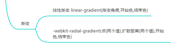
- background:设置渐变色,如: -webkit-radial-gradient(center center,400px 400px,#ff62f0,rgba(0,0,0,0.1))
- box-shadow:背景倒影

- transition值的设置:可以设置两个值,第一个值是效果几秒完成,第二个值是效果何时开始

<!DOCTYPE html>
<html>
	<head>
		<meta charset="utf-8">
		<title></title>
		<style>
			*{
				margin: 0;
				padding: 0;
			}
			html{
				background: #000000;
			}
			#app{
				perspective: 1000px;
				height: 200px;
				width: 133px;
				margin: 150px auto;
			}
			#app>.content{
				height: 100%;
				width: 100%;
				position: relative;
				transform-style: preserve-3d;
				transform: rotateX(-20deg);
			}
			#app>.content>img{
				position: absolute;
				top:0;
				left:0;
				box-shadow: 1px 1px 20px #ff62f0;
				border-radius: 10px;
				-webkit-box-reflect: below 5px;
			}
		</style>
		<script type="text/javascript" src="js/jquery-3.5.1.min.js"></script>
	</head>
	<body>
		<div id="app">
			<div class="content"></div>
		</div>

		<script>
			$(function(){
				for(let i = 0; i < 11; i++){
					$('<img src="images/' + (i+1) + '.jpg">').css({
						transform: 'rotateY(0deg) translateZ(0px)',
						transition: '1s ' + (i * 0.5) + 's',
					}).appendTo($('#app>.content'))
				}

				$('<div></div>').css({
					height: '800px',
					width: '800px',
					'border-radius': '400px',
					position: 'absolute',
					top: '100%',
					left: '50%',
					transform: 'translateX(-50%) translateY(-50%) rotateX(90deg)',
					background: '-webkit-radial-gradient(center center,400px 400px,#ff62f0,rgba(0,0,0,0.1))'
				}).appendTo($('.content'))

				for(let i = 0; i < 11; i++){
					const r = 360 / 11 * i
					$(".content>img").eq(i).css({
						transform: 'rotateY('+ r +'deg) translateZ(400px)'
					})
				}
			})
		</script>
	</body>
</html>