**
可设置样式的窗口部件列表
QAbstractScrollArea(滚动区域:随视口滚动背景、固定背景)
**
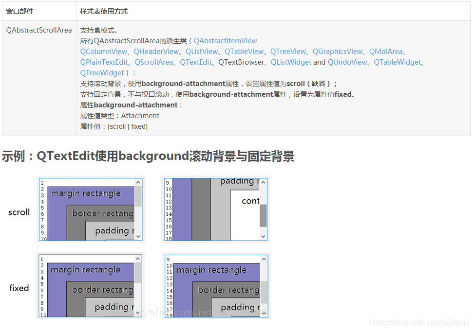
扩展:固定平铺拉伸满视口背景
QTextEdit{


    border-image: url(E:/1.jpg);
}
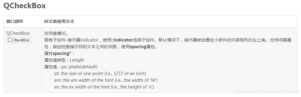
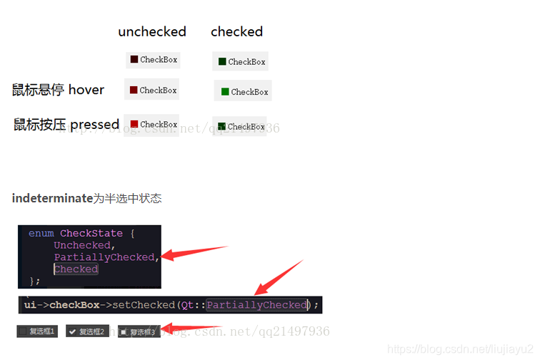
示例:QCheckBox::indicator定制
QCheckBox {


    spacing: 5px;
}
QCheckBox::indicator {


    width: 13px;
    height: 13px;
}
QCheckBox::indicator:unchecked {


    background-color: rgb(60, 0, 0);
}
QCheckBox::indicator:unchecked:hover {


    background-color: rgb(120, 0, 0);
}
QCheckBox::indicator:unchecked:pressed {


    background-color: rgb(180, 0, 0);
}
QCheckBox::indicator:checked {


    background-color: rgb(0, 60, 0);
}
QCheckBox::indicator:checked:hover {


    background-color: rgb(0, 120, 0);
}
QCheckBox::indicator:checked:pressed {


    background-color: rgb(0, 180, 0);
}
QCheckBox::indicator:indeterminate:hover {


    background-color: rgb(0, 0, 255);
}
QCheckBox::indicator:indeterminate:pressed {


    background-color: rgb(0, 0, 255, 100);
}
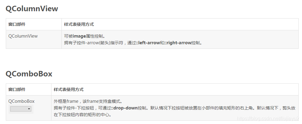
示例:QComboBox定制
QComboBox {


    border: 1px solid gray; /* border: 宽度 线类型 颜色 */
    border-radius: 3px;
    padding: 1px 18px 1px 3px;
    min-width: 6em;
}
QComboBox:editable {


    background: white;
}
QComboBox:!editable, QComboBox::drop-down:editable {


    background: qlineargradient(x1: 0, y1: 0, x2: 0, y2: 1,
                             stop: 0 #E1E1E1, stop: 0.4 #DDDDDD,
                             stop: 0.5 #D8D8D8, stop: 1.0 #D3D3D3);
}
/* QComboBox gets the "on" state when the popup is open */
QComboBox:!editable:on, QComboBox::drop-down:editable:on {


    background: qlineargradient(x1: 0, y1: 0, x2: 0, y2: 1,
                             stop: 0 #D3D3D3, stop: 0.4 #D8D8D8,
                             stop: 0.5 #DDDDDD, stop: 1.0 #E1E1E1);
}
QComboBox:on {

     /* shift the text when the popup opens */
    padding-top: 3px;
    padding-left: 4px;
}
QComboBox::drop-down {


    subcontrol-origin: padding;
    subcontrol-position: top right;
    width: 15px;
    border-left-width: 1px;
    border-left-style: solid; /* just a single line */
    border-left-color: darkgray;
    border-top-right-radius: 3px; /* same radius as the QComboBox */
    border-bottom-right-radius: 3px;
}
QComboBox::down-arrow {


    /* image: url(E:/1.jpg);*/
    border-image: url(E:/1.jpg);
}
QComboBox::down-arrow:on {

     /* shift the arrow when popup is open */
    top: 1px;
    left: 1px;
}
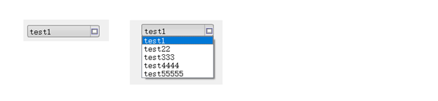
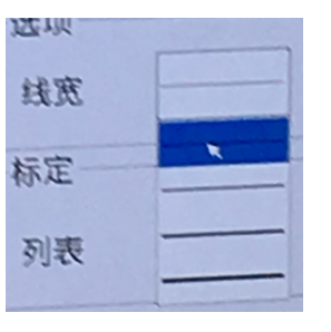
注意:增加test1 test22… 单项的高度(ui->comboBox->setView(new QListView(); 添加图片),
原来是如下:
QComboBox QAbstractItemView::item {

     min-height: 110px; min-width: 40px; }
QDateEdit(参照QSpinBox)
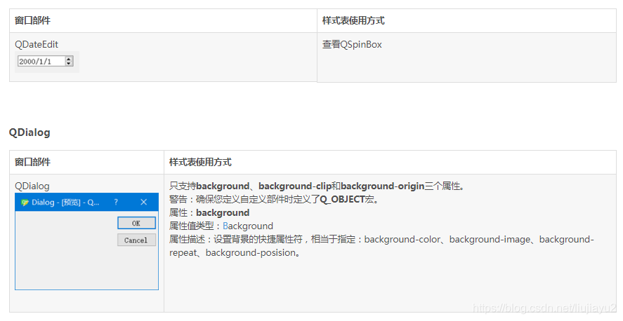
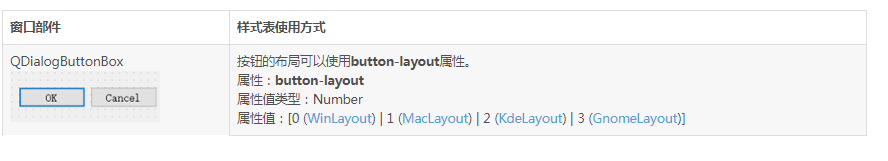
QDialogButtonBox
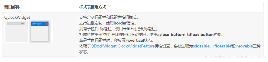
QDockWidget
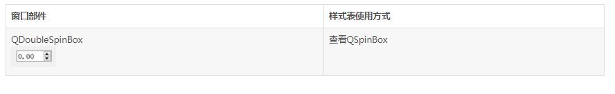
QDoubleSpinBox(查看QSpinBox)
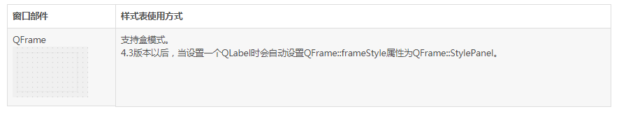
QFrame
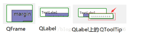
示例:QFrame定制
QFrame, QLabel, QToolTip{


    border: 2px solid green; /* border: 宽度 线类型 颜色 */
    border-radius: 4px;
    padding: 2px; /* 边界都内部矩形的宽度 */
background-image: url(E:/1.jpg);
}
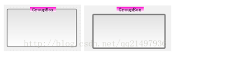
QGroupBox
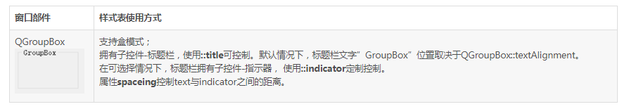
示例:QGroupBox定制
QGroupBox {


    background-color: qlineargradient(x1: 0, y1: 0, x2: 0, y2: 1,
                                 stop: 0 #E0E0E0,
                                 stop: 1 #FFFFFF);
    border: 2px solid gray; /* 右图border: 4px solid gray; */
    border-radius: 5px;
    margin-top: 1ex; /* 右图margin-top: 4ex; */
}
QGroupBox::title {


    subcontrol-origin: margin;
    subcontrol-position: top center; /* position at the top center */
    padding: 0 3px;
    background-color: qlineargradient( x1: 0, y1: 0, x2: 0, y2: 1,
                                  stop: 0 #FF0ECE,
                                  stop: 1 #FFFFFF);
}
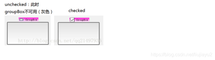
当在代码或者ui中将GroupBox设置为checkable=true时,如下:
QGroupBox {


    background-color: qlineargradient(x1: 0, y1: 0, x2: 0, y2: 1,
                                  stop: 0 #E0E0E0, stop: 1 #FFFFFF);
    border: 4px solid gray;
    border-radius: 5px;
    margin-top: 24px; /* leave space at the top for the title */
}
QGroupBox::title {


    subcontrol-origin: margin;
    subcontrol-position: top center; /* position at the top center */
    padding: 0 3px;
    background-color: qlineargradient( x1: 0, y1: 0, x2: 0, y2: 1,
                                  stop: 0 #FF0ECE,
                                  stop: 1 #FFFFFF);
}
QGroupBox::indicator {


    width: 24px;
    height: 24px;
}
QGroupBox::indicator:unchecked {


    image: url(E:/1.jpg);
}
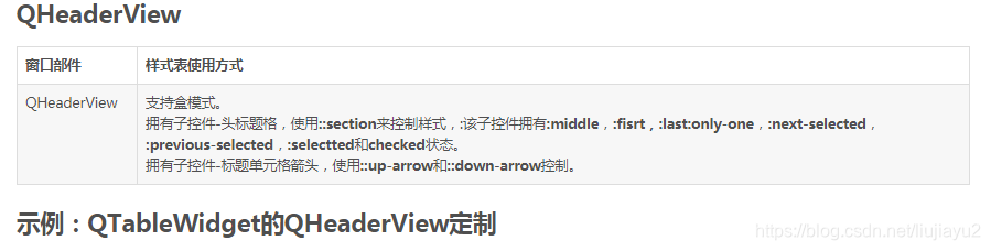
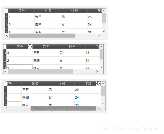
示例:QTableWidget的QHeaderView定制
QHeaderView::section {


     background-color: qlineargradient( x1:0, y1:0, x2:0, y2:1,
                                   stop:0 #616161,
                                   stop: 0.5 #505050,
                                   stop: 0.6 #434343, stop:1 #656565);
     color: white;
     padding-left: 4px;
     border: 1px solid #6c6c6c;
}
QHeaderView::section:checked
{


    background-color: red;
}
/* 以下图标,只有在设置允许sortingEnable排序后,点击表头才会出现*/
QHeaderView::down-arrow {


     width:24px;
     height:24px;
     image: url(E:/arrow-down.jpg);
}
QHeaderView::up-arrow {


     width:24px;
     height:24px;
     image: url(E:/arrow-up.jpg);
}