一、认识matplotlib
Matplotlib是一个Python 2D绘图库,能够以多种硬拷贝格式和跨平台的交互式环境生成出版物质量的图形,用来绘制各种静态,动态,交互式的图表。
Matplotlib可用于Python脚本,Python和IPython Shell、Jupyter notebook,Web应用程序服务器和各种图形用户界面工具包等。
Matplotlib是Python数据可视化库中的泰斗,它已经成为python中公认的数据可视化工具,我们所熟知的pandas和seaborn的绘图接口其实也是基于matplotlib所作的高级封装。
为了对matplotlib有更好的理解,让我们从一些最基本的概念开始认识它,再逐渐过渡到一些高级技巧中。
二、一个最简单的绘图例子
Matplotlib的图像是画在figure(如windows,jupyter窗体)上的,每一个figure又包含了一个或多个axes(一个可以指定坐标系的子区域)。最简单的创建figure以及axes的方式是通过pyplot.subplots命令,创建axes以后,可以使用Axes.plot绘制最简易的折线图。
import matplotlib.pyplot as plt
import numpy as np
fig, ax = plt.subplots()  # 创建一个包含一个axes的figure
ax.plot([1, 2, 3, 4], [1, 4, 2, 3])  # 绘制图像
[<matplotlib.lines.Line2D at 0x29936f8d588>]

和MATLAB命令类似,你还可以通过一种更简单的方式绘制图像,matplotlib.pyplot方法能够直接在当前axes上绘制图像,如果用户未指定axes,matplotlib会帮你自动创建一个。所以上面的例子也可以简化为以下这一行代码。
plt.plot([1, 2, 3, 4], [1, 4, 2, 3])
[<matplotlib.lines.Line2D at 0x29937023948>]

三、Figure的组成
现在我们来深入看一下figure的组成。通过一张figure解剖图,我们可以看到一个完整的matplotlib图像通常会包括以下四个层级,这些层级也被称为容器(container),下一节会详细介绍。在matplotlib的世界中,我们将通过各种命令方法来操纵图像中的每一个部分,从而达到数据可视化的最终效果,一副完整的图像实际上是各类子元素的集合。
-
Figure:顶层级,用来容纳所有绘图元素 -
Axes:matplotlib宇宙的核心,容纳了大量元素用来构造一幅幅子图,一个figure可以由一个或多个子图组成 -
Axis:axes的下属层级,用于处理所有和坐标轴,网格有关的元素 -
Tick:axis的下属层级,用来处理所有和刻度有关的元素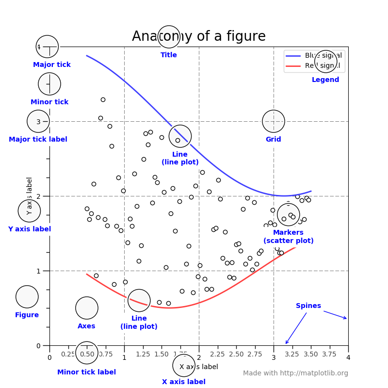
四、绘图函数的输入类型
除了numpy之外,所有绘图函数都是如此。 numpy.array 或 numpy.ma.masked_array 作为输入。类是“类数组”,如pandas数据对象和numpy。numpy.matrix可能按预期工作,也可能不按预期工作。最好将这些转换为numpy。数组对象之前绘图。
- 比如,去转换一个pandas.DataFrame
import pandas
a = pandas.DataFrame(np.random.rand(4, 5), columns = list('abcde'))
a_asarray = a.values
a_asarray
array([[0.64315283, 0.71255487, 0.63248487, 0.12595602, 0.99449794],
       [0.16308167, 0.61709654, 0.66262482, 0.80364086, 0.62175289],
       [0.26725519, 0.40534232, 0.80591293, 0.18886383, 0.76421408],
       [0.45280963, 0.54372388, 0.51494903, 0.77928021, 0.39712175]])
- 转换 numpy.matrix
b = np.matrix([[1, 2], [3, 4]])
b_asarray = np.asarray(b)
b
matrix([[1, 2],
        [3, 4]])
b_asarray
array([[1, 2],
       [3, 4]])
五、两种绘图接口
matplotlib提供了两种最常用的绘图接口
-
显式创建figure和axes,在上面调用绘图方法,也被称为OO模式(object-oriented style)
-
依赖pyplot自动创建figure和axes,并绘图
使用第一种绘图接口,是这样的:
x = np.linspace(0, 2, 100)  # 这个函数返回0-2之间均有间隔的数字100个

fig, ax = plt.subplots()
ax.plot(x, x, label='linear')
ax.plot(x, x**2, label='quadratic')
ax.plot(x, x**3, label='cubic')
ax.set_xlabel('x label')
ax.set_ylabel('y label')
ax.set_title("Simple Plot")
ax.legend()  # legend()用于显示图标
<matplotlib.legend.Legend at 0x299370a6d88>

而如果采用第二种绘图接口,绘制同样的图,代码是这样的:
x = np.linspace(0, 2, 100)

plt.plot(x, x, label='linear')
plt.plot(x, x**2, label='quadratic')
plt.plot(x, x**3, label='cubic')
plt.xlabel('x label')
plt.ylabel('y label')
plt.title("Simple Plot")
plt.legend()
<matplotlib.legend.Legend at 0x29937137e48>

实际上,对于在GUI应用程序中嵌入Matplotlib的情况,还有第三种方法,它完全删除了pyplot,甚至对于图形创建也是如此。我们不在这里讨论它;更多信息参见图库中相应的部分(在图形用户界面中嵌入Matplotlib)。
Matplotlib的文档和示例同时使用了OO和pyplot方法(这两种方法都同样强大),您应该可以随意使用其中任何一种方法(不过,最好选择其中一种方法并坚持使用,而不是混合使用它们)。通常,我们建议将pyplot限制为交互式绘图(例如,在Jupyter笔记本中),而对于非交互式绘图(在打算作为更大项目的一部分重用的函数和脚本中),则首选ooc风格。
六、函数化作图
通常,人们会发现自己一遍又一遍地绘制相同的绘图,但使用不同的数据集,这导致需要编写专门的函数来绘制绘图。推荐的函数签名是这样的
def my_plotter(ax, data1, data2, param_dict):
    """
    A helper function to make a graph

    Parameters
    ----------
    ax : Axes
        The axes to draw to

    data1 : array
       The x data

    data2 : array
       The y data

    param_dict : dict
       Dictionary of kwargs to pass to ax.plot

    Returns
    -------
    out : list
        list of artists added
    """
    out = ax.plot(data1, data2, **param_dict)
    return out
你可以这样做
data1, data2, data3, data4 = np.random.randn(4, 100)
fig, ax = plt.subplots(1, 1)
my_plotter(ax, data1, data2, {

    'marker': 'x'})
[<matplotlib.lines.Line2D at 0x7ff6082f6e10>]

同时,你也可以这样做
fig, (ax1, ax2) = plt.subplots(1, 2)
my_plotter(ax1, data1, data2, {

    'marker':'x'})
my_plotter(ax2, data3, data4, {

    'marker':'o'})
[<matplotlib.lines.Line2D at 0x7ff604ec0c90>]

参考资料
作业
你在工作或学习中通常何时会用到数据可视化,希望通过可视化达到什么目的?