来源博客:u.mr90.top
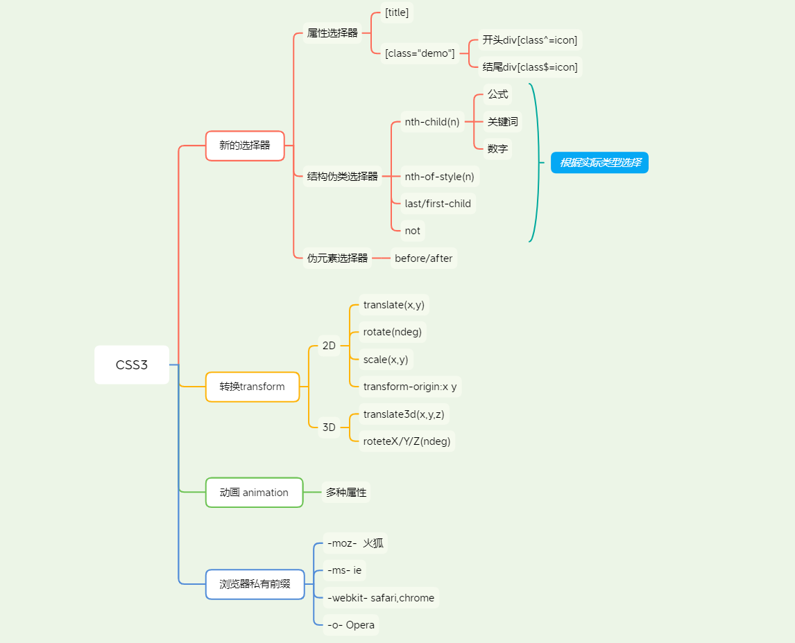
CSS3思维导图
3D转换
- x右面为正,左边为负
- y下面为正,上面为负
- z外面为正,里面为负
- transform:translate3d(x,y,z),且xyz都不能省略
透视perspective
透视(视距)写到被观察元素的父盒子上
3D旋转
-
可以沿着xyz分别旋转,加透视效果更明显
-
使用左手定则判断方向
-
transform:rotate3d(x,y,z,ndeg)
-
3d呈现transform-style:flat/preserve-3d,代码写给父级,影响的时子盒子
-
有3d翻转效果和旋转木马效果
* {
    padding: 0;
    margin: 0;
}

body {
    -webkit-transform: translate3d(0, 0, 0) ;
    transform: translate3d(0, 0, 0);
    /* perspective:1200px; */

    }

.box {
    position: relative;
    width: 200px;
    height: 200px;
    margin: 100px auto;
    transform-style: preserve-3d;
    transition: all 2s;
}

.box:hover {
    transform: rotateY(-180deg);
}

/* .box:hover .back {
    transform: rotateY(180deg);
}  */

 .front,.back {
    border-radius: 50%;
    position: absolute;
    top: 0;
    left: 0;
    width: 100%;
    height: 100%;
    font-size: 40px;
    text-align: center;
    line-height: 200px;
}

.front {
    background-color: #9b6ab5;
    z-index: 1;
}

.back {
    background-color: #ce485c;
    transform: rotateY(180deg);
}

.box2 {
    position: relative;
    height: 35px;
    width: 100px;
    margin: 100px auto;
    transform-style: preserve-3d;
    transition: all .6s;
}
.box2:hover{
    transform: rotateX(90deg);
}

.box2 ul li {
    list-style: none;
    height: 35px;
    width: 100px;
}

.b1, .b2 {
    position: absolute;
    height: 100%;
    width: 100%;
    top: 0;
    left: 0;
    border-radius: 6px;
    text-align: center;
    line-height: 35px;
}

.b1 {
    background-color: #5757ff;
    z-index: 1;
    transform: translateZ(17.5px);
}

.b2 {
    background-color: #268354;
    transform:translateY(17.5px) rotateX(-90deg);
}

section{
    width: 156px;
    height: 502px;
    position: relative;
    margin: 50px auto;
    transform-style: preserve-3d;
    animation: rotate 5s linear infinite;
}
@keyframes rotate{
    0%{
        transform: rotateY(0);
    }
    100%{
        transform: rotateY(360deg);
    }
}
section img{
    position: absolute;
    display: block;
    margin: 0 auto;
    width: 100%;
    top: 0;
    left: 0;
}
section img:nth-child(1){
    transform: translateZ(300px);
}
section img:nth-child(2){
    transform: rotateY(60deg)translateZ(300px) ;
}
section img:nth-child(3){
    transform:rotateY(120deg) translateZ(300px) ;
}
section img:nth-child(4){
    transform:rotateY(180deg) translateZ(300px)  ;
}
section img:nth-child(5){
    transform: rotateY(240deg) translateZ(300px);
}
section img:nth-child(6){
    transform:rotateY(300deg) translateZ(300px);
}
CSS移动端
- meta视口标签
neme="viewport" content="width=device-width,user-scalable=no,initial-scale=1"
background
bgs可以跟像素单位或百分比,- background-size:cover/contain(等比拉伸)
特殊样式
- 盒子模型
box-sizing;border-box,-webkit-box-sizing:border-box - 点击高亮清除
-webkit-tap-highlight-color:transparent - 清除移动端ios按钮样式
-webkit-appearance:none - 禁用长按页面时的弹出菜单
img,a{-webkit-touch-callout;none}