添加几何对象
上一讲我们介绍的是如何创建散点图,这一讲我们介绍如何创建其他类型的图,以及怎么创建有多个几何对象的图。同样用用tidyverse自带的数据mpg举例,
ggplot2::mpg
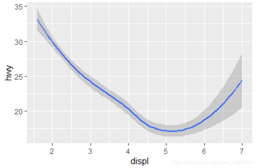
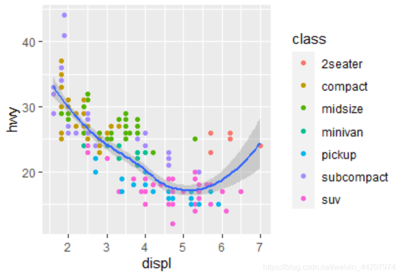
在这个数据中,我们比较关注displ与hwy这两个变量,displ表示引擎尺寸(升),hwy表示高速路上的燃油效率(英里/加仑)。为了展示这两个变量之间的关系,我们可以尝试画一条平滑曲线,平滑方法用LOESS
ggplot(data = mpg)+
  geom_smooth(method = "loess",mapping = aes(x = displ, y = hwy),
              formula = "y~x")
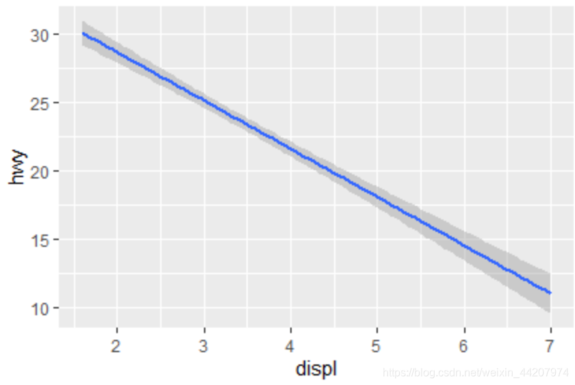
当然平滑方法是可以换的,比如我们可以用线性平滑,
ggplot(data = mpg)+
  geom_smooth(method = "lm",mapping = aes(x = displ, y = hwy),
              formula = "y~x")
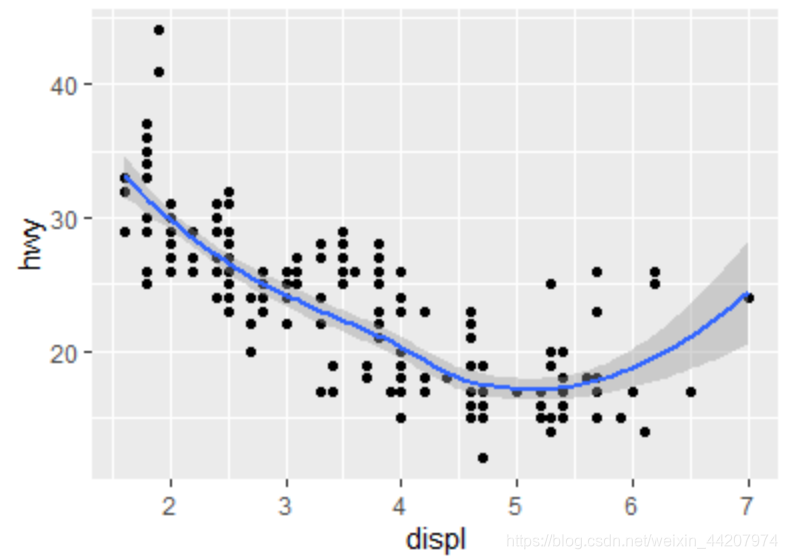
我们可以把趋势线作为一个新的图层,与上一讲画的散点图的图层重叠起来,也就是把趋势线贴到原始数据上:
Layered Grammar(默认的smooth方法是LOESS)
ggplot()+
  layer(data = mpg, mapping = aes(x = displ, y = hwy),
        geom = "point" ,stat = "identity",position="identity")+
  layer(data = mpg,mapping = aes(x = displ, y = hwy),
        geom = "smooth" ,stat = "smooth",position="identity")+
  scale_y_continuous()+
  scale_x_continuous()+
  coord_cartesian()

两个图层的Layered Grammar也可以有做一些简化(趋势线周围的灰色区域是95%置信区间):
ggplot(data = mpg)+
  geom_point(mapping = aes(x = displ, y = hwy))+
  geom_smooth(method = "loess",mapping = aes(x = displ, y = hwy),
              formula = "y~x")
但是即使是上面那三行代码仍然不是minimal code,因为数据与aesthetics mapping是一样的,再加上loess是smooth的默认方法,所以上面的三行代码可以进一步简化为一行
Minimal Code:
ggplot(data = mpg,mapping = aes(x = displ, y = hwy))+geom_point()+geom_smooth()
如果要添加其他功能,比如按颜色展示不同的车型,可以直接在minimal code上添加语句即可
ggplot(data = mpg,mapping = aes(x = displ, y = hwy))+
  geom_point(mapping = aes(color = class))+geom_smooth()
数据的统计变换
这部分我们用diamonds这个数据集举例。
ggplot2::diamonds
如果我们要展示钻石不同档次切工的频数,可以用直方图来表示:
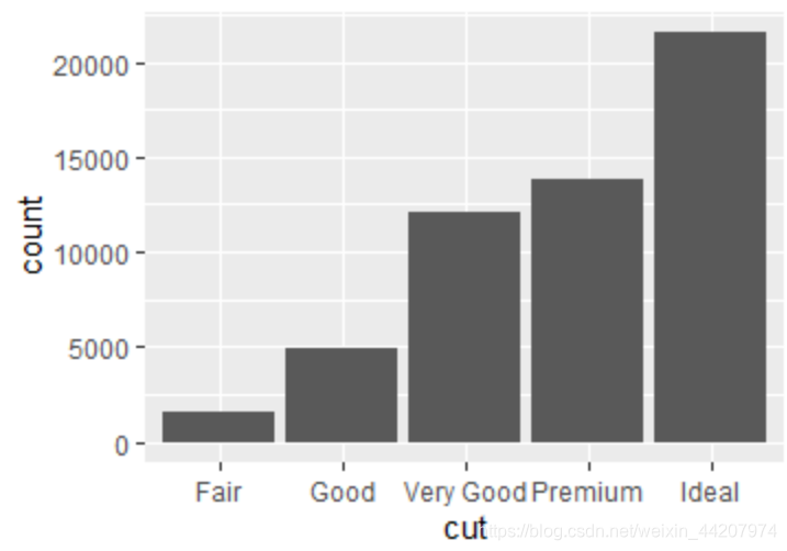
画这个直方图的Minimal Code是:
ggplot(data=diamonds)+
  geom_bar(mapping = aes(x = cut))
这里用到的创建直方图几何对象的函数是geom_bar,对于这种统计图像的创建,我们对函数之下发生的具体的事情也是很感兴趣的,
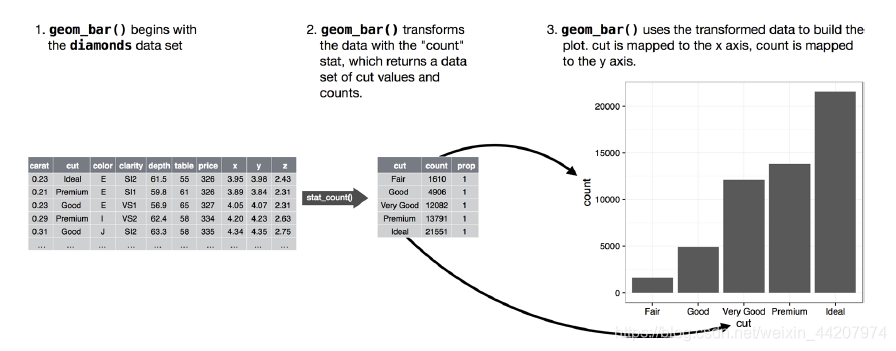
geom_bar函数使用data=diamonds作为输入,我们指定了mapping = aes(x = cut),也就是基于diamonds数据集,计算每一种cut的数目,这个功能是由stat_count函数提供的,这一步就是data transformation,在形成的图像的时候,就是基于data transformation的结果作图。如果用Layered Grammar省略掉scale与coord代码如下:
ggplot()+
  layer(data = diamonds,mapping = aes(x = cut),
        geom = "bar",stat = "count",position="identity")
虽然Minimal Code在工程中显得更有效率,但Layered Grammar更有助于我们在学习中理解ggplot2作图的逻辑。
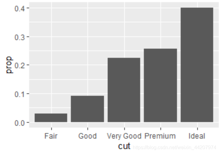
我们也可以用频率直方图来展示:
ggplot(data=diamonds)+
  geom_bar(mapping = aes(x = cut,y =..prop..,group = 1))