话不多说直接开始,从一个简单的button开始,样式参照element-ui的按钮样式。
按钮组件:
<template>
    <button :class="btnClass">
        <span><slot></slot></span>
    </button>
</template>
<script>
import {

    ref, computed, watchEffect,} from 'vue'
import {

    handleButton} from './trButtonCompositionAPI'
export default {


    props: {


        size: String
    },
    setup(props){


        const {

    btnClass} = handleButton(props)
        return {

    btnClass}
    },
}

</script>
<style>
.tr-button{


    display: inline-block;
    line-height: 1;
    white-space: nowrap;
    cursor: pointer;
    background: #fff;
    border: 1px solid #dcdfe6;
    color: #606266;
    text-align: center;
    box-sizing: border-box;
    margin: 0;
    transition: .3s;
    font-weight: 500;
    padding: 12px 20px;
    font-size: 14px;
    border-radius: 4px;
}
.tr-button:focus, .tr-button:hover {


    color: #409eff;
    border-color: #c6e2ff;
    background-color: #ecf5ff;
}
.tr-button-size-medium{


    padding: 10px 20px;
    font-size: 14px;
    border-radius: 4px;
}
.tr-button-size-small{


    padding: 9px 15px;
    font-size: 12px;
    border-radius: 3px;
}
.tr-button-size-mini{


    padding: 7px 15px;
    font-size: 12px;
    border-radius: 3px;
}
</style>
然后是按钮的CompositionAPI
import {

    watchEffect,ref} from 'vue';
export function handleButton(props){


    const btnClass = ref('tr-button')
    watchEffect(()=>{


        btnClass.value= 'tr-button' + ' ' + 'tr-button-size-'+props.size
    })
    return {


        btnClass
    }
}
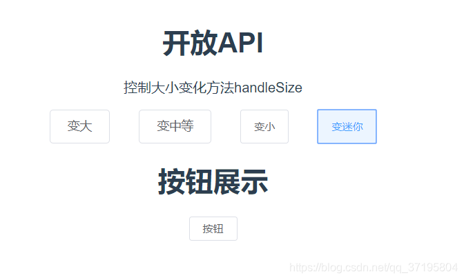
这样一个简单的组件就做好了,在页面中调用试试,并且设置一个更改大小的方法看看能不能实现更新。
<template>
    <div>
        <h1>开放API</h1>
        <p>控制大小变化方法handleSize</p>
        <div style="text-align:center;margin:0 450px">
            <div style="display:flex;justify-content: space-between;">
                <tr-button @click="handleSize('default')">变大</tr-button>
                <tr-button size="medium" @click="handleSize('medium')">变中等</tr-button>
                <tr-button size="small" @click="handleSize('small')">变小</tr-button>
                <tr-button size="mini" @click="handleSize('mini')">变迷你</tr-button>
            </div>
        </div>
        <h1>按钮展示</h1>
        <tr-button :size="btnSize">按钮</tr-button>
    </div>
</template>
<script>
import trButton from './index.vue'
import {

    ref} from 'vue'
export default {


    setup(){


        const btnSize = ref('default')
        function handleSize(type){


            btnSize.value = type
        }
        return {


            handleSize,
            btnSize
        }
    },
    components:{


        trButton
    }
}

</script>
页面效果图:

点击变迷你:
CompositionAPI+组件的封装对于整体组件的设计有着极大的要求,比如上面的CompositionAPI中的handleButtonSize方法,这里只是举了一个简单的例子,事实上如果仅仅是返回一个size的值,那么可以针对于所有的组件的大小做一个统一的方法,这样这个方法就能作为全局的CompositionAPI来使用,不用每个组件都去声明一个新的方法。