float
四个参数:left,right,none,inherit继承
实现文本环绕,水平排列,解决父元素塌陷
如何利用清除浮动,解决塌陷问题
利用float:left;实现块级元素水平排列
<style>
*{


padding: 0;
margin: o;
}
.test{


width:100px;
height: 100px;
background:red ;
float: left;
margin-right: 10px;
}
</style>
<body>
	<div class="test"></div>
	<div class="test"></div>
	<div class="test"></div>
</body>
float实现文本环绕效果:
用float:left或right即可
为什么浮动能实现环绕图片呢?
其实带有float都会变成块状元素,会脱离正常的文档流进行排列布局。但依然占据正常文本流的空间。
显示图片后正常显示文字。
css中的定位机制
标准流,定位,浮动
<style>
*{


padding: 0;
margin: o;
}
.per{


width:500px;
height: auto;
border:1px solid #000 ;
}
.test{


width:100px;
height: 100px;
background:red ;
float: left;
}
.bro{


width:100px;
height: 100px;
background:blue ;
}
</style>
<body>
<div class="per">
	<div class="test"></div>
	<div class="test"></div>
	<div class="test"></div>
	<div class="bro"></div>
</div>
</body>
此时发现高度没有了,float使其脱离了文档流,这就是副作用其一。
bro没有浮动,本应该出现在父元素下面,但出现在test下,这就是浮动导致的第二个副作用。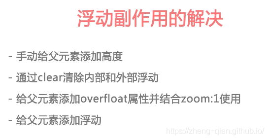
给父元素加高度,但这方法不适用,当给子元素加数量时又会撑开。
.per{


width:500px;
height: 10px;
border:1px solid #000 ;
}

2.用clear属性
clear:none,left,right,both

3.给父元素加overflow和zoom
.per{


width:500px;
height: 10px;
border:1px solid #000 ;
overflow:hidden;  /*解决溢出问题的*/
zoom:1; /*IE专属的*/
}
使用这两个可以很好的兼容浏览器

4.给父元素也加float元素
但有个缺点:父类的兄弟元素则也陷入了
还要给父类的兄弟元素加clear:both;
以后使用before::伪类浮动清除可以更好的实现
应用
<style>
	*{


	padding:0;
	margin: 0;
	}
	.head{


	width:100%;
	height: 64p×;
	}
	.logo{


	width:160px;
	height: 40p×;
	float:left;
	}
	.nav{


	width:320px;
	height: 64p×;
	float:left;
	}
	.nav-li{


	width: 80px;
	height:64px;
	text-align: center;
	line-height: 64px;
	color:#333;
	float:left;
	}
	.icons{


	width:320px;
	height:64px;
	float:right;
	}
	.i01{


	width: 64px;
	height:64px;
	float:left;
	background: url("o01.png") center no-repeat;
	}
	.i02{


	width: 64px;
	height:64px;
	float:left;
	background: url("o01.png") center no-repeat;
	}
	.i03{


	width: 64px;
	height:64px;
	float:left;
	background: url("o01.png") center no-repeat;
	}
	.i04{


	width: 64px;
	height:64px;
	float:left;
	background: url("o01.png") center no-repeat;
	}
	.i05{


	width: 64px;
	height:64px;
	float:left;
	background: url("o01.png") center no-repeat;
	}

</style>

<body>
	<div class="head">
		<div class="logo">
			<img src="logo.png" width="160" height="40" alt="">
			</div>
			<div class="nav">
				<div class="nav-li">实战</div>
				<div class="nav-li">路径</div>
				<div class="nav-li">猿问</div>
				<div class="nav-li">手记</div>
			</div>
			<div class="icons">
				<div class="i01"></div>
				<div class="i01"></div>
				<div class="i03"></div>
				<div class="i04"></div>
				<div class="i05"></div>
			</div>
	</div>
</body>
NEXT:
CSS定位。让元素固定在页面的任何有个位置上。