前言:WPF(Windows Presentation Foundation)是微软推出的基于Windows 的用户界面框架,属于.NET Framework 3.0的一部分。它提供了统一的编程模型、语言和框架,真正做到了分离界面设计人员与开发人员的工作;同时它提供了全新的多媒体交互用户图形界面
WPF布局规则:wpf窗口只能包含单个元素,为在wpf窗口中放置多个元素,需要添加容器然后向容器中放置元素
一般常用的布局方式:
1.Canvas:使用固定坐标绝对定位元素
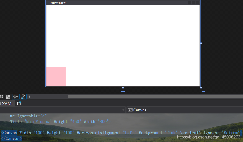
<Canvas Width="100" Height="100" HorizontalAlignment="Left" Background="Pink" VerticalAlignment="Bottom">
    </Canvas>
    //width:为容器的宽度,height:为容器的高度
    //HorizontalAlignment:水平对齐方式,VerticalAlignment:垂直对齐方式
    //Background:背景色
2.Grid:根据不可见的表格在行和列中排列元素

<Grid Width="100" Height="200" Background="Pink">
        <Grid.ColumnDefinitions>//设置列
            <ColumnDefinition/>
            <ColumnDefinition/>
            <ColumnDefinition/>
        </Grid.ColumnDefinitions>
        <Grid.RowDefinitions>//设置行
            <RowDefinition/>
            <RowDefinition/>
            <RowDefinition/>
            <RowDefinition/>
        </Grid.RowDefinitions>
        //所以图中见到了4行3列
    </Grid>
注:虽然说在xaml代码中划分了行和列但是线条不会在运行结果中显示

3.WarpPanel:在一系列可换行的行中放置元素;在水平方向上,WarpPanel面板从左向右放置条目,然后在随后的行中放置元素;在垂直方向上,WarpPanel面板在自上而下的列中放置元素,并使用附加的列放置剩余的条目:
我们用button按钮进行演示:

<WrapPanel Background="Pink">
        <Button VerticalAlignment="Top" Width="100" Height="100"/>
        <Button VerticalAlignment="Top" Width="100" Height="100"/>
        <Button VerticalAlignment="Top" Width="100" Height="100"/>
        <Button VerticalAlignment="Top" Width="100" Height="100"/>
    </WrapPanel>
WrapPanel提供了一些假想的行和列,当WrapPanel自身的宽高发生改变时对其中的元素布局也会有影响,如下图:当宽度变窄时其会自动调节其中元素的布局方式

4.DockPanel:沿着一条外边缘来拉伸所包含的控件,也就类似于许多窗口顶部的工具栏:

<DockPanel  LastChildFill="False" Background="Pink" >
        <Button Content="上" DockPanel.Dock="Top" Background="Blue"/>
        <Button Content="左" DockPanel.Dock="Left" Background="Yellow"/>
        <Button Content="下" DockPanel.Dock="Bottom"  Background="Red"/>
        <Button Content="右" DockPanel.Dock="Right"  Background="Black"/>
    </DockPanel>
    //Dock用于设置其对齐方式,有"Top","Left","Bottom","Right"四个属性值
LastChildFill:获取或设置一个值,该值指示 System.Windows.Controls.DockPanel 中的最后一个子元素是否拉伸以填充剩余的可用空间,默认为true。
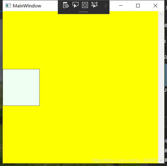
5.StackPanel:和DockPanel类似都有拉伸作用:

默认情况下是水平拉伸,如果我们想垂直拉伸,可以加一下属性Orientation="Horizontal"

6.ScrollViewer:自定义滚动条样式容器,自带滚动条:

可以看到在右侧有一个白色的滚动条样式