说明:本总结来源于慕课网 @ustbhuangyi老师的课程《Vue.js2.5+cube-ui重构饿了么App》课程,本博客做了项目总结梳理便于回顾,需要学习的伙伴可以移步学习。与君共勉!
上节回顾:项目总结:vue.js2.5饿了么APP(1)概述+项目准备
本章主要实现:header组件,header-detail浮层组件,star评分显示组件,tab切换组件
速看
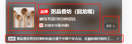
1. v-header组件 主要由内容区和公告区组成,核心要点在于公告栏要有不折行+显示缩略的效果。实现方法为设置属性:white-space: nowrap; overflow: hidden;text-overflow: ellipsis。还有就是对于整个header部分显示半透明模糊效果的图片,背景整个位于这部分的底部,把图片position:absolute,并设置index:-1,宽高撑满header区块。模糊效果使用filter,并且设置header组件有一个灰色半透明背景rgba。
2. header-datail浮层组件 整个组件效果是全屏效果,下部还有个固定的关闭按钮,由于本身高度可能超过手机高度,因此会滚,不能使用position fixed布局,如果内容比较长,则会盖住X。这里使用到了经典的css sticky footers 布局。
尝试过把head-detail组件放在header组件中,为了防止父元素的嵌套样式效果影响组件,更好的方法是把该部分被创建为cube-ui中的create-API组件。(cube-ui提供了一个很好的API就是creat-api模块,让我们把一个模块从声明式的写(<star></star>),而变为API调用(creatAPI(vue,component))即当一个组件执行createAPI之后,我们可以在组件内部通过$ceate(Star)来调用组件,并且可以动态挂载到body下面。因此就很适合这种全屏弹窗组件动态挂载到body下,而移除时可以从body下卸载。)在调用时,使用驼峰形式引入组件,传入props,创建之后通过组件调用show()方法控制显示,使用hide()方法控制浮层关闭。
由于show()和hide()方法在后面其他部分有类似的逻辑处理,因此抽离出mixin。对于过渡动画,使用<transtion>定义name=”fade”,然后写动画。其中的---text----是flex布局由三个部分组成:line text line
3. star组件 显示是由三组图片组成(全星,半星,空),使用props接收size和score两个参数。计算属性依赖size实现三种大小的样式展现,通过计算score在数组中放入响应的星星状态,使用v-for遍历数组显示评分。
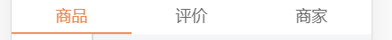
4. tab组件 使用cube-ui提供的tab-bar来实现页面切换。为了实现点击tab做页面切换,写入change事件(cube-ui的slide的)在slide页面切换时触发,并且派发当前页面的索引值,从而实现页面切换。为了优化体验,希望tab滑动时下划线可以跟着页面实现流畅滚动,可以根据tab占比和slide占比相同实时计算tab滚动位置。
由于开始tab标签是写死的,个数也是固定的,因此希望这个tab可以接收一个数组,包含tab个数,tab名称,对应的组件,而tab只是用来维护这些内容,因此v-for遍历,使用<component :is>动态提供组件。并在app.vue中添加默认的tab数组。
目录
一、header组件
1. 概括
v-header组件的主要由内容区和公告区组成,核心要点在于公告栏要有不折行+显示缩略的效果。实现方法为设置属性:white-space: nowrap; overflow: hidden;text-overflow: ellipsis。还有就是对于整个header部分显示半透明模糊效果的图片,背景整个位于这部分的底部,把图片position:absolute,并设置index:-1,宽高撑满header区块。模糊效果使用filter,并且设置header组件有一个灰色半透明背景rgba。
2. 布局
布局主要包含两个区块:内容区(图象+名称描述等+浮层),公告相关
<div class="header">
    <div class="content-wrapper">
      <div class="avatar"></div>
      <div class="content">
        <div class="title"></div>
        <div class="description"></div>
        <div class="support"></div>
      </div>
      <div class="support-count"></div>
    </div>
    <div class="bulletin-wrapper"></div>
    <div class="background"></div>
</div>
3. 具体实现
(1)组件传值
首先需要在props接收seller对象,并且需要设置默认为空
props: {
      seller: {
        type: Object,
        default() {
          return {}
        }
      }
    },
(2)商家图片部分
直接添加图片
<div class="avatar"><img width="64" height="64" :src="seller.avatar"></div>(3)右侧content内容
动态绑定seller.name 、seller.description 、seller.deliveryTime
Support表示下面的满减活动,包含icon和text,并且supports是一个数组,使用v-if
    <div class="content">
        <div class="title">
          <span class="brand"></span>
          <span class="name">{{seller.name}}</span>
        </div>
        <div class="description">
          {{seller.description}}/{{seller.deliveryTime}}分钟送达
        </div>
        <div v-if="seller.supports" class="support">
          <support-ico :size=1 :type="seller.supports[0].type"></support-ico>
          <span class="text">{{seller.supports[0].description}}</span>
        </div>
      </div>
(4)添加浮层入口
<div v-if="seller.supports" class="support-count">
        <span class="count">{{seller.supports.length}}个</span>
        <i class="icon-keyboard_arrow_right"></i>
</div>
(5)公告区bulletin-wrapper
三个部分:icon,文字,箭头(点击展开蒙层)如果内容超出区域会显示缩略(...)
<div class="bulletin-wrapper">
    <span class="bulletin-title"></span><span class="bulletin-text">{{seller.bulletin}}</span>
    <i class="icon-keyboard_arrow_right"></i>
 </div>
由于描述比较多,如果不写样式会把描述全部显示,不符合所需结果。不折行+显示缩略:
white-space: nowrap
overflow: hidden
text-overflow: ellipsis
(6)背景图
<div class="background"><img :src="seller.avatar" width="100%" height="100%"></div>效果:显示半透明的图片,模糊效果,背景整个位于这部分的底部,方法:把图片position:absolute,并设置index:-1,宽高撑满header区块。模糊效果:filter,并且设置header组件有一个灰色半透明背景rgba
.background
      position: absolute
      top: 0
      left: 0
      width: 100%
      height: 100%
      z-index: -1
      filter: blur(10px)
二、Header-detail头部弹层组件
1. 概括
整个组件效果是全屏效果,下部还有个固定的关闭按钮,由于本身高度可能超过手机高度,因此会滚,不能使用position fixed布局,如果内容比较长,则会盖住X。这里使用到了经典的css sticky footers 布局。
尝试过把head-detail组件放在header组件中,为了防止父元素的嵌套样式效果影响组件,更好的方法是把该部分被创建为cube-ui中的create-API组件。(cube-ui提供了一个很好的API就是creat-api模块,让我们把一个模块从声明式的写(<star></star>),而变为API调用(creatAPI(vue,component))即当一个组件执行createAPI之后,我们可以在组件内部通过$ceate(Star)来调用组件,并且可以动态挂载到body下面。因此就很适合这种全屏弹窗组件动态挂载到body下,而移除时可以从body下卸载。)在调用时,使用驼峰形式引入组件,传入props,创建之后通过组件调用show()方法控制显示,使用hide()方法控制浮层关闭。
由于show()和hide()方法在后面其他部分有类似的逻辑处理,因此抽离出mixin。对于过渡动画,使用<transtion>定义name=”fade”,然后写动画。
其中的---text----是flex布局由三个部分组成:line text line
2. 布局

效果:全部屏效果,模糊,本身高度可能超过手机高度,因此会滚动。主要分为内容部分+下层关闭部分。
不能使用position fixed布局,如果内容比较长,则会盖住X。这里使用到了经典的css sticky footers 布局。并且组件引入放在app.vue中,而不是在header组件内部.(但是此处会被使用createAPI做出修改)
<transition name="fade">
        <div v-show="visible" class="header-detail">
            <div class="detail-wrapper clear-fix">
                <div class="detail-main">
                    <div class="star-wrapper"><star></star></div>
                    <div class="title"></div>
                    <ul class="supports"><li class="support-item"></li></ul>
                    <div class="title"></div>
                    <div class="bulletin"></div>
                </div>
            </div>
            <div class="detail-close"></div>
        </div>
    </transition>
3. 实现
(1)Css sticky footer布局
Sticky footers设计可以概括如下:如果页面内容不够长的时候,页脚块粘贴在视窗底部;如果内容足够长时,页脚块会被内容向下推送。参考连接:https://www.w3cplus.com/css3/css-secrets/sticky-footers.html
我们选择一个兼容性较好的,但是比较复杂的方法,套路如下:需要设置两层,分别是:detail-wrapper clear-fix(内容内部有一个detail-main 用于真正承载内容)和detail-close。
其中detail-wrapper主要有一个min-height来成满屏幕,内部的detail-main中设置一个padding-bottom为底部留下空间,最后detail- close向上移动margin为刚才留出部分。
.detail-wrapper
      display: inline-block
      width: 100%
      min-height: 100%    // 撑满屏幕
      .detail-main
        margin-top: 64px
        padding-bottom: 64px   // 重要,撑开下面高度
.detail-close
      position: relative
      width: 30px
      height: 30px
      margin: -64px auto 0 auto   // -64
      clear: both
      font-size: $fontsize-large-xxxx
(2)clear-fix
使用了cube-ui中的,默认写法如下:
.clear-fix
    display: inline-block
    &:after
        display:block
        content: "."
        height: 0
        line-height: 0
        clear: both
        visibility: hidden
(3)---text---部分
需要使用flex布局,三个部分组成:line text line
小标题自适应布局,推荐文章:http://www.ruanyifeng.com/blog/2015/07/flex-grammar.html
<div class="title">
           <div class="line"></div>
            <div class="text">优惠信息</div>
            <div class="line"></div>
</div>
Title使用flex布局,对于屏幕80%的宽度,margin左右是浮动的
line自适应布局flex:1,位置为相对。text文字根据内容长度自动撑开
.title
          display: flex
          width: 80%
          margin: 28px auto 24px auto
          .line
            flex: 1
            position: relative
          .text
            padding: 0 12px
注意:此处使用flex布局在编译的时候会有postcss自动生成一些兼容性代码,而不用写mixin
(4)活动内容部分
主要是遍历数组实现
<ul v-if="seller.supports" class="supports">
      <li class="support-item" v-for="(item,index) in seller.supports" :key="item.id">
            <support-ico :size=2 :type="seller.supports[index].type"></support-ico>
            <span class="text">{{seller.supports[index].description}}</span>
       </li>
</ul>
(5)组件之间的引用--创建CreateAPI
思考:可以尝试把head-detail组件放在header组件中。可以实现。
推荐:遇到全屏弹层组件,把组件放在body下是最保险的。那是因为对于嵌套的fix布局可能受到父元素影响等。
方法:cube-ui提供了一个很好的API就是creat-api模块,让我们把一个模块从声明式的写(<star></star>),而变为API调用(creatAPI(vue,component))即当一个组件执行createAPI之后,我们可以在组件内部通过$ceate(Star)来调用组件,并且可以动态挂载到body下面。因此就很适合这种全屏弹窗组件动态挂载到body下,而移除时可以从body下卸载。
1)定义一个register.js,写入
import { createAPI } from 'cube-ui'
import Vue from 'vue'
import HeaderDetail from 'components/header-detail/header-detail'

createAPI(Vue, HeaderDetail)
2)并且在入口文件main.js中加入import './register'实现API的调用,因此不需要在app.vue中引入该组件
(6)添加点击事件实现弹层显示
1)添加click事件showDetail()
2)在此处可以实现API调用,定义headerDetailComp是一个组件,并且使用驼峰形式引入组件,传入props,创建之后通过组件调用show()方法控制显示。同理使用hide()方法控制浮层关闭。
methods: {
      showDetail() {
        this.headerDetailComp = this.headerDetailComp || this.$createHeaderDetail({
          $props: {
            seller: 'seller'
          }
        })
        this.headerDetailComp.show()
      }
    },
3)控制显示:在head-detail组件中添加v-show=”visible”,并通过show方法修改visible的true 和 false。为了简化之后的操作,使用mixin抽离出来
const EVENT_SHOW = 'show'
const EVENT_HIDE = 'hide'

export default {
    data() {
        return {
            visible: false
        }
    },
    methods: {
        show() {
            this.visible = true
            this.$emit(EVENT_SHOW)
        },
        hide() {
            this.visible = false
            this.$emit(EVENT_HIDE)
        }
    }
}
(7)过渡动画显示浮层
在head-tail中使用transition,定义name=”fade”,然后写动画
&.fade-enter-active, &.fade-leave-active
      transition: all 0.5s
 &.fade-enter, &.fade-leave-active
      opacity: 0
      background: $color-background
三、星级评分组件
1. 概括
显示是由三组图片组成(全星,半星,空),使用props接收size和score两个参数。计算属性依赖size实现三种大小的样式展现,通过计算score在数组中放入响应的星星状态,使用v-for遍历数组显示评分。
2. 实现
效果:使用图片素材 全星(on) 半星(half) 空(off) 拼接评分效果
(1)组件传值
使用span绑定starType;v-for遍历itemClasses数组,使用计算属性显示。
<div class="star" :class="starType">
    <span v-for="(itemClass,index) in itemClasses" :class="itemClass" class="star-item" :key="index"></span>
  </div>
Props接收两个参数:size大小(有三种类型24 36 48)score分数
props: {
      size: {
        type: Number
      },
      score: {
        type: Number
      }
    },
(2)数组实现评分
定义常量length ,cls_on, cls_half, cls_off分别记录评星长度,和星级
定义result数组,通过props中的score拿到分数,计算四舍五入之后的评分,得到hasDecimal是否有半星,integer有多少个全星。
做循环,将全星cls_on放入数组result,如果有半星就放入半星。再循环补上空星。
itemClasses() {
        const result = []
        const score = Math.floor(this.score * 2) / 2
        const hasDecimal = score % 1 !== 0
        const integer = Math.floor(score)
        for (let i = 0; i < integer; i++) {
          result.push(CLS_ON)
        }
        if (hasDecimal) {
          result.push(CLS_HALF)
        }
        while (result.length < LENGTH) {
          result.push(CLS_OFF)
        }
        return result
      }
    }
(3)动态添加样式
使用computed计算属性计算starType()需要依赖size, 返回‘star’ + this.size,因此可以添加不同的样式star-24 star-36 star-48
.star
    display: flex
    align-items: center
    justify-content: center
    .star-item
      background-repeat: no-repeat
    &.star-48
      .star-item
        width: 20px
        height: 20px
        margin-right: 22px
        background-size: 20px 20px
        &:last-child
          margin-right: 0
        &.on
          bg-image('star48_on')
        &.half
          bg-image('star48_half')
        &.off
          bg-image('star48_off')
    &.star-36
      .star-item
        width: 15px
        height: 15px
        margin-right: 6px
        background-size: 15px 15px
        &:last-child
          margin-right: 0
        &.on
          bg-image('star36_on')
        &.half
          bg-image('star36_half')
        &.off
          bg-image('star36_off')
    &.star-24
      .star-item
        width: 10px
        height: 10px
        margin-right: 3px
        background-size: 10px 10px
        &:last-child
          margin-right: 0
        &.on
          bg-image('star24_on')
        &.half
          bg-image('star24_half')
        &.off
          bg-image('star24_off')
(4)组件的使用
引入组件并注册,即可使用。并且<star>组件接收两个参数score type
<star :size="48" :score="seller.score"></star>四、tab组件
1. 概括
tab组件使用cube-ui提供的tab-bar来实现页面切换。为了实现点击tab做页面切换,写入change事件(cube-ui的slide的)在slide页面切换时触发,并且派发当前页面的索引值,从而实现页面切换。为了优化体验,希望tab滑动时下划线可以跟着页面实现流畅滚动,可以根据tab占比和slide占比相同实时计算tab滚动位置。
由于开始tab标签是写死的,个数也是固定的,因此希望这个tab可以接收一个数组,包含tab个数,tab名称,对应的组件,而tab只是用来维护这些内容,因此v-for遍历,使用<component :is>动态提供组件。并在app.vue中添加默认的tab数组。
2. 布局
使用cube-ui的tab-bar组件实现页面切换,组件放在app.vue下面
<div class="tab">
        <cube-tab-bar></cube-tab-bar>
        <div class="slide-wrapper">
            <cube-slide>
                <cube-slide-item>
                    <component ></component>
                </cube-slide-item>
            </cube-slide>
        </div>
 </div>
3. 实现
(1)<cube-tab-bar>部分
:showSlider是否显示下划线;
v-model当前选择的tab;在后面设置了一个计算属性。通常计算属性就是一个get,但是这里添加了一个set,当点击tab-bar某一项时,会修改label,set主要用于计算当前的index值(index就是一个当前页面的索引,而index也会作为<cube-slide>的:initial-index=”index”传入,当点击某一项时,index会发生改变,会触发set(),然后根据当前tab值找到索引,从而实现点击切换。)
computed: {
        selectedLabel: {
        get() {
          return this.tabs[this.index].label
        },
        set(newVal) {
          this.index = this.tabs.findIndex((value) => {
            return value.label === newVal
          })
        }
      }
    }
:data=”tab”是一个数组,包含label(比如:seller goods ratings)
(2)<cube-slide>部分
:loop设置为false,不需要轮播; 显示索引为index
<cube-tab-bar
            :showSlider=true
            :useTransition=false
            v-model="selectedLabel"
            :data="tabs"
            ref="tabBar"
            class="border-bottom-1px">
 </cube-tab-bar>
(3)上下滚动联动
思考:slide滚动到某一页,希望可以派发一个事件,根据事件判断滑动到某一页然后做切换。cube-ui对于slide组件提供了一个change事件,他会在slide页面切换时触发,并且派发当前页面的索引值。
做法:给cube-slide 监听一个change事件onchange(),并编写方法,参数current当前索引,拿到索引,把它赋值给index。当index变化,selectedLabel就会重新计算,从而实现切换。
onChange(current) {
            this.index = current
            const component = this.$refs.component[current]
            component.fetch && component.fetch()
        },
(4)下划线相对滚动
思考:知道slide实时滚动的位置,因此下划线的滚动比例应该和slide页面的比例相同。
<cube-slide
                :loop=false
                :auto-play=false
                :show-dots=false
                :initial-index="index"
                ref="slide"
                @change="onChange"
                @scroll="onScroll"
                :options="slideOptions">
         <cube-slide-item v-for="(tab, index) in tabs" :key="index">
             <component :is="tab.component" :data="tab.data" ref="component"></component>
         </cube-slide-item>
</cube-slide>
1)首先,需要实时知道slide滚动的位置,使用cube-ui中的onscroll(res)事件,它会派发两个事件,其中对cube-slide配置(option会传入两个参数listenscroll probetype)这样就可以实时拿到坐标.
slideOptions: {
                listenScroll: true,
                probeType: 3,
                directionLockThreshold: 0   // 不会斜着滚动
            }
2)写onscroll()方法
其中cube-ui提供了一个setSliderTransform的API,可以改变slide的位置。
首先拿到slide宽度,和整个slide组件的宽度,计算比例,计算下划线滚动的位置。从而可以实时滚动。
onScroll(pos) {
            const tabBarWidth = this.$refs.tabBar.$el.clientWidth
            const slideWidth = this.$refs.slide.slide.scrollerWidth
            const transform = -pos.x / slideWidth * tabBarWidth
            this.$refs.tabBar.setSliderTransform(transform)
        }
3)但是效果不自然,这是因为默认的transform是当我们点击时,本身有一个缓动,因此需要关闭默认缓动。:useTransition=false
(5)tab组件抽象和封装
问题:由于开始tab标签是写死的,个数也是固定的,因此希望这个tab可以接收一个数组,包含tab个数,tab名称,对应的组件,而tab只是用来维护这些内容。
思考:tab组件需要label。Tab通过props传入tab数组。并且组件是通过tab传入,不写死组件,v-for遍历,使用<component :is>动态提供组件。
<cube-slide-item v-for="(tab, index) in tabs" :key="index">
            <component :is="tab.component" :data="tab.data" ref="component"></component>
</cube-slide-item>
在app.vue中添加计算属性
 computed: {
    tabs() {
      return [
        {
          label: '商品',
          component: Goods,
          data: {
            seller: this.seller
          }
        },
        {
          label: '评价',
          component: Ratings,
          data: {
            seller: this.seller
          }
        },
        {
          label: '商家',
          component: Seller,
          data: {
            seller: this.seller
          }
        }
      ]
    }
  },
(6)组件使用
<tab :tabs="tabs"></tab>(7)扩展props从而可以设置初始页面
<tab :tabs="tabs" :initialIndex=1></tab>

props: {
        tabs: {
            type: Array,
            default() {
                return []
            }
        },
        initialIndex: {
            type: Number,
            default: 0
        }
    },
(8)样式
Vue css如果希望scoped样式的一个选择器作用的更深,可以使用>>>操作
.tab
        >>>.cube-tab
            padding: 10px 0
        display: flex
        flex-direction: column
        height: 100%
        .slide-wrapper
            flex: 1
            overflow: hidden